Modern concrete floor in a renovated home with character
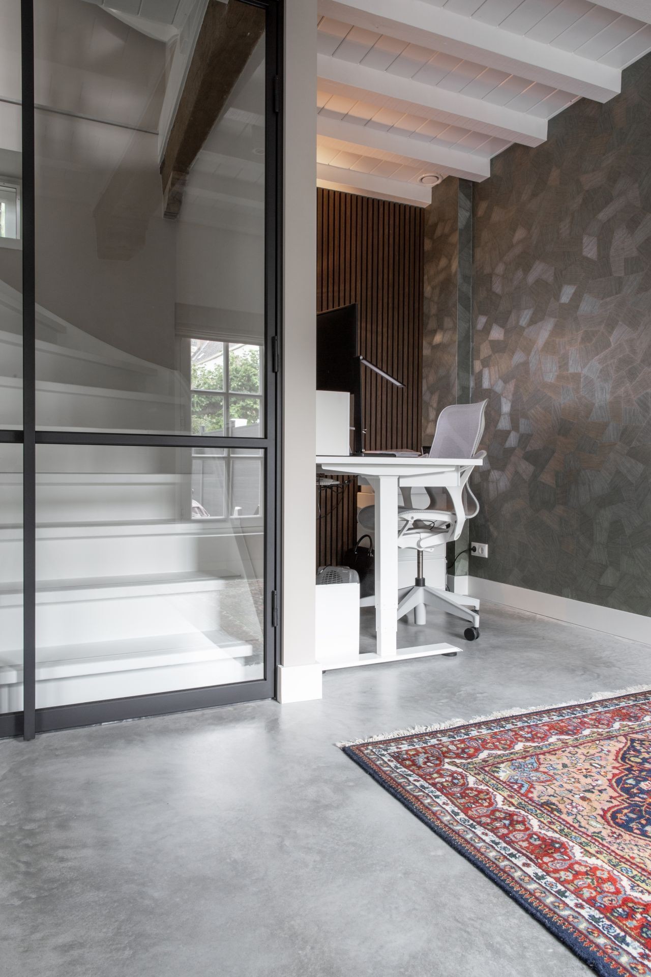
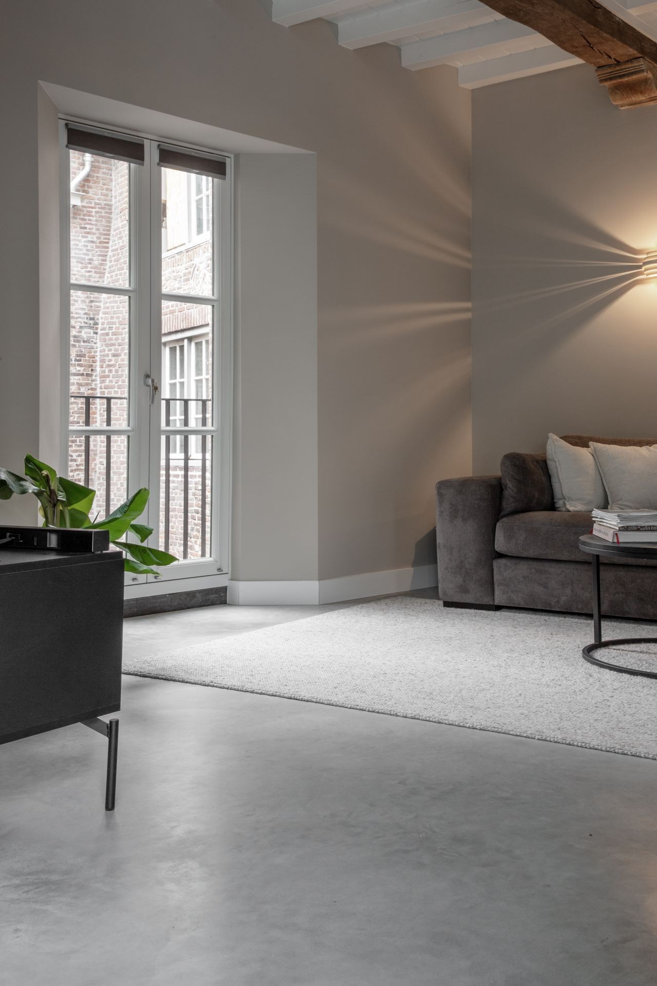
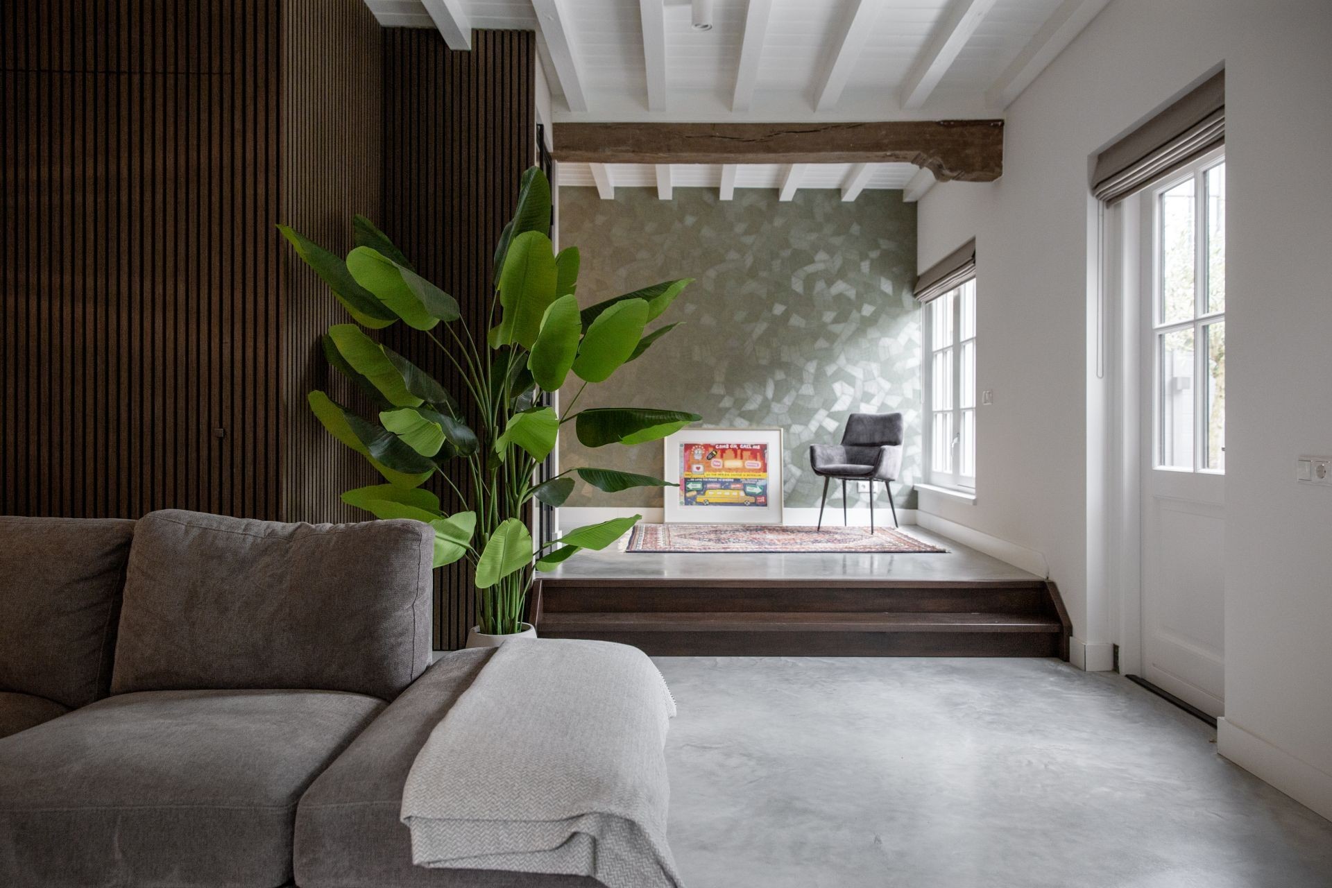
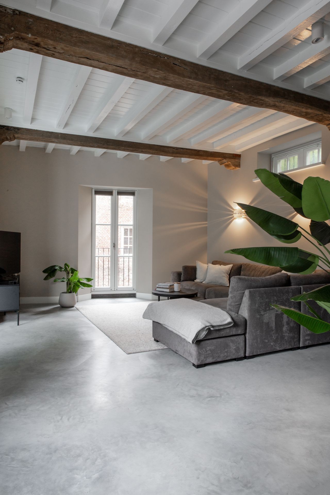
The polished concrete floor runs through the house like a steady grey plane, setting the tone before the beams and kitchen details even come into view. Its base colour is understated, but the surface carries just enough movement to keep the room from feeling flat. Above it, the preserved wooden structure and the rebuilt interior keep each other in check, so the renovation reads as one continuous space rather than a collection of separate rooms.
Concrete floors in homes can carry the whole room
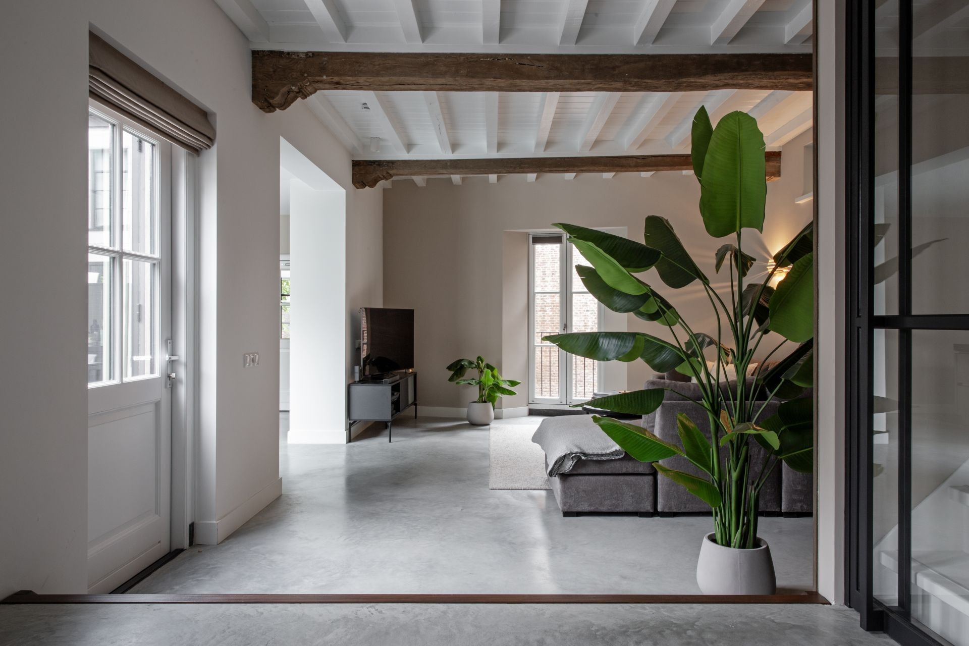
Here, the concrete floor does more than sit under the furniture. It links the living area, kitchen and passageways in one visual line, which makes the plan feel clear as soon as you step inside. The floor’s cool grey tone also gives the white walls, timber beams and darker furniture something to lean against. That contrast is what gives the interior its pace: a smooth, grounded base below, and a layered ceiling above.
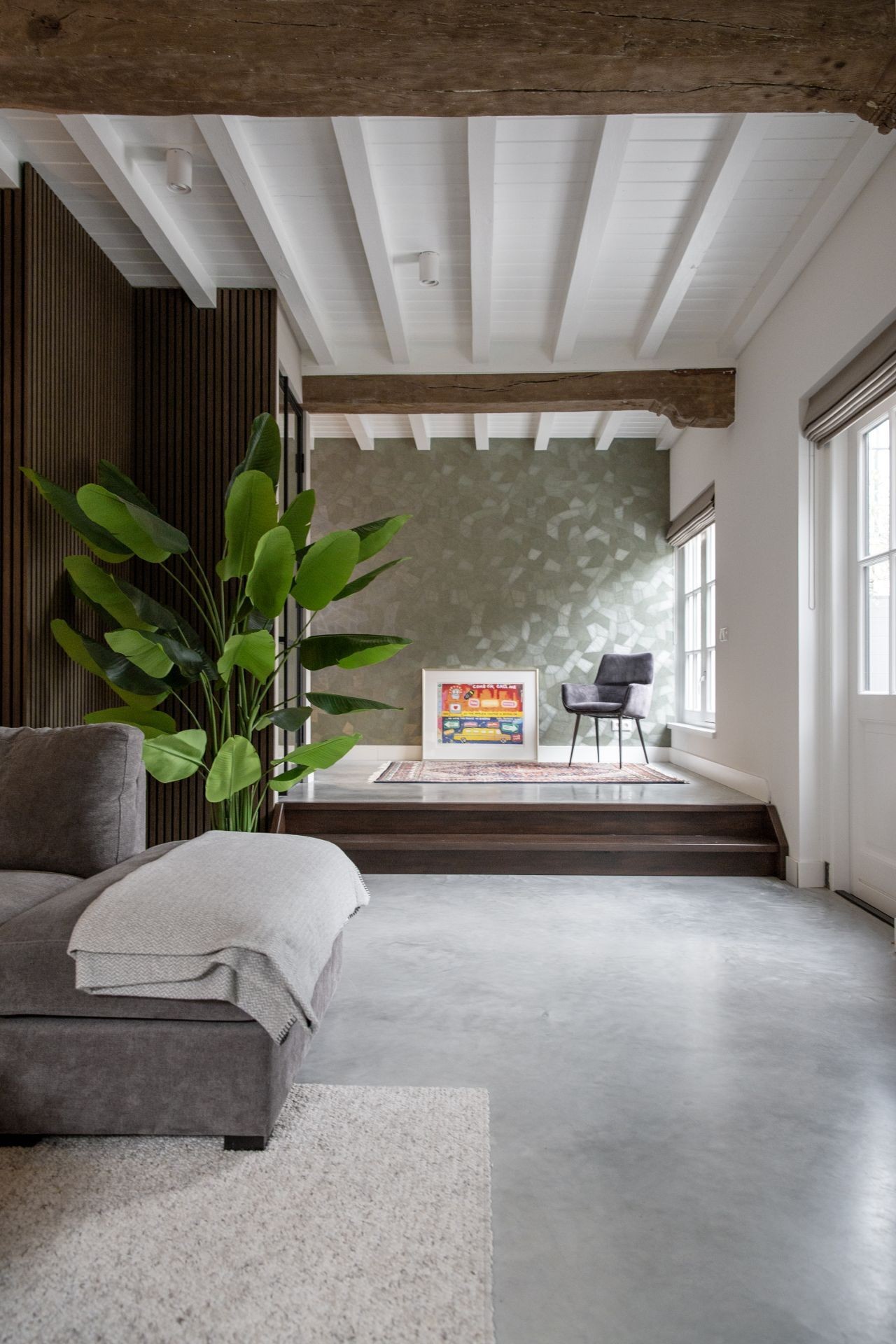
The original layout has been kept in place, and that decision is visible in the way the rooms still connect through their old proportions. The house has been renewed without flattening its history. Wooden beams remain exposed across the ceiling, and the white infill around them brightens the upper part of the room. The result is not decorative in a loud sense; it is structural. You read the beams first, then the floor, then the long opening toward the kitchen and windows.
Exposed beams set the rhythm above the floor
One of the strongest pairings in the house is the concrete floor with exposed beams. The ceiling is not hidden behind layers of finish. Instead, the timber and white ceiling sections stay visible, which gives the room a measured rhythm. Light from the large glazed openings lands across that surface and softens the line between old and new. In the living zone, the beams frame the space while the floor keeps it visually calm.
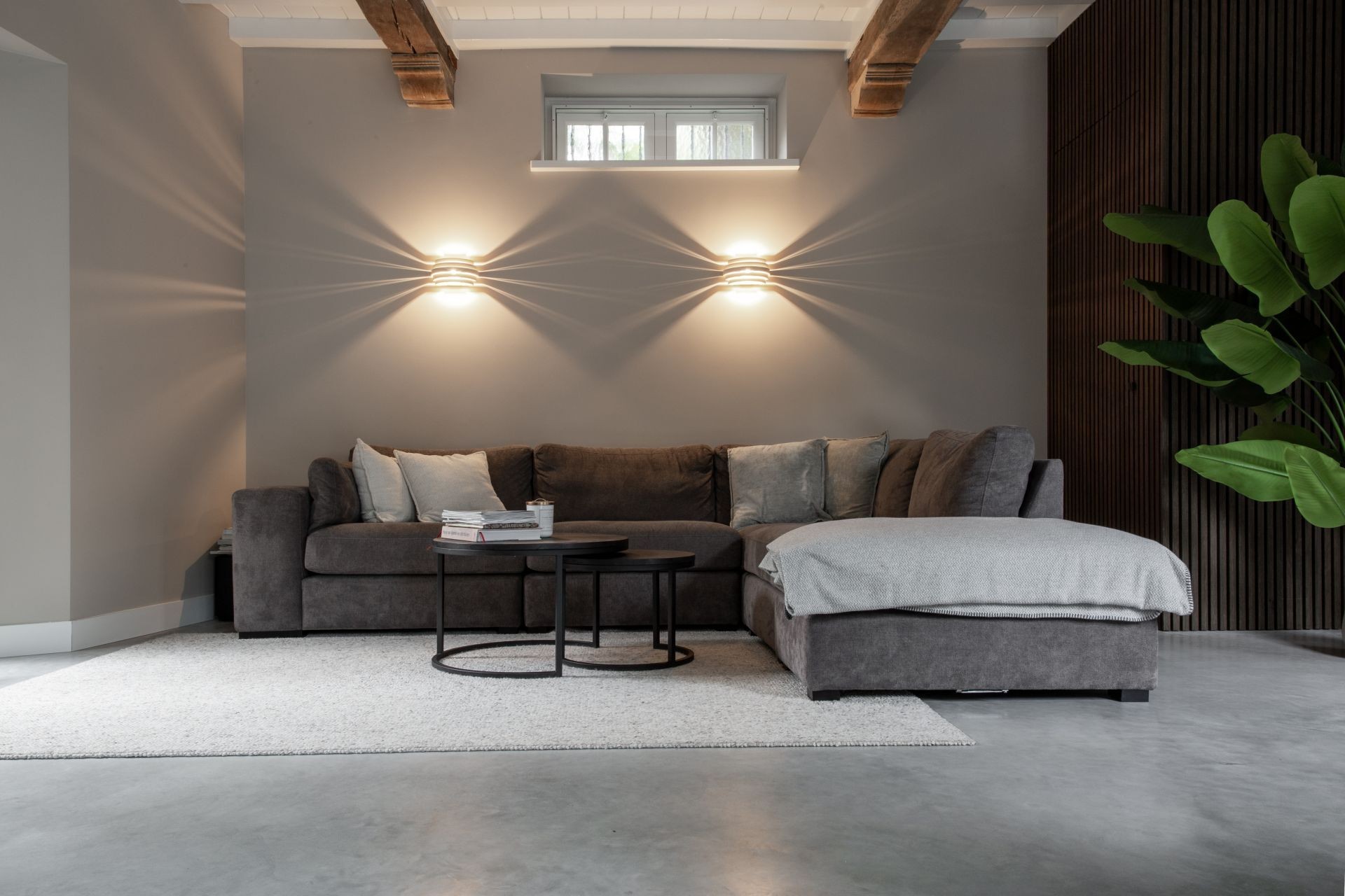
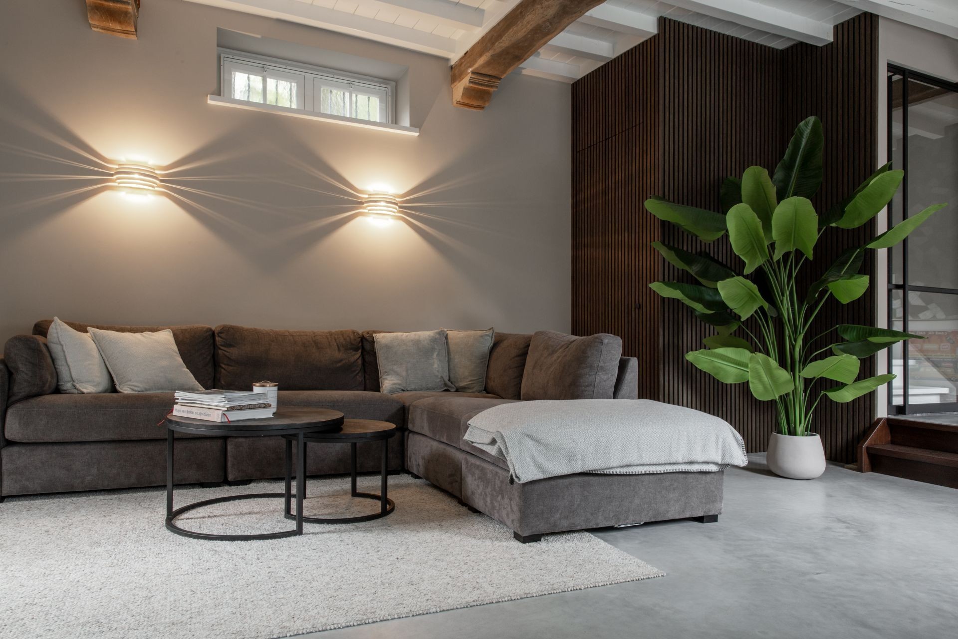
Warm spotlights in the ceiling add another layer without competing with the daylight. Their pools of light touch the walls and the timber details, making the room read differently at night than it does during the day. The lighting is discreet, but it has a clear role: it picks up the texture of the concrete floor and the vertical wood slats beside the seating area. Those slats break up the wall and give the room a finer grain.
A kitchen defined by dark fronts and a marble composite countertop
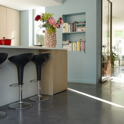
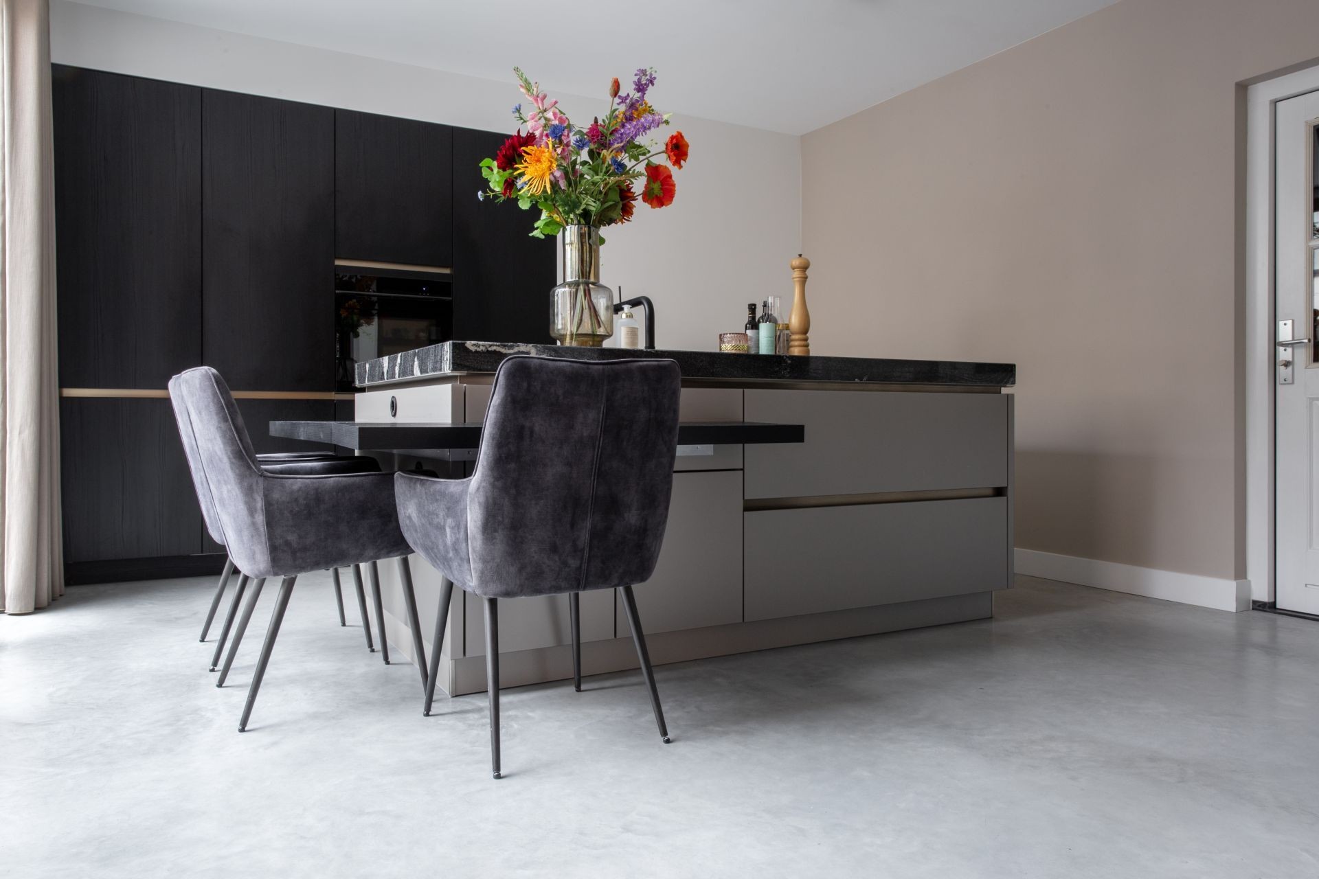
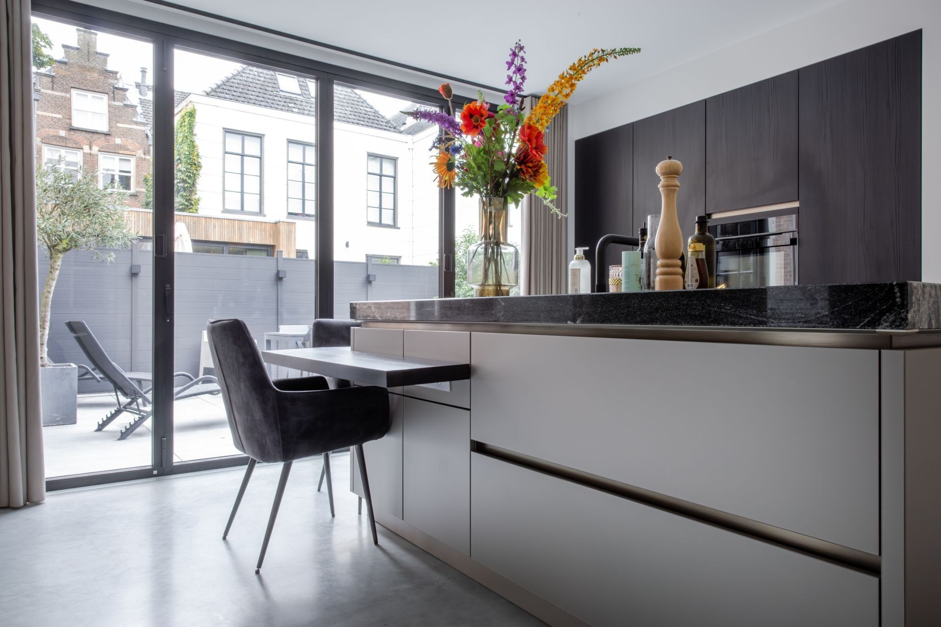
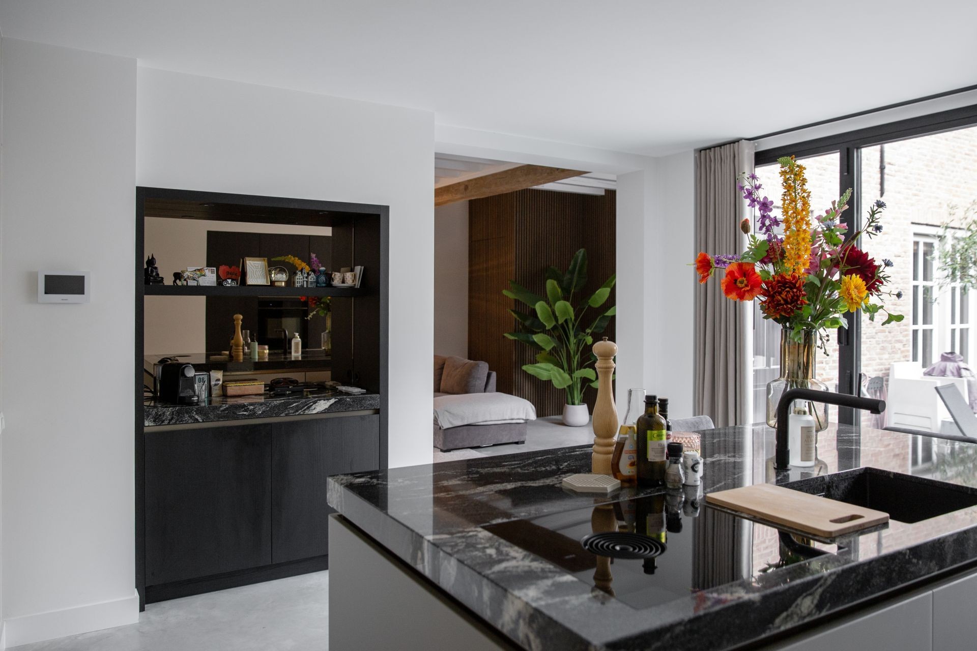
The kitchen sits in the same open space, but its darker cabinetry gives it its own weight. Modern dark kitchen cabinets line the wall with a calm, compact look, while a marble composite countertop lightens the composition. That surface catches the eye because it sits between the dark fronts and the lighter room around it. It also links back to the rest of the interior through its restrained pattern and stone-like finish, without pulling attention away from the concrete floor.
Seen from across the room, the kitchen keeps an open sightline across the living area and toward the glass doors. There is no hard stop between cooking, sitting and looking out. Instead, the eye moves from the countertop to the darker joinery, then over the floor to the windows. This is where the project’s strongest gesture becomes clear: the materials are varied, but the route through the room stays open and easy to read.
Open sightline kitchen with light from both sides
The kitchen also benefits from the light that comes in through the large glazed openings. In the daylight, the dark fronts sit back and let the floor and walls do more of the visual work. In the evening, the ceiling spots and the reflective parts of the countertop shift the emphasis back to the kitchen zone. That change is subtle, but it keeps the room from becoming static. The space feels different depending on where the light lands.
There are no oversized gestures here. The cabinetry is crisp, the worktop is controlled, and the floor stays constant underneath. Because of that, the kitchen reads as part of the renovation rather than as a separate insert. It belongs to the same language as the beams, the wood details and the wide grey floor, even though each element has its own texture and tone.
Wood slats, textile layers and a room that does not stay flat
Beside the seating area, the vertical wood slat accent wall brings a finer scale into the room. It changes the way the wall catches light and gives the lounge a more measured edge. In front of it, the grey sofa and the rug sit low and quiet, letting the texture of the floor remain visible around them. The textile layer softens the harder surfaces, but it does so through colour and weave rather than through decoration.
Because the room is open, every material has to earn its place. The concrete floor keeps the base level. The timber beams draw attention upward. The slats add depth to one wall. The dark kitchen fronts anchor the far side of the space. Together they make the interior feel built from a clear sequence of surfaces instead of from isolated statements. Even the green accents and the framed views through glass work as part of that sequence, breaking up the greys and whites without taking over.
Details that hold the renovation together
Smaller moments help the renovation stay legible. A mozaïek wall in grey tones appears in a separate wet zone, where the glaze and texture shift away from the concrete and timber palette. Elsewhere, a doorway in dark framing and a white surround marks a transition without overplaying it. These are not showpiece gestures. They are quiet moves that support the rest of the house and keep the material story coherent as you move from one area to another.
What remains with you is the way the polished concrete floor stays present in almost every view. It sets the scale of the room, reflects enough light to keep the space open, and gives the preserved beams a clear counterweight. Around it, the kitchen, the slatted wall and the light scheme each add a different register. The house feels renewed because the original structure was left visible, not hidden, and because the new finishes were chosen to work with that structure rather than against it.
Photography: Studio Bern
Want to see more of Willem Designvloeren? View the page of Willem Designvloeren for even more great projects and company information.



NEW 2026 Jubileum Edition The Best Interior Designers Benelux
Order Now €125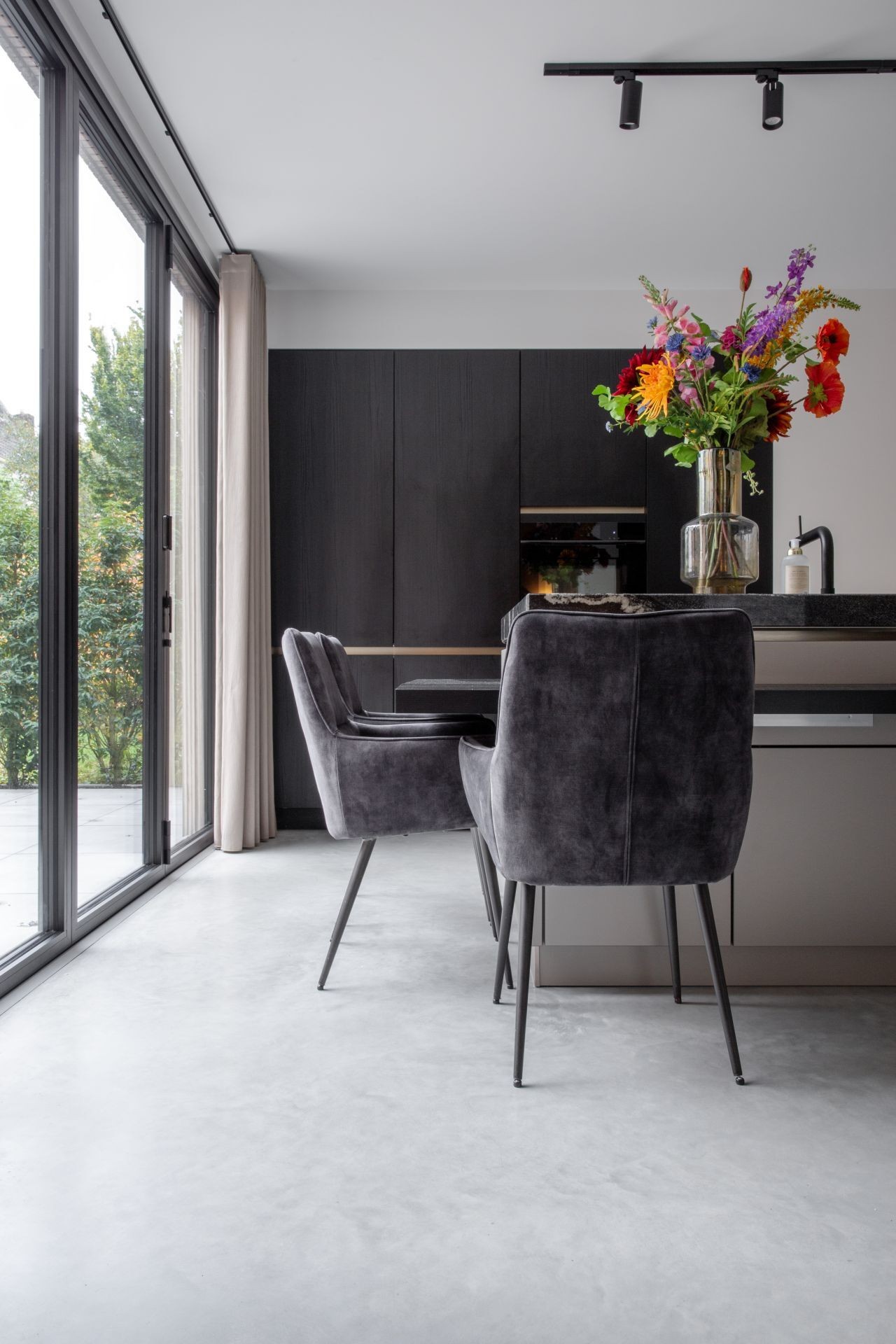
NEW 2026 Jubileum Edition The Best Interior Designers Benelux
Order Now €125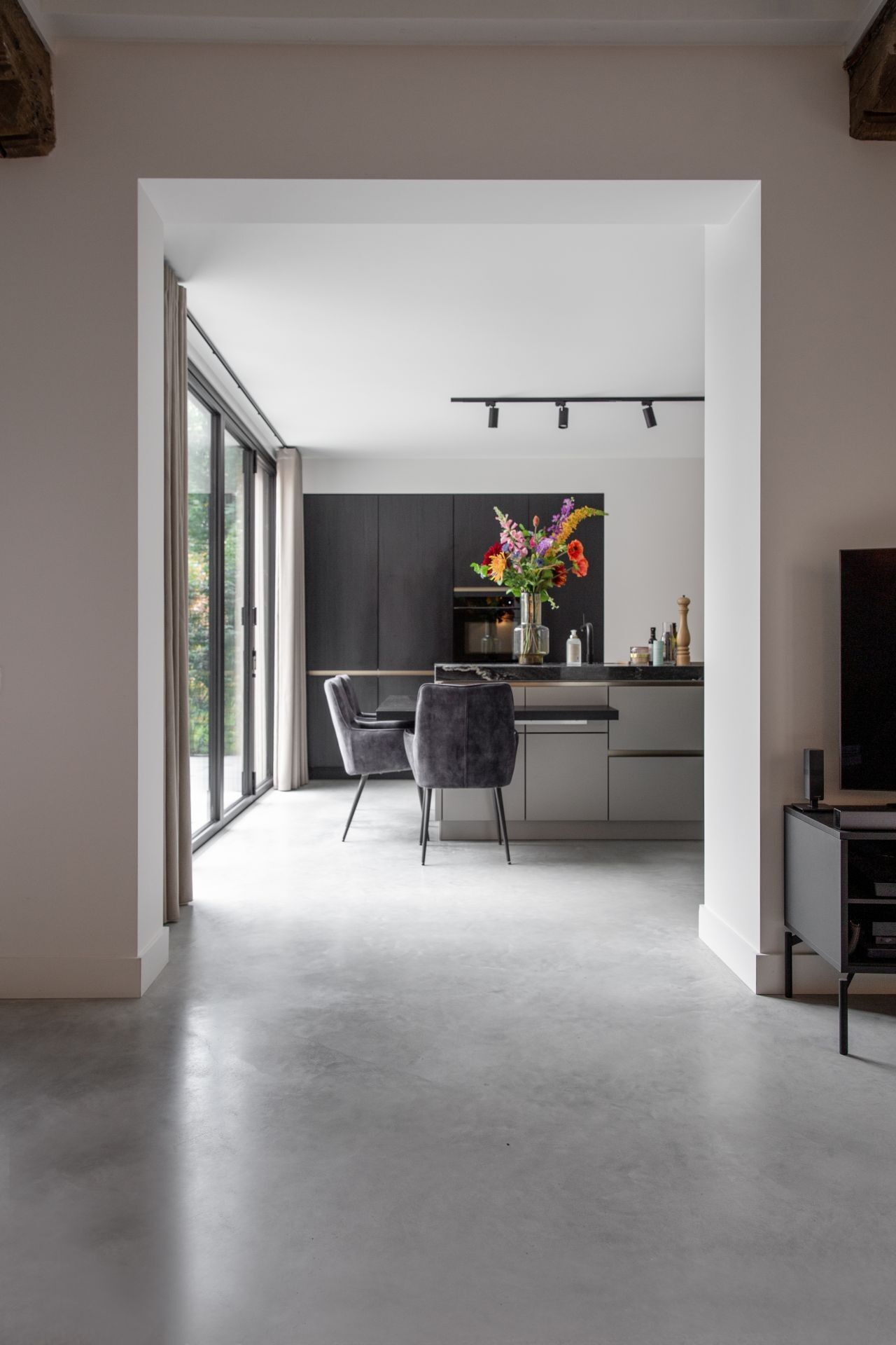
NEW 2026 Jubileum Edition The Best Interior Designers Benelux
Order Now €125