










Custom interior with hidden cabinetry
The first thing you notice is the storage wall. Its shelves run into a hidden wall cabinet without a visible break, so the surface reads as one long piece of joinery rather than separate units. Light catches the white fronts, the wood tones and the slim lines that divide them. The result is a custom interior that feels composed by the materials themselves: plate material by Decolegno, open niches, and closed storage folded into the same wall.
That wall sets the tone for the rest of the home. It leaves room for quiet sightlines, but it also gives the rooms structure. Open shelves sit inside the larger composition, so books and objects appear in deliberate pockets instead of scattered across the space. The built-in open niches are not decorative add-ons; they are part of the storage system, cut into the wall at points where the eye needs relief.
Seamless storage that stays in view
The cabinetry does not hide itself completely. In several places, the front panels shift between white and wood finish, and the vertical joints keep the wall moving from one zone to the next. A slatted feature wall introduces another layer, breaking up the flatter planes with narrow vertical rhythm. That detail also helps the storage read as architecture rather than furniture placed against a wall.
Seen across the full composition, the custom cabinetry uses height and repetition to control the room. Tall cupboards, low runs, and open shelving alternate within the same linear system. Some panels disappear into the background, while other sections project slightly or open into display niches. The effect is calm because nothing competes for attention, yet the wall still carries most of the room’s visual weight.
Open niches, shelves and a measured rhythm
The built-in open niches are where the wall becomes lighter. A few compartments are left open, with lighting tucked beneath the shelves so the recesses are readable at dusk as well as during the day. Those illuminated pockets soften the long horizontal runs and make the storage wall feel less closed. The shift between solid fronts and exposed niches is what gives the custom interior its pace.
Closer to the kitchen side, glass framed in black introduces a sharper edge. It reflects the light rail above the work zone and marks the transition between the kitchen and the adjoining storage composition. The glass does not dominate the space; it simply cuts a darker line through the composition and gives the surrounding white and wood elements something to press against.
The kitchen island as a steady centre
The kitchen island anchors the room with a clear, rectilinear form. Its top reads as one continuous surface, while the base repeats the same restrained palette seen in the storage wall. Above it, rail lighting and spotlights spread a practical wash of light over the work area. The pendants hang lower, creating a second layer of light that drops the scale and pulls the island into the foreground.
Because the cabinetry around the kitchen stays disciplined, the island gets room to register as a working piece rather than a show element. You can read the edges, the overhangs and the join between materials. The clean lines are especially visible where the island meets the surrounding black-framed glazing. That contrast keeps the kitchen sharp without turning it cold.
Light, glass and the edge of the work zone
The lighting plan is simple but effective. Spots trace the ceiling line, a rail holds the pendants, and smaller light sources are tucked into the storage. Together they reveal the depth of the joinery and the changes in material. On the kitchen side, the light picks out the grain and tone of the wood finishes; on the storage side, it highlights the recesses and the long handles of the taller cupboards.
Vertical slats appear again near the work area, where they act as a screen and a surface at the same time. They soften the transition between closed storage and open movement through the room. Rather than using a heavy partition, the project relies on these slimmer elements to organize the interior. That choice keeps the custom interior open while still giving each zone a clear edge.
Materials that hold the room together
Much of the project’s character comes from the way plate material is used across different forms. White panels, wood-look fronts and dark details are repeated in a controlled sequence, so the eye can move from one part of the wall to another without losing orientation. The same material language appears in the high cabinets, the lower storage runs and the integrated shelving. Nothing is treated as a separate object for its own sake.
This consistency matters because the rooms depend on joinery to do most of the work. The hidden wall cabinet absorbs storage that would otherwise interrupt the view. The open niches give the wall a place to pause. The kitchen island sets a clear centre. Every part uses the same reduced set of finishes, which keeps the interior legible even when the functions change from display to storage to cooking.
A bathroom pared back to the essentials
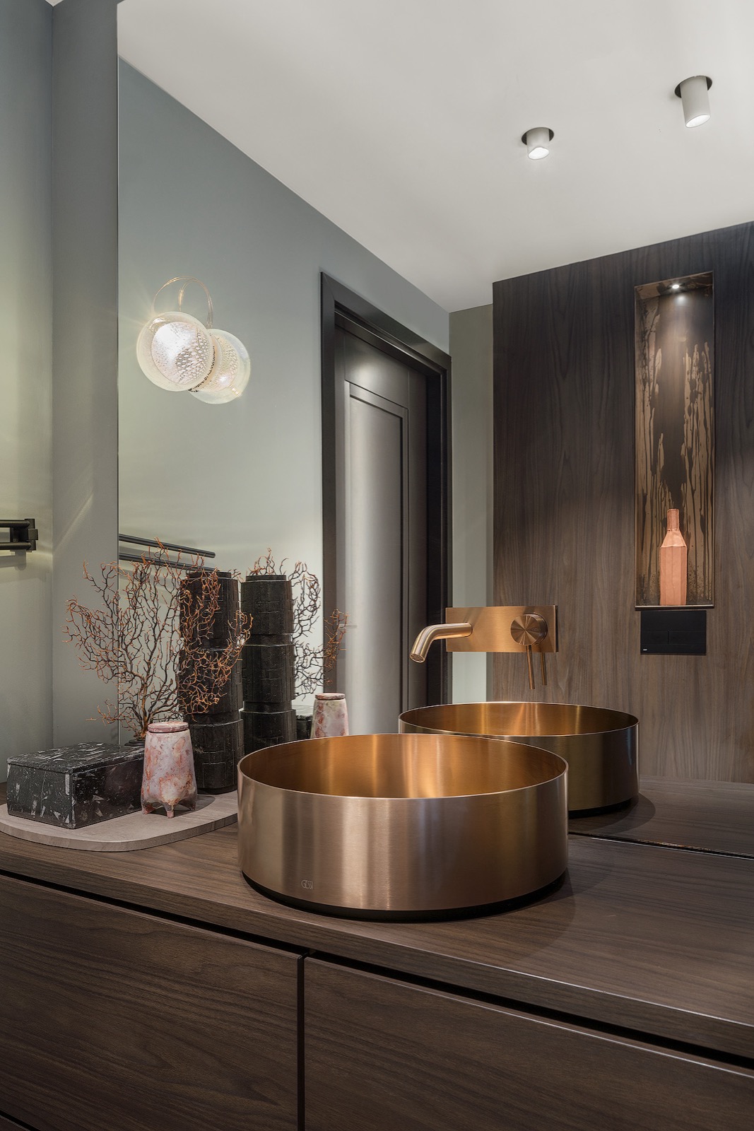
The bathroom follows the same discipline. A round backlit mirror lifts the wall with a clean halo of light, while the vanity below stays low and precise. The basin is set into a white surface, and the wood-look base adds depth without breaking the calm line of the room. Behind it, the stone-print wall brings a harder texture into view, so the basin area reads as a focused composition rather than a crowded one.
The modern bathroom vanity uses straight edges and restrained detailing, which lets the mirror take the lead. Its circular form softens the angles around it, and the light around the edge separates it from the patterned wall behind. Even here, the project keeps the same approach seen in the main living areas: storage is built in, surfaces are kept clear, and the room is organized by line, recess and reflection rather than ornament.
Across the whole custom interior, the strongest move is the decision to let cabinetry shape the experience of the space. The hidden wall cabinet, the open niches, the slatted feature wall and the kitchen island all belong to one clear system. It is a project of transitions: closed to open, matte to reflective, white to wood, light to shadow. Those shifts are what make the rooms feel settled without becoming static.
Want to see more of Hubbers interieurmakers? View the page of Hubbers interieurmakers for even more great projects and company information.




NEW 2026 Jubileum Edition The Best Interior Designers Benelux
Order Now €125


NEW 2026 Jubileum Edition The Best Interior Designers Benelux
Order Now €125


