










Dark vertical blinds in a modern interior
Dark vertical blinds set the tone as soon as the first window comes into view. Their vertical rhythm cuts the daylight into slimmer bands, while the white walls keep the room open and bright. Against that pale base, warm wood on the floor and in the furniture softens the hard edges. The result is a modern interior built on contrast: black details, pale plastered walls, and a dark screen at the windows that gives the rooms a clear outline.
Black lighting against white plastered walls
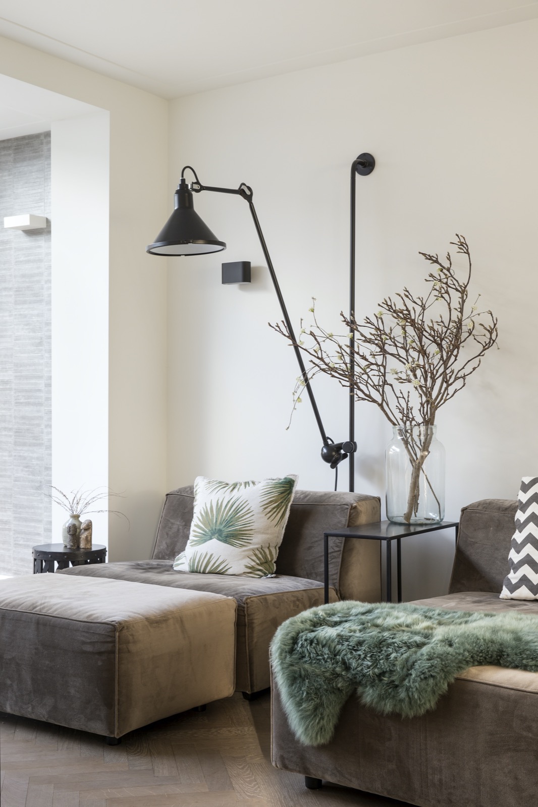
In the living room, a grey sofa sits close to a white plastered wall, with a black floor lamp beside it. The lamp does not take much space, but it draws a sharp line next to the soft upholstery. Above the sofa, a black wall lamp adds another dark mark on the wall. Together they turn the seating area into a defined corner, instead of letting it dissolve into the larger open plan. The floor stays visible, and the warm wood beneath the furniture keeps the room from feeling cold.
The seating group is kept low and restrained, which leaves the wall surface and the floor to carry most of the visual weight. That choice works especially well with warm wood and white walls. The wood adds grain and depth at ground level, while the white background makes the black fittings stand out. Even the cushions and textiles stay quiet in tone. Nothing competes for attention. The room is shaped by the way light lands on the wall, the lamp silhouettes, and the strip of floor between them.
A dining area by large windows with filtered daylight
The dining area is placed directly in front of large glass doors, so daylight enters in a broad sweep. A wooden dining table and modern chairs sit in that bright zone, but the dark vertical blinds change the mood at the edge of the opening. They temper the glare and make the window wall feel more grounded. The table top, chair legs and window divisions become easier to read because the background is darker and less reflective. A patterned rug under the table anchors the zone and keeps it distinct from the rest of the room.
In this part of the house, the window treatment does more than cover glass. It gives the dining area structure. The vertical lines echo the height of the doors and turn the opening into a strong background rather than a blank surface. That is what gives the dining area by large windows its clarity. Wood, glass and fabric sit close together, but each material keeps its own role. The table remains central, the floor stays visible, and the dark screen at the windows holds the composition together.
Dark vertical blinds as a repeating line through the house
The same dark vertical window covering appears in several views, and that repetition gives the interior a steady visual thread. In the living room, the dining area and the kitchen zone, the blinds pull the light inward and prevent the rooms from becoming too flat. They also work as a backdrop for the white walls, the black lighting and the wood surfaces. Because the structure is vertical, the windows still feel tall. The openings remain generous, but the dark layer in front of them adds weight and definition.
Dark wood-look kitchen joinery keeps the wall calm
The kitchen is the most concentrated example of dark wood-look kitchen joinery. Broad handleless fronts run in a straight line, creating a long surface that reads as one built-in wall rather than a set of separate units. The dark wood-look finish is paired with a lighter, more lively worktop grain, so the surface does not flatten out completely. That contrast keeps the kitchen legible and measured. Black accents return in the lighting, which ties the working zone back to the rest of the interior.
White walls frame the kitchen and make the dark cabinetry stand out without overwhelming the room. Near the windows, the vertical blinds soften the daylight above the work area and the long counter beneath it. That pairing is visible in the images: a clear working line, dark cabinetry, and a controlled strip of light. The kitchen does not try to compete with the living spaces. It sits quietly within the plan, using the same language of black, white and wood as the rest of the house.
Lighting that follows the wall and the furniture
The black wall lamp in the console detail and the standing lamp in the living room are part of the composition, not separate decorative objects. Each one lands on a white wall and gives it a point of tension. Above a console surface, the lamp draws the eye to the width of the wall and the small objects placed below it. In the seating area, the long arm of the floor lamp extends over the sofa and marks the edge of the room. That is how black lighting works here: it shapes the space with lines, not with volume.
A fireplace niche framed in white
One image shows a recessed fireplace opening set inside a light wall. The niche is rectangular and crisp, with a white surround that keeps the opening compact. It reads almost like a cut-out in the wall surface. Around it, the plastered finish stays quiet, while the dark blinds in the background make the fireplace wall stand out even more. The opening does not dominate the room. Instead, it marks a fixed point inside the broader layout, where the wall, the floor and the window treatment all meet in the same visual field.
The rug pattern and the low coffee table in the same view help set the seating area apart from the rest of the room. That small arrangement gives the fireplace niche a clear role: it becomes the still point in a room that is otherwise made of long lines and open sightlines. The white surround keeps the recess light, while the darker background layers stop it from feeling too plain. It is a simple detail, but it carries the same visual logic as the rest of the interior.
Warm wood and white walls keep the contrast readable
What gives this modern interior its structure is the way warm wood and white walls stay close without blending together. The wood on the floor, table and worktop adds depth at the surface level, while the plastered white walls hold back and let the darker elements read clearly. Because the palette is narrow, every shift in texture matters. A grain in the tabletop, the weave of the window covering, the matte black of the light fitting: each one changes how the room is seen. Nothing feels overworked, but nothing is left undefined either.
The console corner makes that particularly clear. A slim white surface sits against a light wall, with wooden chairs nearby and a black wall lamp above. The patterned rug brings the zone down to floor level and gives it a precise footprint. This is where the house shows its method most clearly: keep the background plain, let the materials do the work, and repeat the dark vertical blinds so that the windows, the furniture and the lighting speak the same language.
Small details that hold the plan together
Across the living, dining and kitchen views, the same visual ingredients return in different proportions. The grey sofa, the wooden dining table, the black lamp stems, the dark cabinetry and the vertical window covering all sit within a restrained field of white plaster and warm timber. That mix keeps the rooms readable from one area to the next. Even when the camera moves from the seating corner to the kitchen work line, the eye keeps finding the same combination of filtered daylight, dark edges and wood surfaces.
For a project page, those repeating details matter more than any single room on its own. The dark vertical blinds are not treated as a background afterthought; they are one of the main elements that shape how the interior is experienced. They frame the glass doors, support the black lighting, and make the warm wood stand out. In that sense, the whole house is held together by a few clear moves rather than by decorative density. The rooms stay open, but each one has a visible edge.
Want to see more of Maaike van Diemen? View the page of Maaike van Diemen for even more great projects and company information.





NEW 2026 Jubileum Edition The Best Interior Designers Benelux
Order Now €125


NEW 2026 Jubileum Edition The Best Interior Designers Benelux
Order Now €125


