Distressed herringbone floor in a modern home
The light distressed herringbone floor sets the tone as soon as you enter. Its used-look surface carries a soft oak colour, while the slimmer board width keeps the pattern crisp rather than busy. In this new-build home, the floor runs through the hall, living area and kitchen, so the eye keeps following the same line from one room to the next. The result is a continuous herringbone floor that feels deliberate without drawing too much attention to itself.
A slim herringbone floor with a used-look surface
The boards are longer than the classic herringbone format, which changes the rhythm of the pattern. That longer proportion makes the layout read a little lighter and more current, especially in the open spaces shown in the project photos. The grain remains visible, and the distressed finish keeps the planks from looking flat. Seen across the bright interior, the used-look herringbone floor adds texture without interrupting the calm of the white walls and pale surfaces around it.
From the living room, the flooring draws a clear path past the seating area and toward the windows. Rail lighting follows the ceiling line, and the large curtains soften the opening along the wall. The floor underneath stays visually steady: narrow joints, repeated angles, and a pale oak tone that reflects the daylight. This is where the herringbone floor starts to work as an architectural layer, not just a surface under furniture.
Built for a home with underfloor heating
The project is described as a herringbone floor with underfloor heating, and that detail suits the new-build setting. The floor continues across the open layout without a hard break at the threshold, which helps the rooms read as one sequence. In the kitchen, dark cabinetry gives the boards a stronger contrast, while the light pattern stays visible under the worktop edge. The flooring does not compete with the interior; it holds the space together by running through it at a measured pace.
That sense of continuity is especially clear in the hall, where sightlines stretch from the entrance toward the living room and the stair. The floor keeps the same direction and finish, even as the light changes from one zone to the next. Because the boards are slim and the tone remains pale, the pattern stays readable in each room. It is an example of a continuous herringbone floor doing quiet work across an otherwise restrained interior.
Rooms linked by one flooring line
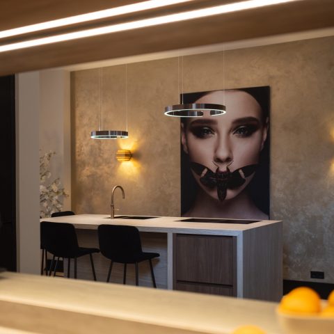
The kitchen image shows how the floor sits under darker fronts and a clean work surface without losing its presence. The pattern is still easy to read, but the contrast gives it more depth. In the living area, the same flooring appears beside a low TV unit and neutral seating elements, which keeps the room visually open. Across both settings, the floor acts as the common thread. The material may be understated, yet it is the detail that connects the spaces most clearly.
The staircase follows the same material
The staircase clad in same flooring brings the project further than a standard floor installation. Here the treads are finished to match the herringbone floor, so the material continues upward instead of stopping at the base of the stair. White balustrades, slim spindles and a dark handrail frame the wood, but the tread surfaces remain the focus. The warm tone of the steps echoes the floor below and ties the stair area back to the rest of the house.
Several images show the stair from different angles, and each one highlights a slightly different aspect of the finish. In one view, the lower flight meets the hall floor directly, with the herringbone pattern visible in the foreground. In another, the white wall edges sharpen the outline of the steps. Because the same flooring material returns on the stair, the transition between levels feels visually consistent, not separate.
Why the longer plank format matters
The slim herringbone floor is not only about the pattern itself. The longer plank length shifts the look away from a strict classic reference and gives the floor a more relaxed proportion. That detail matters in a home with large windows, straight ceiling lines and minimal furnishings. The pattern still reads as herringbone, but the longer boards keep it from feeling too compact. The effect is subtle, yet easy to spot in the open zones and in the detail shots where the joints and angles are clearly visible.
In the corridor and near the stair, the repeated geometry becomes part of the route through the house. Light falls across the boards, creating small changes in tone from plank to plank. The surface never turns glossy or flat; it keeps enough variation to show the distressed finish. That gives the used-look herringbone floor a lived-in appearance without losing the precision of the layout.
Light, contrast and a restrained palette
Neutrals dominate the surrounding rooms: white walls, pale trim, dark kitchen fronts and simple upholstered pieces. Against that backdrop, the floor carries most of the texture in the interior. The visual balance comes from the material itself rather than from decoration. Curtains soften the large window opening, while the rail spots trace the ceiling edge above the living area. The flooring beneath stays steady and low in tone, letting the pattern remain visible from room to room.
Even in the close-up views, the floor does not disappear into the background. The visible grain, the slight variation in colour and the narrow width of each board keep the surface readable. That is what makes this distressed herringbone floor work well in a new-build home: it introduces depth, but it does so through proportion, finish and repetition rather than through ornament. The stair finish extends that idea one step further, using the same material to carry the look upward.
Across the hall, kitchen, living room and stair, the project stays focused on one clear decision. The floor leads the interior, and the staircase repeats it. With its slim herringbone width, used-look surface and longer plank format, the flooring gives the house a distinct line from the ground floor through the stair zone. It is a restrained composition, built around pattern, light and one continuous material.
Want to see more of Vloerenhuis Amsterdam? View the page of Vloerenhuis Amsterdam for even more great projects and company information.




NEW 2026 Jubileum Edition The Best Interior Designers Benelux
Order Now €125


NEW 2026 Jubileum Edition The Best Interior Designers Benelux
Order Now €125