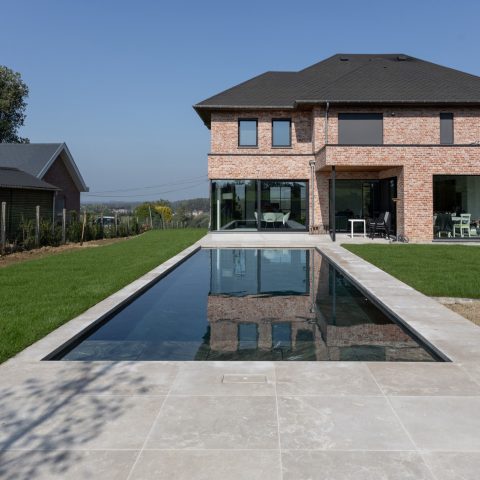
Glass conservatory house with large glazing and a minimal white interior
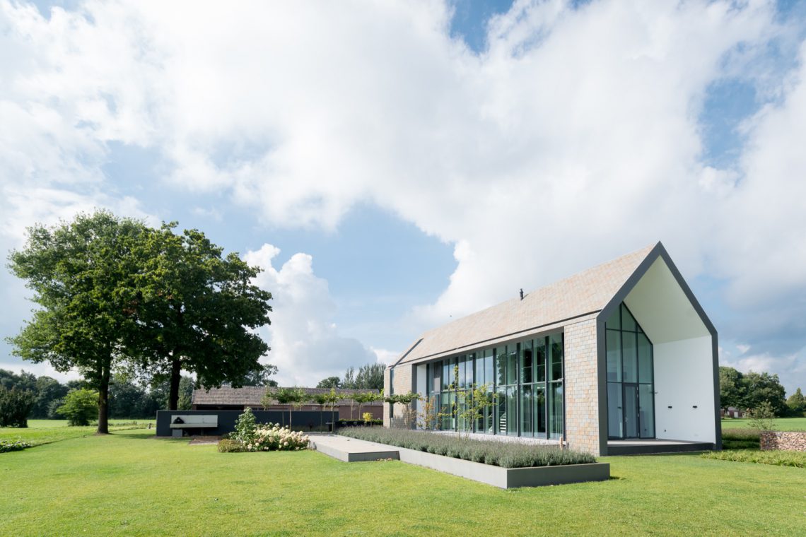
The house reads first as a glass conservatory house, then as a solid volume wrapped in stone and slate. Set on a raised terrace platform, it sits above the ground line and takes on the role of a marker in the field. That move is not decorative. It gives the building height, keeps the terrace part of the composition, and lets the glass walls look out across the surrounding land without interruption.
Glass walls that keep the landscape in view
Large glazing runs through the side and end façades, so the outdoor setting stays present from inside. The view is not treated as a distant backdrop; it is built into the room edges, the walkways, and the corners where the glass meets the slate shell. In the same frame, the house appears both open and protected. That tension is what gives the modern house with large glazing its clarity.
The outer layer of stone or slate cladding tempers the transparency. It creates a darker perimeter around the bright interior and gives the volume a firm outline against the fields. From a distance, the material contrast makes the glass conservatory house legible as one object rather than a collection of separate parts. Up close, the slate surfaces sharpen the edges of the terrace platform and the roof line.
A minimal white interior with industrial surfaces
Inside, the palette shifts to white walls and light tones. The minimal white interior does not compete with the glazing; it keeps the eye moving toward the windows, the adjoining spaces, and the changing light. Industrial materials provide the counterpoint. Their harder surfaces stand out against the calm base colours, while a limited use of wood prevents the rooms from feeling flat. The result is spare, but not cold.
That contrast matters because the house is set in open country. Rather than trying to blend into the surroundings, the interior acknowledges the setting through restraint. Surfaces remain clean and direct, with little visual noise. When wood appears, it is used sparingly and at the right scale, where it can soften a wall edge, a floor transition, or a built-in element without taking over the room.
Light, texture, and the room edge
Seen in sequence, the rooms depend on the same discipline. A pale wall meets a darker surface, a glazed opening meets a white ceiling plane, and the frame of the window becomes part of the spatial composition. The house never leans on ornament. It uses light, texture, and material change to define where one zone ends and the next begins. That is what keeps the interior focused on the outside world.
An open plan staircase ties the levels together
The spatial organization is built around openness. A recessed upper-floor element creates depth in the volume, while the cross-positioned staircase cuts through the house and links the kitchen, study, bedroom, and living room. It is not hidden in a corner. It becomes part of the daily route and part of the sightline, so movement through the house is always visible in some way.
That open plan staircase also helps the interior stay connected across levels. Looking through the house, you see the voids, the overviews, and the transitions between floors rather than isolated rooms. The structure encourages long views through the plan, and the glass balustrade atrium effect strengthens that reading. Light drops through the open zones, and the upper edge of the house feels lighter than the slate shell outside.
A TV that disappears to preserve the view
One of the most telling details is the television that rises from the floor when needed and disappears again afterward. It is a small gesture, but it fits the logic of the house. Visual clutter stays low, and the room can keep its open character. The solution belongs to the same attitude as the transparent walls: keep the view clear, keep the surfaces calm, and let the architecture do the work.
Built-in elements keep the rooms visually quiet
The custom built-in kitchen wall follows that same line of thought. Cabinets are kept flush and restrained, and the integrated equipment prevents the kitchen from breaking up the room with too many separate objects. The wall reads as one composed surface rather than a series of appliances. In the images, this precision also appears in the wardrobe and storage zones, where vertical lines and plain fronts hold the composition together.
Other rooms continue that measured approach. The bathroom views show light finishes, a glass shower enclosure, and a freestanding bath set against clean planes. Nothing competes with the geometry of the room. Even in close-up, the attention stays on the way glass, white surfaces, and fitted elements meet. The project’s strongest rooms are not overloaded; they are edited down to the line where one material stops and another begins.
What the project makes visible
The image set makes the main qualities easy to read: a façade with repeated glazing and slate surfaces, the raised terrace platform as a clear base, and interior spaces organized around sightlines. The stair hall, with its glass balustrades and open void, shows how the levels connect. The kitchen wall and storage joinery show how the house keeps its interior surfaces disciplined. Together, those parts make the glass conservatory house feel exact rather than expressive for its own sake.
That exactness is also what gives the house its presence in the landscape. The raised base, the glass walls, and the dark perimeter are all doing different jobs, but they work toward the same result: a dwelling that keeps the fields in view while holding its own shape. It is a modern house with large glazing, but also a study in how to use restraint, depth, and material contrast to frame the outdoors from within.
Interior architecture: B-TOO. Architecture: Arches.
Want to see more of B-TOO? View the page of B-TOO for even more great projects and company information.





NEW 2026 Jubileum Edition The Best Interior Designers Benelux
Order Now €125


NEW 2026 Jubileum Edition The Best Interior Designers Benelux
Order Now €125


NEW 2026 Jubileum Edition The Best Interior Designers Benelux
Order Now €125


NEW 2026 Jubileum Edition The Best Interior Designers Benelux
Order Now €125


NEW 2026 Jubileum Edition The Best Interior Designers Benelux
Order Now €125


NEW 2026 Jubileum Edition The Best Interior Designers Benelux
Order Now €125