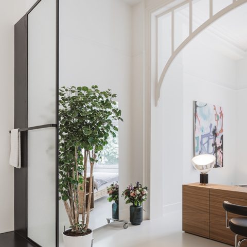
Glass facade in a home extension with a seamless indoor-outdoor connection
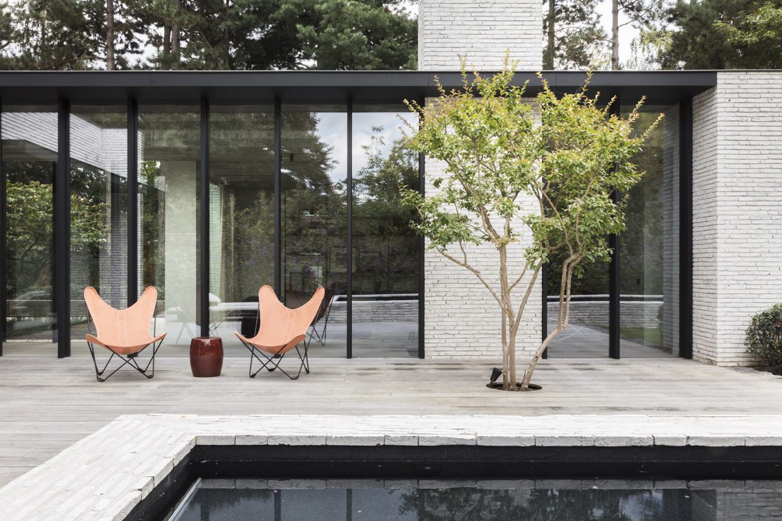
A full-height sheet of glass now marks the edge of the living spaces, turning the garden into part of the daily route through the house. The glass facade home extension links a former half-subterranean storage level with the ground-floor rooms above it, so the plan reads as one sequence rather than separate floors. Slim black frames sit deep in the surfaces around them, and the line between inside and outside is reduced to little more than a shadow.
A two-storey addition built around light and garden views
The extension rises over two levels and uses its clear glazed skin to open the house toward the garden. From the interior, the view runs straight through the large panes to the lawn, while the old part of the house remains present in the background as a brick frame with rectangular openings. That contrast gives the project its tension: solid masonry on one side, a transparent volume on the other. The result is not about display, but about letting the rooms borrow light and distance from the outside.
The indoor outdoor connection is handled through details rather than gestures. Window frames are integrated into the floor, ceiling, and walls wherever possible, so the edges of the opening do not interrupt the room. That choice keeps the surfaces calm and makes the transition feel continuous when moving between the kitchen, the living area, and the garden-facing zone. Even the junctions around the glass read as part of the architecture, not as added trim.
Slim window frames that disappear into the room
The glass facade home extension depends on a disciplined frame language. Narrow profiles draw a fine grid across the openings, but they never compete with the view. Instead, they hold the glass in place and let the interior surfaces continue around them. In the photographs, that restraint is visible in the way the white walls, tiled floor, and black lines of the glazing stay visually separate yet tightly aligned. The architecture is doing more with less material, not by hiding the structure, but by keeping its edges exact.
A structural layer above supports the weight of the glazed volume, allowing the lines and corners to remain clean. That engineering logic is part of the room experience. Because the upper glass wall is carried without visual clutter, the opening below feels open and direct. The composition reads as a clear shell, with each line placed to keep the corners sharp and the surfaces easy to follow with the eye.
Where the old brick envelope stays visible
The original brick facade windows still appear in the wider context of the house, and they give the extension something to push against. Their heavier rhythm stands in contrast to the new glazing, which makes the extension feel lighter without cutting itself off from the existing building. Seen from outside, the brickwork and the new glass volume create a measured overlap of old openings and new transparency. That relationship is quiet, but it is what keeps the project grounded.
From inside, the brick context is felt more than announced. The glass does not erase the house behind it; it sharpens the view of it. Rectangular openings, pale wall surfaces, and the dark window lines all work together to frame the transition from the enclosed rooms to the garden. The extension therefore reads as an addition that edits the house rather than replacing its memory.
An open-plan kitchen brought into daylight
Below the upper glazing, a void draws more natural light into the lower level and helps define a large open-plan kitchen. The space is organized around wide surfaces and long sightlines, so the daylight living space feels deeper than its footprint suggests. In the imagery, the room is finished in light tones, with white walls and a bright floor that reflect the light back into the core of the plan. The result is a kitchen that sits low in the house but does not feel buried.
A statement chandelier hangs in the open room, adding a vertical counterpoint to the horizontal glazing. Its scale marks the central space without closing it off. Around it, the eye moves from table to wall opening to garden view, following the same clear route that the building sets up. The chandelier does not compete with the architecture; it anchors the room and makes the height of the space legible.
Rooms that connect without losing their own edges
The interconnection of spaces is one of the project’s most practical gestures. The former storage level, the main living rooms, and the kitchen now operate as connected parts of one house, which matters in a building that has had more than one way of being used over time. The plan allows movement between functions without forcing them into one undifferentiated room. That flexibility is visible in the shifting views between landing, stair, kitchen, and garden-facing living area.
On the stair, the details become lighter. A glass balustrade keeps the edge open, while white walls and small wall lights pick up the vertical movement of the route. The stair zone acts as a hinge between the levels, and its transparency keeps the lower rooms in view as you move. In the photographs, that sequence reads clearly: tile underfoot, glass at the edge, light on the wall, and an open view beyond.
Interiors shaped by clear lines and reflective surfaces
Inside, the palette stays controlled. White walls, glass, black framing, and a tiled floor create a setting where the view can take priority. A glazed internal partition shows how the design uses transparency not only at the outer edge, but also between rooms. That double-height glass wall effect lets one room borrow light from another, extending the sense of openness through the upper and lower parts of the house.
The photographs also show the domestic scale of the project. A sofa sits close to the glazed opening, while the garden remains visible beyond the panes. Niche-like wall recesses and slim wall lamps bring small points of light to the white interior, so the rooms feel detailed rather than bare. The house extension with glass facade is most convincing here, where the architecture is experienced through daily use: walking, sitting, looking out, and moving up the stair.
Photographer: Sebastian van Damme.
Want to see more of JUMA architects? View the page of JUMA architects for even more great projects and company information.



NEW 2026 Jubileum Edition The Best Interior Designers Benelux
Order Now €125


NEW 2026 Jubileum Edition The Best Interior Designers Benelux
Order Now €125


NEW 2026 Jubileum Edition The Best Interior Designers Benelux
Order Now €125


NEW 2026 Jubileum Edition The Best Interior Designers Benelux
Order Now €125


NEW 2026 Jubileum Edition The Best Interior Designers Benelux
Order Now €125