Heritage home renovation with custom interiors and more light
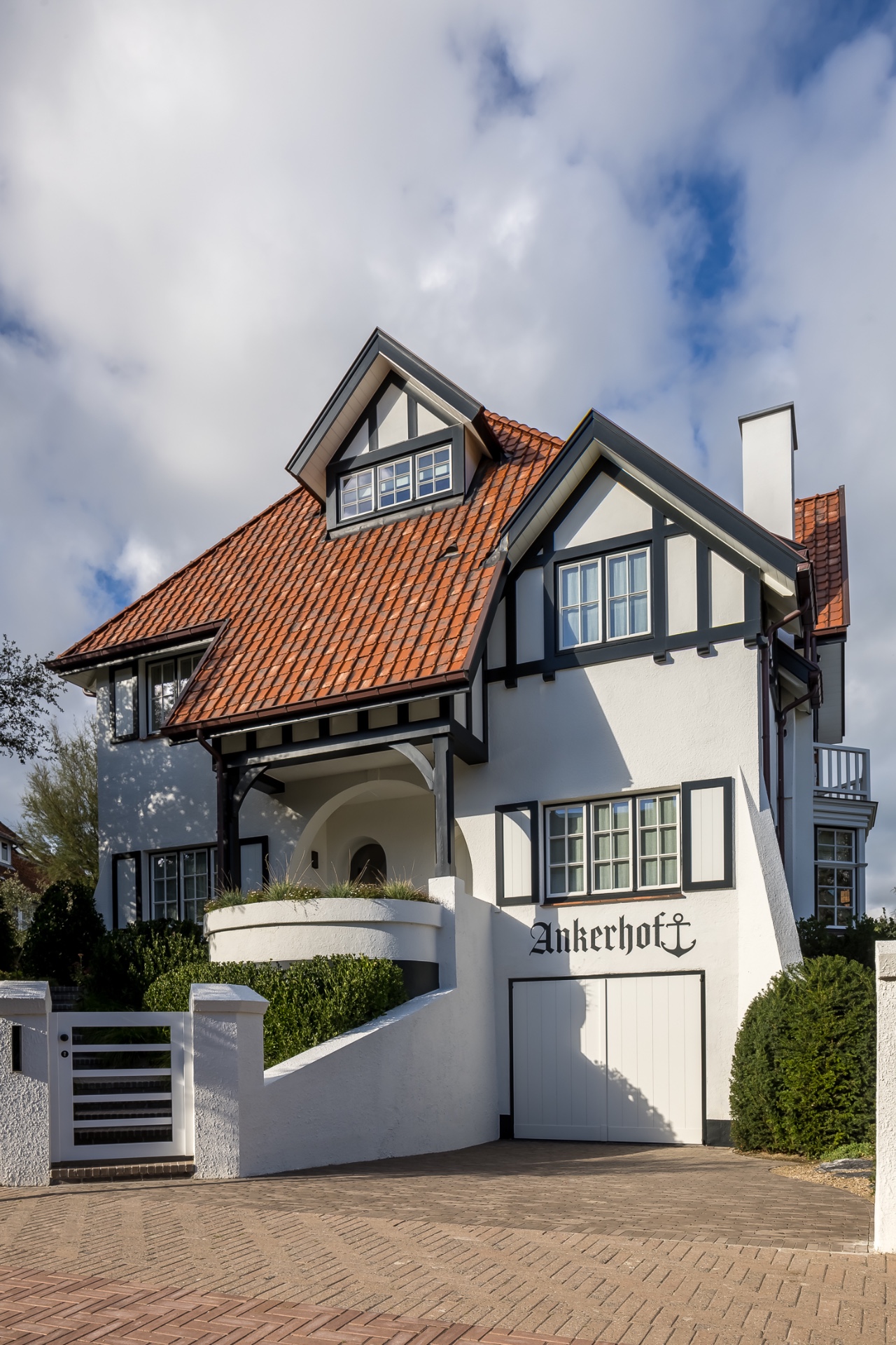
The white render catches the light first, then the dark window accents and red roof tiles hold the eye on the roofline. The house still reads as an Anglo-Normand-inspired cottage after the renovation, but the interior now opens up with larger glazing and a clearer flow between rooms. In this heritage home renovation, the old shell remains visible while the inside is given more daylight, calmer lines and custom elements that follow the architecture instead of competing with it.
Preserved cottage character, kept in plain view
The exterior does not try to be reset into something new. White wall planes, dark trim around the windows and the asymmetrical arrangement of openings stay in place, so the house keeps its familiar profile. Red ceramic roof tiles sit above the pale render and the darker timber-like accents, and the contrast gives the cottage its pace. Rather than smoothing out those differences, the renovation leaves them readable. That is what makes this heritage home renovation feel grounded in the building it started with.
From closer up, the details do more than decorate. The arched entrance under the canopy marks the shift from garden to house, while shadows under the overhang break the front into layers. The arch is compact, almost understated, but it gives the entry a clear threshold. Around it, the façade remains asymmetrical and slightly varied, with dark-framed openings, brick-like sections and white plaster surfaces working side by side. The result is a house that still shows its age, but not as a fixed image.
An arched entry that slows the arrival
The arched entry is the first spatial gesture you register when approaching the house. It sits beneath the canopy and is tied visually to the roof tiles above, so the movement from outside to inside feels deliberate. Dark beam-like elements sharpen the passage, while the white wall below keeps the composition bright. The entrance does not become a separate object; it stays part of the larger house renovation and keeps the route legible.
That small shift in scale matters. The entry is sheltered, compact and slightly recessed, which gives the front a pause before the interior begins. Light falls differently under the canopy, and the edge between garden and threshold becomes visible in the change of material and shadow. In a heritage home renovation, those moments are often where the character survives, and here the entrance carries that role clearly.
A light-filled interior shaped by built-in cabinetry
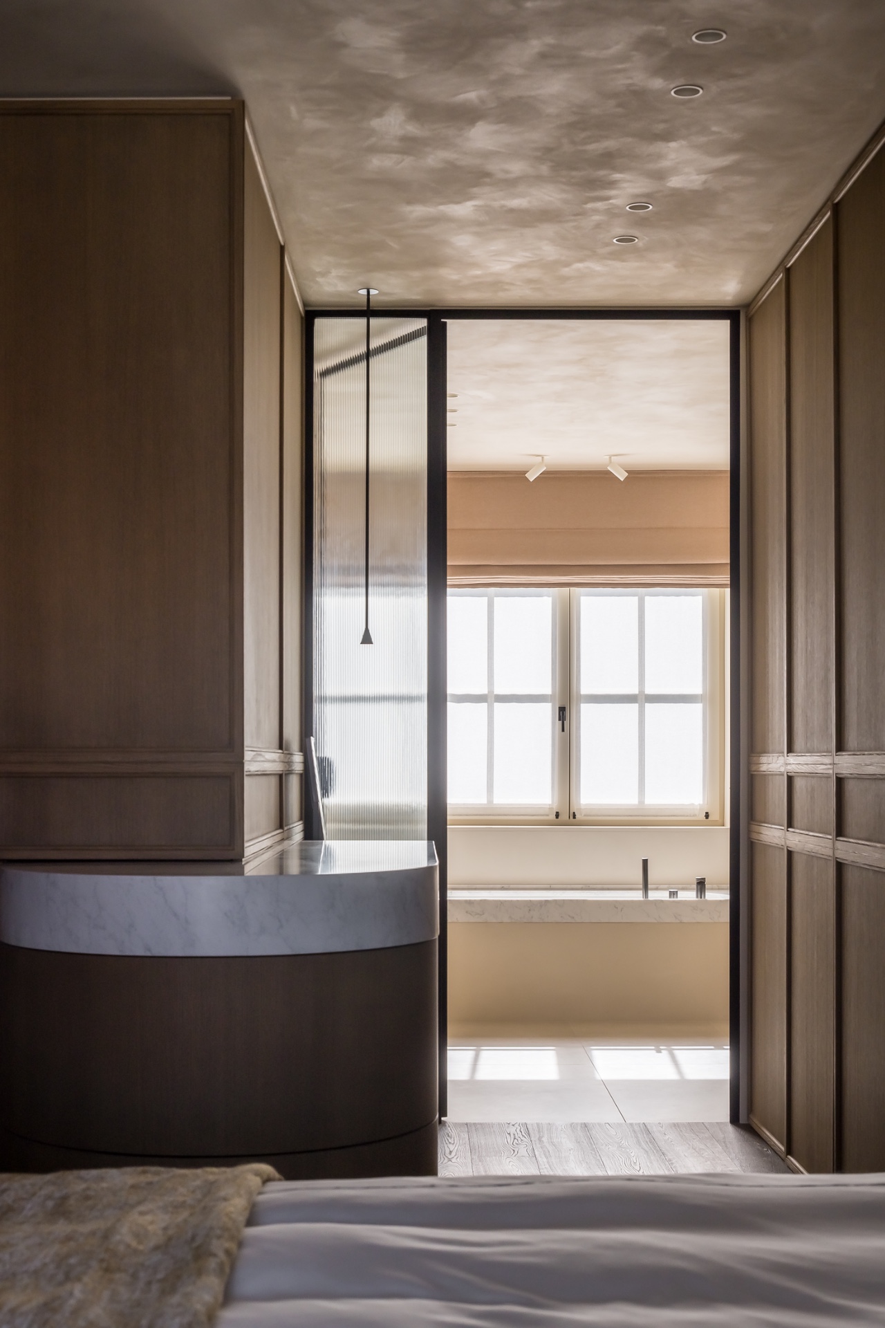
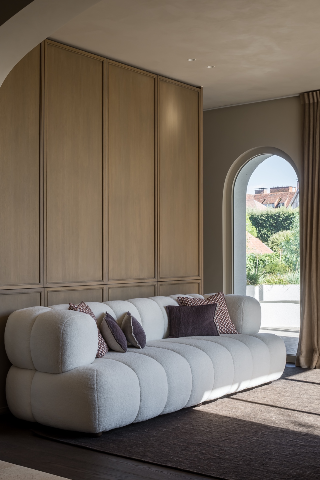
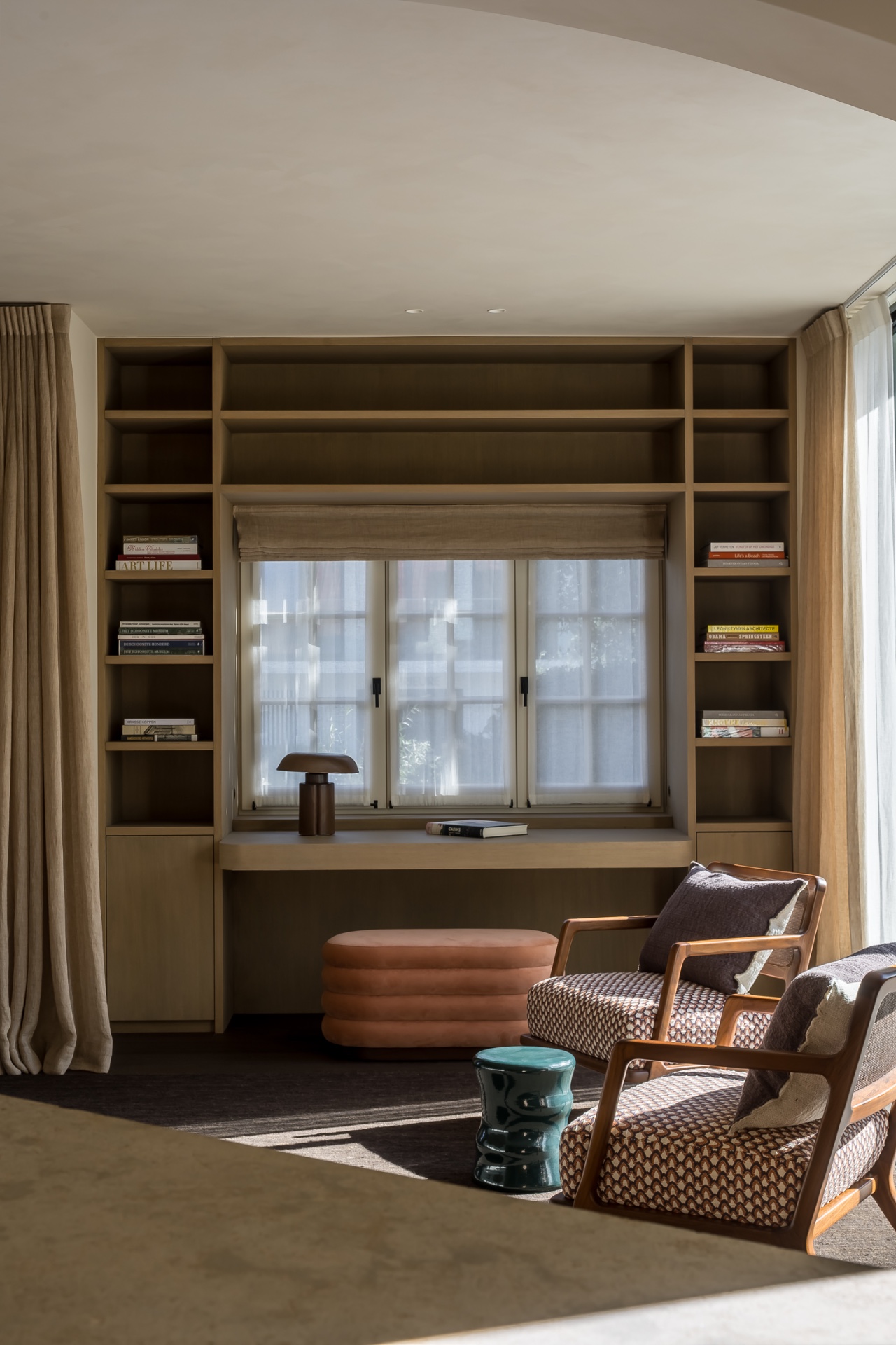
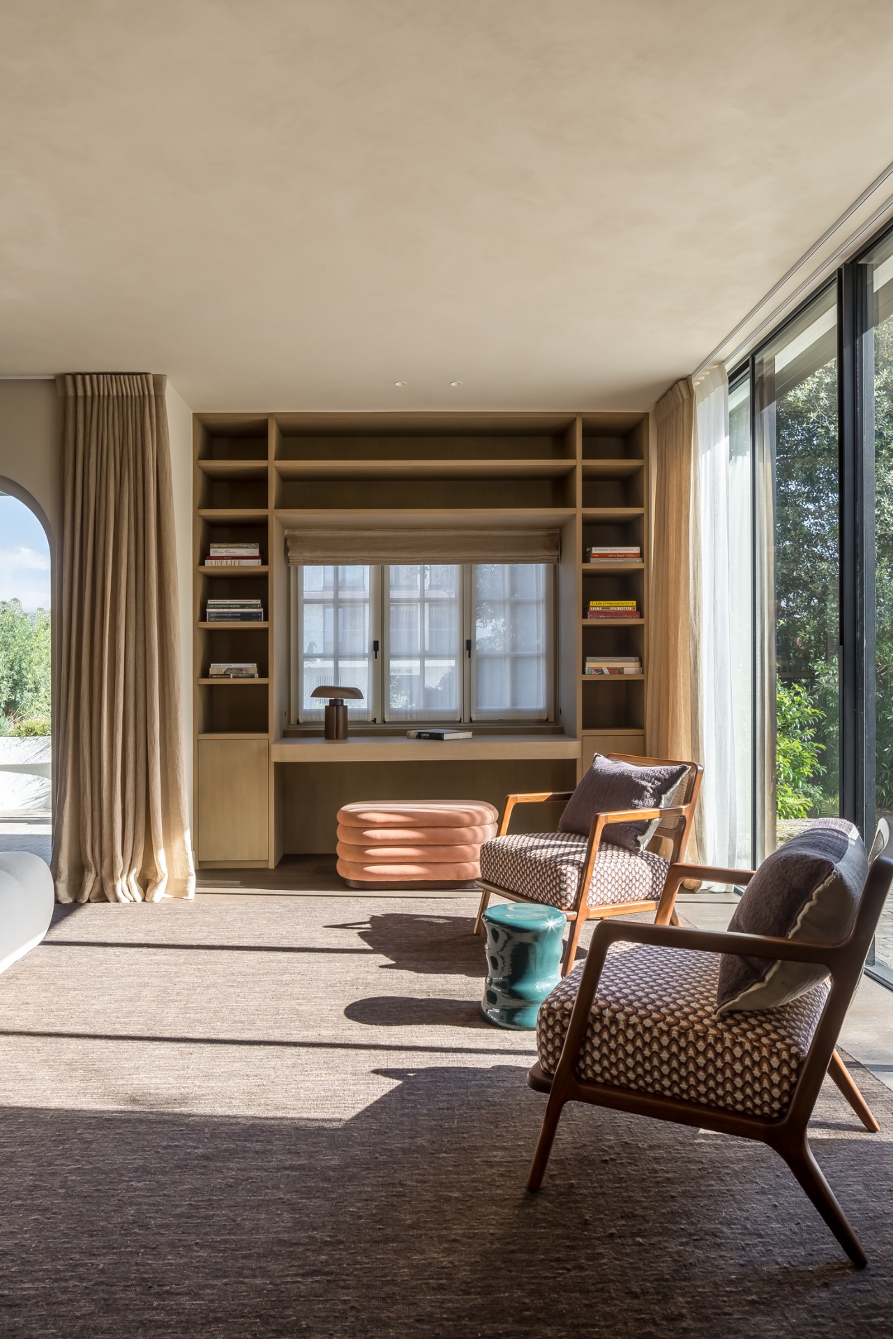
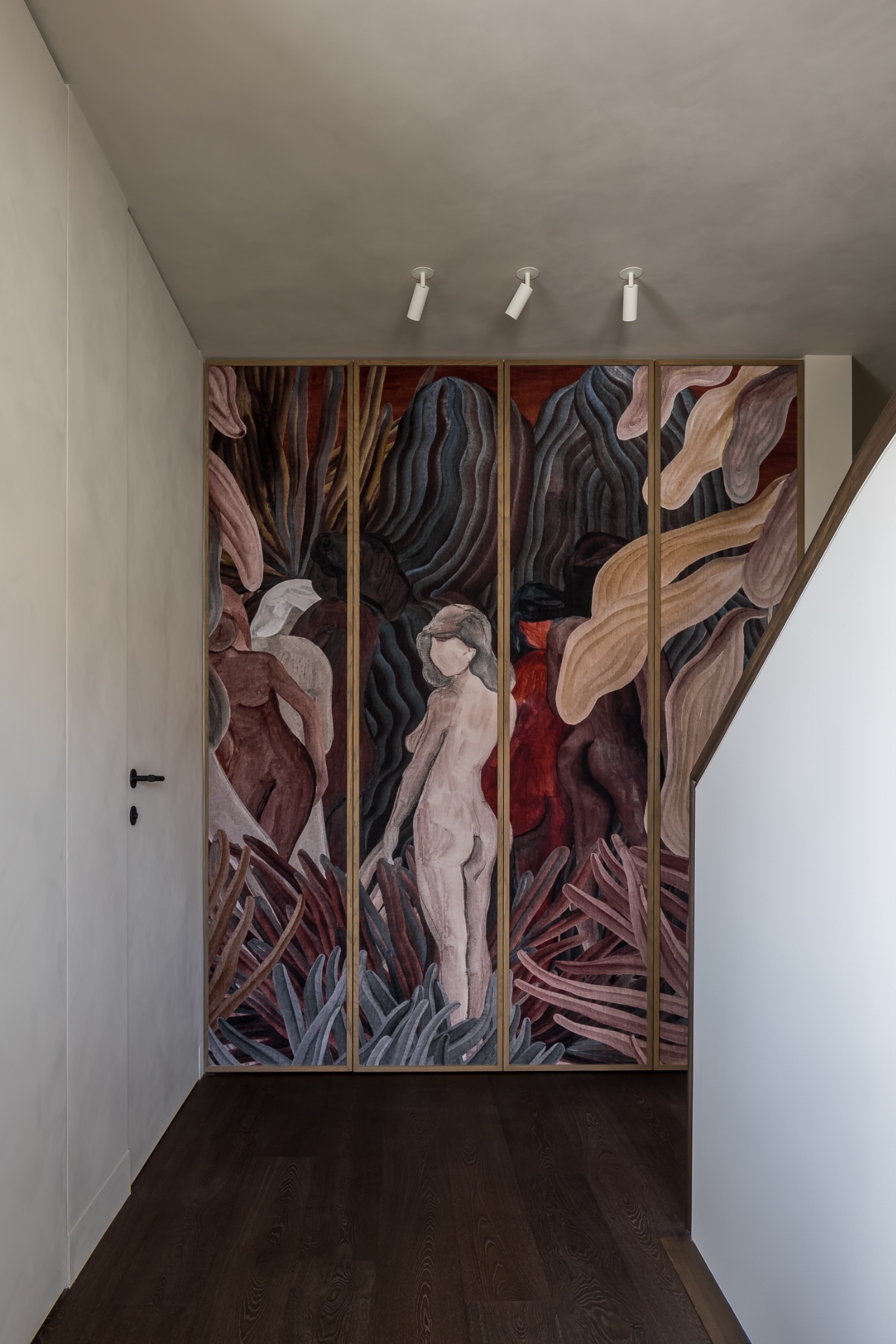
Inside, the tone changes without losing restraint. Walls remain calm, but the space opens through larger glazing and broader openings, allowing daylight to travel deeper into the rooms. Built-in cabinetry lines niches and wall lengths with steady verticals, so storage reads as part of the architecture. Wood softens the white plaster, while black metal details cut clean edges around stairs, windows and cupboards. The custom interior is not loaded with ornament; it works through proportion, joinery and the way surfaces meet.
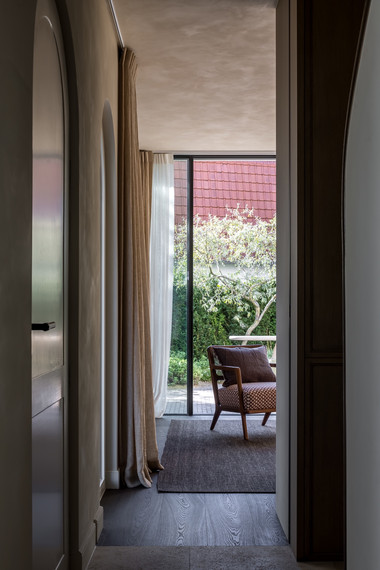
Several openings are rounded or arched, and that gesture repeats the entry inside the house. It breaks the dominance of straight lines without turning the rooms decorative. A lowered ceiling with recessed lighting keeps the composition compact enough to read, and the flat plastered planes around it make the woodwork stand out. This is a light-filled interior that gains its calm from precision: the cabinetry is fitted, the corners are controlled, and the openings allow one room to lead into the next.
Joinery that sits with the architecture
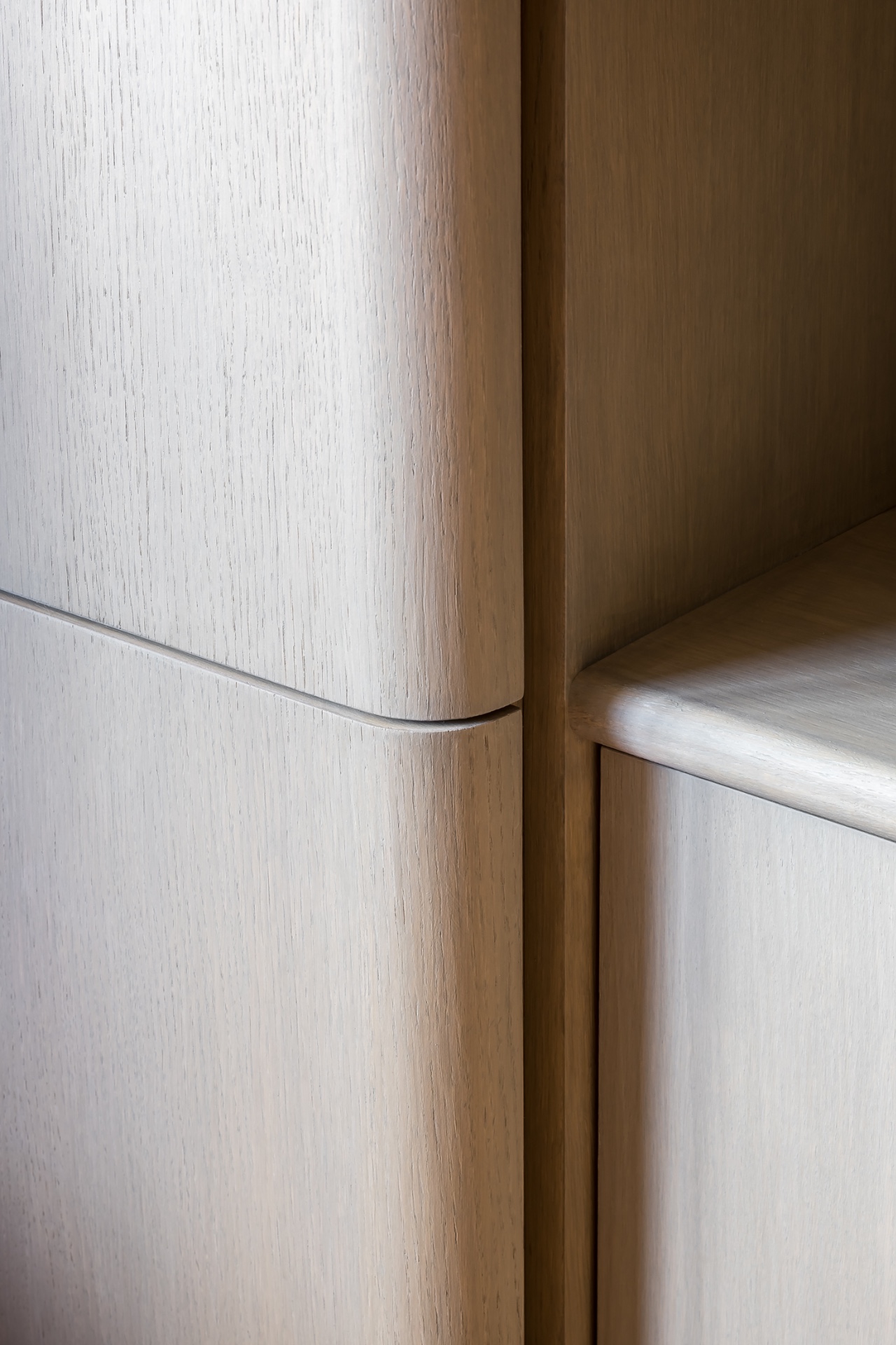
The custom interior relies on built-in cabinetry that runs into alcoves and around openings, so the storage feels embedded rather than added on. Vertical wood panels lift the wall visually, while smooth door fronts keep the surfaces quiet. In a few places, curved cut-outs interrupt the rectangular plan and introduce a softer rhythm. Those moves are modest, but they give the renovation a clearer sequence from one zone to another. The room does not rely on loose furniture to define itself; the joinery does that work.
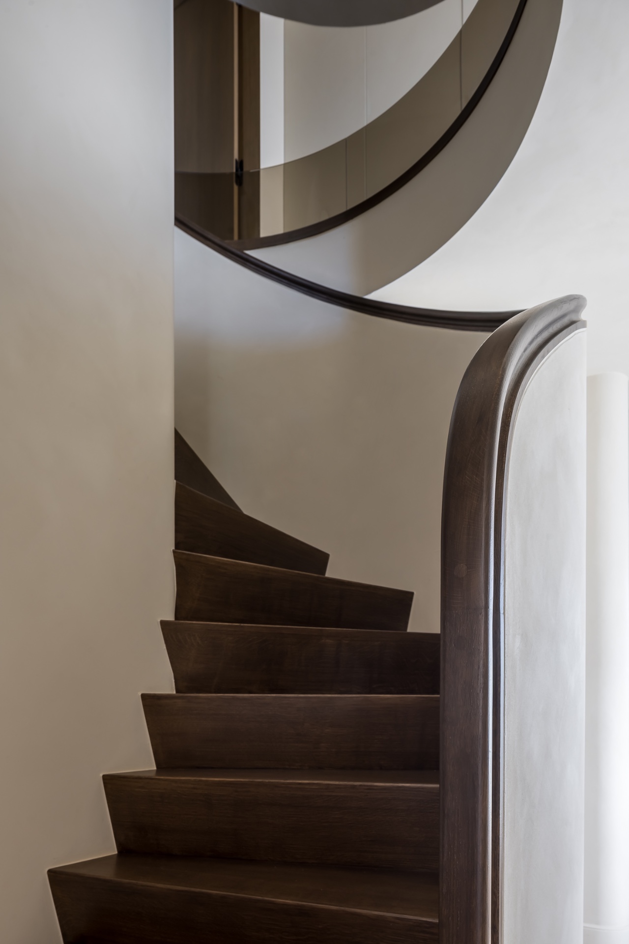
The staircase follows the same logic. Wooden treads, dark handrails and a tight meeting point with the wall create a controlled transition between levels. Nearby, ceramic flooring and stone-like surfaces catch light without reflection, so the material palette stays muted. This is where the heritage home renovation becomes most legible as an interior project: it is not about filling space, but about ordering it with cabinetry, wall thickness, openings and light.
Stone-look surfaces, wood and black metal in the kitchen
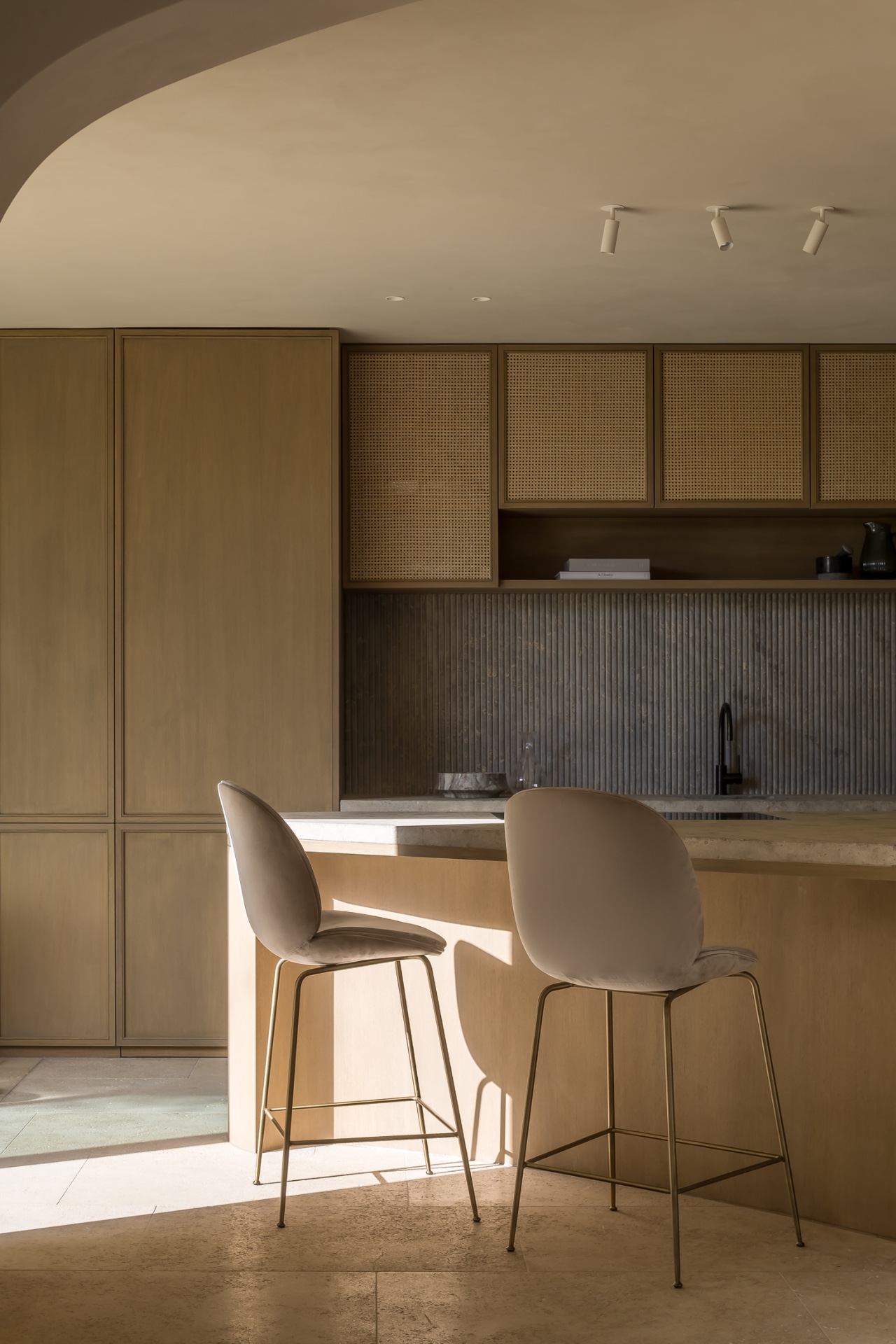
The kitchen is arranged around an island that organizes movement instead of blocking it. Its stone-look worktop carries a darker tone, which makes the wood fronts and pale walls around it easier to read. Above the working zone, perforated panels add texture without filling the room with visual noise. The composition stays clear: cooking area, storage wall and circulation each have their place, and the island gives the whole room a practical centre. As part of this heritage home renovation, the kitchen adds a new layer of use while staying in step with the house.
Wood, black and light surfaces are repeated here in measured amounts. The curved ceiling line links the kitchen back to the adjoining living areas, and the materials continue that connection. You do not get a display of appliances; you get a composed interior where fronts, worktop and wall treatment do the visual work. The custom interior benefits from that restraint. It lets the kitchen remain present without becoming louder than the architecture around it.
Marble-look detailing in the wet areas
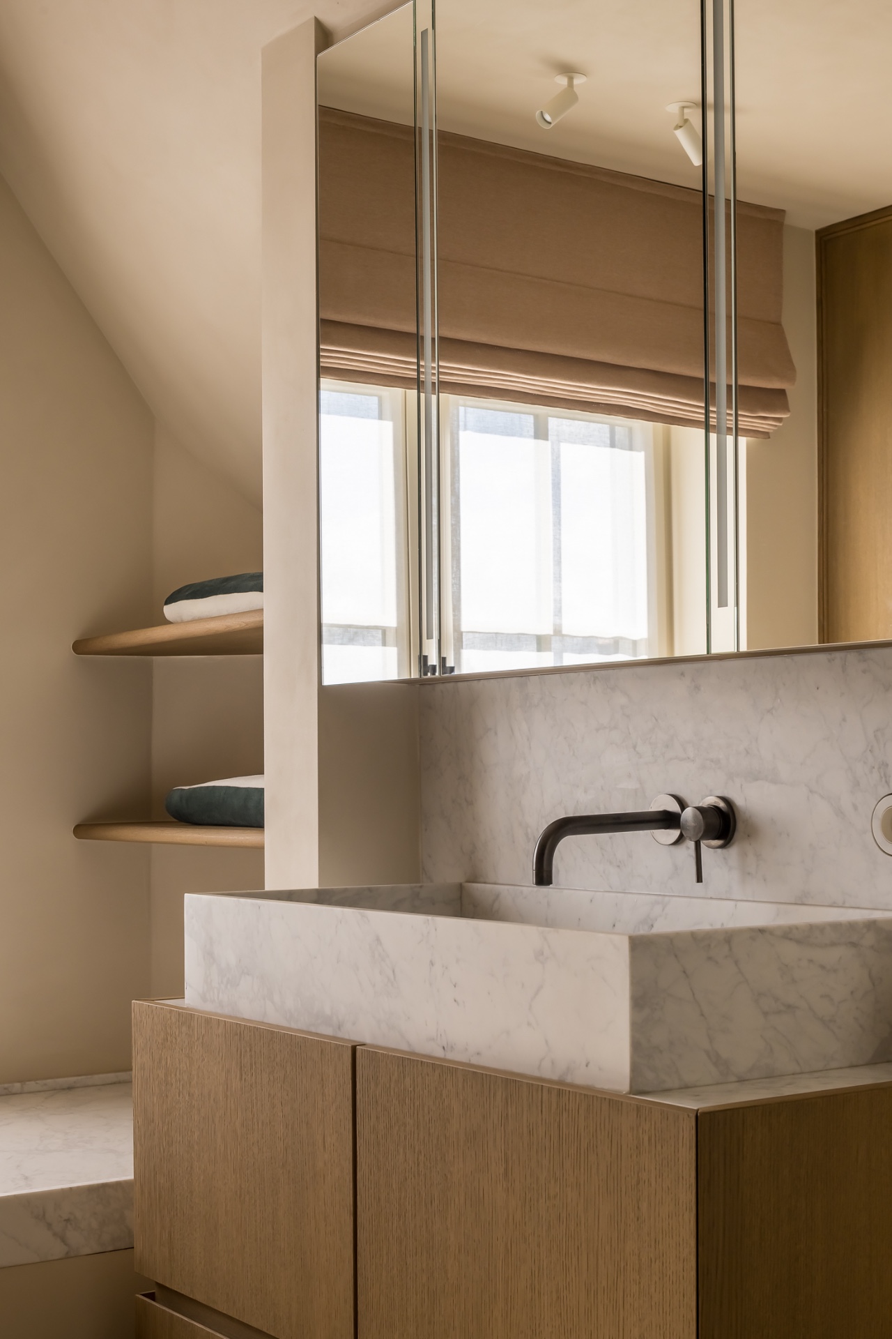
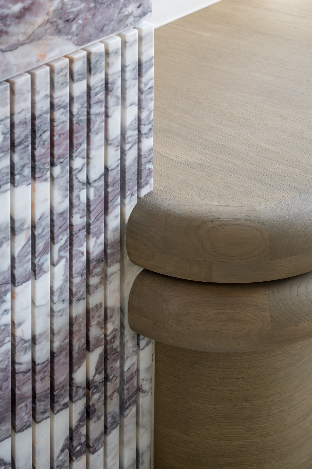
Elsewhere in the interior, stone-like finishes with a veined marble look introduce a sharper note. A vanity top and basin area are shown with a dark tap against the pale surface, and daylight from the window keeps the stone pattern readable. The material is not used as a flourish. It appears where water, light and reflection meet, which is exactly where a surface like this can hold the room together without drawing attention to itself.
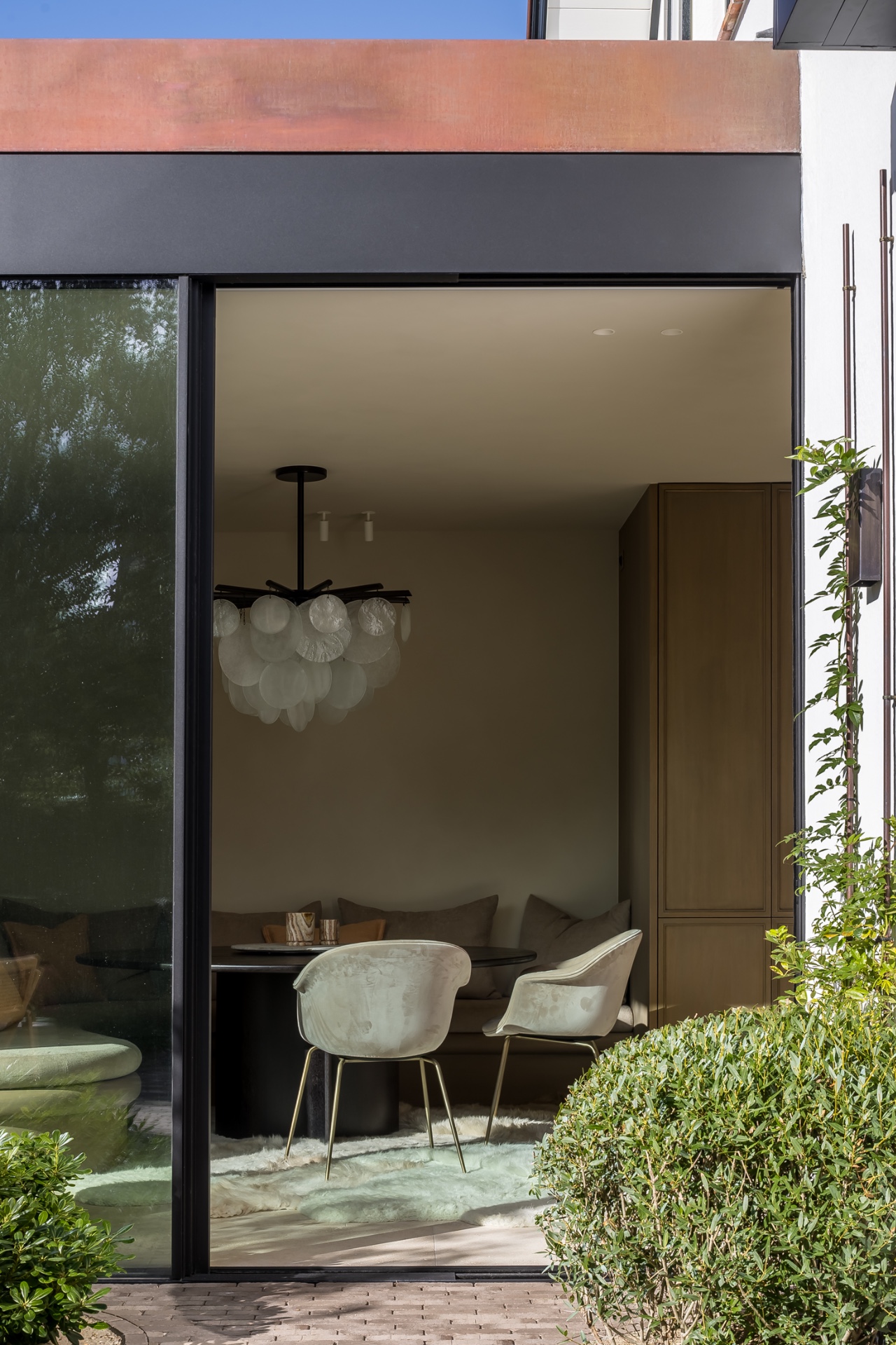
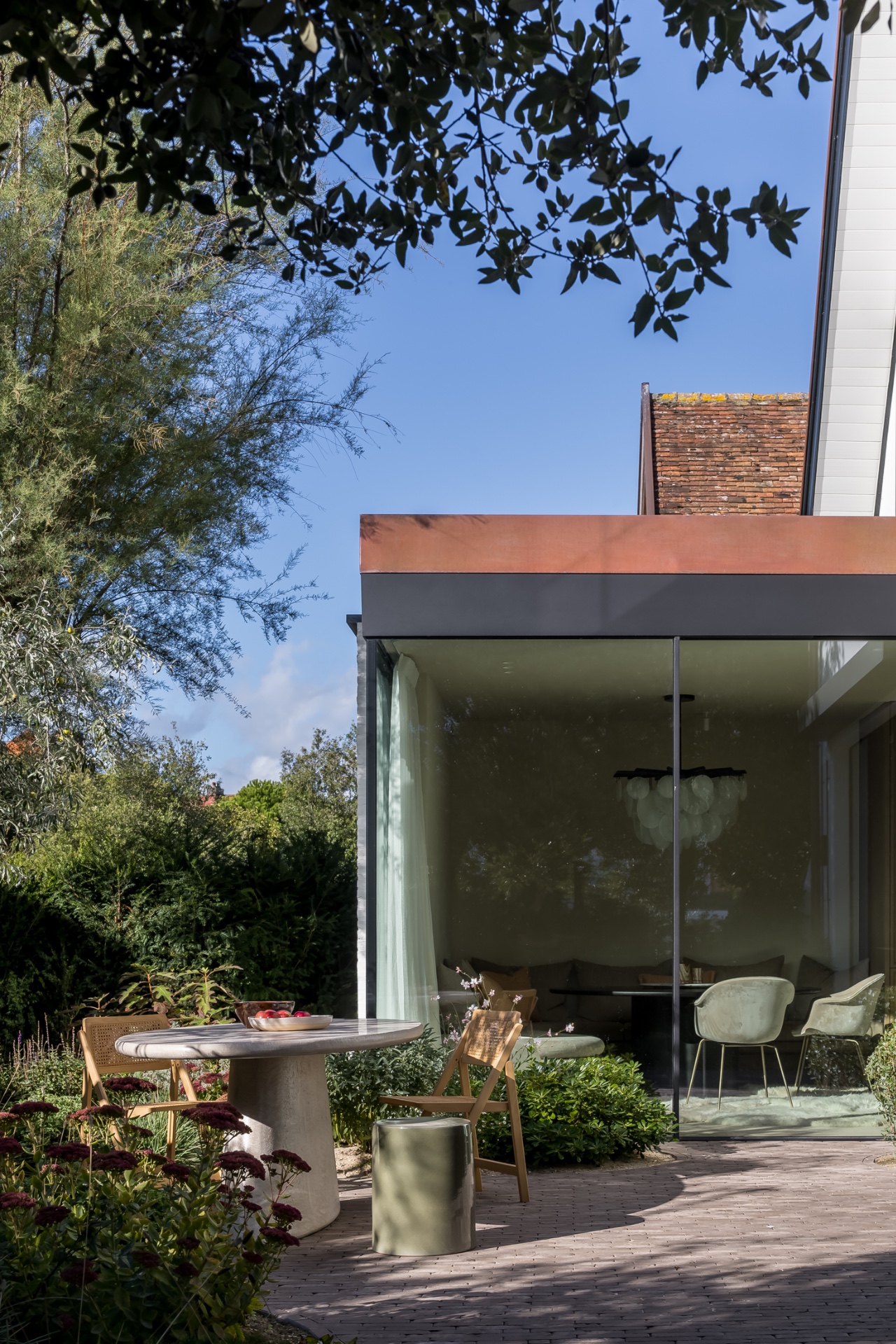
That same discipline appears in the transition to the terrace. Large glazing opens the room to the outside, and the terrace continues the walking surface with a patterned tile field beside the house. Plants sit close to the glazing, softening the edge without hiding the frame. The white wall remains visible behind the glass, so the inside-outside relationship stays tied to the original house. In a heritage home renovation, those large openings matter because they extend the daylight and make the old envelope feel more usable.
Where the garden, glass and masonry meet
The strongest impression in the project comes from the way the old exterior and the newer interior meet at the openings. Dark-framed windows, white render and red tiles keep the cottage character intact from the outside, while the glazing pulls light into the rooms and opens views to the terrace. The house no longer depends on small, enclosed compartments. Instead, the larger openings and the built-in cabinetry help the interior read as a sequence of connected spaces. This heritage home renovation uses that shift carefully, without losing sight of the original shell.
What stays with you is the contrast between the quiet exterior details and the sharper inner surfaces. Arched transitions, fitted storage, stone-look worktops and black metal accents all support the same move: preserve the building’s identity, then make the interior clearer and lighter. The result is not a reinvention of the house, but a measured heritage home renovation that keeps the façade legible, the entry expressive and the custom interior closely tied to everyday use.
Want to see more of Vlassak-Verhulst? View the page of Vlassak-Verhulst for even more great projects and company information.



NEW 2026 Jubileum Edition The Best Interior Designers Benelux
Order Now €125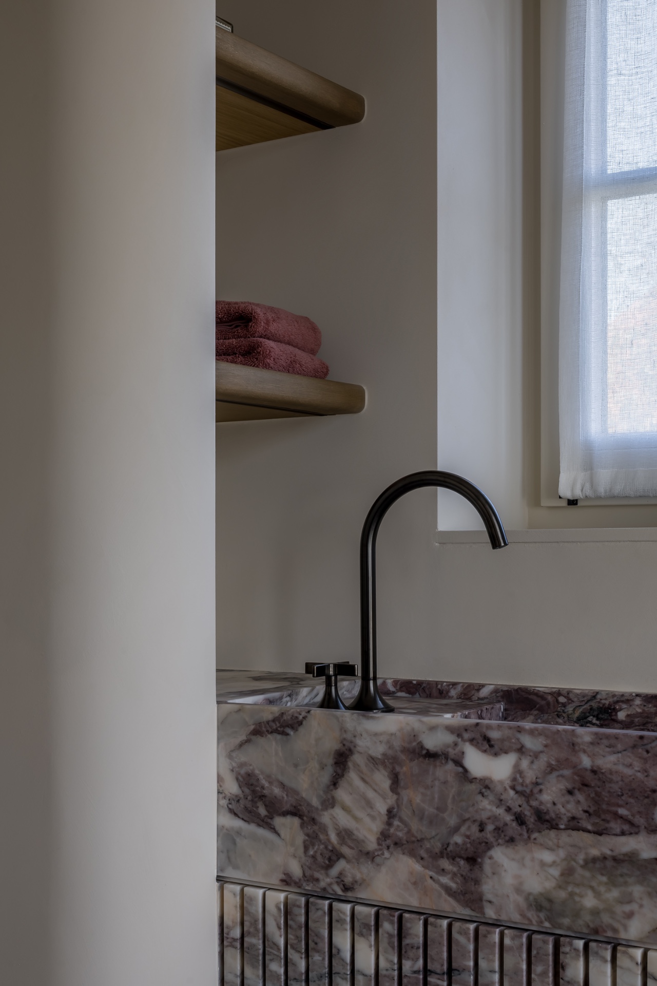
NEW 2026 Jubileum Edition The Best Interior Designers Benelux
Order Now €125
NEW 2026 Jubileum Edition The Best Interior Designers Benelux
Order Now €125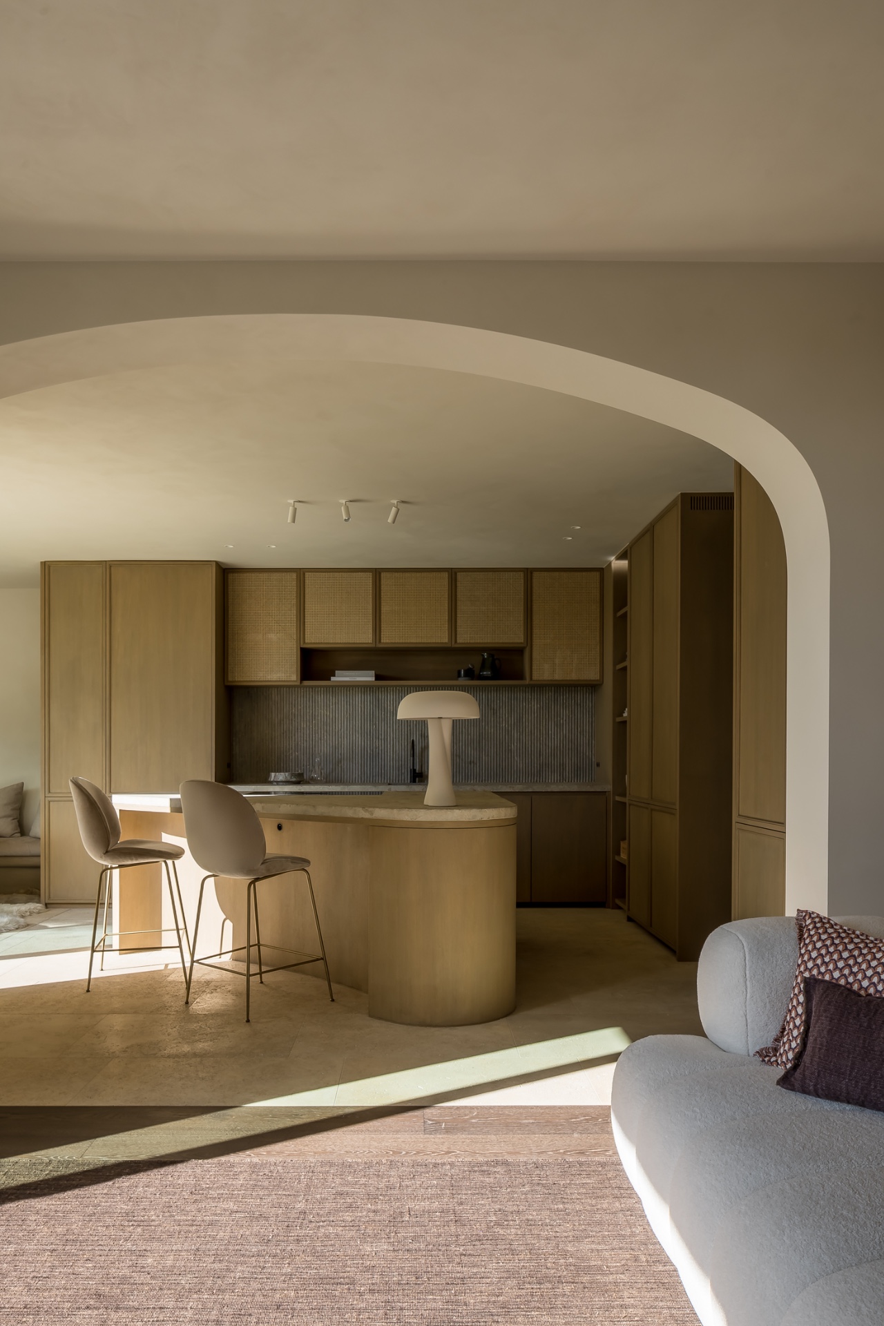
NEW 2026 Jubileum Edition The Best Interior Designers Benelux
Order Now €125