Home renovation into a modern custom interior with indirect lighting
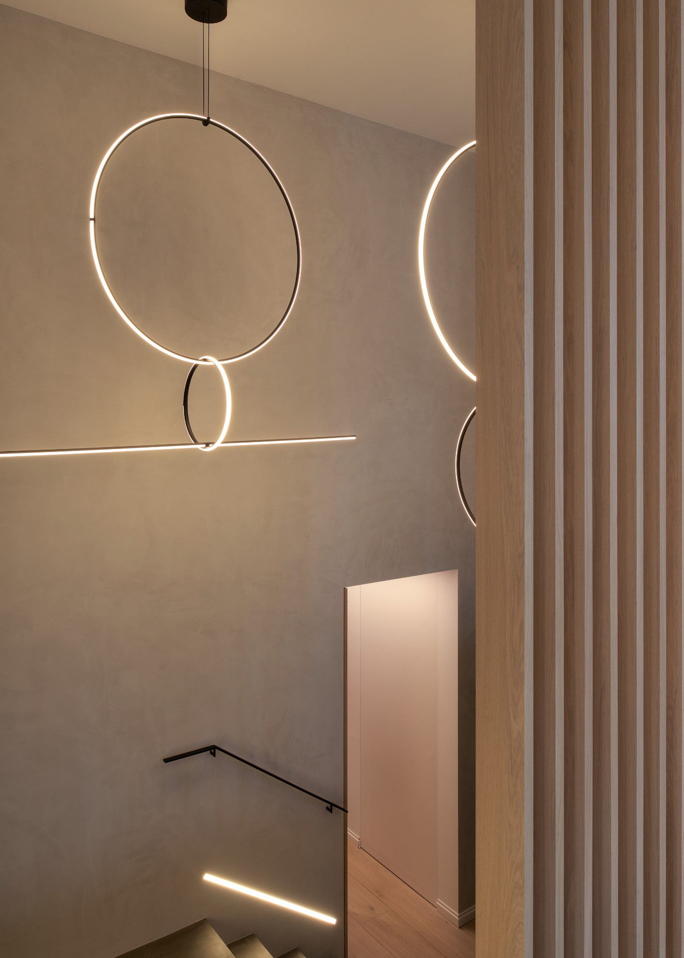
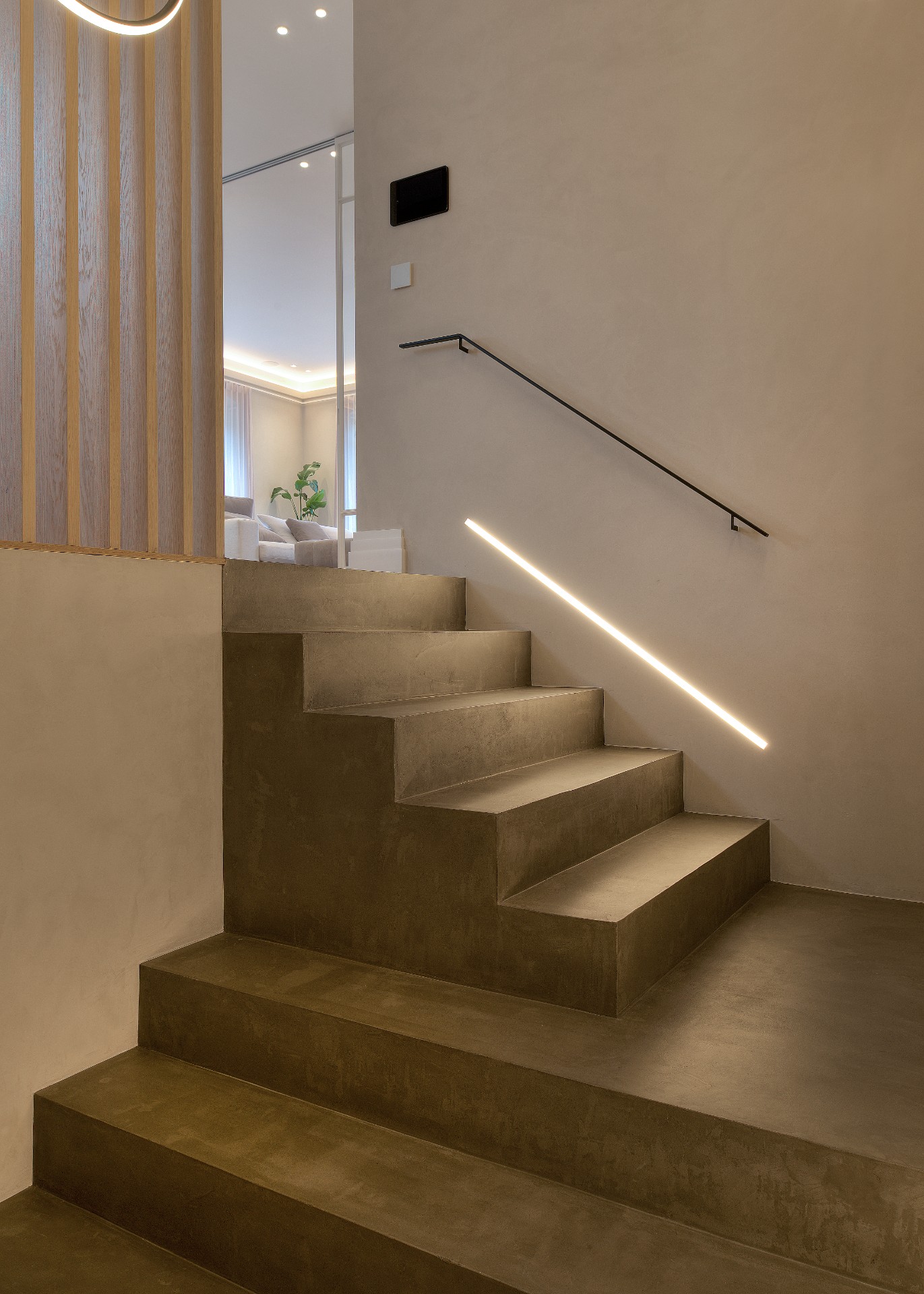
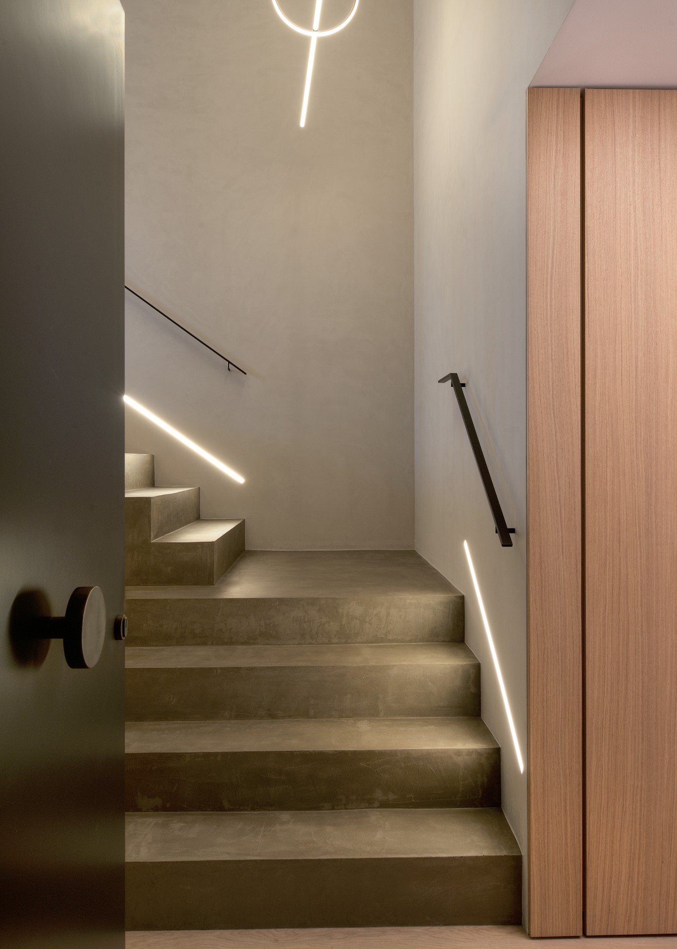
A raw shell was turned into a home through a careful sequence of cuts, lifts, and custom fittings. The first impression comes from the stair, which reads less like circulation and more like a sculptural spine. Its layered form carries through the room in plinths, window sills, and built-in details, so the home renovation feels continuous without becoming repetitive. Light runs quietly through the interior, picked up by glass surfaces, pale walls, and the long lines of the joinery.
A staircase form that sets the tone
The stair does more than connect floors. Its stepped layers establish the language for the rest of the interior, and that language returns in the lower edges of the cabinetry and the broad sills beneath the windows. The effect is visible in the way the rooms are held together by one family of forms. Rather than introducing separate gestures in each zone, the project repeats the same profile at different scales. That makes the home renovation read as a single interior, even where the spaces change in function.
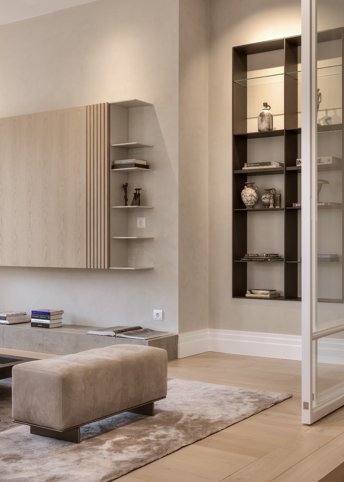
Custom pieces follow the same rule. Built-in cabinets sit flush with the walls, while open niches and closed volumes alternate to keep the surfaces from becoming flat. The result is measured, not decorative. In a home renovation like this, the joinery carries much of the spatial weight, and here it does so by controlling depth, shadow, and the transitions between materials.
Raising the living room to meet the windows
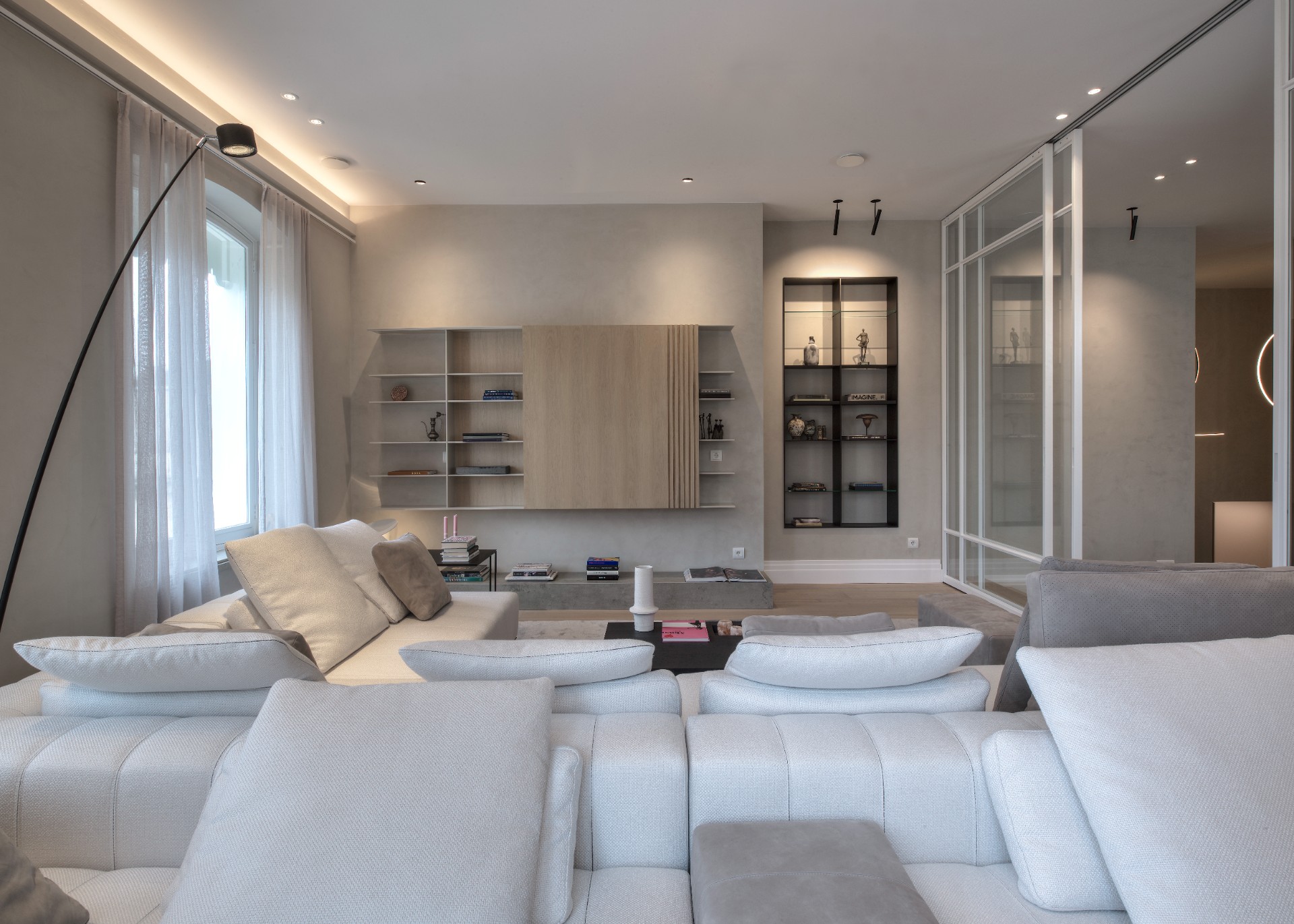
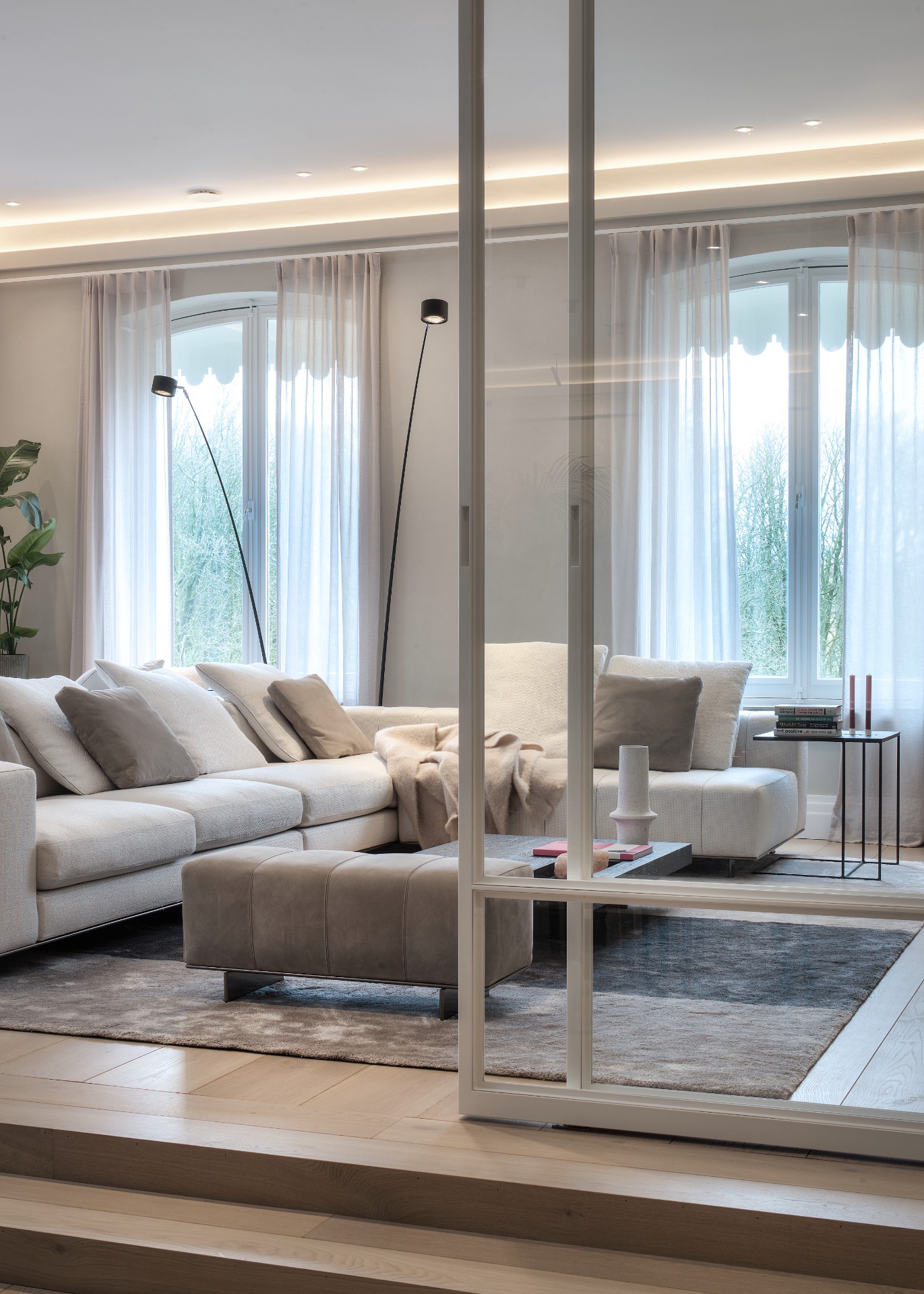
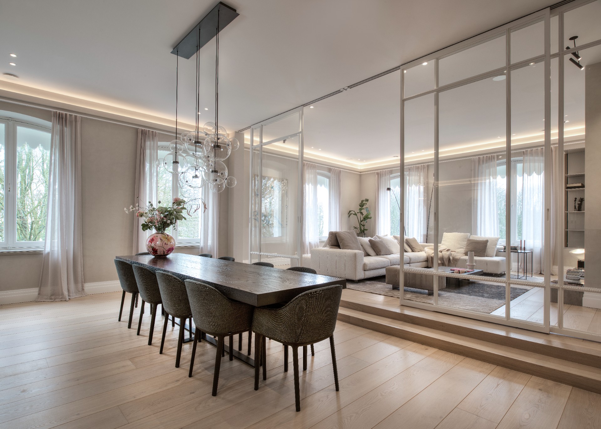
The original large room, about 100 m², was divided by lifting one part of the floor to create the living room. That raised platform changes the way the room is read at once. It gives the seating area its own level and brings the window line closer to eye height, so the view can be taken in from a seated position instead of from below the sill. The move is simple, but it solves two problems at once: it defines the room and responds to the tall window placement that came with the shell.
Visible from the dining side, the raised volume also echoes the stair’s layered profile. This repetition matters. The home renovation avoids adding more objects than needed, and instead uses one form to organize several rooms. The change in level becomes a spatial hinge, not a gesture for its own sake. It is one of the clearest examples of how the plan was adapted without losing the scale of the original room.
A glass room divider with a clear purpose
Between the living and dining areas, a set of glass doors marks the shift without closing it off. They were designed specifically for this interior and keep sightlines open across the full depth of the room. Glass room divider elements like this work well here because they separate use while preserving the sense of width. The dining table, the raised lounge area, and the long run of walls remain visually connected.
Several other doors were custom made as well, including nearly four-metre-high oak doors. Their height changes the room scale immediately. They rise with the walls instead of breaking them up, and their material adds weight to the lighter glass and painted surfaces around them. In a home renovation with a strong architectural line, those doors act less as hardware and more as part of the room composition.
The kitchen as a central object
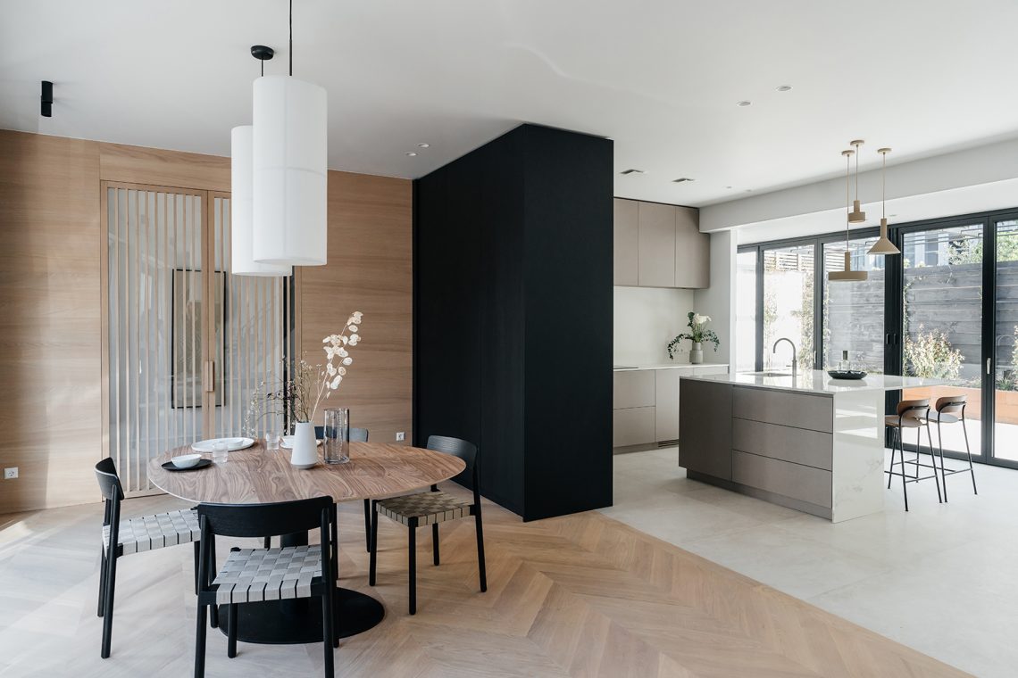
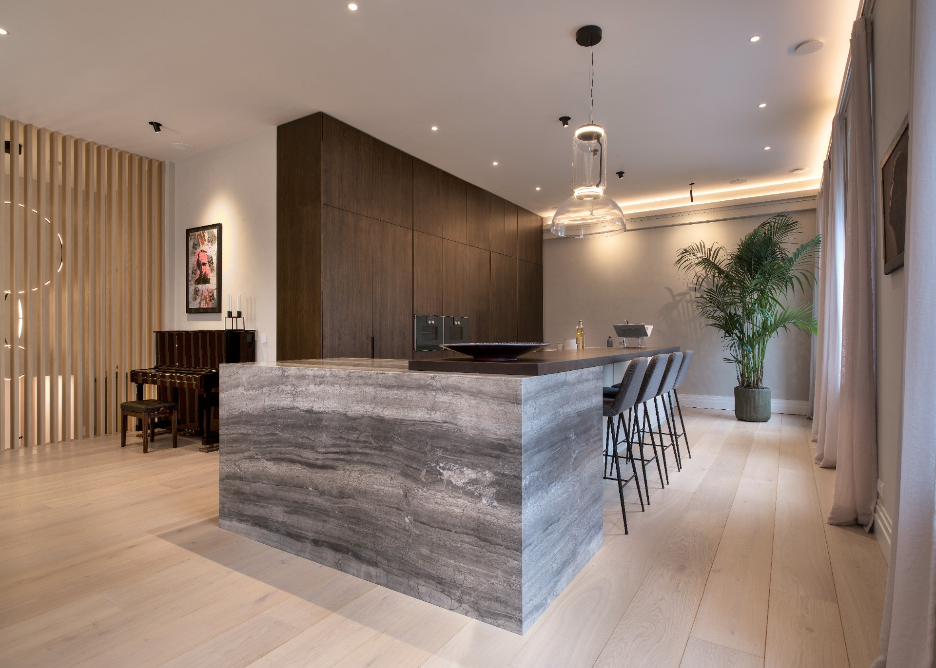
The kitchen is arranged as a single, striking mass rather than a collection of separate parts. A stone-like block links the bar and the island, giving the room a firm center. Around it, tall wooden cabinets rise in a darker tone, which sets off the pale surfaces used elsewhere in the home. The balance here is not about decoration. It is about how the kitchen occupies space and how the eye moves from the heavy block to the vertical storage around it. The home renovation gives this room a clear identity without isolating it from the rest of the plan.
Inside the cabinetry, the practical functions are folded away. A hidden coffee corner, a wine bar, and the cooking zone are integrated into the layout so the room stays visually calm when not in use. Access to the pantry is through a pivot door set into the dark wood fronts, which keeps the storage readable but discreet. The kitchen becomes a study in built-in cabinets and stone surfaces, with every element tied back to the same restrained material palette.
Indirect lighting and layered surfaces
Indirect lighting traces the ceiling edges and picks up the relief of the joinery rather than competing with it. In the evening, those light lines soften the sharper outlines of the stair and the kitchen volumes. They also emphasize the depth of the wall units, especially where open shelves meet closed fronts. Because the light is embedded rather than exposed, the architecture stays in view. The home renovation relies on that restraint to keep the rooms legible.
Material changes are handled with equal care. Wood, glass, and stone-like finishes each occupy a distinct role, but none of them is allowed to dominate the room. The pale walls and lighter flooring give the darker cabinetry and the tall oak doors a stronger edge. In the living areas, the custom wall unit and the built-in cabinets work as parts of the same system, with recesses and solid panels set against a clean field of plaster.
Details that hold the house together
What makes the interior convincing is not a single statement feature but the repetition of a few precise moves. The stair profile returns in the raised living platform. The window sills and plinths pick up the same layered edge. The glass doors keep the rooms connected, while the tall oak doors add scale where needed. Even the kitchen follows this discipline, using a central block and hidden storage instead of a loose arrangement of units. As a home renovation, it depends on control of section, level, and surface.
The rooms remain open enough to read as one home, yet each part has a distinct job. A seated view toward the windows, a dining zone separated by glass, a kitchen built around a stone-like core, and joinery that sits deep in the walls all contribute to that reading. The result is an interior shaped by measured interventions rather than spectacle, with staircase led detail, indirect lighting, and custom wall units doing most of the work.
Photography – Patrick Meis
Contributors:
Lichtadvies 010 – Lighting
Noort interieur – Furniture
Intermat – Sanitary
Want to see more of Studio Wendy Mahieu? View the page of Studio Wendy Mahieu for even more great projects and company information.

NEW 2026 Jubileum Edition The Best Interior Designers Benelux
Order Now €125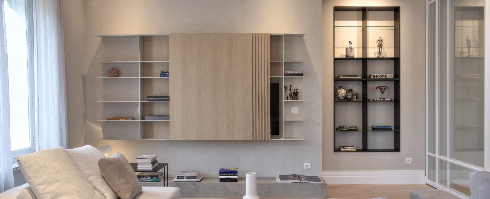

NEW 2026 Jubileum Edition The Best Interior Designers Benelux
Order Now €125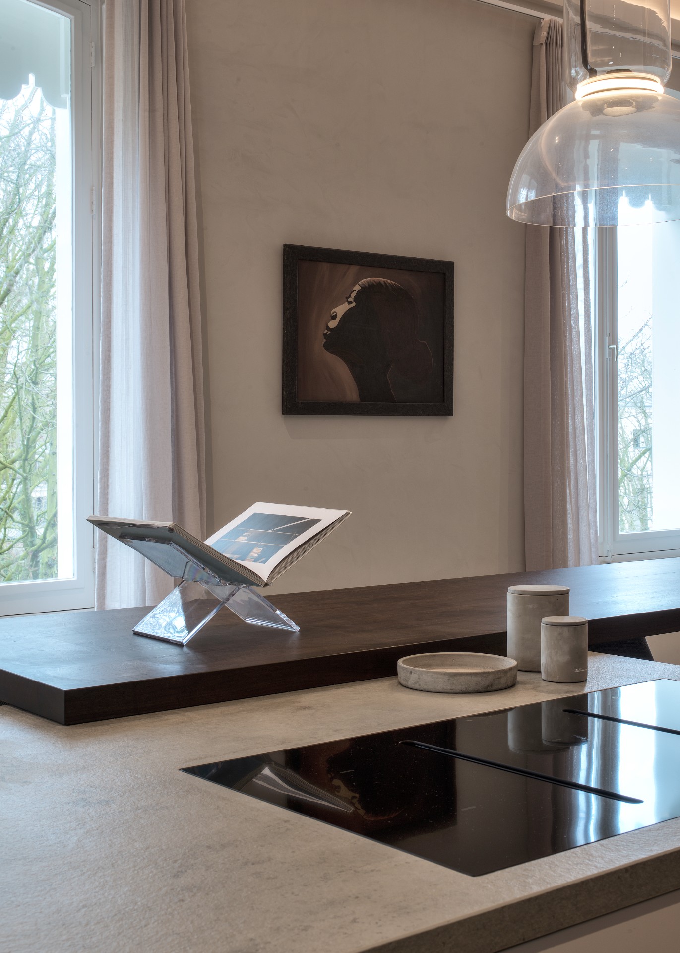
NEW 2026 Jubileum Edition The Best Interior Designers Benelux
Order Now €125