Hotel lobby style interior
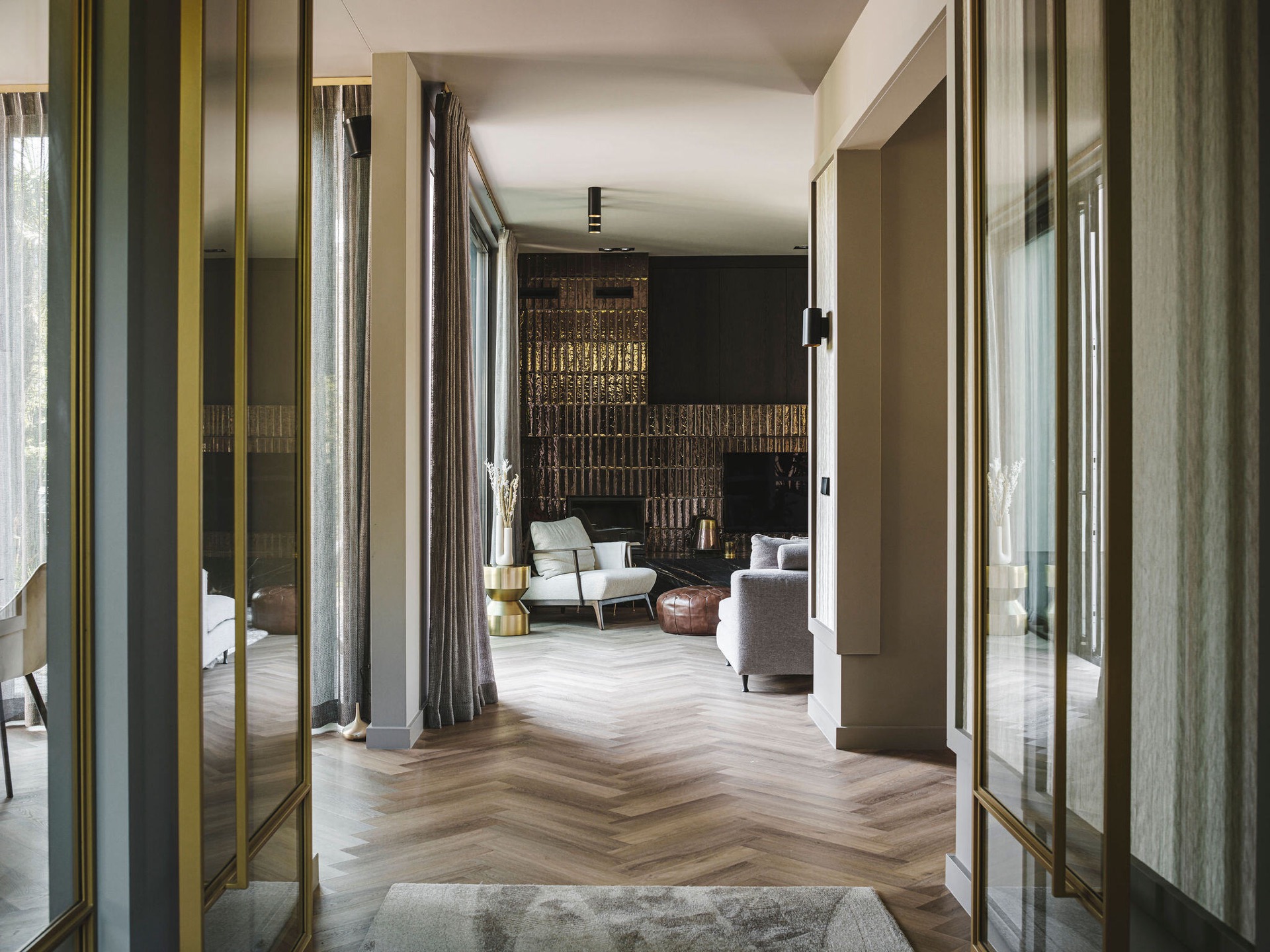
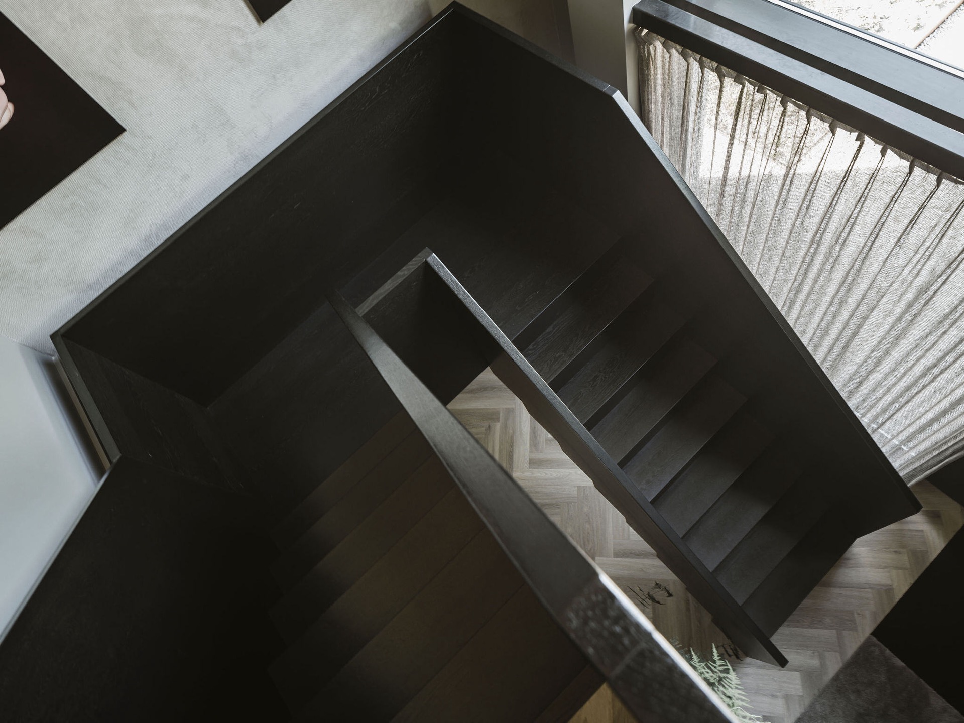
The first impression is set by the entry: a luxe run of wall finishes, a velvet-like runner, and a tunnel fireplace that lets you look through to the kitchen. The route is open and direct, with sightlines pulling you from one room to the next. An oak floor continues across both levels, while the sculptural stair makes a sharp vertical break in the otherwise calm layout. Even before you reach the living room, the house already speaks in layers of light, dark surfaces, and custom joinery.
An entry that works like a sequence
The luxury entry is more than a passage. A built-in wardrobe sits inside a cube at the center of the house, paired with a toilet tucked behind it. That same volume appears again upstairs, where it becomes an inbuilt storage wall with a niche for display pieces. The effect is practical, but it also keeps the plan legible. From the hall, the fire is visible almost immediately, and that long view gives the interior its hotel lobby style interior feeling without turning the house into a stage set.
Materials carry that mood through the ground floor. The wall covering is rich rather than glossy, the runner softens the line of the hall, and the electric tunnel fireplace adds a clear point of focus between entry and kitchen. Hanging plants sit near the stair, which lightens the geometry of the balustrade. The stair itself reads like a sculptural object, especially when seen beside the dark openings and the pale oak underfoot. It is a small sequence of contrasts, but it shapes the whole arrival.
The living room as the hinge between rooms
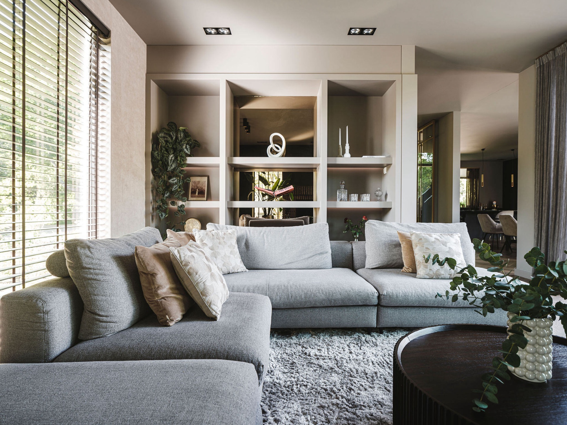
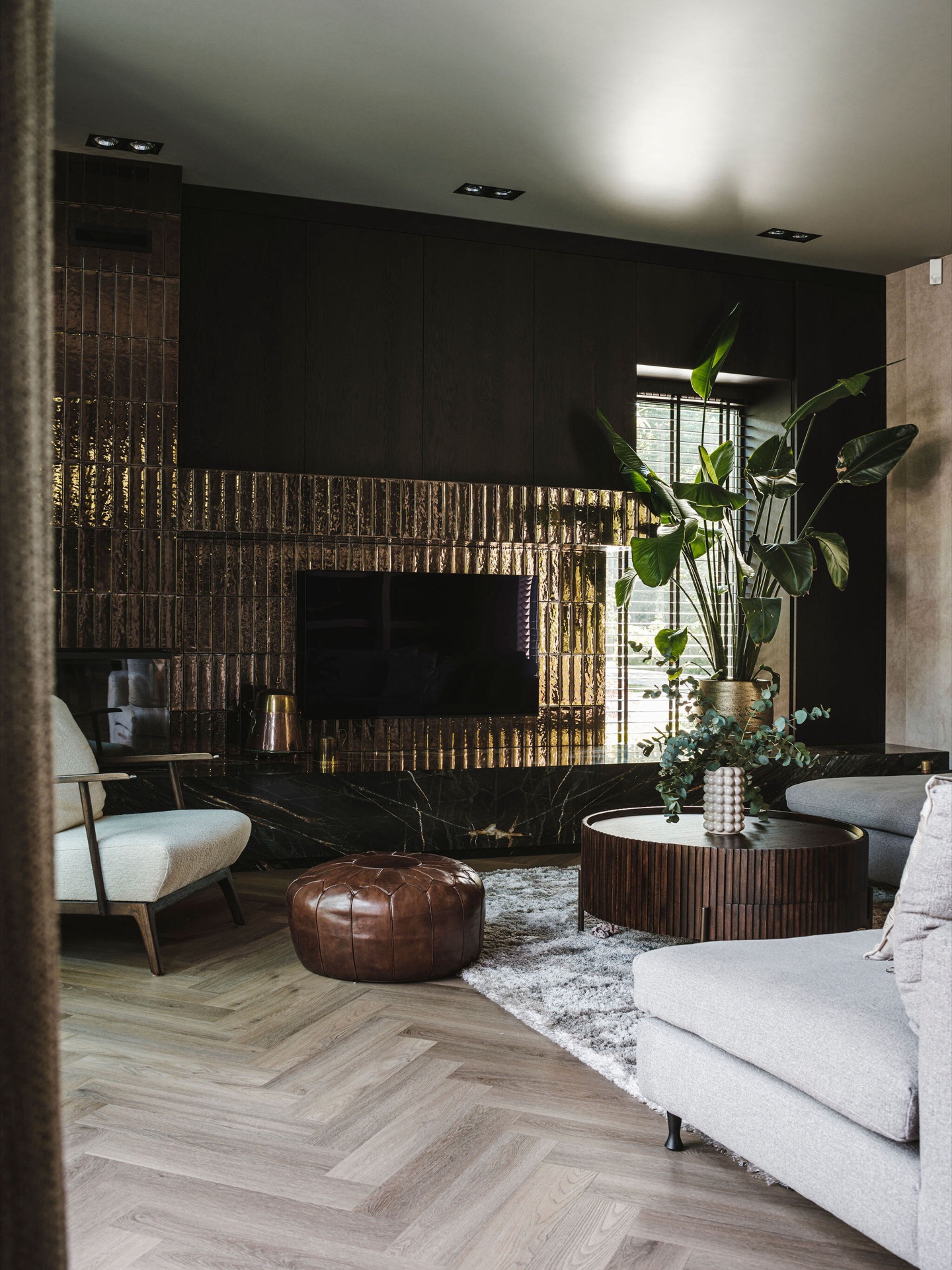
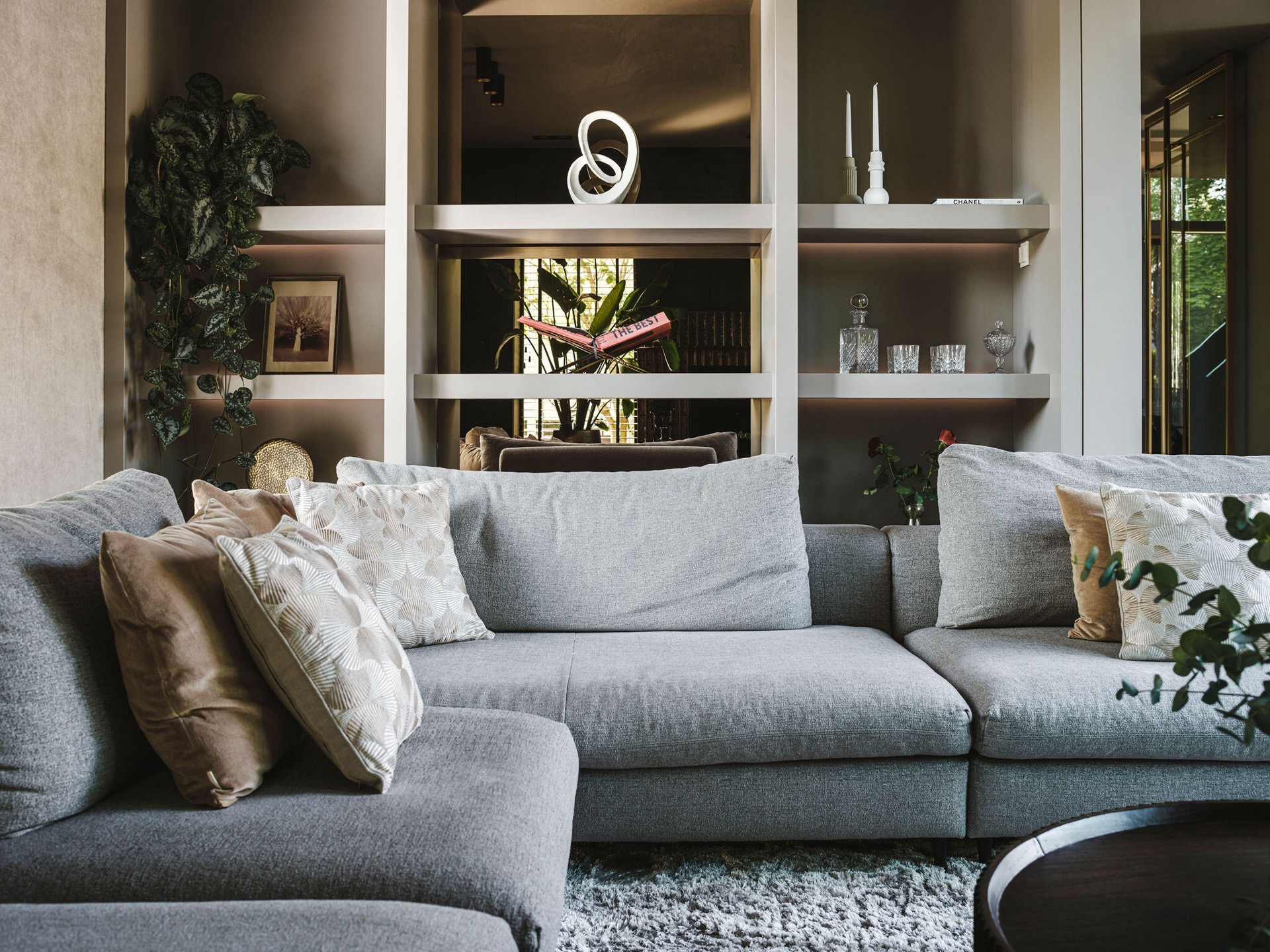
In the living room, the seat beside the fire is the place the owner claims first. From there, the full lower floor remains visible because the plan stays open, yet each zone still feels defined. The fireplace feature wall draws attention with a reflective bronze-gold tile finish, while a niche beside it stores firewood within reach. Custom joinery wraps into the central cube and ends in a mirrored niche cabinet, so the room never feels cut off from the hall.
The furniture mix moves between cosmopolitan and vintage, which suits the layered surfaces around it. Belvedere quartzite returns in different parts of the house, tying the interior together through material rather than decoration. A custom living built-in wall would be too narrow a way to describe it; this is a sequence of storage, display, reflection, and fire, all fitted to the room’s long sightlines. The result is restrained, but never bare.
Fire, reflection and a measured palette
Dark tones settle into the back wall around the fireplace, while lighter oak and pale upholstery keep the room from closing in. The fire is not hidden. It sits in the line of sight, framed by finishes that catch the light at different angles. Even the mirrored elements in the joinery have a job to do: they return depth into the room and extend the view toward the hall. That is where the hotel lobby style interior reads most clearly, through composition rather than gesture.
A kitchen with island that opens to the garden
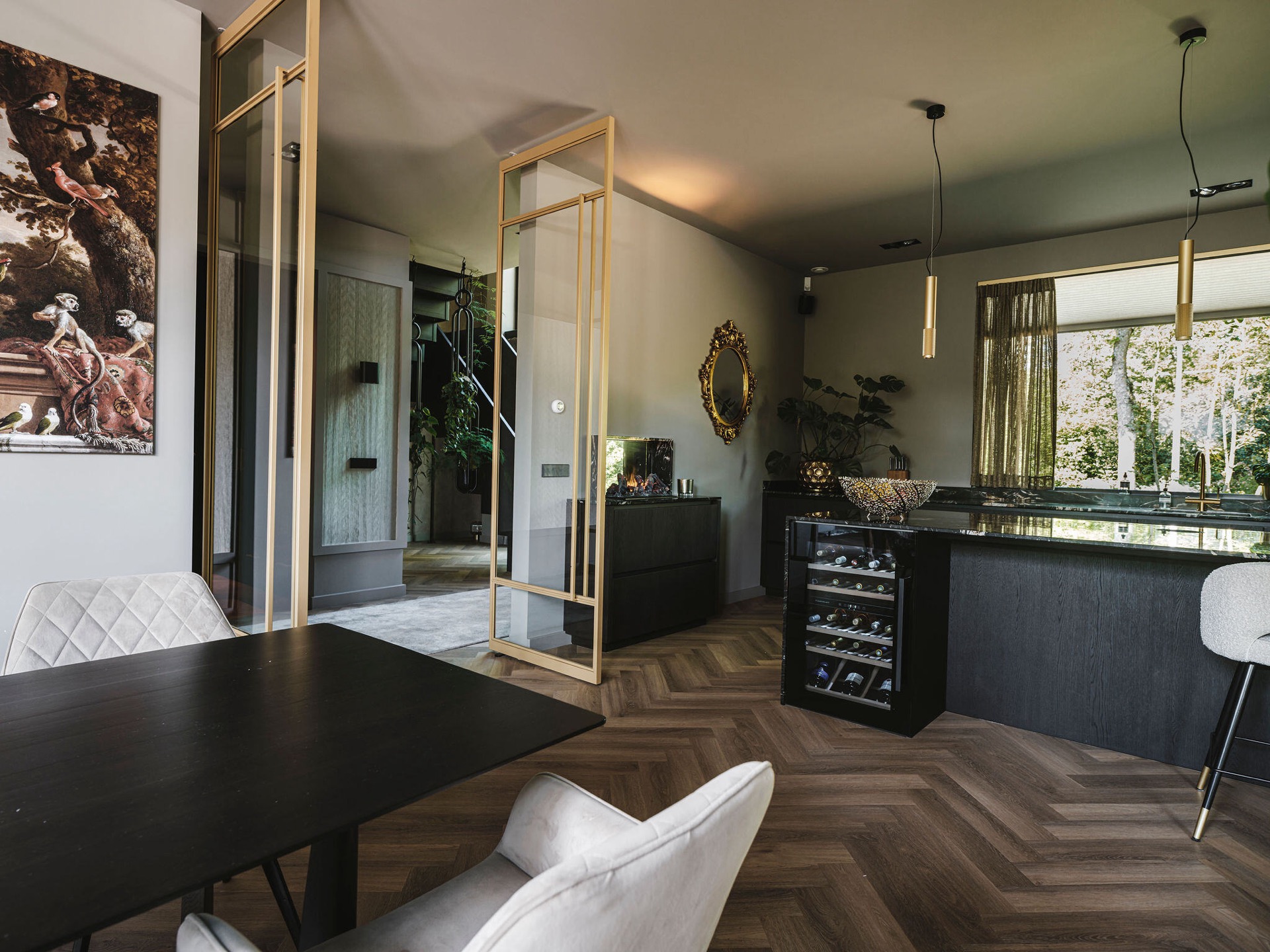
The kitchen is described as larger than the living room, and that size changes the rhythm of the house. One wall carries the main run of cabinets, while a broad island anchors the center. The owner placed the layout himself, and the choice suits how the room is used: cooking with friends, pouring wine, and moving straight toward the terrace when the weather allows it. Dark finishes keep the volume grounded, even with the amount of daylight entering from the wide opening.
The connection to the garden is direct. A large glazed opening slides back so the pool terrace becomes part of the daily route, not a separate outside zone. At night, light from the garden reaches the interior through semi-transparent curtains, and the kitchen holds that transition well. Above the table, a suspended lamp marks the dining area without closing it off. Nearby, a generous wine room sits as a separate luxury detail, close enough to support the kitchen but distinct enough to register as its own space.
Outdoor pool living at the edge of the house
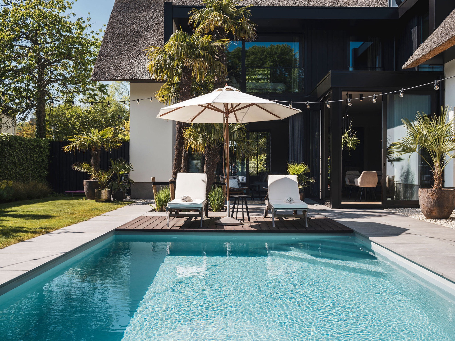
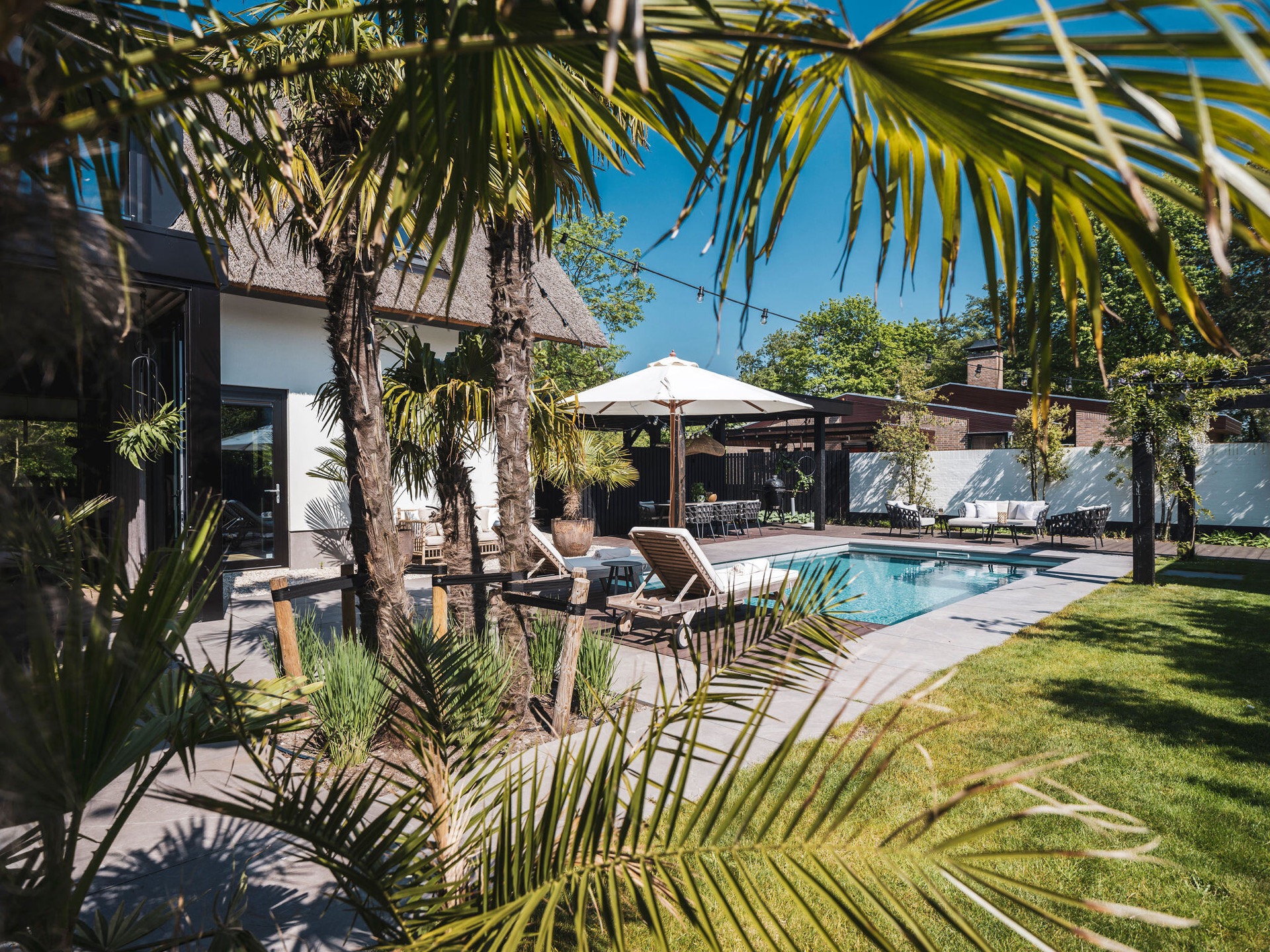
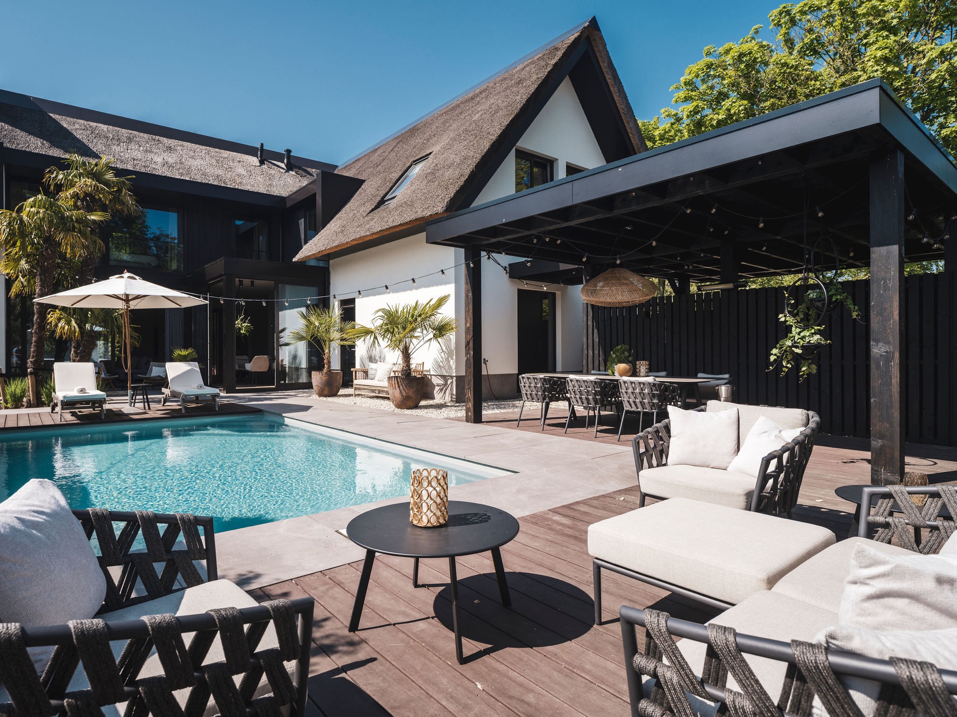
Outside, the water sits beside a straight terrace and a covered section that gathers the seating and dining areas. String lights mark the evening line across the space, and the view back toward the house keeps the threshold visible. This outdoor pool living area is not treated as a separate showpiece; it continues the same measured palette and straight lines seen inside. The garden light filters back through the glazing, so the interior and terrace are read together in one glance.
The cover softens the geometry above the terrace, while the pool brings a reflective surface close to the house. Chairs and low tables stay close to the edge, allowing the outdoor room to work with the interior rather than away from it. The house keeps its focus on routes, views, and repeated materials, and that makes the outdoor zone feel like part of the plan, not an addition at the end.
Upstairs, the rooms turn darker and more intimate
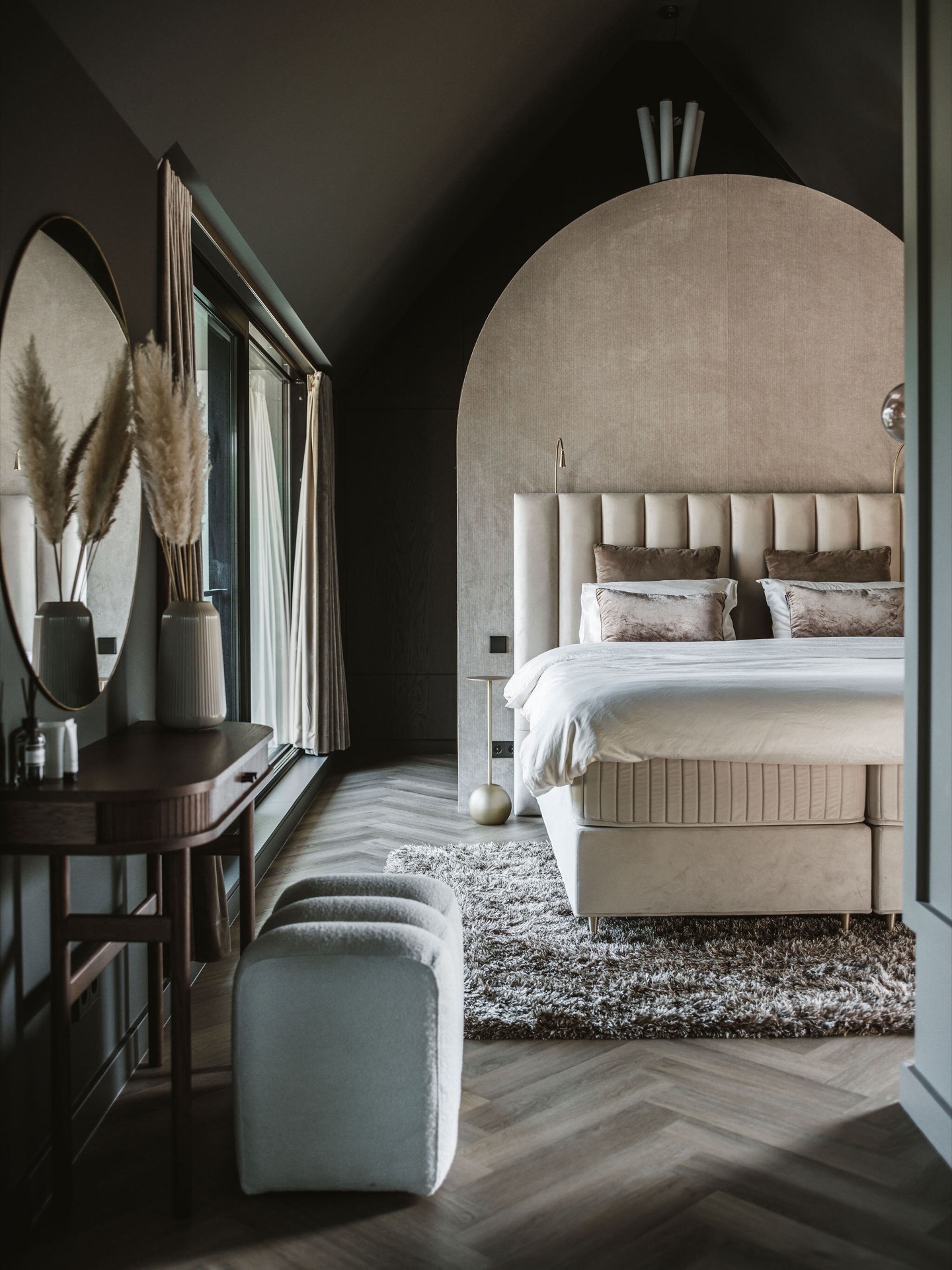
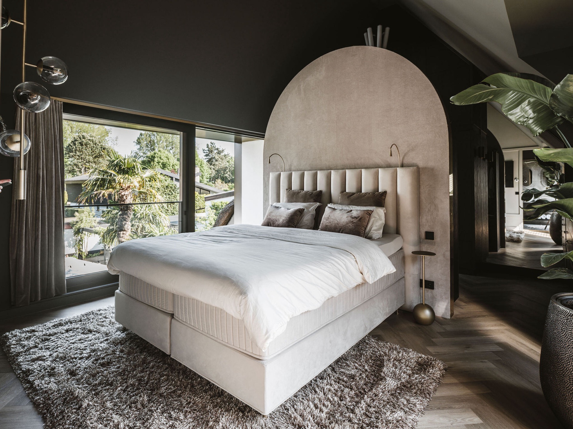
On the upper floor, the central cube returns as a built-in cabinet with a small display niche, almost like a private jewel box in the middle of the house. The main bedroom sits beyond it in a tall room that looks up to the ridge. Here the strongest gesture appears: a high, round bed wall finished with brass and ribbed wallpaper, with a lamp set above it like a crown. The first reaction was hesitation, but the form now defines the room with real certainty.
The bedroom uses deeper colors than the rooms below, and that shift matters. It separates the sleeping level from the open lower floor without relying on walls alone. From the bed, the eye reaches toward the palms in the garden, so the room keeps a link to the outside even while it stays enclosed. Two children’s bedrooms, two extra rooms, a separate bathroom, and a toilet complete the floor, but the main bedroom remains the clearest statement.
Marble-look bathroom surfaces and rounded openings
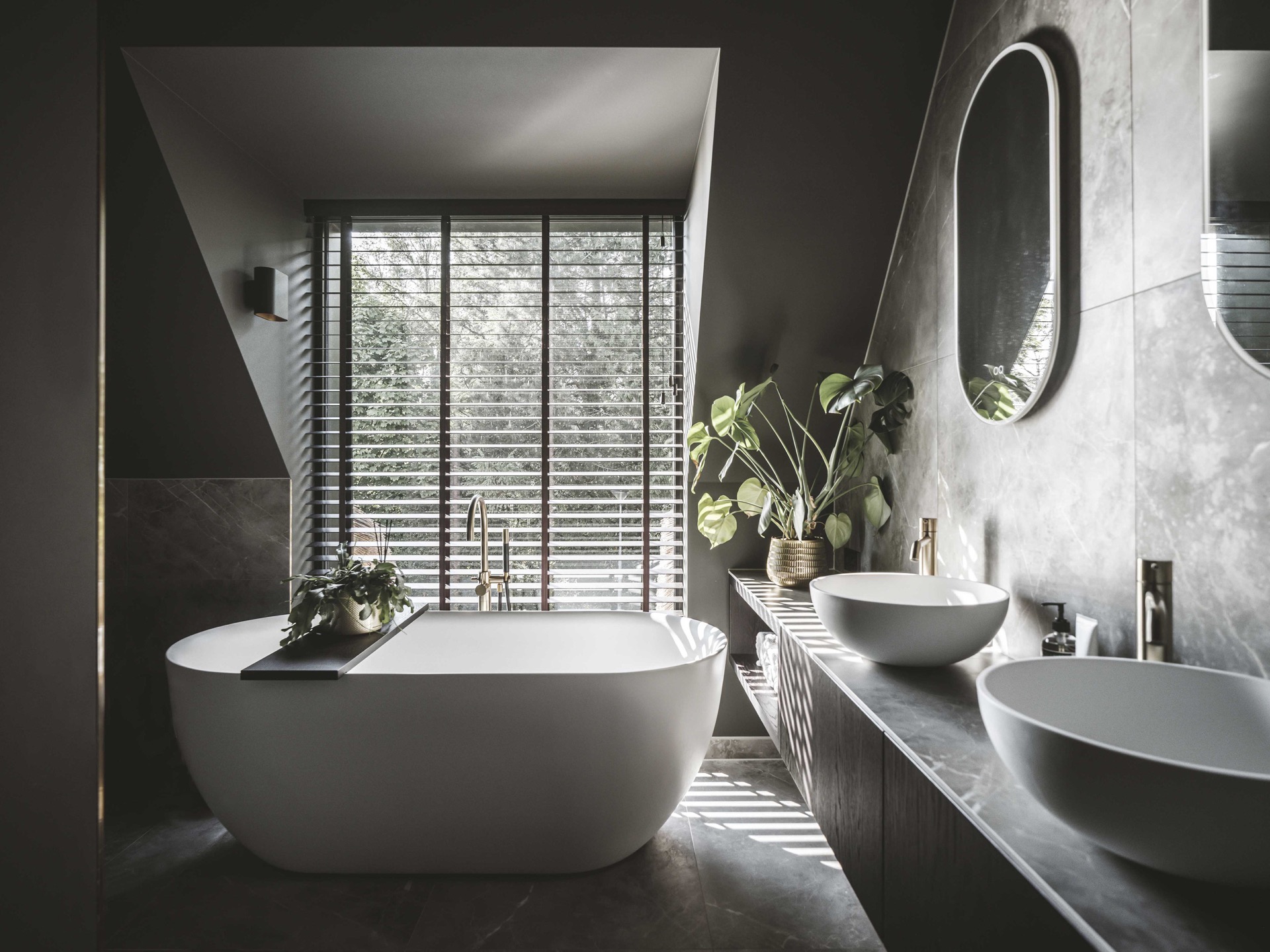
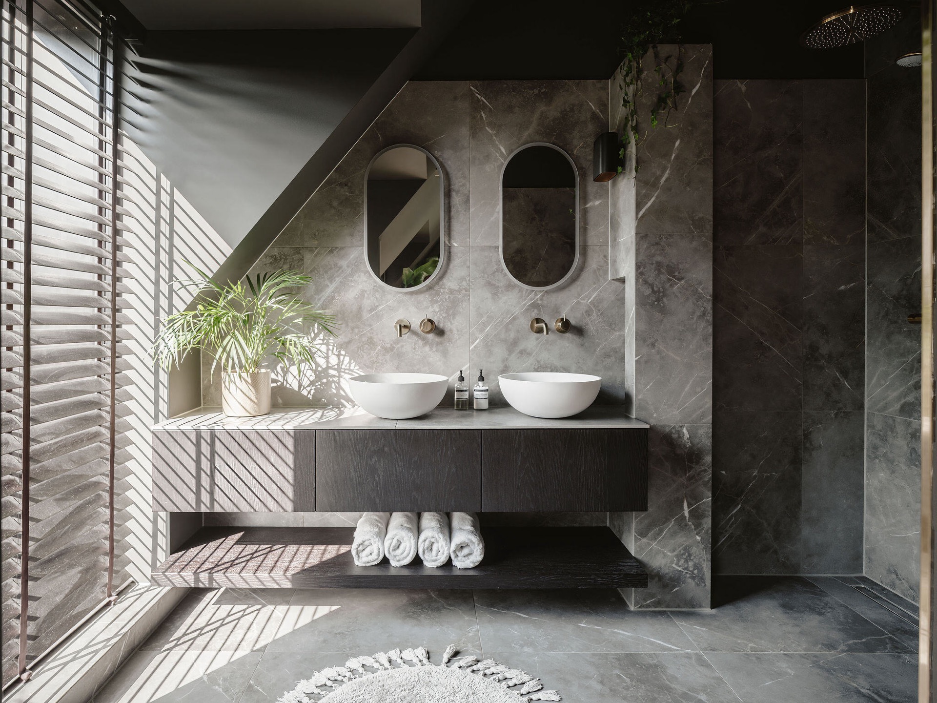
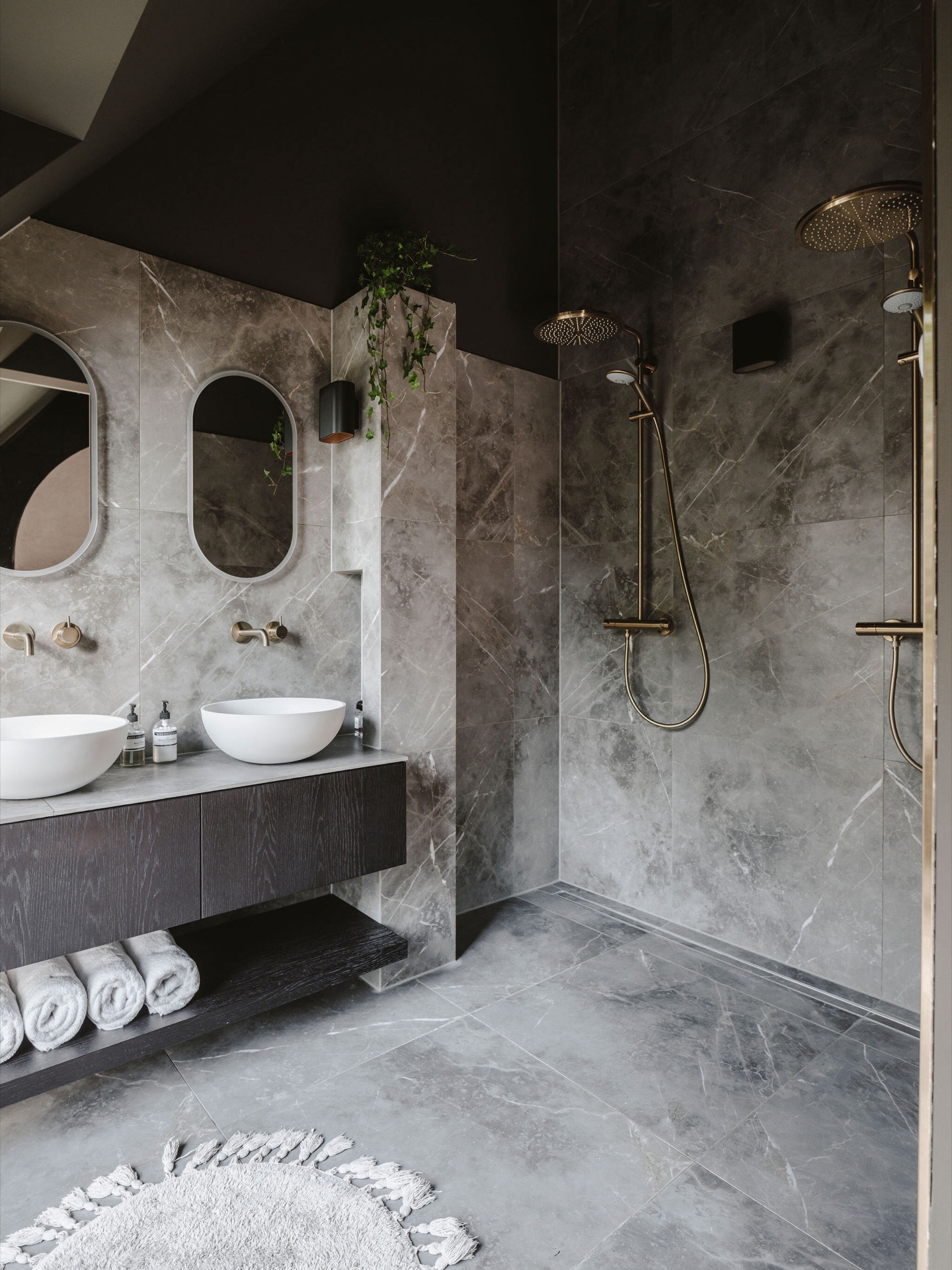
The bathrooms continue the darker, more deliberate tone of the upper level. Marble-look tiles cover the walls, and rounded openings break up the plane with niches for storage and display. In the bathroom image, two round basins sit on one continuous console, which gives the room a calm horizontal line against all the curves. A walk-in shower with a rain shower head keeps the layout open, and the glass lets the tile surfaces remain visible across the room.
The bathroom design does not rely on excess fittings. Instead, the material rhythm does the work: stone-look surfaces, rounded cut-outs, and a restrained palette that supports the brass, wood, and dark finishes used elsewhere in the house. It is the same interior language, just reduced in scale. That consistency is what makes the whole home read as one luxury interior rather than a collection of separate rooms.
Text by Esther Sessink
Project photography: Peter Baas
Suppliers and materials mentioned: B.R.O; Koen Timmer Interieur; Delta Light; Maretti; Breed Interieur Hugowaard; Erkamp Projectservice BV.
Want to see more of Jeroen de Nijs? View the page of Jeroen de Nijs for even more great projects and company information.



NEW 2026 Jubileum Edition The Best Interior Designers Benelux
Order Now €125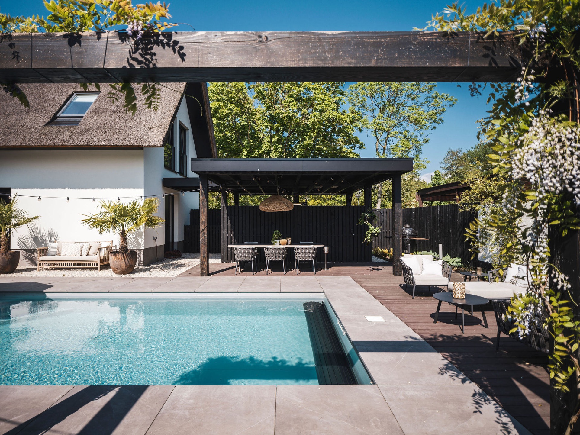
NEW 2026 Jubileum Edition The Best Interior Designers Benelux
Order Now €125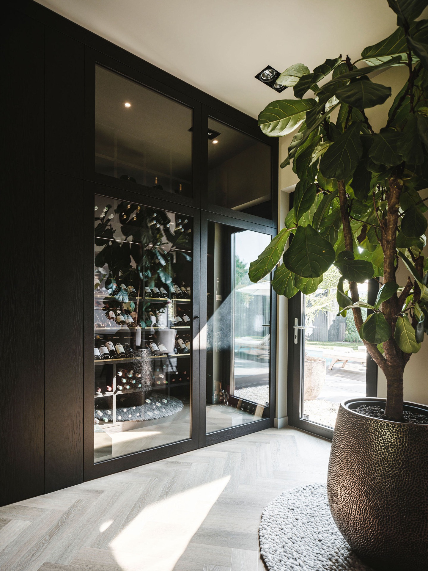
NEW 2026 Jubileum Edition The Best Interior Designers Benelux
Order Now €125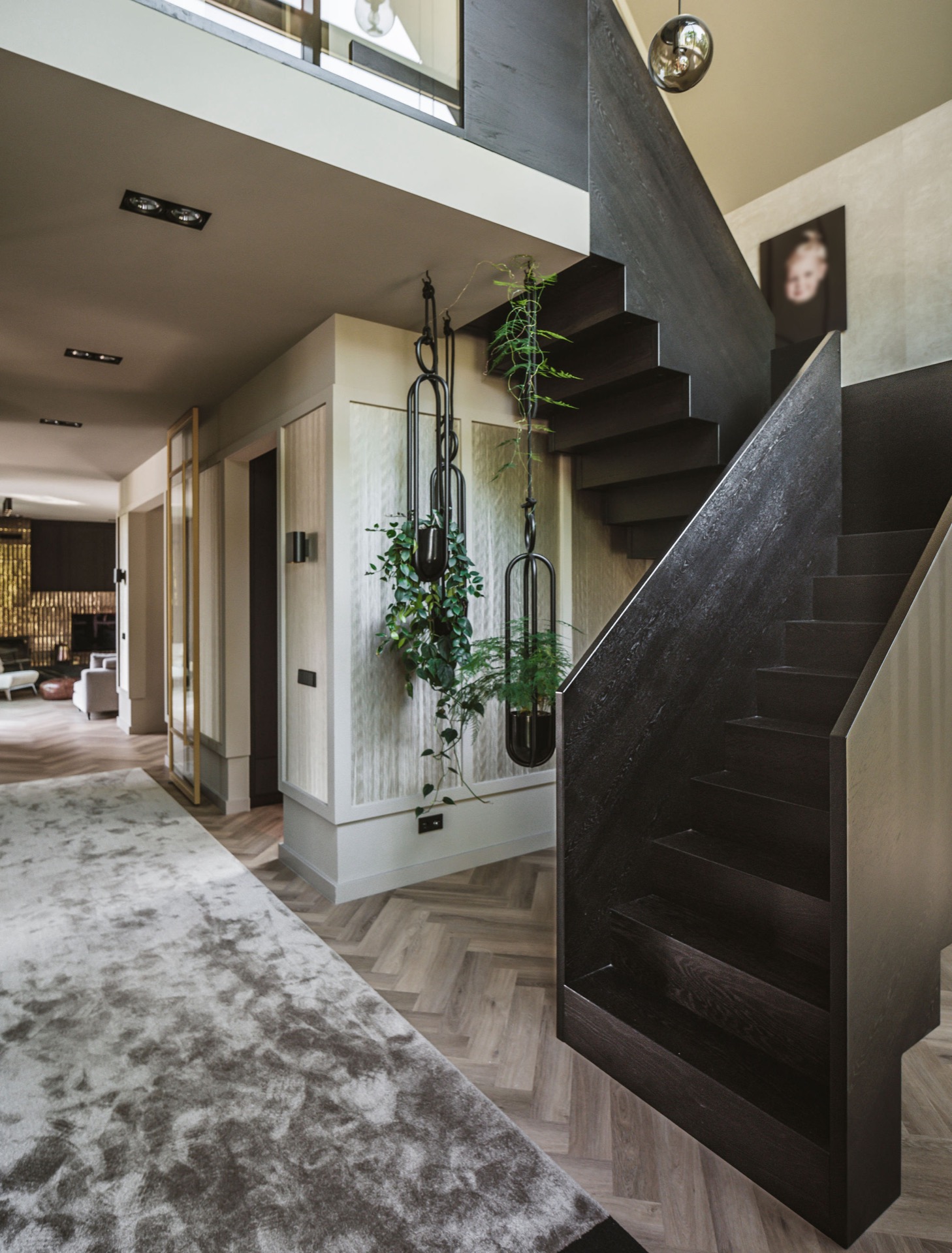
NEW 2026 Jubileum Edition The Best Interior Designers Benelux
Order Now €125