Family home with hotel-style interior
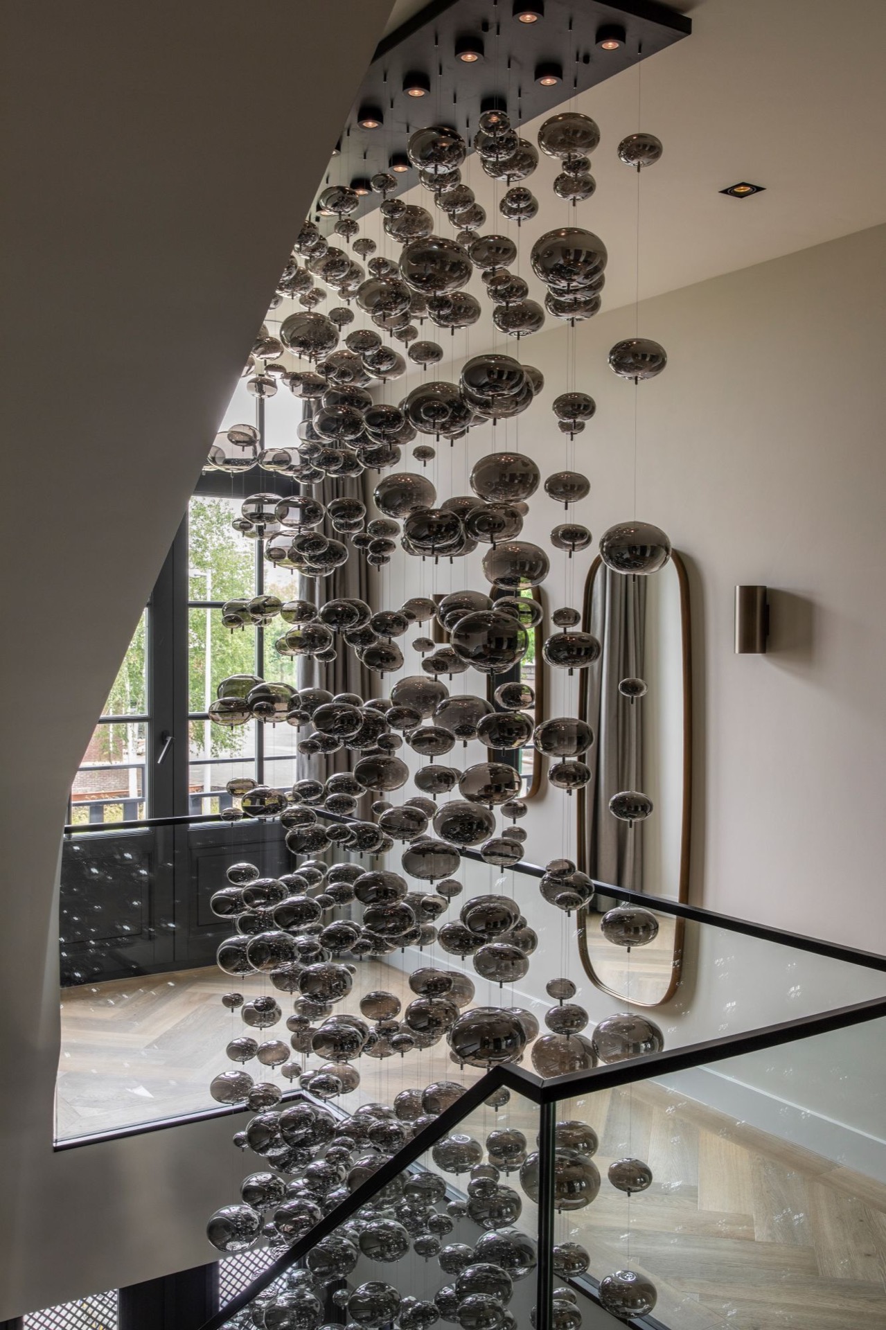
A marble-look floor sets the tone before the room has even finished opening up. Light grey upholstery, dark window shutters, and soft curtains sit against one another without fuss, while the ceiling pulls the eye through with downlights and glass bubble pendant lights. The result is a hotel style interior that still reads as a family home interior: lived in, but measured in every line and surface.
Living areas shaped by light and texture
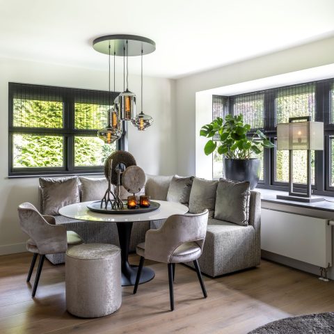
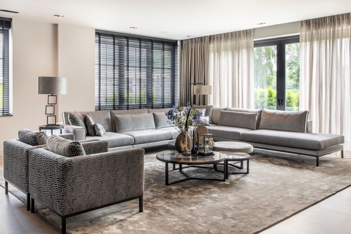
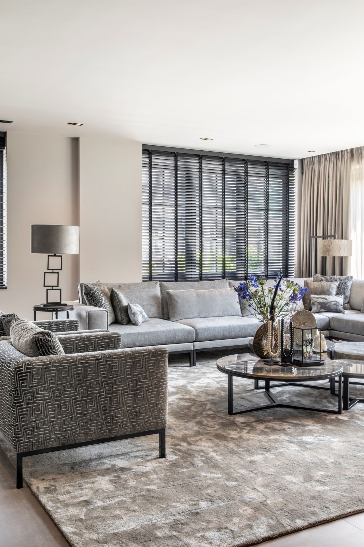
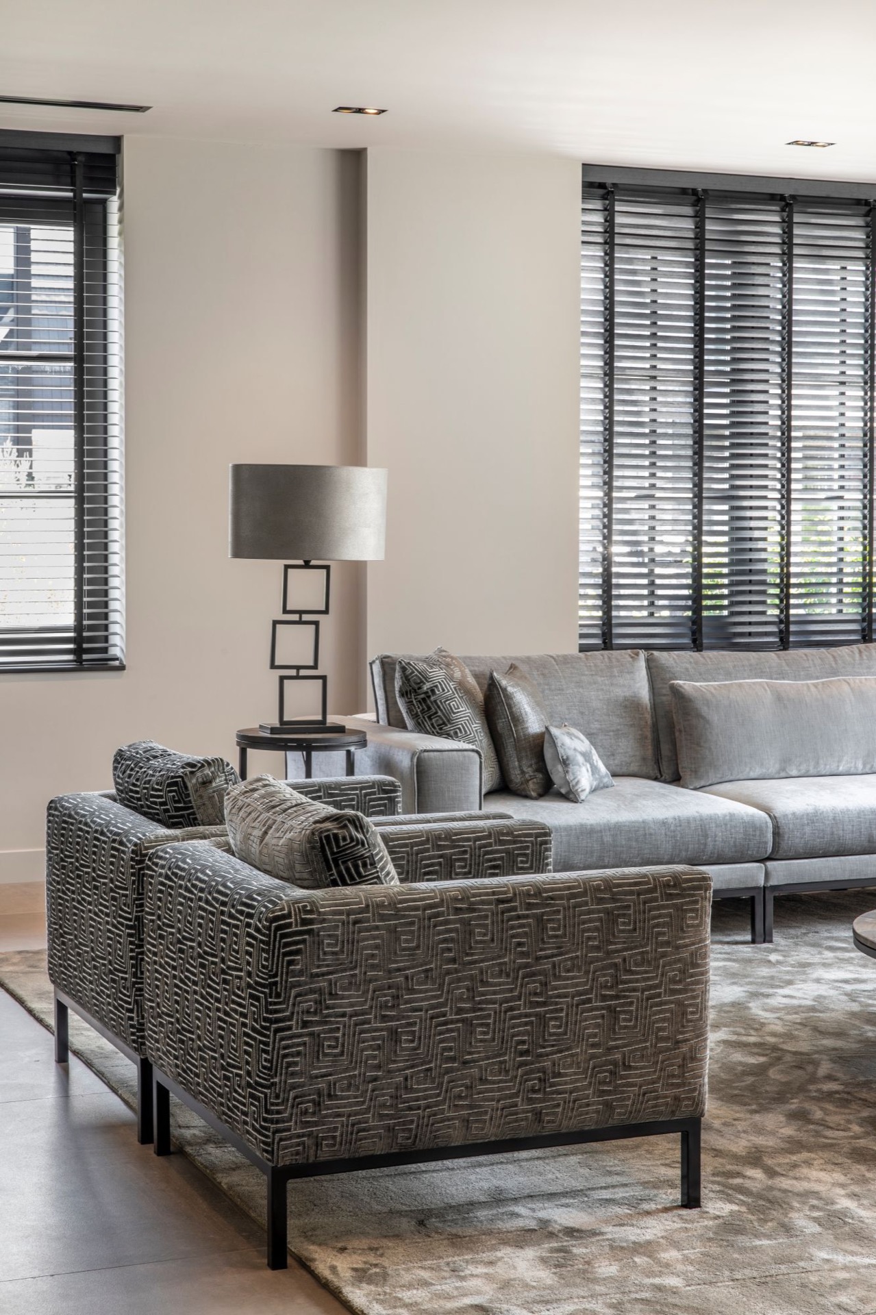
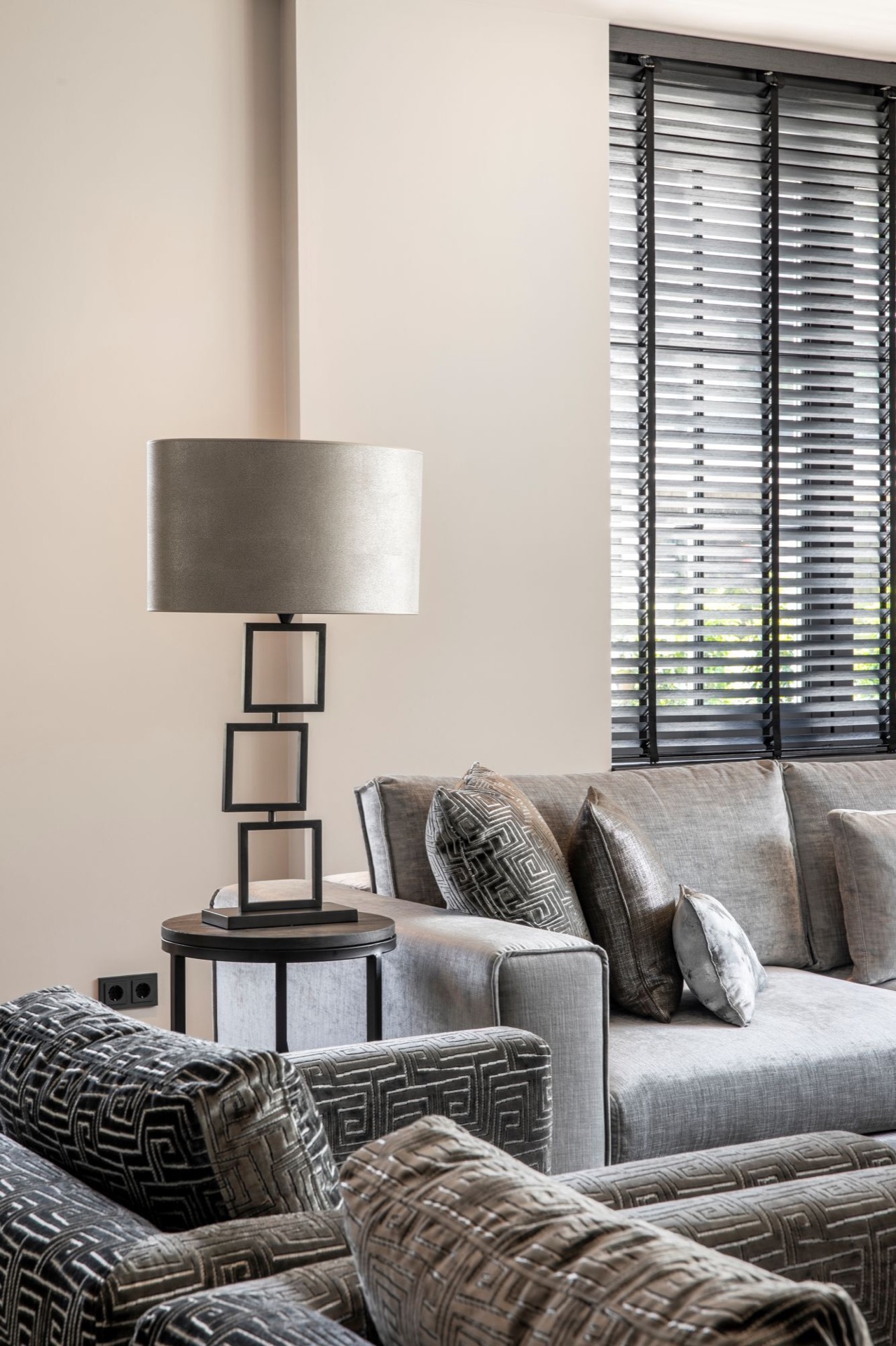
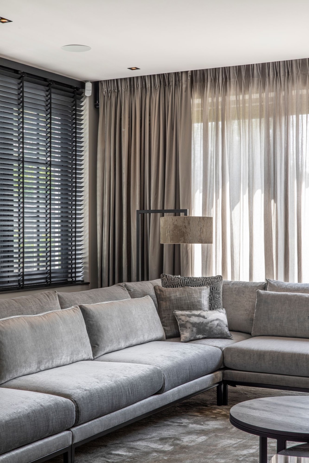
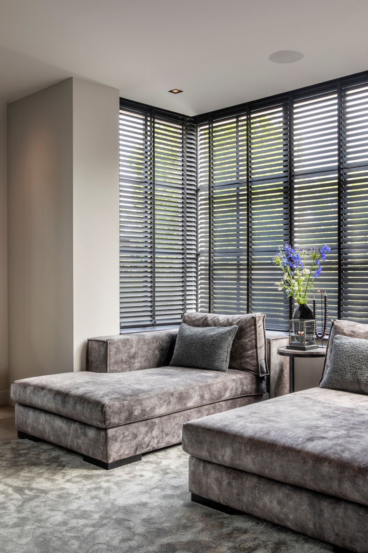
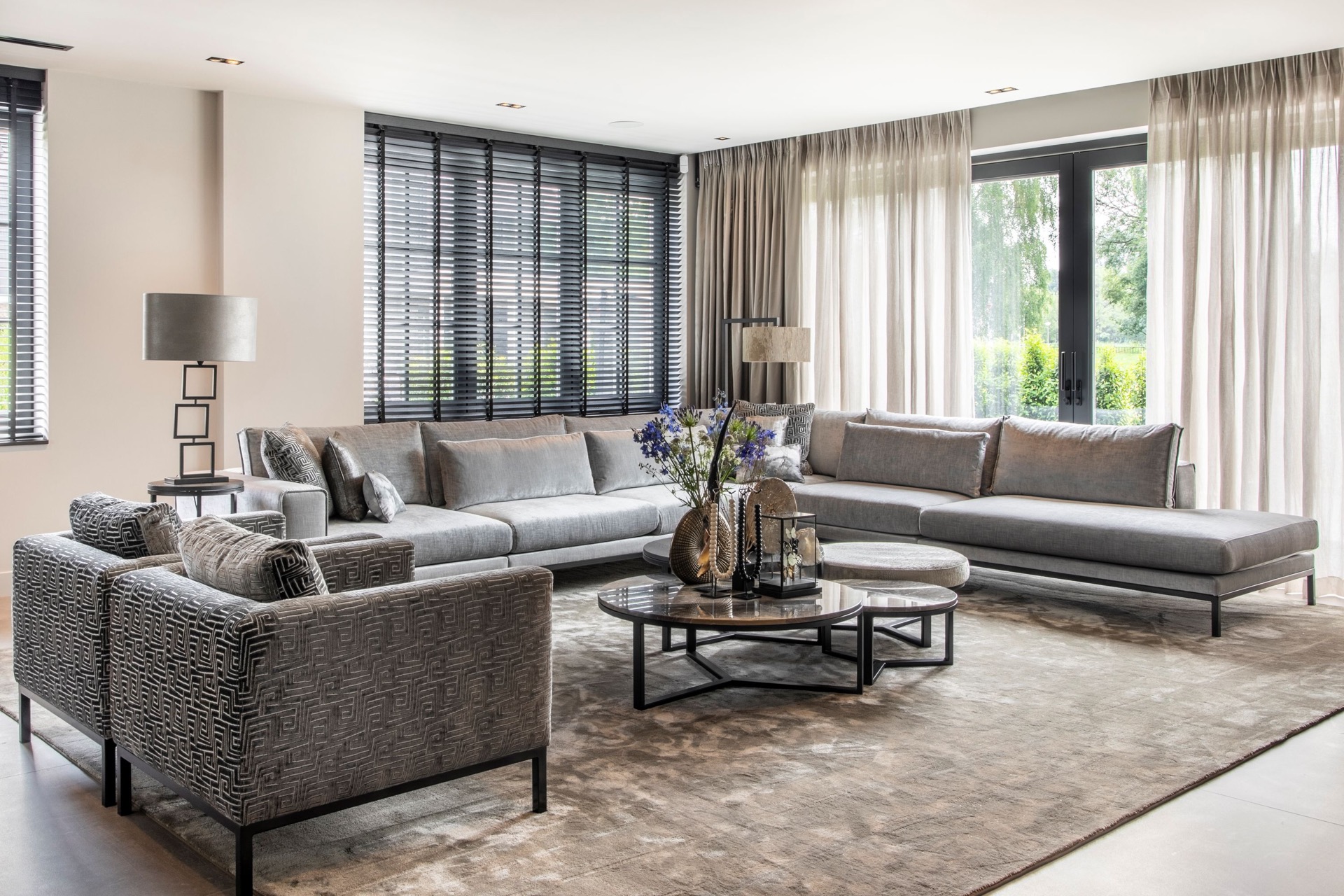
The seating area leans on restraint. A large sofa in grey fabric holds the space, with cushions breaking up the surface in subtle pattern and tone. Beside it, the living room shutters sharpen the window wall and keep the view controlled, so the daylight arrives in strips rather than a single wash. That shift gives the room a steady rhythm. The layered lighting plan follows the same logic, with ceiling spots doing the practical work and the pendants adding a more visible note overhead.
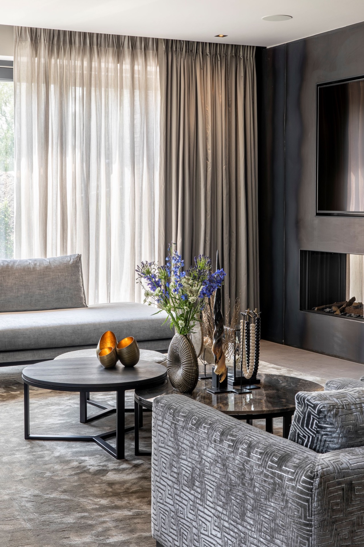
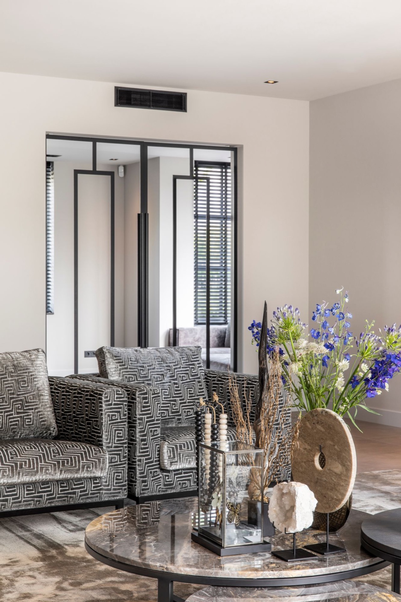
What stands out is the way the furniture sits low against the room’s darker edges. Rounded coffee tables and a pale rug soften the geometry of the marble-look floor, while a dark wall element with curved corners pulls the eye away from the straight run of the window. Nothing feels overworked. The materials do the speaking: textile, glass, stone effect, and paint laid out in clear contrast.
A hotel style interior that still feels domestic
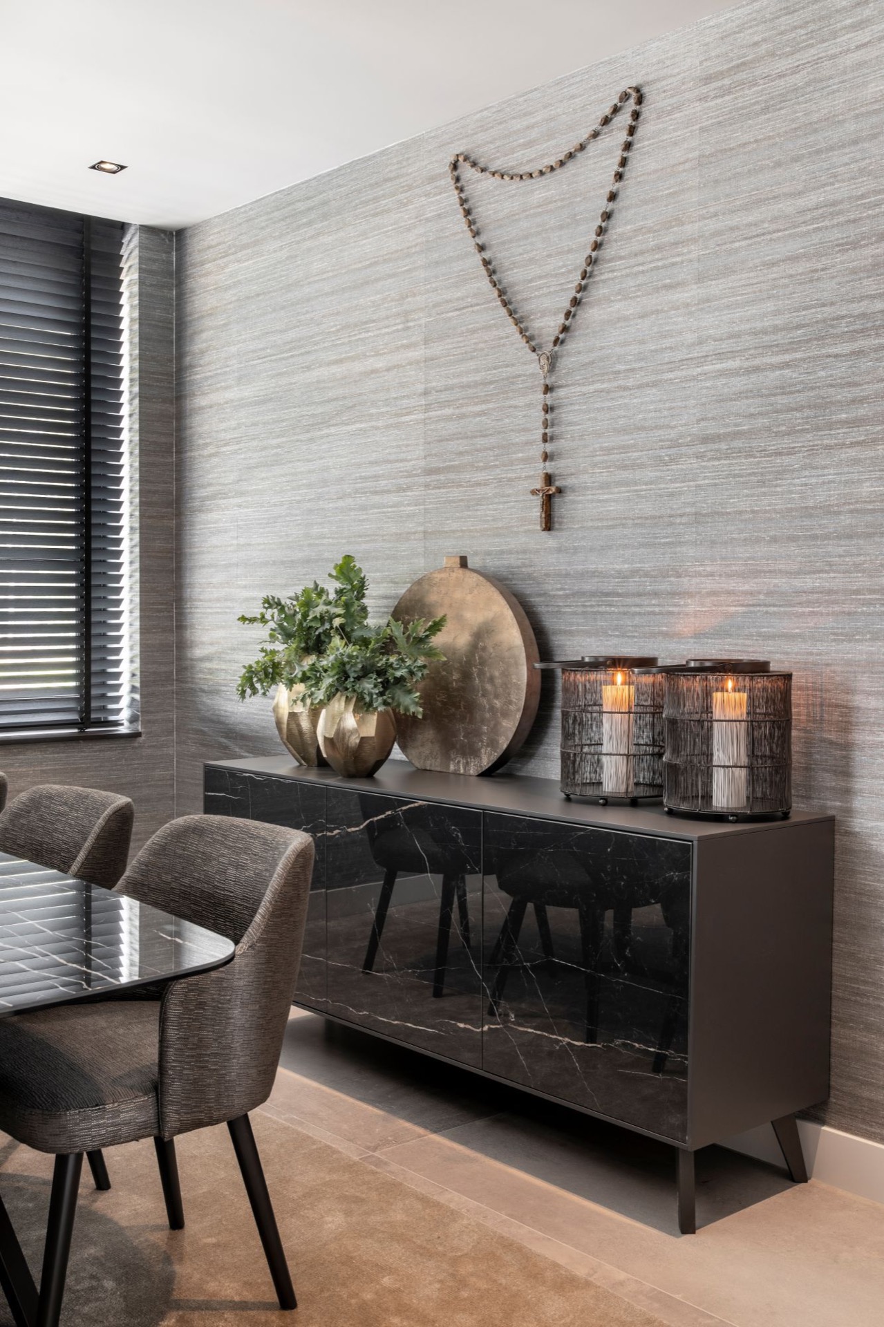
This hotel style interior avoids the sterile look that sometimes comes with polished finishes. The room holds enough softness for everyday use, but the surfaces still carry a certain discipline. Long curtains in cream and taupe fall beside the shutters, giving the windows two layers to work with. That combination is visible in several spaces, and it gives the home a quieter edge when the daylight is strong. The room does not rely on ornament. It relies on proportion, texture, and the way each finish meets the next.
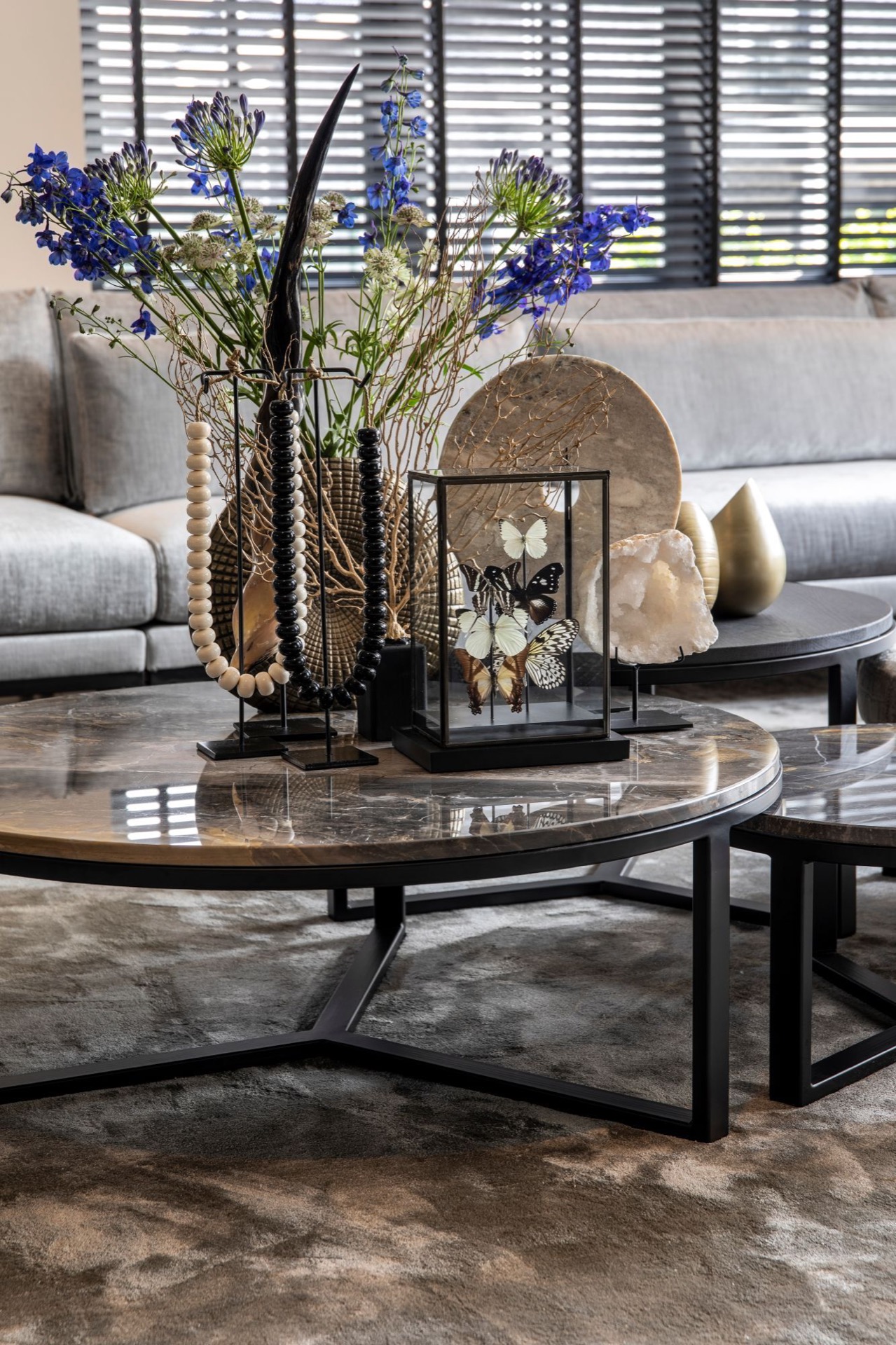
Seen from across the living space, the eye keeps moving between the bright floor, the grey seating, and the dark joinery details. Those transitions matter. They stop the interior from flattening into one tone. Instead, the home reads as a sequence of surfaces: matt fabric, reflective glass, painted panels, and the slightly patterned stone-look floor underfoot. The atmosphere comes from that sequence rather than from any single statement piece.
Custom joinery with a quiet profile
Bespoke joinery forms the backbone of the fitted elements, even where it stays discreet. The project was developed with full interior design in mind, so material choices and fine details in furniture, lighting, and styling could be aligned from the start. That approach is visible in the built-in elements and in the way the room edges are resolved. Panels meet corners cleanly, storage disappears into the background, and the overall line stays calm even when the room is full of objects and seating.
The custom work also supports the sense of order around the windows and seating zones. Instead of competing with the soft upholstery, the joinery gives the room a fixed frame. It leaves room for the layered lighting and for the more tactile elements, such as cushions, curtains, and the glass pendants. In a family home interior, that kind of structure matters because it keeps everyday use from spilling visually into every corner.
Layered lighting across dining and lounge spaces
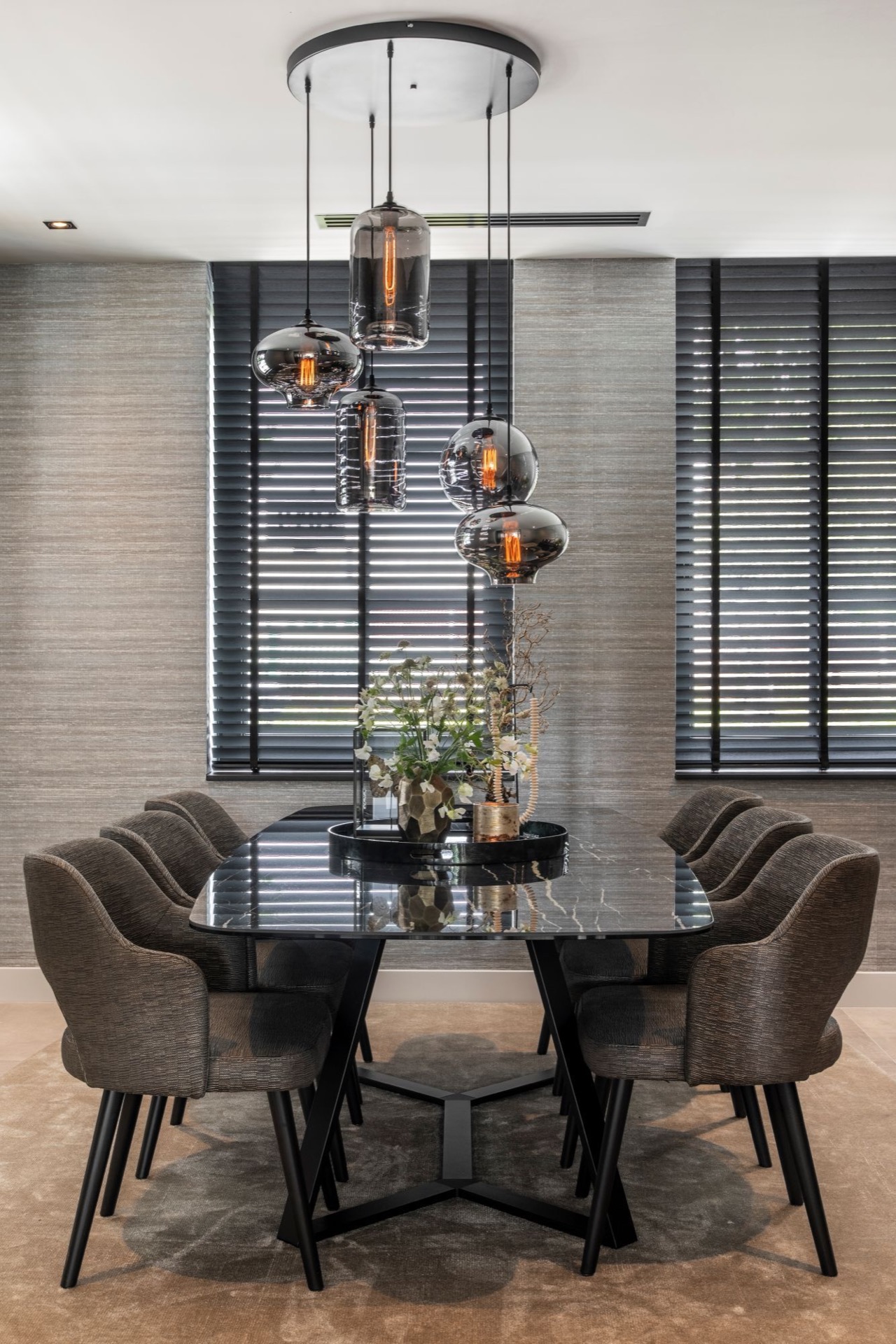
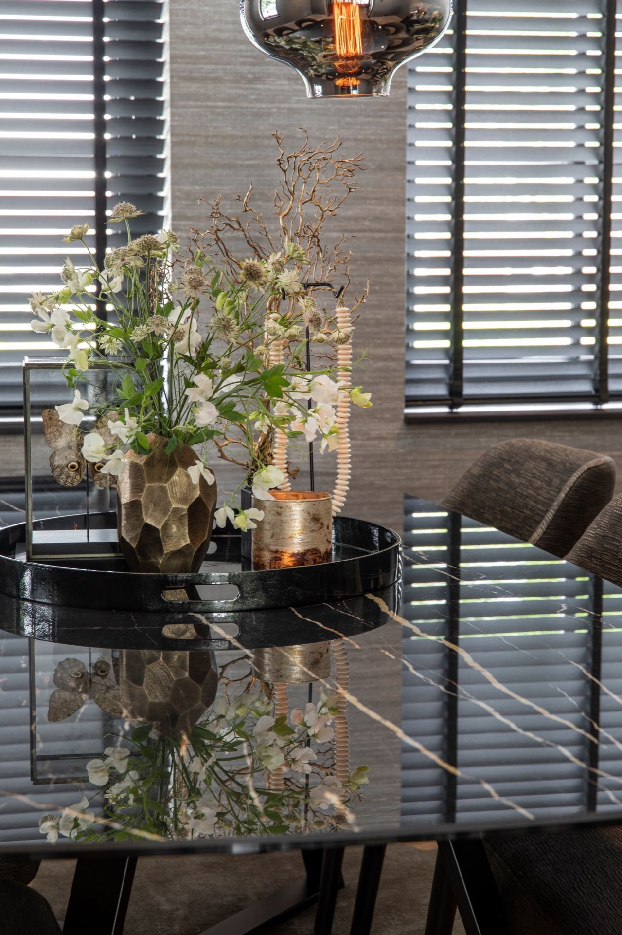
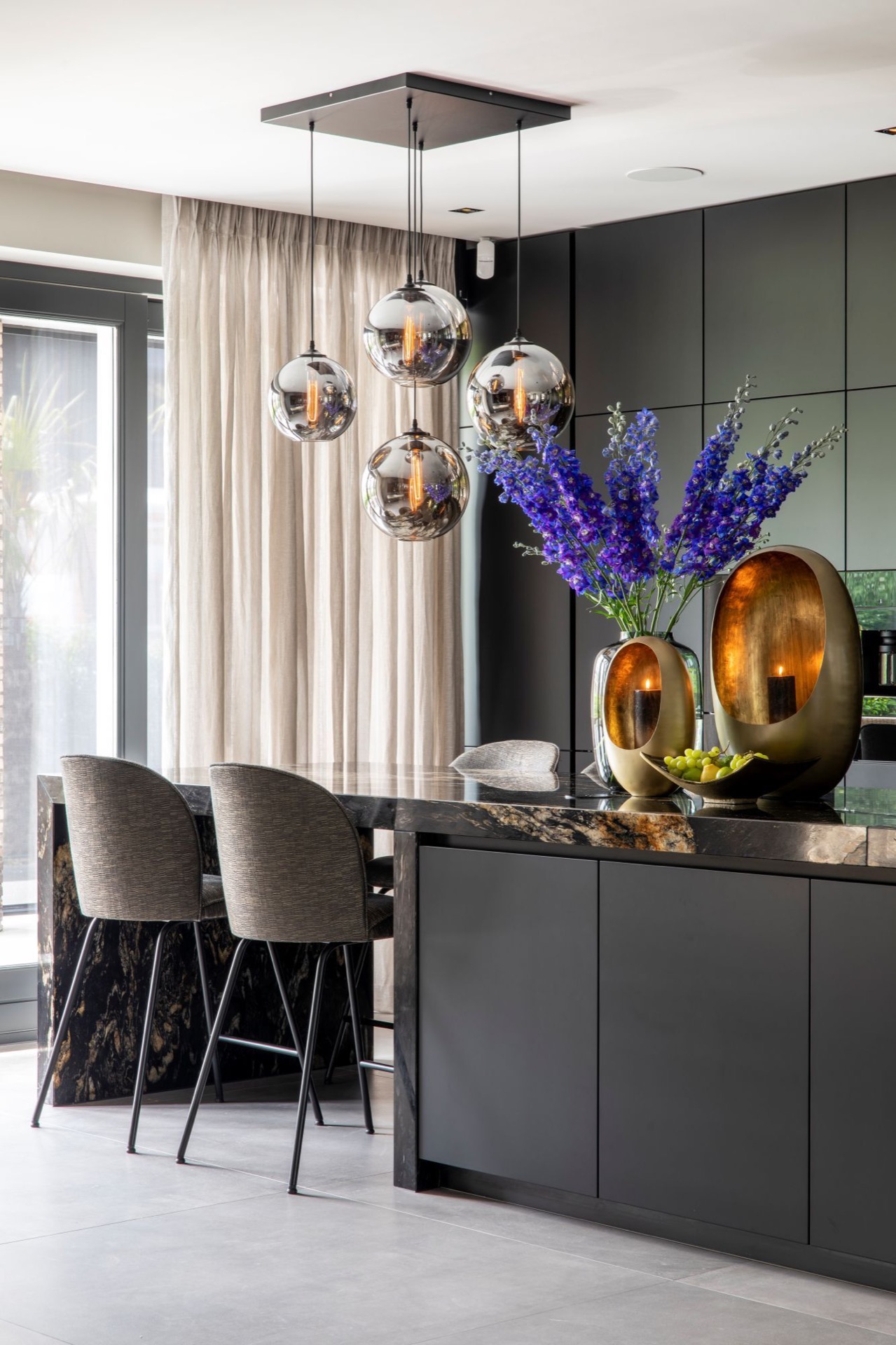
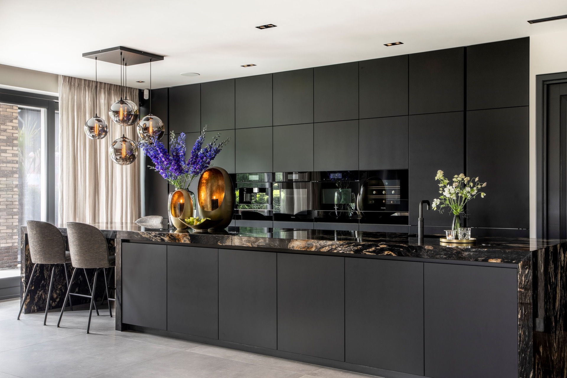
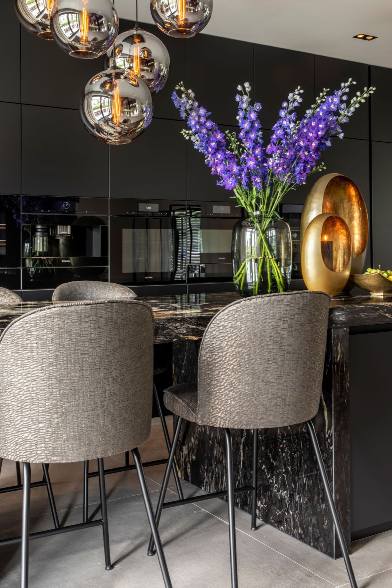
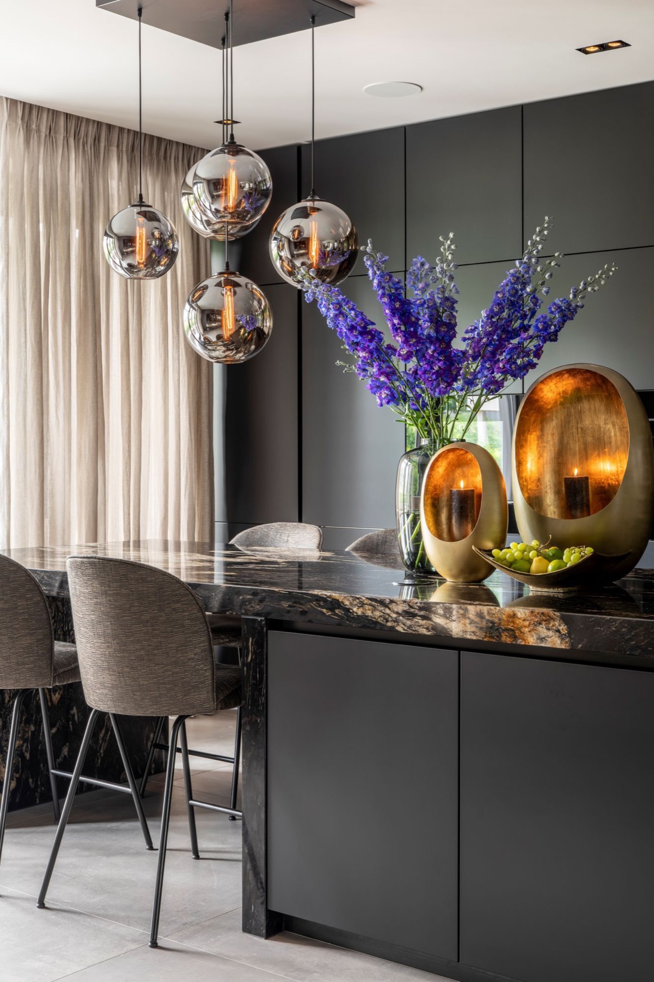
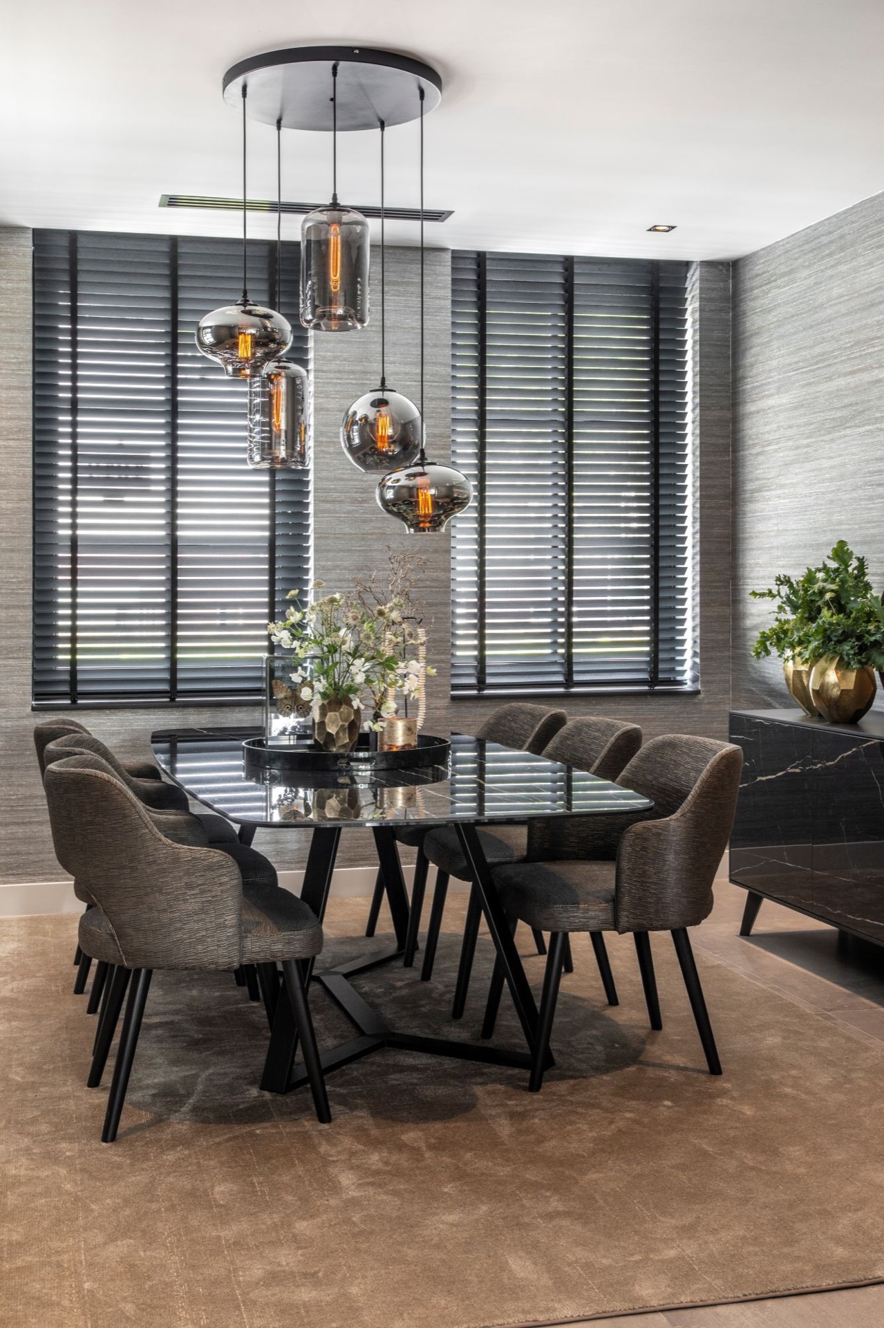
Lighting changes the mood from one zone to the next. In the dining area, multiple glass bubble pendant lights hang low enough to define the table without closing the space in. Their rounded forms catch the eye, especially against the strong horizontal lines of the shutters behind them. Above the kitchen island and work surfaces, a similar pendant rhythm repeats, but the context shifts: here the light lands on darker cabinetry and the stone-look kitchen countertop, making the working plane read clearly.
The ceiling spots do their part in the background. They spread light evenly across the room and keep the larger surfaces legible at night, while the pendants create focal points that break up the ceiling plane. That contrast between diffuse light and concentrated light gives the house its layered lighting character. It is a simple idea, but in a room with marble-look flooring and reflective glass, it changes how each material behaves.
Kitchen surfaces with a darker edge
The kitchen brings in a different register. Dark cabinet fronts hold the space together, and the stone-look kitchen countertop adds a firmer horizontal line above them. The kitchen surface is only briefly described in the source material, but it matters because it gives the room a grounded centre. The finish reads as mineral rather than glossy, which suits the rest of the interior and keeps the kitchen linked to the marble-look floor elsewhere in the home.
Above the work zone, the glass pendants return and bring the same soft reflection seen in the living and dining areas. That repetition gives the home a clear visual language. Even from one room to the next, the material palette stays consistent: grey textiles, dark joinery, pale curtains, and stone-like surfaces. The kitchen does not break from that language. It extends it.
Details that hold the rooms together
One of the strongest parts of the project is how little it relies on obvious decoration. Instead, the room is built from small decisions that register when you move through it: the angle of a shutter, the rounded edge of a table, the shift from curtain to panel, the change from matte fabric to glass. These details do the work of making the interior feel complete without forcing attention.
That is also where the luxury interior aspect becomes visible. Not in excess, but in control of the visible parts of the room. The furniture sits with room around it. The lighting is layered but not crowded. The joinery is present without taking over. Even the marble-look floor is busy only when you look closely; from a distance, it acts as a pale base that carries the whole layout. The family home interior therefore stays easy to read, while still carrying the more polished note the homeowners wanted.
The final impression is of a house designed around everyday use, but edited with the eye of a hotel. The shutters, curtains, pendants, and custom-built elements all work together across the rooms, yet each piece remains visible on its own terms. That is what gives the hotel style interior its strength here: it never becomes theatrical. It stays practical in plan, precise in detail, and calm in the way it lets light move over stone, glass, and fabric.
Want to see more of Interiors DMF? View the page of Interiors DMF for even more great projects and company information.


NEW 2026 Jubileum Edition The Best Interior Designers Benelux
Order Now €125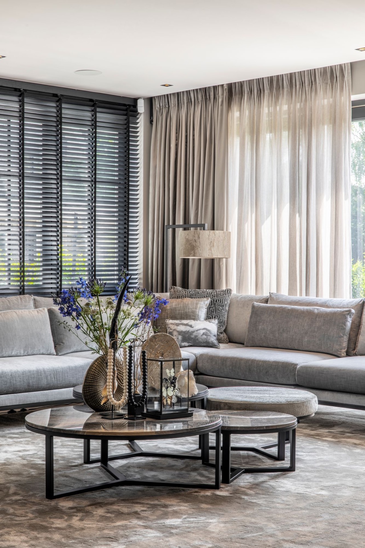
NEW 2026 Jubileum Edition The Best Interior Designers Benelux
Order Now €125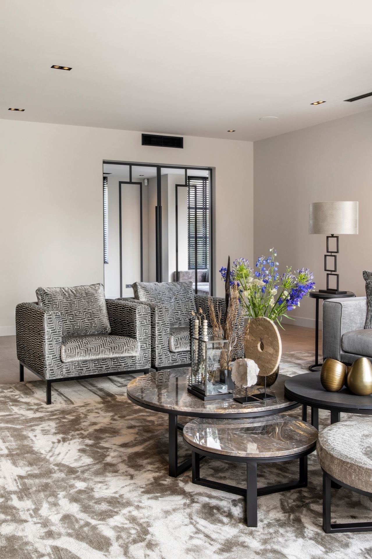
NEW 2026 Jubileum Edition The Best Interior Designers Benelux
Order Now €125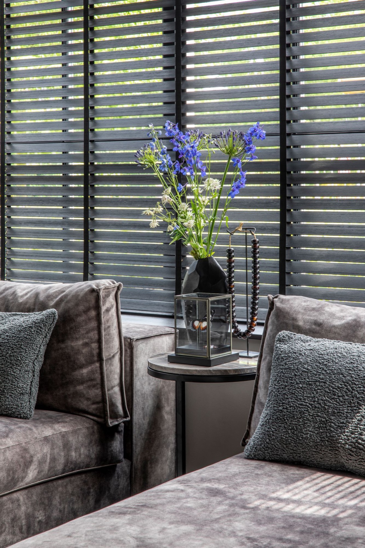
NEW 2026 Jubileum Edition The Best Interior Designers Benelux
Order Now €125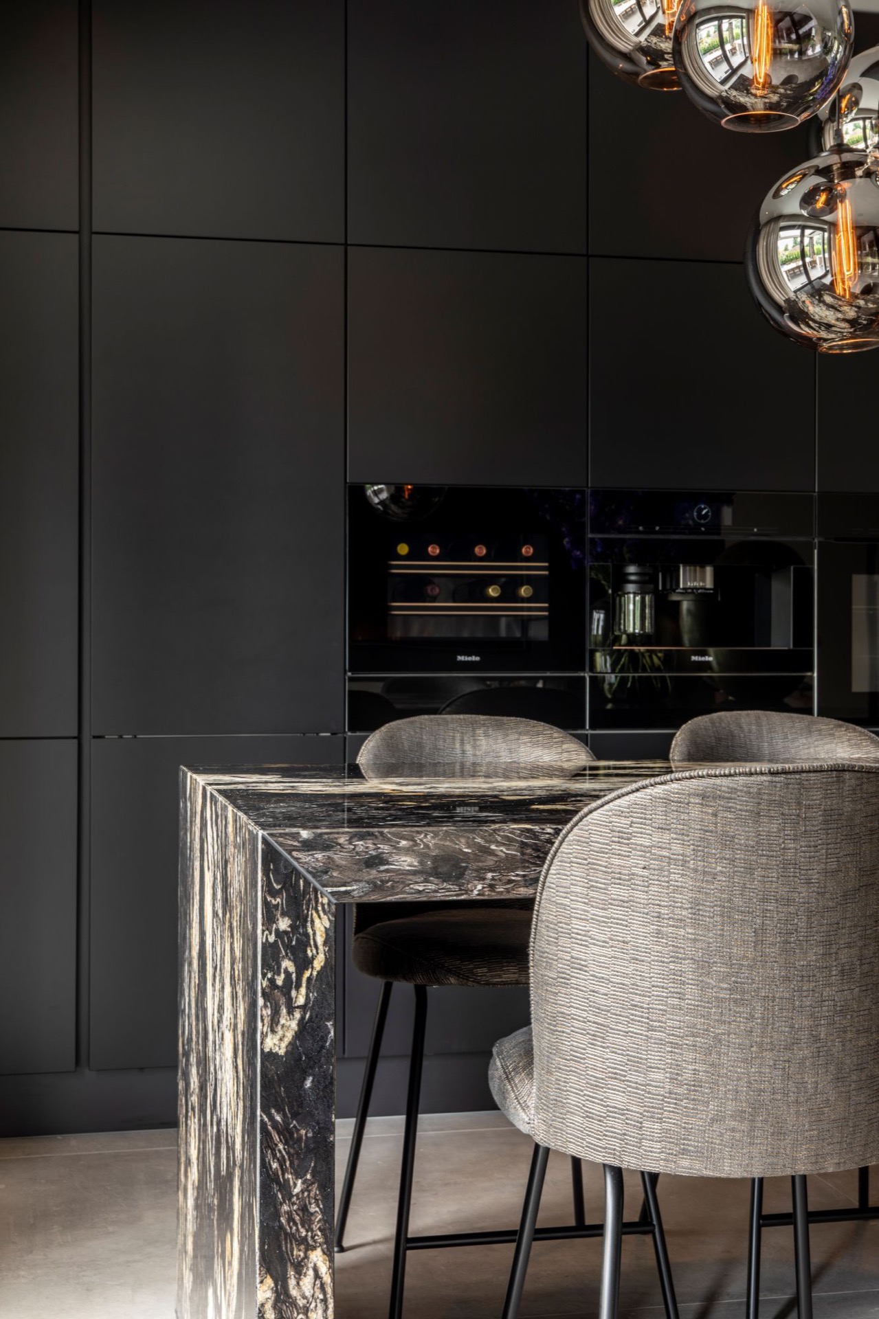
NEW 2026 Jubileum Edition The Best Interior Designers Benelux
Order Now €125