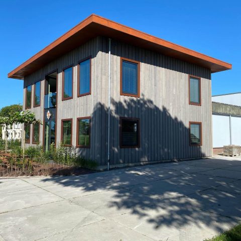
Industrial restaurant interior with central kitchen
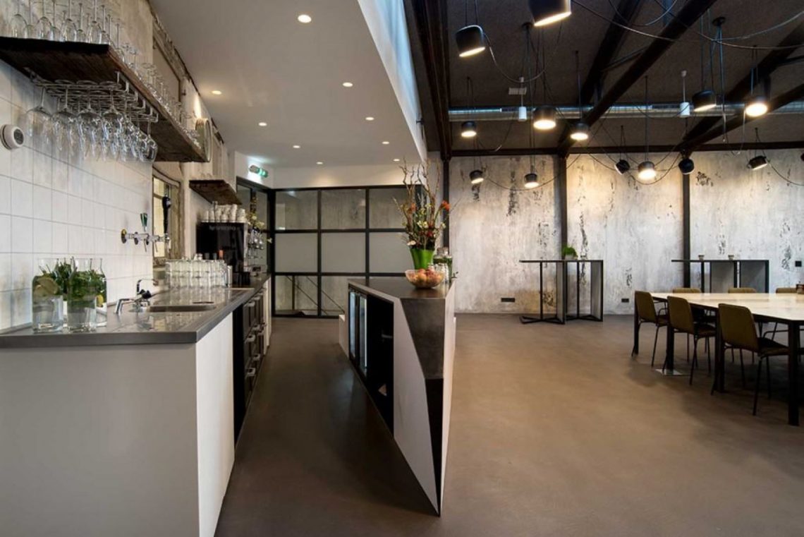
The central kitchen sits in clear view, framed by glass and surrounded by a floor plan that keeps changing from room to room. What was once a garage now reads as an industrial restaurant interior with several connected spaces, each holding its own pace. Some zones are set up for private dining, others for meetings or larger gatherings, and the old structure is left visible rather than hidden. Open ceiling lines, rough wall texture, and steel edges keep the building’s former use present in every direction.
Rooms that change character without losing the building’s edge
The project is spread across three linked buildings, which gives the interior a sequence of smaller halls instead of one fixed hall. That structure helps the plan shift between a private dining room, an industrial meeting room, and event areas without forcing the rooms into the same mood. One space opens onto long tables and fixed seating, while another holds a more informal lounge corner with lower furniture. The variation comes from layout, light, and the way each surface is left visible.
Raw walls and an open ceiling set the tone from the first step inside. Pipes, exposed services, and patched surfaces stay in view, so the building still reads as a working shell rather than a polished blank interior. That decision gives the rooms a directness that fits the use: diners, meetings, and events all sit inside a setting that shows its age. The walls carry texture instead of finish, and the ceiling keeps its full height and technical lines.
A glass kitchen centerpiece at the middle of the plan
The kitchen was placed in the center of the building and treated as part of the room experience. Glass makes it visible from surrounding spaces, so the work zone becomes a clear focal point rather than a hidden back-of-house area. From the dining tables and the adjacent circulation paths, the kitchen stays present through reflections, frames, and long sightlines. That central position also helps connect the different rooms, pulling the industrial restaurant interior into a single readable arrangement.
Near the kitchen, the finishes stay restrained and practical. Dark framing, clear glass, and simple surfaces keep attention on the movement of people and the layout of the room. A service counter and bar edge sit close by, and their material language follows the same direct approach. The result is a space where cooking, serving, and gathering are all visible at once, with the kitchen acting as the clearest anchor in the building.
Custom furniture made for shifting uses
The furniture was designed to move with the room rather than sit still in it. Meeting tables can be shifted, linked together, or tilted into standing tables, which gives the industrial meeting room a flexible setup for different formats. Chairs around those tables were made in the same upholstery as the seating elsewhere, including on the upper floor, so the rooms share one material thread without becoming repetitive. The pieces are tailored to the building’s proportions and to the kind of use the interior asks for.
In the front part of the project, a steel and glass bar is built from separate elements and can be moved as needed. It works as a bar, but also as a spatial divider that breaks up the large volume. Nearby, green-and-white benches and a long lounge object extend the seating into a more relaxed zone. The pieces are not decorative add-ons; they shape the route through the room and define where people gather, pause, or turn toward the kitchen and dining tables.
Materials that keep the past visible
Textured walls, dark metal, glass, and upholstery in a strong woven fabric give the interior a clear material contrast. Some surfaces feel worn, others newly made, and the project lets that difference stay visible. The old walls are not cleaned into neutrality; they still show age, stains, and the marks of previous use. Against them, the custom furniture introduces crisp lines and a tighter finish. That mix is what gives the industrial restaurant interior its particular tone: not decorative nostalgia, but a building that shows how it has changed.
There are also graphic wall paintings that refer to the garage years, along with details that echo the original use of the building. The work is not treated as a themed backdrop. Instead, it sits in the same frame as the dining tables, the glass partitions, and the fitted benches. Visible joints, metal trims, and the lines of the original ceiling tie the old structure to the newly built shed section. The room reads as layered, with the past still legible underneath the new plan.
Light, seating, and the break in the large volume
Lighting helps subdivide the space where walls do not. Pendant fixtures and other accent lights drop low over tables and bar areas, making the room feel more legible at night and drawing attention to the surface below them. Heavy curtains and darker corners slow down the long sightlines, while larger windows bring daylight into the main halls. In the lounge areas, the seating sits low and broad, so the eye moves from bench to wall to ceiling instead of stopping at a single object.
The lounge bar object, which doubles as a bench, interrupts the scale of the larger room without closing it off. It extends the bar and gives people a place to sit while still keeping the circulation open around it. That break in volume matters in a building this size. It creates smaller zones inside the industrial event venue, so a private dinner, a meeting, or a gathering can each occupy a different part of the same interior. The room stays open, but it no longer feels empty.
One of the strongest details is the way warm and colder materials sit next to each other without softening their differences. Wood in the overhead structure, steel in the bar and frames, glass at the kitchen, and the rough finish of the old walls all remain readable. Even the seating follows that logic, with green upholstery, simple legs, and enough weight to hold the room in place. The industrial restaurant interior does not rely on one gesture. It works through layers, through sightlines, and through the decision to let the building keep its rough edges.
That approach gives the project a clear use case as well as a strong visual identity. It can host private dining, meetings, and larger events, yet each room still feels tied to the same building history. The old garage structure, the visible kitchen, the custom furniture, and the steel and glass bar all work together through restraint rather than excess. What remains is a space that shows how adaptive reuse can keep an interior active, legible, and grounded in its own material record.
Want to see more of Jeroen van Zwetselaar? View the page of Jeroen van Zwetselaar for even more great projects and company information.



NEW 2026 Jubileum Edition The Best Interior Designers Benelux
Order Now €125


NEW 2026 Jubileum Edition The Best Interior Designers Benelux
Order Now €125


NEW 2026 Jubileum Edition The Best Interior Designers Benelux
Order Now €125


NEW 2026 Jubileum Edition The Best Interior Designers Benelux
Order Now €125