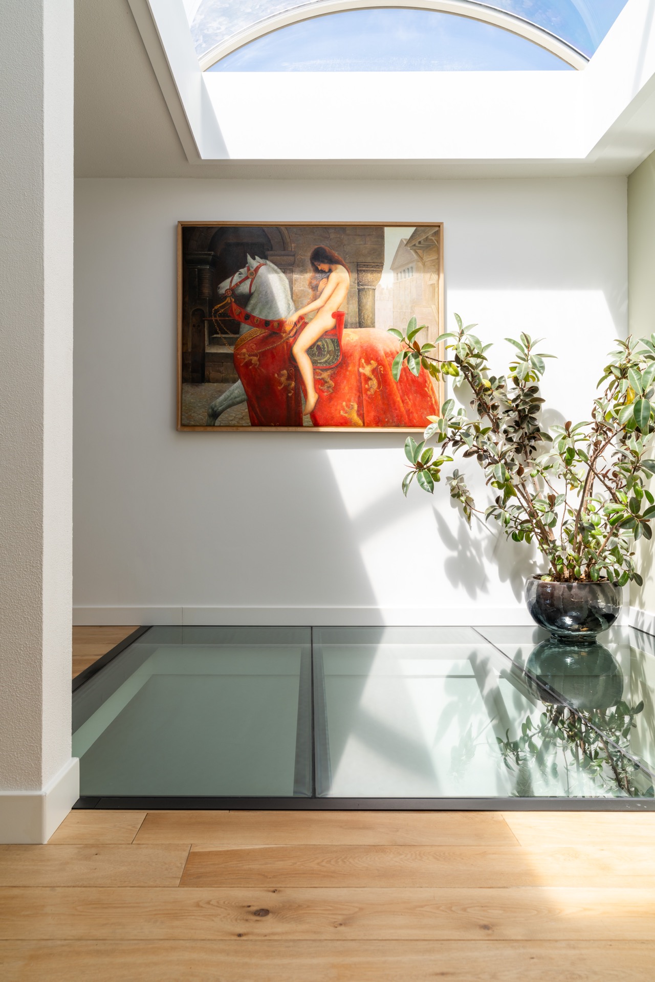
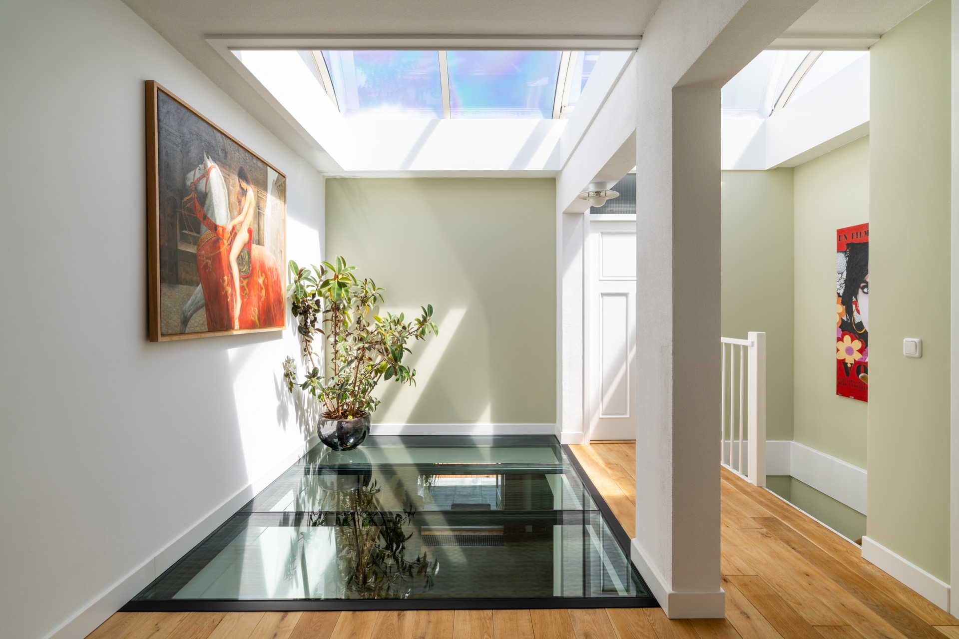
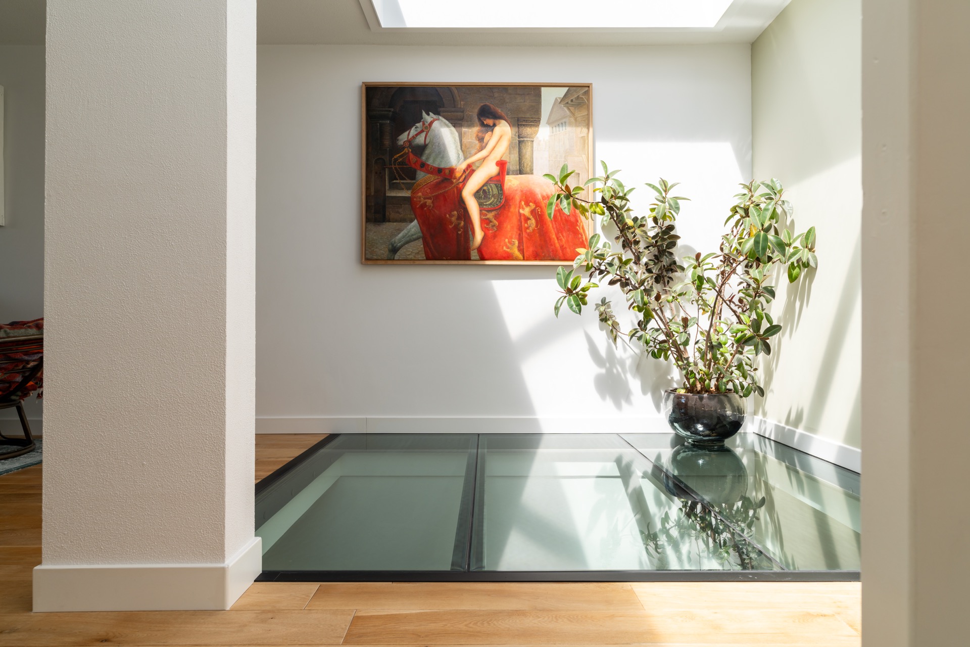
High-quality interior painting with refined wall finishing and precise window-edge details
Light walls set the tone immediately, but it is the edge work that holds the eye. In this interior painting project, the pale surfaces read as calm and even, while the dark window frames cut through the space with a clear graphic line. The result is less about decoration than about control: clean, smooth walls, careful transitions, and refined detailing where the room meets the window zone.
Interior painting that shapes the room
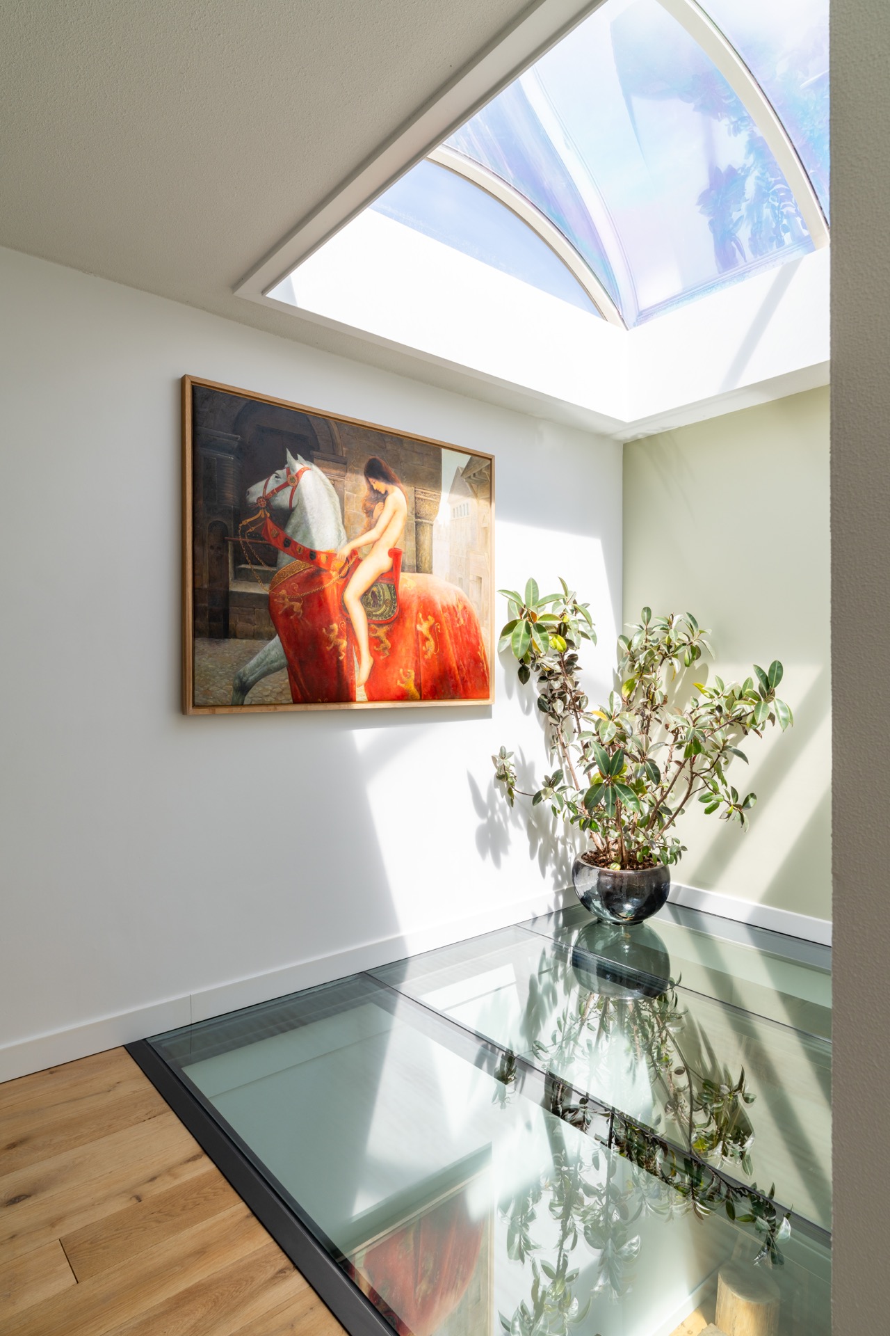
Interior painting here is treated as part of the room itself, not as a final layer added at the end. The source material describes a process that brings together atmosphere, personal character, and the practical reading of each space. That approach is visible in the way the wall surfaces carry a light, consistent colour, allowing the room proportions to stay open and legible. Instead of competing with the architecture, the paint finish supports it and makes the surfaces easier to read.
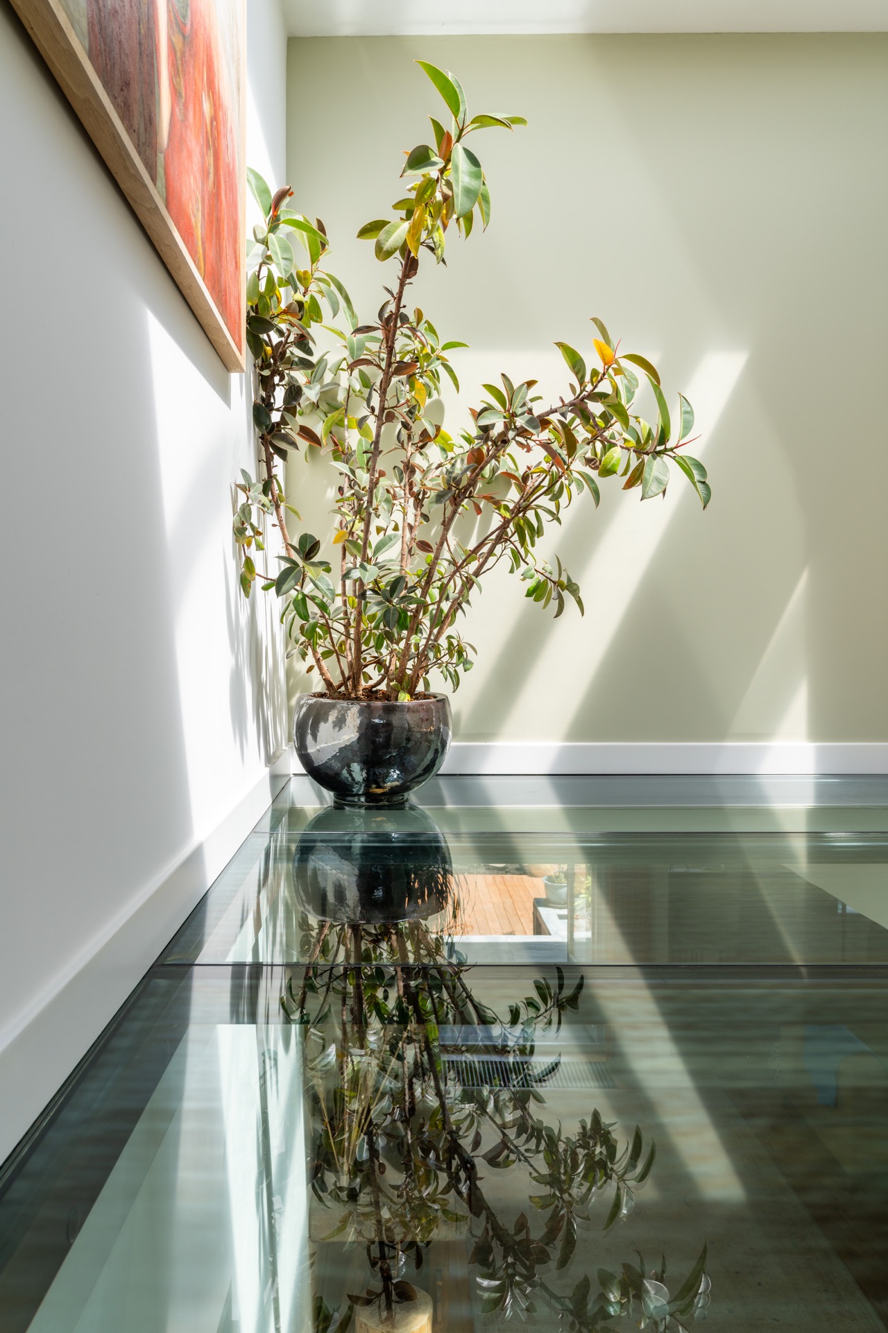
Color and texture are chosen with the room in mind. The project text notes that each area is adjusted to its own qualities and light. On the images, that idea shows up in the soft wall surfaces and the subtle plaster texture beneath the paint. The finish does not flatten everything into one note; it keeps enough surface variation to catch daylight without losing the sense of order. That is where quality interior paintwork becomes visible: in the way light travels across a wall.
Clean, smooth walls with visible restraint
The walls in the photographed spaces are light, even, and kept deliberately quiet. This gives the darker window frames more weight, but it also reveals how much care sits behind the paintwork. Small irregularities would stand out at once on surfaces like these, so the emphasis lands on precision. Clean, smooth walls do not need to announce themselves. They work by holding the room steady, letting openings, shadows, and junctions remain clearly defined.
In several views, the paint finish around windows becomes the main detail. The frame lines are sharp, the margins are tidy, and the contrast between pale wall and dark trim gives the opening a clear outline. That visual break is important in a project of this kind. It keeps the room from feeling blurred at the edges and shows how refined detailing can change the way a wall is read, especially where daylight enters and the eye moves from glass to plaster to paint.
Window edges and frame contrast
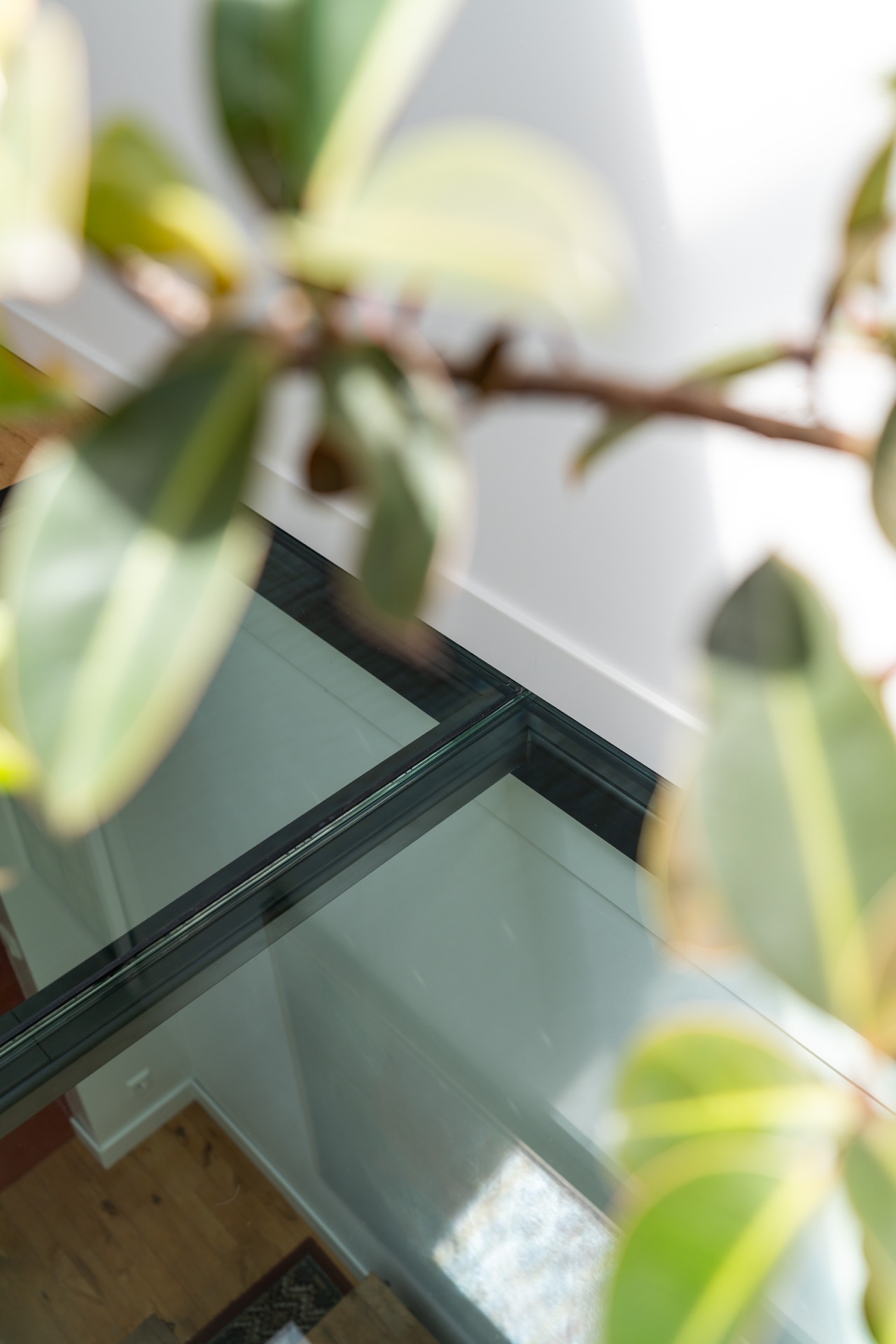
The paint finish around windows is one of the strongest cues in the project. Dark frames create a clean border against the light wall surfaces, and the junctions are handled with enough accuracy that the contrast feels deliberate rather than abrupt. In the images, the window zone is not hidden or softened away; it is defined. The line between wall, frame, and glass is crisp, which gives the room a measured, edited quality without adding visual noise.
One image places a pendant light near the window area, which adds another layer to the composition. It is not treated as a feature on its own, but it does show how the wall surface sits within the broader room. The light fixture, the frame, and the painted plane all occupy the same field of view, making the precision of the finish easy to judge. This is where interior painting becomes a discipline of edges rather than a matter of colour alone.
Wall to ceiling junctions kept quiet
The wall to ceiling junction is handled with the same restraint seen elsewhere in the project. There are no distracting breaks or heavy transitions. Instead, the surfaces meet in a way that keeps the room visually calm and lets the ceiling line remain clean. In the photographs, this matters as much as the wall colour itself, because the junction frames the whole room. If the upper edge is tidy, the rest of the paintwork feels more settled and easier to read.
That sense of order extends across the surfaces that show a slight plaster texture. Rather than hiding the material character, the finish respects it. You can still read the surface, but the paint brings consistency to it. This combination of plaster and paint gives the walls a more grounded appearance, especially where daylight moves across them. It is a practical kind of refined detailing: visible enough to be appreciated, controlled enough not to take over the room.
Color and texture guided by daylight
Light plays a clear role in how the project is experienced. The fact pack notes that colours and textures are aligned with the character of each room and with its lighting. In the images, this reads as a balance between pale wall planes and darker elements that anchor them. The lighter paint reflects daylight without becoming flat, while the textured surfaces add small shifts in tone as the view changes. That makes the rooms feel observed, not overworked.
The palette remains restrained, which gives the material differences room to speak. A painted wall, a window frame, a curtain edge, and a visible light fitting each contribute to the overall composition. None of them dominates. This kind of control is typical of quality interior paintwork when the goal is not to mask the room, but to clarify it. The colours are quiet; the transitions carry the interest.
Details that stay visible on purpose
Refined detailing is not presented as ornament here. It appears in the brushwork, the edge alignment, and the way each surface meets the next. The source content describes the work as an attention to every stroke and every colour decision, and the images support that reading. On the wall faces, the finish looks even; at the borders, it stays exact. That combination is what gives the project its precision. You can see where the work was held back and where it was allowed to speak.
There is also a wider interior effect to that restraint. When the paintwork is handled with this level of care, the room gains clarity without needing extra intervention. Surfaces remain open, openings are sharper, and the geometry of the space becomes easier to follow. The project does not rely on statement colours or decorative flourish. It relies on good decisions at the points where wall, frame, and ceiling meet.
A finish meant to be read up close
The project text describes the result as a lasting investment in the interior experience, but the visual evidence is even more direct: this is a finish meant to be read up close. On the wall planes, the paint sits evenly. Around the window openings, the lines are exact. At the ceiling edge, the transitions stay controlled. Those are the places where interior painting either disappears or fails. Here it does neither. It stays present in a measured way, giving the rooms their clarity.
Seen as a whole, the work turns simple surfaces into something more disciplined. The pale walls, dark frames, and careful junctions create a room that feels edited rather than decorated. That is what makes the project memorable: not a dramatic transformation, but the concentration of small decisions. Quality interior paintwork shows itself in those decisions, and in this case the evidence is in every edge, every junction, and every quiet shift of colour and texture.
Want to see more of Metaal-Art? View the page of Metaal-Art for even more great projects and company information.



NEW 2026 Jubileum Edition The Best Interior Designers Benelux
Order Now €125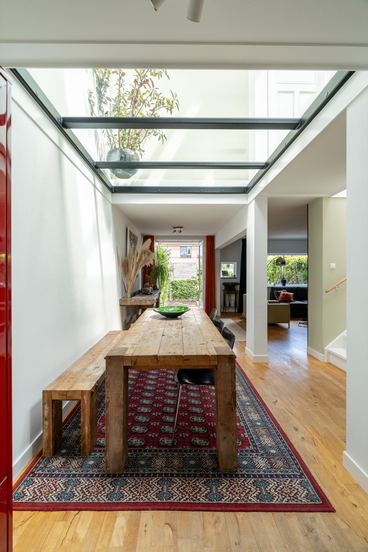
NEW 2026 Jubileum Edition The Best Interior Designers Benelux
Order Now €125