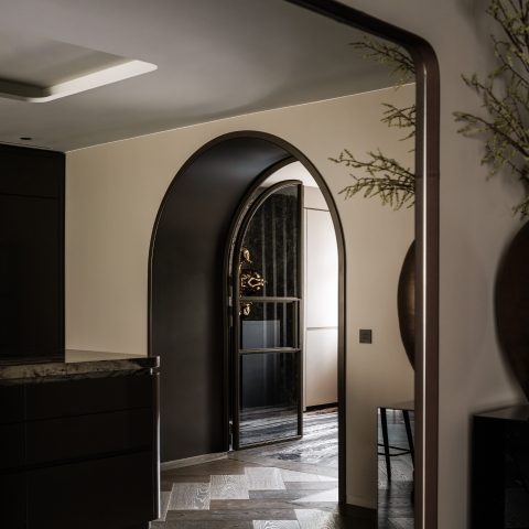
Interior with lots of daylight and custom detailing
Large glass panels pull daylight deep into the living space, past the sofa and toward the dining table. White walls read sharply against dark window frames, anthracite accents and the stone-look tile floor, so the room feels defined by line and contrast rather than decoration. In this realized home, the focus is on clean sightlines, integrated storage and details that sit back into the architecture instead of competing with it.
Daylight stretching across the living and dining areas
The living area opens along a broad run of glazing. A corner sofa, a low coffee table and a striped rug sit on the tile floor, while greenery remains visible between the frames. The black and white interior gains rhythm from that contrast: pale wall surfaces catch the light, and the darker edges carry the line of the room forward. When the sun moves across the floor, the outlines of the furniture and walls become more exact.
The dining area continues that reading of the space. A tabletop with a stone-like finish sits on a slim base, while the glass behind it runs almost from floor to ceiling. The transition to the outside is therefore less of a threshold than a pause in the same visual axis. White plaster, dark framing and the hard, flat floor keep the room grounded. This is what an interior with lots of daylight can do when the openings are set up to guide the eye rather than simply let light in.
Built-in niches and cabinets that stay in the wall
Elsewhere, dark recessed units and fixed cabinets repeat in a steady sequence. They are not placed as separate furniture pieces but absorbed into the wall or set between white volumes. That keeps the view calm and leaves the storage present without making it dominant. Open shelving, a deep shadow gap and a dark cabinet wall show how custom built-in niches can support the architecture in a quiet way.
The effect is practical and visual at once. Everyday items disappear from view, and the walls keep the lead. In a house with so many long sightlines, that matters. Each recess and built-in cabinet helps the interior with lots of daylight stay legible, because the storage follows the room instead of interrupting it. Even the darkest insertions remain part of the same clear order.
Dark recesses against white surfaces
The strongest moments come from the relation between the cut-out and the surface around it. A niche next to a large opening gains depth from shadow. A built-in cabinet nearly vanishes when the wall beside it stays white. The same language appears in the hall and around the stair: dark steps stand out against white walls drawn with very straight lines. That contrast makes the route through the house easy to read, especially where several directions meet.
The bedroom repeats the same logic on a quieter scale. A large built-in cabinet sits against a white wall, with a window fitted with slats nearby. There are no loose volumes fighting for attention. Instead, the room is made of clear planes that close off one another. The result stays aligned with the rest of the black and white interior, without feeling rigid.
A stone-look tile floor that carries the light
The stone-look tile floor runs through several spaces and ties the house together without needing decorative gestures. In the sitting area it acts as a matte base that catches daylight softly. In the hall and around the stair it reinforces the straight geometry of the plan. Combined with the recessed ceiling spots, it creates a bright setting in which niches, openings and furniture remain readable. The finish is restrained, but it does real work in how the rooms are understood.
That same material language returns in the bathroom and toilet area. A stone-like wall treatment covers a large surface, with a dark basin zone set into a niche and a grey floor below it. The room relies on surface, shadow and a few exact cuts rather than accessories. The wall makes the space feel taller; the darker built-in element below adds weight at floor level. Within an interior with lots of daylight, this is one of the clearest shifts from open living space to a more enclosed, material-driven room.
Hall, stair and kitchen drawn with the same line
The kitchen and utility zone follow the same disciplined composition. Dark cabinets stand against a light work surface, while openings in the wall and views toward adjacent rooms keep the space connected to the rest of the house. Recessed lighting sits flush with the ceiling and follows the same straight logic as the cabinet fronts and the edges of the openings. The room stays easy to read, with every surface doing a specific job.
The stair and hall sharpen that idea. Dark treads rise between white walls, and the open volume around the stair shows how daylight moves through the building. Where the living area is wide and open, the hall works as a hinge: narrow, bright and exact. It is a quiet zone, but not anonymous. The shift from white to dark turns the route itself into part of the composition, which is why the clean sightlines feel so deliberate throughout the project.
A fireplace cut into the white wall
One small detail shows the same contrast in a more concentrated form. A fireplace opening sits as a black cut in a white frame, almost like a slice taken from the wall plane. It does not stand apart as a separate object. Instead, it sharpens the surface around it. In a black and white interior where glass, shadow and built-in elements keep returning, that kind of detail fits naturally into the overall reading of the house.
Materials and views that keep the rooms linked
The flooring, the dark frames, the white plaster and the built-in elements all repeat from room to room, so the spaces remain connected even when they serve different functions. In the dining area the glass wall opens the view outward; in the living room the floor catches the light; in the stair hall the darker elements define the route. The result is not based on ornament, but on consistent choices that make the interior with lots of daylight easy to follow from one zone to the next.
The bedroom and bathroom confirm that same pattern in more contained settings. A built-in cabinet sits cleanly against a wall. A stone-like surface rises behind a dark recess. A window with slats filters the light. Each room keeps the same black and white interior language, but changes the scale of it. That gives the project its clarity: not a series of isolated rooms, but one house drawn through light, shadow and custom integrated storage.
Outside, the same contrast continues
The exterior echoes the same set of choices. A white volume is set off by dark frames and darker edges, while a thatched roof softens the roofline. Large glass openings keep the relation between inside and outside visible, and the terrace and planting remain part of the view. The façade is not used as a separate gesture; it extends the same line work that starts inside with the glazing and the stone-look tile floor.
Seen together, the house is held together by repetition rather than display. Large glass panels, white walls, dark trims and custom built-in niches return in different rooms, but always with the same calm logic. The interior with lots of daylight is strongest when the light meets a hard surface or drops into a recess, because that is where the room shows its depth. The project turns that into its main theme, from the living area to the stair, the bathroom and the bedroom.
Want to see more of Bob Manders? View the page of Bob Manders for even more great projects and company information.




NEW 2026 Jubileum Edition The Best Interior Designers Benelux
Order Now €125


NEW 2026 Jubileum Edition The Best Interior Designers Benelux
Order Now €125


NEW 2026 Jubileum Edition The Best Interior Designers Benelux
Order Now €125


NEW 2026 Jubileum Edition The Best Interior Designers Benelux
Order Now €125


NEW 2026 Jubileum Edition The Best Interior Designers Benelux
Order Now €125


NEW 2026 Jubileum Edition The Best Interior Designers Benelux
Order Now €125