Kempian country house exterior with a composite volume
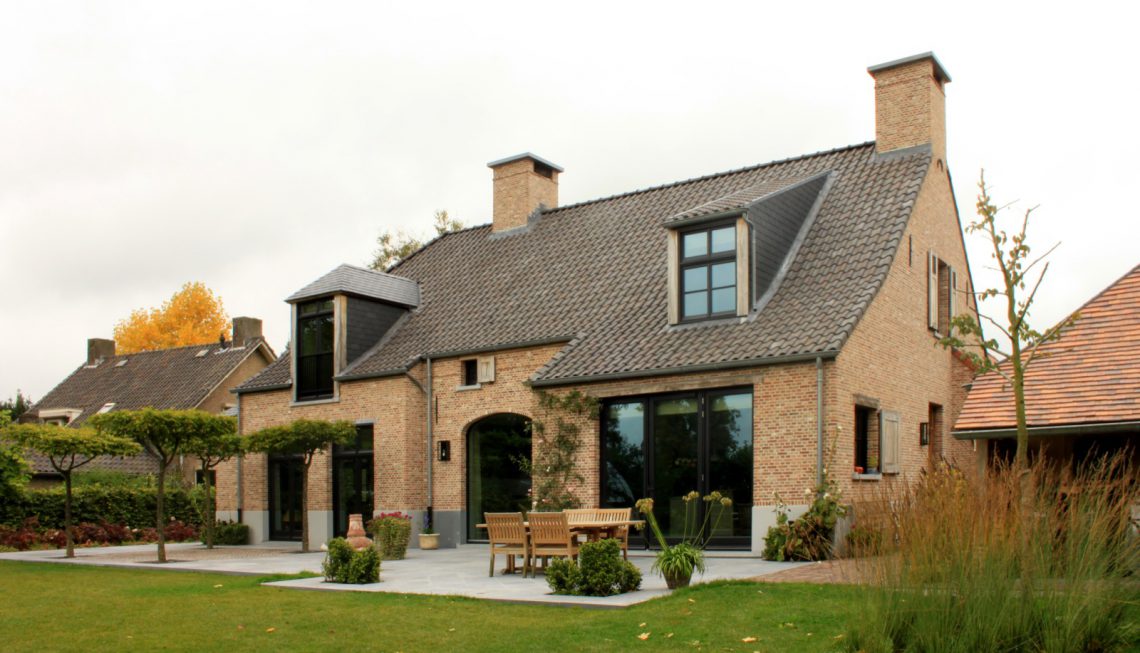
The first read is one of crossings: a Kempian country house exterior made up of a composite volume, with the main body under a gable roof set perpendicular to the secondary volume that holds the garage. That simple turn in the plan gives the house its outline before any detail is noticed. Brick, dark timber, stone, and tile then sharpen the view. The whole composition stays legible from a distance, but it becomes richer as the eye moves toward the openings, shutters, and roof edges.
Two volumes, one clear roofline
The main volume sits under a pitched roof, while the garage volume meets it at a right angle. That arrangement pulls the roofscape apart just enough to read each part separately. From the garden, the junction between the two masses creates a firm line in the silhouette, especially where the chimneys rise against the tiled planes. The result is not a single box dressed in ornament, but a composite volume house that makes its structure visible on the outside.
Roof tiles in red and blue tones extend that clarity across the upper level. They break the surface in a subtle way, so the roof does not flatten into one uniform color. The darkened panning sits well with the chimney forms and the angled meeting of the roofs. Below, the brick walls anchor the composition and keep the massing grounded. Even from a quick glance, the house reads as built from separate parts that have been brought into a controlled exterior rhythm.
Brickwork set with shutters and dark frames
The brick facade with shutters is one of the strongest visual cues in the project. Improved old cladding brick is laid in cross bond, giving the wall a tight and deliberate surface. That pattern catches light differently across the facade, especially around the window openings where the mortar lines run through the masonry in a clear grid. Shutters sit against that background and give the openings a measured depth. The result is crisp rather than decorative for its own sake.
Lamp-black window frames, doors, and shutters cut through the brick with a dark outline. In places the timber is left untreated in padouk; in others it is painted in the same dark tone. That contrast keeps the openings from dissolving into the wall. Instead, they read as precise insertions. The house does not rely on large gestures. It relies on the repetition of dark frames, wood grain, and shutter leaves to hold the elevation together.
Arched brickwork where the openings turn upward
Some of the window details shift away from the straight rectangle. An arched brickwork window detail appears above several openings, softening the wall without interrupting its discipline. The curve is built into the masonry itself, not added as a separate frame. That makes the detail feel tied to the construction of the facade. Near the base of the openings, stone sills and lintel-like elements sharpen the edges and keep the wall assembly readable.
Blue hardstone facade accents add weight at these junctions. They appear as larger-dimension elements rather than small trim pieces, so the eye registers them as structural markers. Against the brick and dark timber, the stone reads almost architectural in the strict sense: it names the corners, thresholds, and support points. This is where the country house becomes more than a brick shell. Its openings, bases, and edges are given a precise material hierarchy.
Padouk, stone, and the grain of the openings
Padouk appears in the windows, doors, and shutters, sometimes untreated and sometimes darkened. Its natural grain is visible in the closer views, where the wood surface sits beside metal fittings and brick. The contrast is strongest where a black latch or hinge is set against the timber. Those small hardware details keep the house grounded in use. The material palette may be restrained, but it is never flat; every opening carries its own texture.
At the entrance, a wooden door is tucked into the brick wall beneath a modest overhang. The threshold is set slightly forward, with a step and path leading in from the outside paving. It is a simple movement, but it gives the front of the house a sense of arrival without excess. Elsewhere, large glazing opens the ground floor toward the terrace, turning the wall into a sequence of solid and transparent parts rather than a single continuous surface.
Terrace glazing and the garden-facing side
Along the terrace, the house opens wider. Large glazing brings the interior edge close to the paving, so the brick wall is read together with reflections, frames, and the strip of grass beyond. The garden side feels less formal than the front, though the same dark frames and shutter language continue here. The transition from terrace to lawn is direct, and that clarity suits the straightforward massing of the house. It lets the exterior work as a measured sequence of surfaces.
The terrace itself appears as a link between the house and the garden rather than as a separate outdoor room. Paving sits tight against the openings, and the glass makes the interior presence visible without revealing what lies inside. That balance between opacity and transparency is one of the quieter strengths of the project. It is easy to read from the photos: brick on one side, glass on the other, with the garden acting as a calm strip in between.
A glass garden room set against brick
In the garden, a glass greenhouse / garden room volume adds a lighter counterpoint to the main house. It stands on a brick base and is framed in dark metal, so it echoes the language of the primary building while staying clearly separate. The glazed surfaces bring in the surrounding greenery, but the stone footing keeps the volume visually tied to the ground. It reads as a small, purposeful structure rather than a decorative addition.
This secondary glazed volume helps explain the wider composition of the site. The house is not limited to the main body and garage. It extends into smaller outbuildings and garden structures that repeat the same material discipline in another register. The wooden outbuilding with a tiled roof follows that pattern as well. Its timber siding, small openings, and pitched cover keep the garden ensemble coherent without making it repetitive.
Where the material palette settles into the landscape
The final impression comes from the way the materials sit against the outside ground. Brick walls meet paving, gravel, and lawn without abrupt transitions. Dark windows and shutters draw the eye back to the openings, while the roof tiles and chimneys define the top of the composition. Nothing feels overworked. The house relies on proportion, surface, and a few strong contrasts: wood against brick, dark frames against pale mortar, stone against tile.
Seen from the garden, the Kempian country house exterior holds together through that sequence of details. The composite volume remains visible in the roof geometry. The brick facade with shutters gives the walls their cadence. Padouk, lamp-black, and blue hardstone punctuate the openings and edges. Even the smaller structures in the garden continue the same vocabulary, so the site reads as one architectural family rather than a collection of separate parts.
Want to see more of Spanjers Architect? View the page of Spanjers Architect for even more great projects and company information.





NEW 2026 Jubileum Edition The Best Interior Designers Benelux
Order Now €125


NEW 2026 Jubileum Edition The Best Interior Designers Benelux
Order Now €125