Modern kitchen with dark oak veneer and island
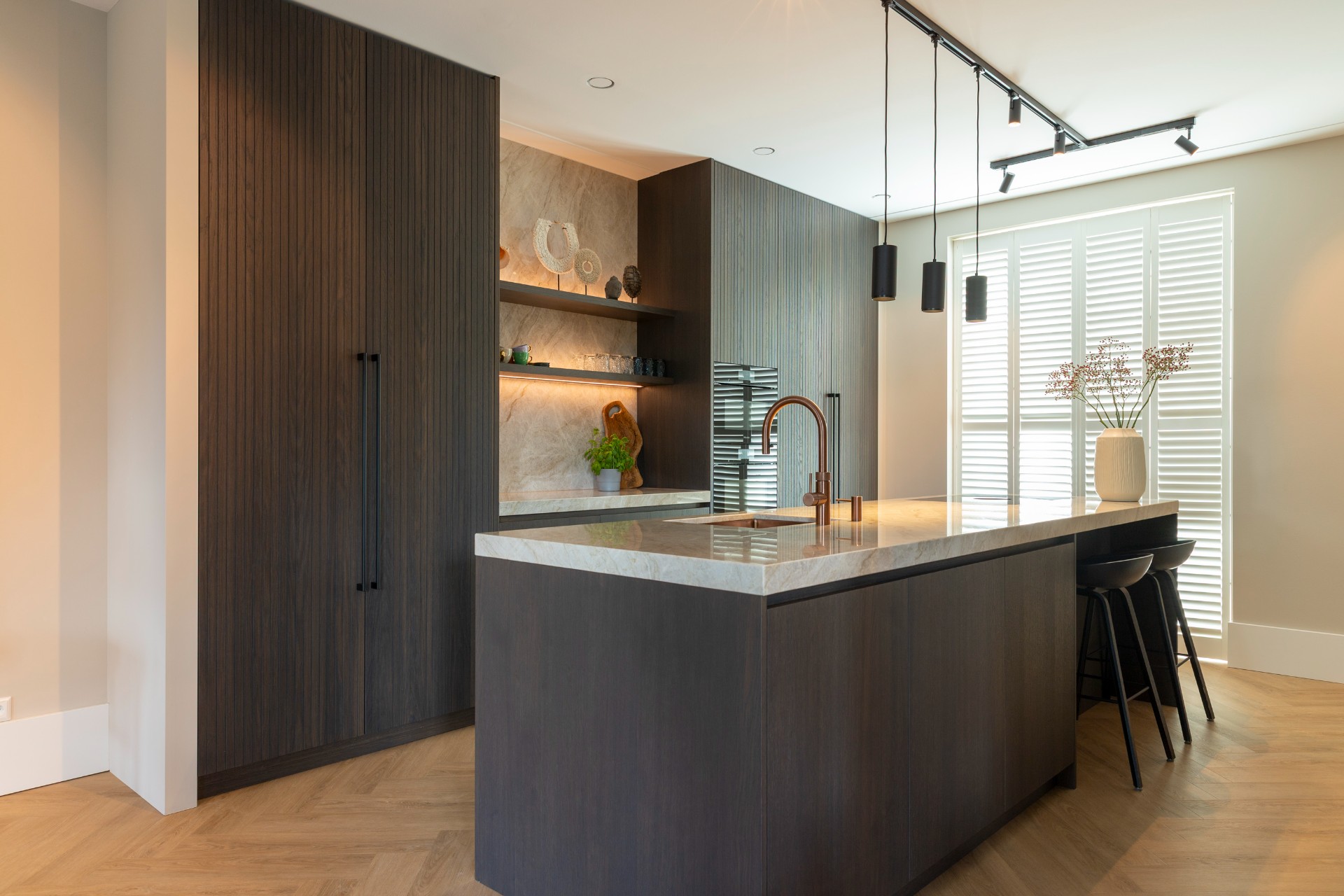
The dark oak veneer cabinet wall sets the tone at once. Its vertical pattern runs from floor to ceiling, pulling the eye upward before it lands on the polished Taj Mahal worktop at the center of the room. Here, the kitchen island takes over as the main surface: stone, wood, metal and light all meet around a layout made for daily use. The rose-gold faucet catches the light near the sink, while the island’s seating edge softens the long run of stone.
Cabinetry that climbs to the ceiling
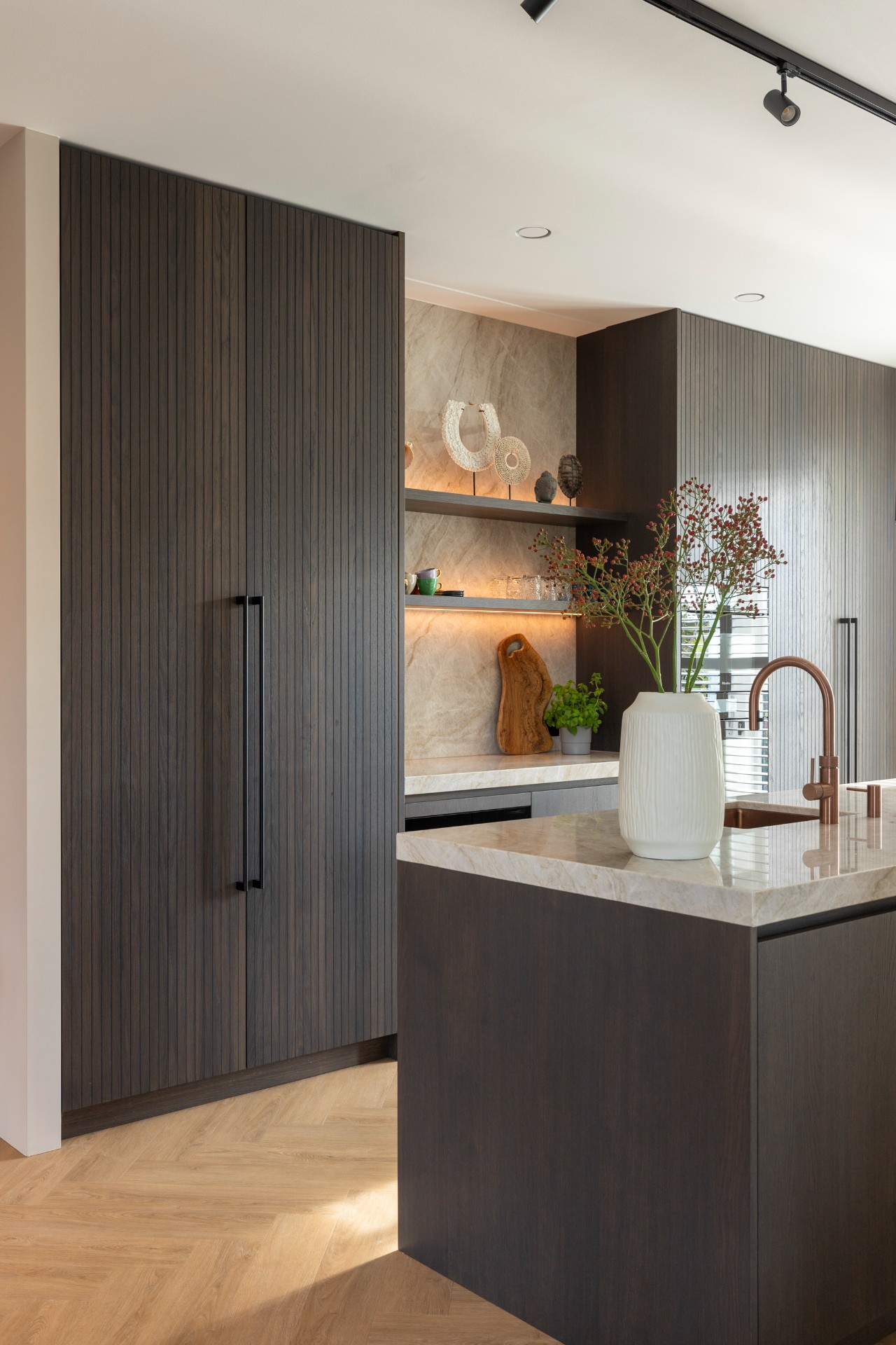
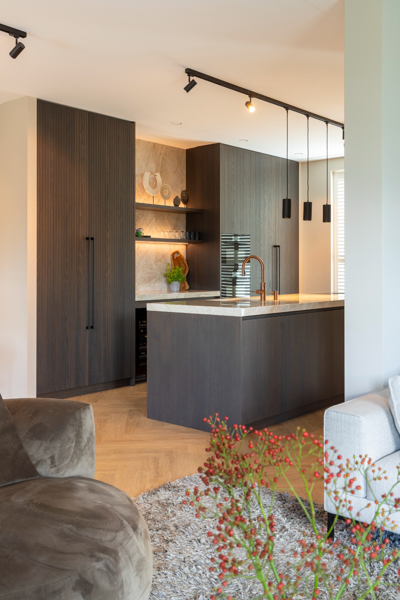
The ceiling-height cabinet wall is more than storage. In dark oak veneer, with a clear vertical rhythm, it gives the room a strong back wall that reads almost like joinery rather than furniture. The dark finish absorbs some of the daylight from the windows with shutters, so the lighter stone surfaces stand out more sharply. Seen from across the room, the tall run of cabinetry frames the open kitchen and keeps the composition calm without flattening the details.
A closer look shows how the timber surface is broken by fine grooves that bring texture into the large plane. That pattern repeats across the wall and gives the kitchen depth even when the doors are closed. It also sets up a contrast with the polished natural stone on the island, where the veining is softer and more reflective. The result is a room built from two clear material languages: dark wood on one side, pale stone on the other.
The kitchen island as the working center
The kitchen island holds the most active part of the plan. It combines a seating area, sink zone and cooking surface within one long stone top, so movement stays compact and direct. From this angle the island reads as a single block, but the functions are carefully separated across its length. There is room to stand at the sink, turn toward the cooktop and still leave a clear edge for sitting. That arrangement gives the island a practical weight without making it feel overloaded.
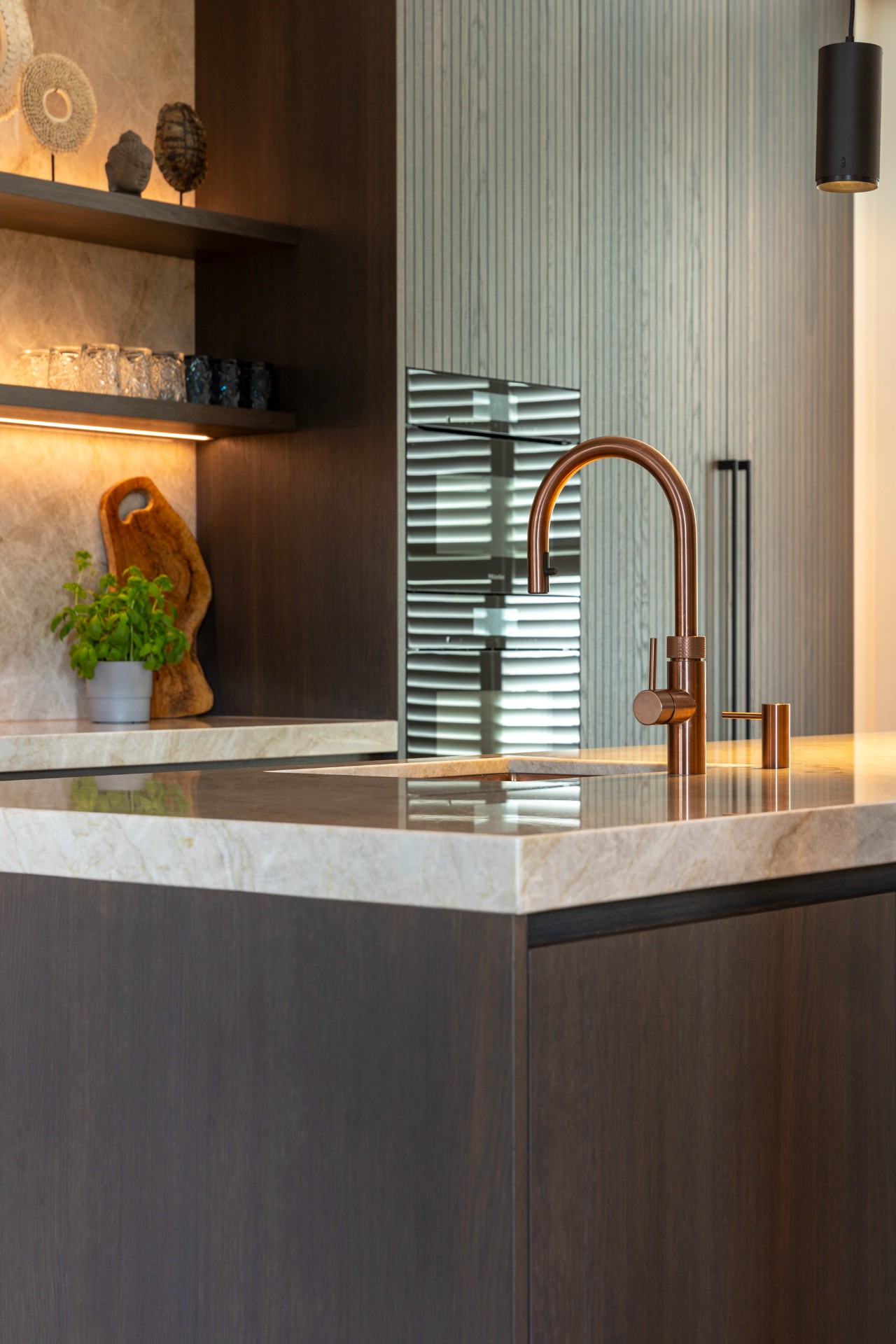
The polished Taj Mahal surface is the visual anchor here. Its pale tone reflects the daylight that enters through the large windows, and the subtle movement in the stone becomes visible as you move around the room. Because the island is so large, the top can carry both preparation and display without looking crowded. The stone is also repeated in the niche at the back of the kitchen, which helps tie the island to the rest of the room.
Stone details that stay visible
One of the strongest gestures in the kitchen is the way the stone appears in more than one place. The island carries a broad polished work surface, while the illuminated niche uses a lighter stone backdrop that catches the warm light inside the recess. This repetition keeps the room from splitting into separate zones. Instead, the eye moves from the island to the niche and back again, following the same material across different depths and heights.
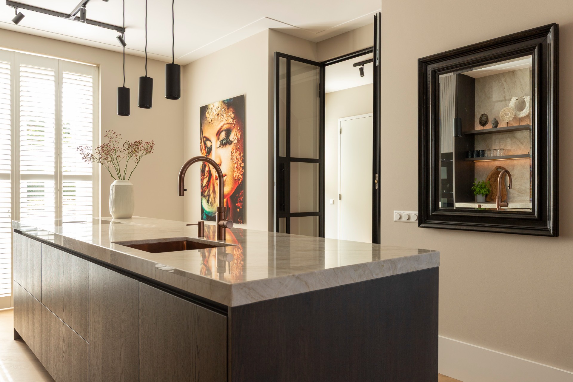
The rose-gold kitchen faucet adds a precise note against the pale counter. It does not compete with the stone; it sits on top of it, almost like a line drawn across the surface. Nearby, the sink is integrated into the island rather than set apart as a separate feature, which keeps the working area visually compact. The choice of a polished stone top means every edge and reflection remains visible, especially in the softer daylight from the shutters.
A niche for coffee, storage and daily routines
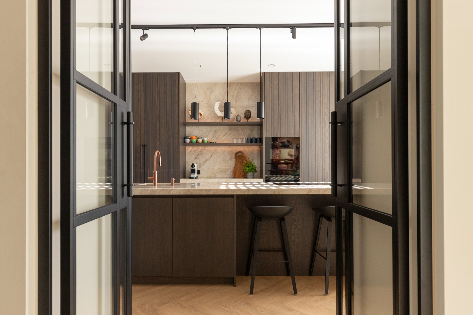
Set into the cabinetry, the integrated coffee niche gives the kitchen a quieter zone. It breaks the long wall of dark oak veneer just enough to introduce a different depth, with light inside the recess and stone at the back. That small shift changes the pace of the room. Instead of reading as one continuous storage wall, the cabinetry opens into a place where cups, appliances and preparation can be gathered out of sight from the main island.
The wine climate cabinet and the Miele oven are positioned within the same broader kitchen composition, so the tall wall does not become a blank backdrop. It remains active, with openings and built-in functions set into the dark timber front. Bora, Quooker and Miele are part of the equipment list, but visually the emphasis stays on how those elements are integrated into the room rather than on the appliances themselves. The result is a kitchen where the working parts are present, yet the eye keeps returning to the surfaces around them.
Light, shutters and the view across the room
Track lighting and round pendant lamps hover above the island and bring a second layer of light after dark. During the day, the large windows with white shutters filter the sunlight and throw a softer pattern across the stone. That makes the polished surfaces feel active without becoming glossy in every angle. The room gains depth from the contrast between the bright openings and the darker cabinet wall, especially when seen from the side through the open plan.
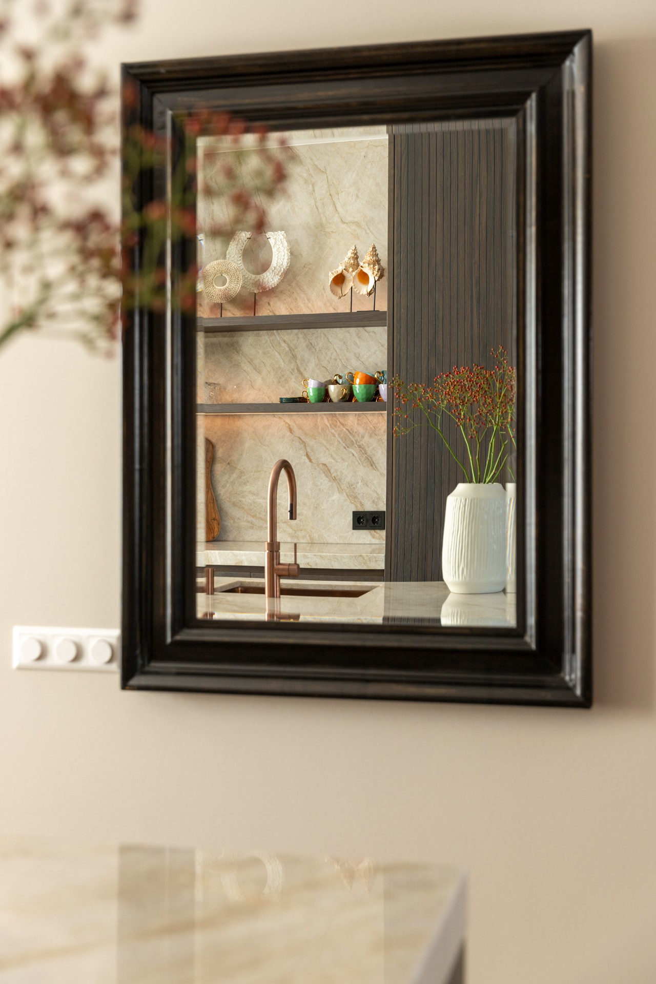
A mirror panel with a dark frame reflects part of the kitchen and turns the niche into another visible layer in the room. In that reflection, the vertical timber pattern, pale stone and hanging lights all appear again, but slightly shifted. It is a small visual move, yet it shows how carefully the kitchen is composed from multiple viewpoints. The kitchen island remains central, but the mirrored view proves that the room is designed to be read from several directions, not only head-on.
Material contrast that carries the whole room
What stays with you is the contrast between the dark oak veneer kitchen wall and the polished natural stone island. One surface is matte and structured, the other is bright and reflective. Between them sit the coffee niche, the wine climate cabinet and the working appliances, all embedded in the cabinetry so they do not interrupt the material rhythm. The kitchen feels planned around movement, light and storage, but it is the surfaces that hold it together.
Seen as a finished interior, this kitchen is not built from isolated features. The ceiling-height cabinet wall, the kitchen island with seating, the illuminated stone niche and the rose-gold faucet all answer one another across the room. Their spacing is measured, their edges are clear, and the room keeps its focus on use without losing the detail in the joinery. It is a kitchen that reads best when you move through it: past the island, toward the niche, and back again to the long wall of oak.
Want to see more of Rhijnart Keukens? View the page of Rhijnart Keukens for even more great projects and company information.



NEW 2026 Jubileum Edition The Best Interior Designers Benelux
Order Now €125