









Kitchen and Living Room Opening
The wall breaks open just far enough to pull the living room toward the kitchen. One corner column is left in place, and that single element keeps the opening legible while still allowing the two spaces to flow into one another. The result is a kitchen living room opening that reads in plan and in the room itself: broad, open, and structured by a fixed point rather than by a full removal of the wall.
A corner column that shapes the open connection
What could have become a simple pass-through is given more presence by the column held at the corner. It marks the edge of the opening and gives the open connection between kitchen and living room a clear profile. From the living side, the eye moves past the column into the kitchen without a hard stop. From the kitchen, the room opens back toward the seating area in one uninterrupted gesture. The layout keeps its definition, but the boundary is lighter and more porous.
The intervention changes how the room is used. Instead of two separate zones with a narrow link, the plan now allows the living area to sit alongside the kitchen. That shift is visible in the proportions of the opening, which is wide enough to let light and sightlines travel through. The retained corner column prevents the space from becoming vague. It gives the opening a frame and makes the transition feel deliberate rather than accidental.
Material cues taken from the wooded setting
The project draws from the wooded surroundings in its material choice and in the way surfaces are shaped. That influence appears less as a literal reference and more as a measured treatment of texture and line. Surfaces in the room do the work of translating the setting indoors: the grain of the wood floor, the stone-like or laminate-look wall finish, and the restrained geometry of the joinery all echo a landscape with trunks, bark, and filtered light. The room does not mimic the forest; it borrows from it in a quieter register.
This approach also affects the mood of the interior. The materials are not treated as decoration layered on top of the plan, but as part of the room’s structure. The open living connection is reinforced by surfaces that continue across the interior and by forms that stay controlled and direct. The result is a space where the opening is only one part of the story; the material language carries the same idea of continuity, using texture and form instead of ornament.
A built-in TV wall unit with a clear rhythm
The most visible piece of joinery is the built-in TV wall unit. It sits as a rectangular composition, with the screen set into a recessed opening that reads almost like a niche. Around it, vertical wall panels create a steady rhythm. Their fine joints keep the surface from looking monolithic, and the repeated lines help the wall unit hold the room without dominating it. It is a precise piece of interior joinery, shaped to organize the wall and to give the television a fixed place.
The wall unit works because of its restraint. The rectangular opening around the TV gives depth, while the panel field around it stays calm and measured. That balance of recess and plane gives the room a strong visual anchor. In a space defined by an open connection between kitchen and living room, a built-in TV wall unit has a practical role, but here it also helps the interior read clearly from across the room. It defines one side of the living area without closing it off.
Integrated light strips along edges and recesses
Light is tucked into the joinery rather than added as a separate gesture. Integrated light strips trace edges and recesses, picking out the geometry of the wall unit and softening the transitions between planes. They underline the rectangular opening around the TV and catch the fine joints in the vertical panels. In the evening, those lines will likely pull the wall closer to the eye, but even in daylight they give the joinery a sharper edge and make the construction read more clearly.
The lighting does more than illuminate. It sets off the depth of the niche and the layered surface of the unit, so the wall becomes readable as a series of planes rather than a flat backdrop. That is important in a room where the kitchen living room opening already changes how the walls are perceived. The integrated light strips help the joinery hold its place in the room without adding visual noise.
Fine joints that keep the surface precise
The vertical wall panels are detailed with narrow joints, and that precision gives the surface its pace. The eye reads the wall as a sequence rather than a single sheet. Those fine joints matter in a room that already contains a wide opening and a strong column, because they repeat the same logic of measured articulation. Even the larger surfaces are broken down into readable parts, which prevents the wall unit from feeling heavy.
There is a quiet discipline in the way the panels are set out. Nothing is overdrawn. The lines run straight, the recesses stay shallow, and the vertical rhythm gives the wall a stable presence. Combined with the built-in TV wall unit and the integrated light strips, the paneling turns one wall into a carefully composed backdrop for the living area. It is a strong piece of interior joinery without needing to announce itself loudly.
Wood floor, stone-like surfaces, and textile underfoot
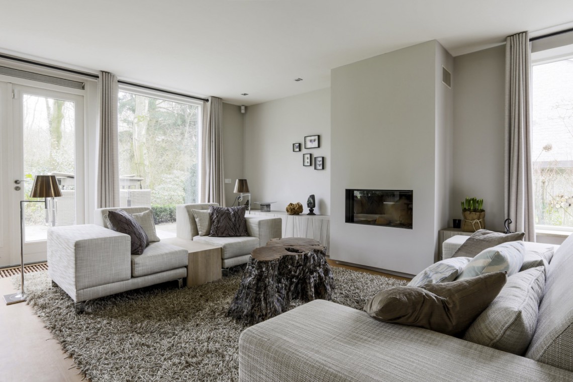
Under the joinery, the wood floor brings a warmer grain and a softer sound to the room. It runs through the space as a continuous base, which helps connect the kitchen and living room after the opening has been made. Against that floor, the stone-like or laminate-look surfaces in the wall composition feel more structured. The contrast is restrained, but it gives the room a clear material hierarchy: floor, wall, and insert all doing different work.
The textile visible in the room adds another layer, this time through touch rather than structure. A carpet breaks the harder lines of the floor and wall unit, and it gives the seating area a more anchored footing. Because the room already relies on fixed elements such as the corner column, the recessed TV, and the vertical panels, the softer material keeps the composition from becoming too rigid. The open living connection remains defined, but the room still has moments of softness in the surfaces people move across and sit on.
A room organized by opening, not by excess
What stands out most is how much the interior does with a limited set of moves. A wall is opened. A corner column is kept. A built-in TV wall unit takes shape in a rectangular niche. Light runs along the joins. Each decision supports the same idea: the kitchen and living room should read together, but without losing their individual positions in the plan. That is why the project feels so direct. The opening itself is the main gesture, and the joinery gives it a visible framework.
The result is a kitchen living room opening that can be read from several angles. It shows up in the way the spaces connect, in the controlled rhythm of the wall panels, and in the relation between the recessed TV and the illuminated edges around it. The room stays grounded in real materials and clear lines, with the wooded setting translated into surfaces rather than decoration. The layout change leads, and the wall unit follows with a measured response.
Want to see more of B-TOO? View the page of B-TOO for even more great projects and company information.





NEW 2026 Jubileum Edition The Best Interior Designers Benelux
Order Now €125


NEW 2026 Jubileum Edition The Best Interior Designers Benelux
Order Now €125


