










Historic canal house redesigned as a family home with extension and more daylight
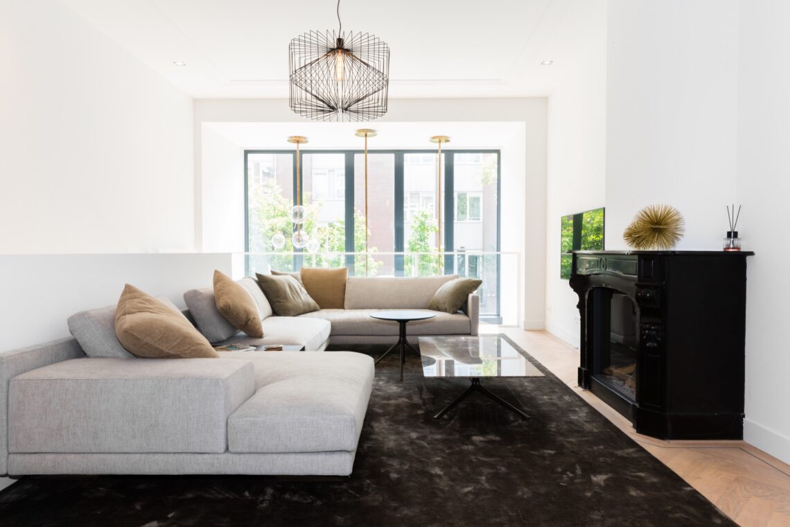
A long run of black-framed glass, pale walls and a dark kitchen set the tone for this canal house interior redesign. The house was reworked into a family home with a new layout, while the historic shell kept its place in the background. A rear extension of 2.5 metres, repeated across four floors, gave the plan more depth. On the first two floors, a glazed void and façade bring daylight further inside and strengthen the indoor-outdoor connection that now runs through the rooms.
A new layout for family life
The family home interior layout begins with movement. Spaces open one after another instead of being locked into separate rooms, and the route through the house feels clearer than before. Historic features were respected, but they were not left untouched for the sake of it. New walls, openings and built-ins shape a plan that works for daily use, while the original structure still frames the experience. The result is not about display. It is about giving each floor a more useful position within the whole.
That shift becomes visible in the way light changes from front to back. Some rooms are restrained and quiet, with pale walls and soft curtains; others are sharper, defined by black frames and reflective glazing. The contrast is deliberate. It helps the house move between older proportions and a more contemporary interior language without breaking the sense of continuity. Across the floors, the layout supports that shift by keeping sightlines open where possible.
How the rear extension brings daylight deeper inside
The rear extension 2.5m is more than an added strip of space. It changes the depth of the house and creates room for larger openings on the first two floors. A glazed façade void for daylight lifts the interior away from the darker core and lets light fall through the plan. Instead of a single bright corner, there are layered views: into the patio, across the glazing, and back into the rooms themselves. That visual sequence gives the house a slower, more readable rhythm.
From inside, the glazed opening does a practical job as well. It marks the shift from enclosed rooms to the outside area without using heavy boundaries. The patio sits just beyond the glass doors, with a paved surface and planting in rectangular planters. The indoor-outdoor connection is therefore drawn with materials rather than statements: glass, stone, plants and hard paving working across one narrow threshold.
Glass doors, patio and the room beyond
The patio with glass doors sits as a compact outdoor room, not as an afterthought. Its hard paving keeps the surface calm and legible, while the planters add a clear edge. Seen from the living space, the opening reads like part of the interior composition. Curtains soften the larger window wall nearby, but the black frames keep the outline crisp. This mix of soft fabric, hard glass and pale wall surfaces makes the connection to outside feel immediate without becoming exposed.
The same idea continues in the larger living zones, where the glazed areas and void create a stronger pull toward daylight. The house does not rely on decorative gestures to feel open. Instead, the openings set the scale. They cut through the structure, bring the patio into view, and make the rear of the house feel wider than the extension alone would suggest. That spatial effect is one of the most visible changes in the project.
Materials kept sharp and restrained
Inside, the strongest material contrasts are black, wood and stone. The staircase uses wooden steps within a black metal frame, so the structure stays visible as you move between floors. It is a straightforward piece of joinery, but it anchors the house. Nearby, the black staircase wood steps black frame combination gives the circulation route a clear identity. The handrail, supports and shadows all remain legible, which keeps the stair from disappearing into the background.
The kitchen follows the same discipline. A black kitchen natural stone look surface runs across the work area, with white veining that breaks up the dark planes. The stone-look cladding and matte fronts give the room a grounded feel without overloading it with texture. Built-in appliances sit flush, and the lines remain straight. The kitchen reads as part of the architecture rather than as a separate object placed inside it.
Custom pieces alongside simpler furnishings
Custom and non-custom furniture were used together, which helps the interior avoid looking over-designed. Some elements are clearly tailored to the house: fitted joinery, the staircase structure and the kitchen composition. Others are quieter and less specific, allowing the rooms to breathe. That mix is important in a historic interior, where every surface does not need to carry the same amount of detail. The stronger pieces hold the plan together; the simpler ones keep the rooms usable and calm.
Nowhere is that clearer than in the living and sleeping areas, where built-in lines sit next to looser furnishing choices. The minimal bedroom uses pale walls, an angled ceiling edge and a large window to keep the room open. It depends on proportion rather than decoration. In the bathroom, a stone-look vanity and round wall lights create a tighter composition. The warm light hits the surface and makes the veining read more clearly, while the rest of the room stays spare.
Details that carry the project
Small details do a lot of the work here. The black kitchen natural stone look finish catches light differently from the painted walls around it. The stair’s wooden treads bring grain into a house that otherwise relies on smooth surfaces. The glazed openings to the patio create reflections that change through the day. Even the bedroom’s folded ceiling lines matter, because they shape where the eye moves when the room is otherwise quiet. These are not decorative extras. They are the parts that hold the interior together.
What remains from the historic house is not treated as a backdrop to erase. Its character sits inside the new layout, in the proportions of the rooms and the way the additions are inserted. The result is a canal house interior redesign that works through measured changes: more light, a clearer plan, a rear extension that opens the back of the house, and a sequence of materials that keeps the house grounded. The project stays close to what can be seen and felt while moving through it.
The photographs make that sequence easy to read. A stair landing with black metal and wood, a kitchen with a dark stone-like worktop, glass doors to the patio, a pared-back bedroom and a bathroom with round lights all point to the same approach. The house has been adjusted floor by floor, but the strongest impression comes from how those parts connect. Light reaches deeper. The patio sits closer. The rooms gain order without becoming rigid.
Want to see more of Foam Architecten? View the page of Foam Architecten for even more great projects and company information.

Contributors



NEW 2026 Jubileum Edition The Best Interior Designers Benelux
Order Now €125


NEW 2026 Jubileum Edition The Best Interior Designers Benelux
Order Now €125


NEW 2026 Jubileum Edition The Best Interior Designers Benelux
Order Now €125


NEW 2026 Jubileum Edition The Best Interior Designers Benelux
Order Now €125


NEW 2026 Jubileum Edition The Best Interior Designers Benelux
Order Now €125


