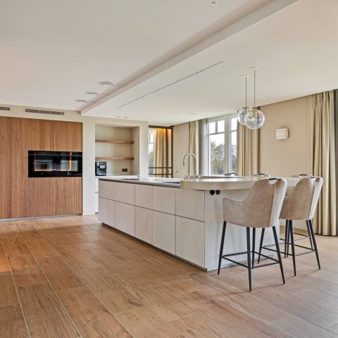
Large living kitchen with island
The marble-look island catches the light before anything else. Around it, the room opens wide, with dark cabinet fronts running along one wall and large windows pulling daylight across the floor. The result is a living kitchen with island that reads as one open plan kitchen living area rather than two separate rooms. Straight lines keep the composition clear, while the mix of dark and pale surfaces gives each zone its own edge.
Kitchen island with a clear social role
The island is more than a working surface. It holds one side of the room together and gives people a place to stop, sit and talk while the cooking area stays active beside it. The marble-look countertop stands out against the darker joinery and the black window frames in the background. From this angle, the island also sets the pace for the rest of the layout: it leads the eye toward the dining table, the pantry area and the lounge beyond.
That social role is reinforced by the seating choices. There is room at the island itself, a large dining table nearby, and a smaller spot close to the pantry. Each one supports a different use of the open living space. One is for a quick coffee, another for a longer meal, and another for a pause beside the bar wall. The room never depends on a single centre point. It spreads activity across the kitchen in a measured way.
Dark kitchen cabinets against a lighter shell
Along the main wall, dark kitchen cabinets form a strong horizontal band. Their handleless kitchen fronts keep the surface calm, with the joints and lines doing the quiet work instead of hardware. Above and around them, the pale walls and ceiling make the cabinetry look even more grounded. Steel beams in the ceiling add another line, this time structural rather than decorative, and they echo the long, linear feel of the room.
The contrast is visible in the materials as well as the color. The dark cabinet wall sits next to a lighter worktop area, and the difference gives the kitchen depth without adding clutter. A second work surface introduces another texture, so the room avoids a single repeated finish. It is the kind of open plan kitchen living arrangement where each element has a clear reading: cabinets, island, table, and pantry all stay distinct.
Handleless fronts and a disciplined line
Because the fronts are handleless, the kitchen depends on proportion and alignment. Edges meet cleanly. Surfaces run level. The eye moves from the island to the tall storage and then out toward the windows without hitting visual noise. That restraint is what allows the darker kitchen cabinets to work in such a large room. They do not dominate every wall; instead, they anchor the composition and leave space for the dining area and lounge zone to breathe.
There is also a practical calm in the way the appliances are set into the cabinetry. Ovens, refrigeration and the rest of the built-in equipment sit within the wall rather than interrupting it. The room keeps its open living space feel, but the working part of the kitchen remains clearly defined. The effect is orderly, not severe, because the lighter surfaces and daylight keep the darker elements from closing the room in.
A pantry bar with glass details
Close to the pantry, the mood changes. A pantry bar with glass details introduces reflections and a more display-like quality, and the warm wood panel behind it softens the darker base units below. The nook receives its own light, so it reads as a separate pause within the larger room. In the evening, that smaller zone would likely feel more intimate than the rest of the kitchen, while still belonging to the same layout.
The gold-toned Quooker tap adds a precise accent to this part of the room. It sits on the worktop like a small but deliberate note, lifted by the lighter stone surface around it. The pantry area does not compete with the main island; it complements it. One handles preparation and gathering, the other is for serving and storage, and the glass-fronted element gives the whole ensemble another layer of detail.
Light, view and the long perspective of the room
Large windows run along the room and bring in a view of greenery and surrounding buildings. They also flatten the shift between kitchen and living room, because the same daylight touches both sides. From the island, the line of sight continues past the dining table and into the lounge area. That open living space is readable at a glance, but it still has pauses and turns, especially where the pantry wall and seating pieces interrupt the flow.
Overhead, the lighting is drawn into straight tracks and recessed spots. This keeps the ceiling visually organised and supports the room’s linear structure. The units above the kitchen zone do their job without drawing attention away from the island or the cabinet wall. At night, the spots and the tucked-in light around the pantry would sharpen the edges of the room; by day, the windows take over and let the surfaces stay quiet.
Dining and seating zones folded into one layout
The large dining table sits comfortably within the same field as the kitchen, which is why the room reads as a living kitchen with island rather than a separate cook zone with furniture added later. The table has enough room around it to avoid crowding the island, and the nearby lounge seating creates a softer change of pace. Those shifts matter. They allow the room to host cooking, eating and sitting without forcing everything into one spot.
That layered use of space is what gives the project its strength. The island handles the daily movement. The table handles the longer gathering. The small seating corner near the pantry handles the in-between moments. Each zone is visible, but none of them breaks the open plan kitchen living idea. The room stays connected through the materials and the shared light, while the different functions remain easy to read.
Materials that stay visible instead of disappearing
The material palette is restrained, but it is never flat. Marble-look countertop surfaces, dark cabinetry, steel details and warm wood panels each carry a different visual weight. The polished stone effect gives the island a brighter presence, while the darker fronts keep the perimeter composed. In the pantry wall, glass introduces clarity and a little reflection, which prevents the deeper tones from feeling heavy.
That mix is supported by the way the room is put together. The kitchen fronts are handleless, the island keeps a strong rectangular form, and the storage wall holds a strict line. Nothing is over-shaped. Instead, the details are allowed to do their work in quiet ways: a gleam at the tap, a change in panel texture, a shift from open shelving to closed storage. In a large living kitchen with island, those small differences are what make the layout legible.
The project also shows a clear approach to kitchen planning. The space is arranged so the working parts, seating spots and pantry wall each have a defined place, yet the room still feels open from one end to the other. That is what makes the composition easy to use and easy to read. The kitchen is not hidden in the background, and the living area is not left as an afterthought. Both are part of the same room, shaped by the island, the dark cabinets and the long line of daylight.
Want to see more of SmartDesign Keukenstudio? View the page of SmartDesign Keukenstudio for even more great projects and company information.




NEW 2026 Jubileum Edition The Best Interior Designers Benelux
Order Now €125


NEW 2026 Jubileum Edition The Best Interior Designers Benelux
Order Now €125


NEW 2026 Jubileum Edition The Best Interior Designers Benelux
Order Now €125


NEW 2026 Jubileum Edition The Best Interior Designers Benelux
Order Now €125


NEW 2026 Jubileum Edition The Best Interior Designers Benelux
Order Now €125