Light and calm interior with unity: warm, natural, and refined
Daylight does most of the work here. Windows on three sides pull light across the rooms, so the apartment reads as a light and calm interior with unity rather than a sequence of separate spaces. The first impression is open, but never stark. A warm pebble color palette softens the walls, while the darker kitchen and entry give the home a clear center and a stronger rhythm from the moment you step inside.
A kitchen that holds the plan together
The kitchen sits at the heart of the apartment and was expanded without asking for more floor area. That move created extra storage and gave the room a cleaner edge around the cooking zone. The black kitchen and entry echo one another, so the transition from hall to kitchen feels deliberate. A suede feel countertop runs into the wall, forming a continuous surface behind the large cooker and the professional extractor. It is a practical gesture, but it also gives the room its strongest line.
From there, the material palette settles into a slower pace. The counter’s muted finish keeps glare down, and the dark cabinetry lets the surrounding light register more clearly. Instead of breaking the room into parts, the finishes pull the eye along the same level and depth. That sense of a light and calm interior with unity is reinforced by the way the kitchen opens directly into the rest of the home, without a visual interruption.
Storage hidden in plain sight
What stands out is not a display of appliances but the way storage disappears into the architecture of the room. More cabinets were fitted into roughly the same footprint, which makes the kitchen feel less crowded even as it holds more. The black surfaces stay disciplined, while the suede feel countertop adds texture where hands meet the room. In a plan with level changes from the basement, that kind of restraint keeps the circulation readable.
Warm pebble tones across wood, walls, and windows
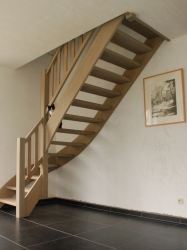
A custom warm pebble color was developed for this apartment and carried across doors, stairs, cabinets, and window frames. Because the same tone repeats in the woodwork, the structure of the home reads more clearly. The colour does not flatten the rooms; it gives the eye a constant reference point as the apartment moves from one zone to another. Even the layered window treatments continue that idea, with curtains and blinds working together to filter the street and soften the daylight.
The effect is strongest where the light hits the timber. Doors, joinery, and framing all sit inside the same muted range, so the apartment avoids visual breaks. That uniform wood tones approach makes the rooms feel less assembled and more edited. It also allows the warm pebble color palette to support the brighter surfaces instead of competing with them, which is why the space reads calm even when there is a lot happening in frame.
Layered window treatments and the way they shape the rooms
The windows are not treated as a backdrop. They actively set the pace of the interiors. Curtains and blinds are layered so the apartment can shift from open daylight to a softer, screened view without losing brightness. In the living areas, this gives the rooms a slower edge. In the bedroom, the same approach frames the bed with a lighter veil and a deeper fabric layer beside it, so the opening feels measured rather than exposed.
That layering also helps connect the rooms visually. You see the same language of folds, slats, and filtered light again and again, and it keeps the apartment from feeling fragmented. The windows on three sides bring in the light; the treatments decide how that light lands on the floor, the wood, and the furniture. It is a quiet system, but it carries a lot of the project’s character.
A living room built from touchable surfaces
The living room moves away from hard edges. An organic mortex table leads into a seating area built from natural materials, including a bouclé sofa with leather base, a soft rug, and a woven lamp. Brass accents interior details appear in small moments rather than as a repeated theme, which keeps the room from becoming too polished. Vintage objects and the owners’ colorful art pieces sit easily within the arrangement because the background is restrained and the surfaces are not fighting for attention.
Here, texture does the talking. The bouclé catches light differently from the leather beneath it. The rug drops the tone of the room. The rattan lamp holds its shape without adding weight. Together they create a tactile setting that still belongs to the apartment’s larger light and calm interior with unity. Nothing is overworked. The objects simply have room to register.
Bathroom surfaces that reflect the same restraint
The wet rooms continue the same disciplined palette, but with a sharper finish. Marble-look bathroom tiles line the walls and floors, while white composite surfaces keep the basins clean and bright. Brass taps and fittings bring a warmer reflection into the room, especially where they sit against the pale tile surfaces. A rectangular mirror with a narrow metallic frame repeats the geometry of the basin below it, so the fittings feel integrated rather than added later.
One bathroom places the bathtub into a tiled niche, where the wall treatment wraps around the tub and holds the space in place. Another view shows the shower with a round overhead head and matching brass set against the same small-format tile work. These details do not change the tone of the apartment; they extend it. Even in the more technical rooms, the same attention to light, surface, and line remains in place.
Small shifts that keep the apartment moving
The layout has level changes, and the design uses them without drawing attention to the mechanics. The entrance opens directly into the core of the house, so the route is clear from the first step. The kitchen, living area, and quieter rooms stay connected through repeated materials and controlled transitions. Light wooden floors bridge the darker kitchen and the softer rooms, while the uniform wood tones keep the circulation easy to read.
That clarity is what gives the apartment its calm. There are enough contrasts to define each zone: black at the kitchen, warm pebble tones around the timber, brass in the wet rooms, and filtered light at the windows. But the project never turns those contrasts into separate statements. It keeps moving in one direction, from the entry through the kitchen to the living area and beyond, with the same measured pace all the way through.
Interieurdesign: A Studio Named Four – Olivier Wilmink
Fotografie: Guy Houben & Ramona van der Voet
Want to see more of Osiris Hertman Studio? View the page of Osiris Hertman Studio for even more great projects and company information.




NEW 2026 Jubileum Edition The Best Interior Designers Benelux
Order Now €125


NEW 2026 Jubileum Edition The Best Interior Designers Benelux
Order Now €125


NEW 2026 Jubileum Edition The Best Interior Designers Benelux
Order Now €125


NEW 2026 Jubileum Edition The Best Interior Designers Benelux
Order Now €125