Light spacious family home with character
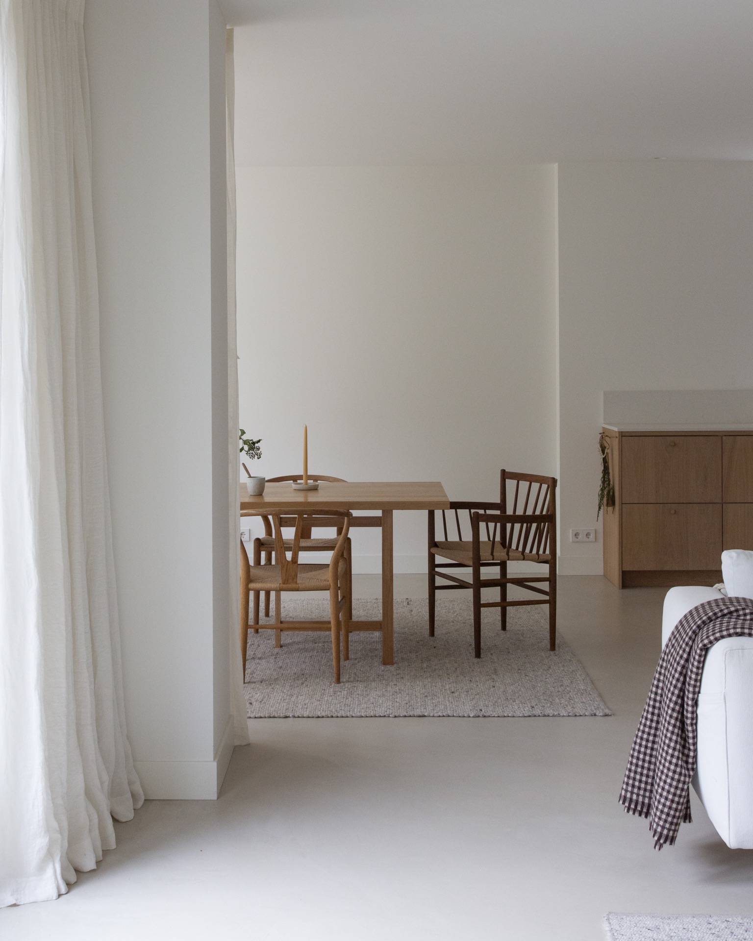
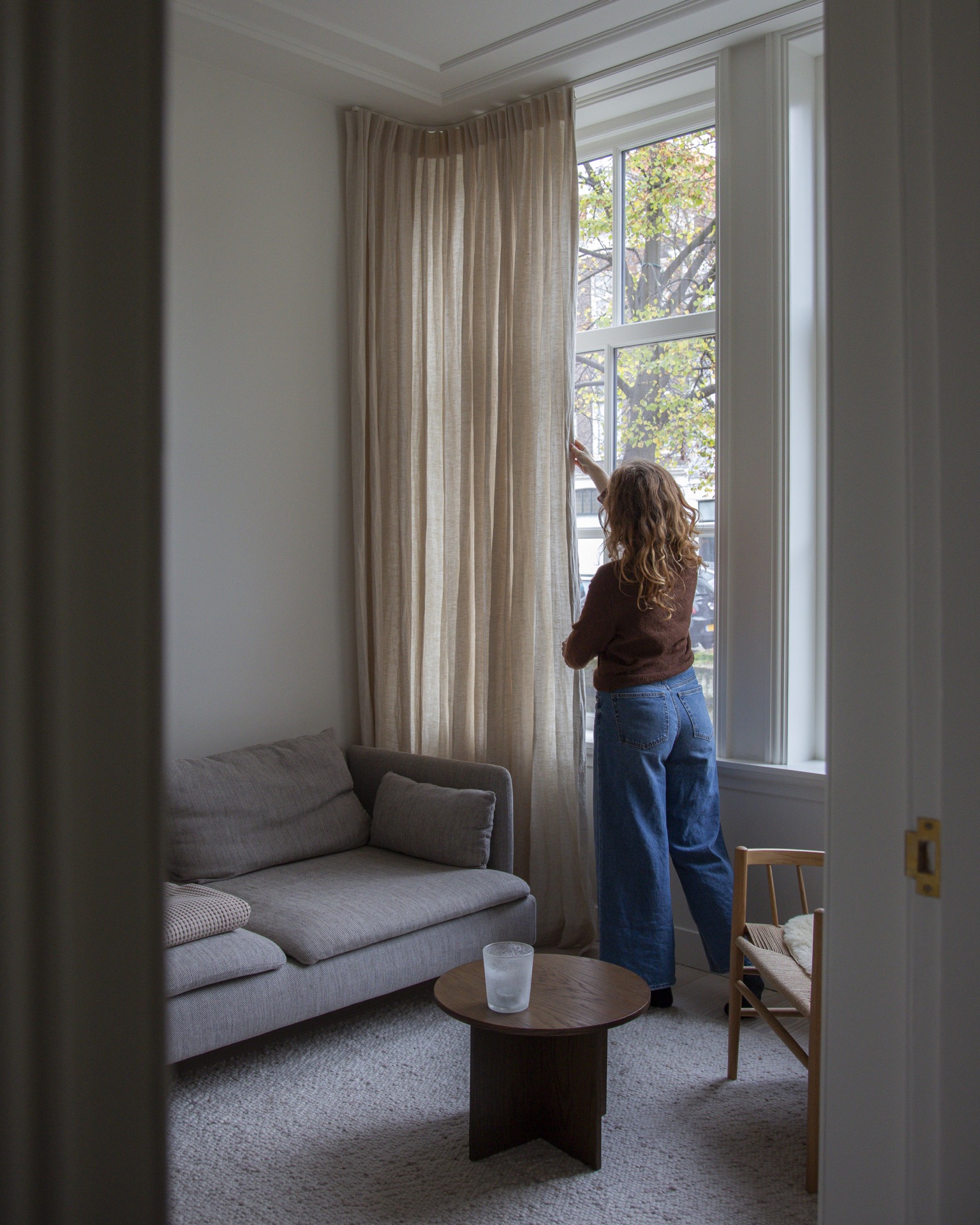
White plaster walls catch the daylight first, then the wood comes into view: cabinet fronts, a dining table, and a run of floorboards that warms the sharper lines of the renovation. The result is a light spacious family home that feels open without losing the marks that give the house its character. Modern surfaces and retained details sit close together, so each room reads as part of one lived-in sequence rather than a set of separate interventions.
Daylight, plaster, and the first sense of space
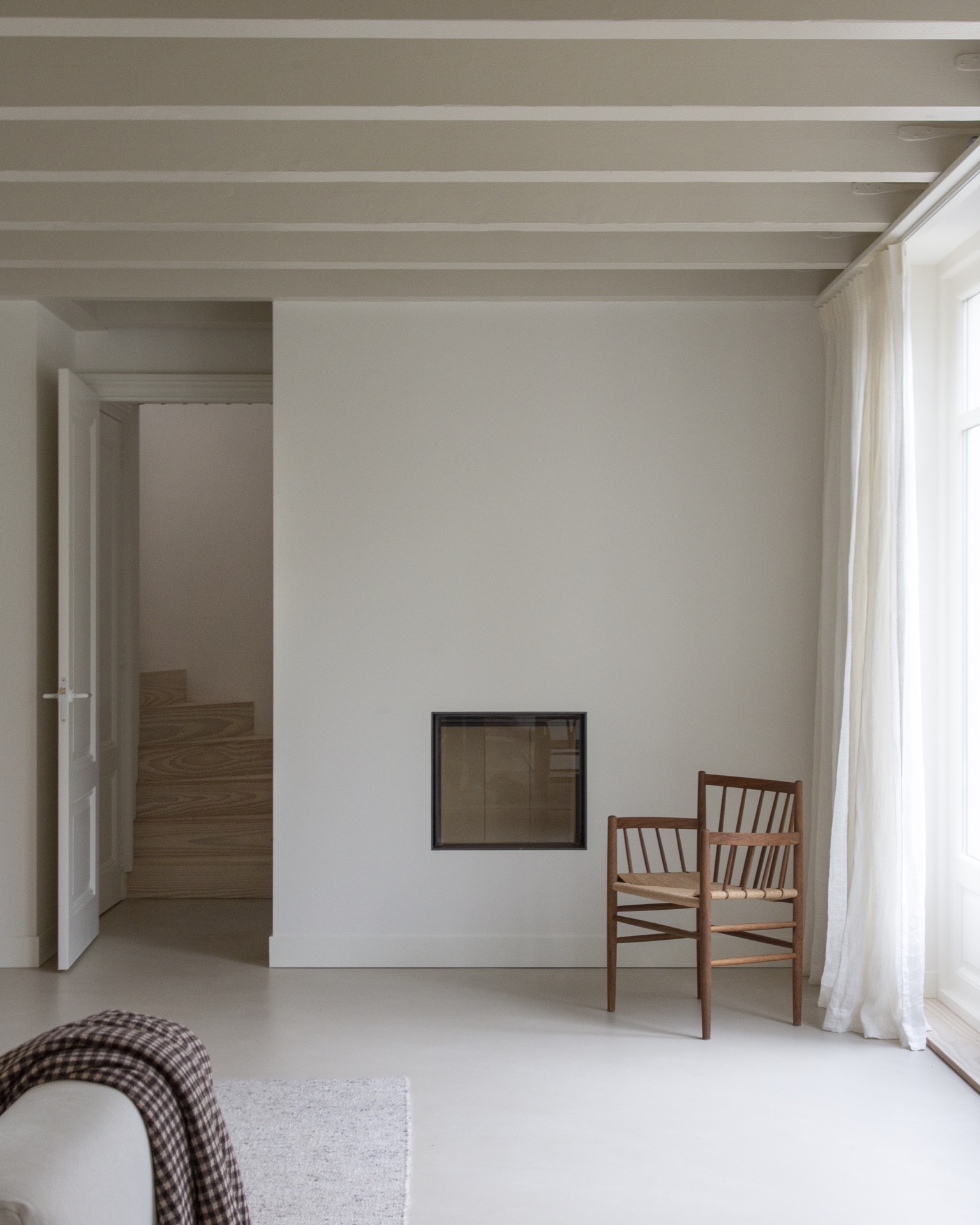
The renovation starts with white plaster walls and a plain ceiling plane, which let the openings carry the composition. Light moves across the room edges and lands on the microtopping floor, where the olive-grey tone softens the transition between wall and timber. In this light spacious family home, the brightness is not decorative. It is built from simple surfaces, clear sightlines, and the decision to keep the rooms visually open from one side to the next.
From one room to another, the house keeps returning to the same set of materials. Microtopping meets broad Douglas planks. White plaster meets wood. A wool rug sits low against the harder finishes and breaks the echo of the larger rooms. The effect is practical before it is visual: floors run cleanly, walls stay calm, and the furniture can take on the task of defining where one zone ends and the next begins.
Modern renovation with character still visible in the frame
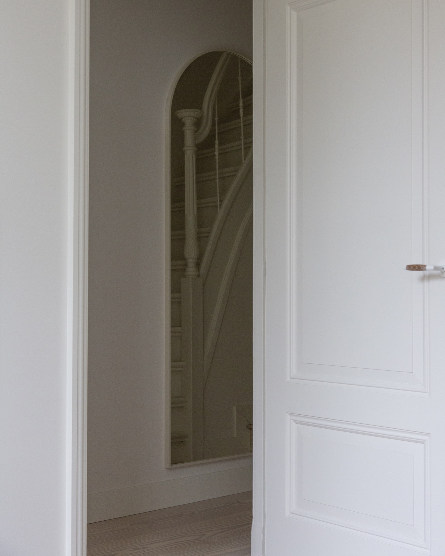
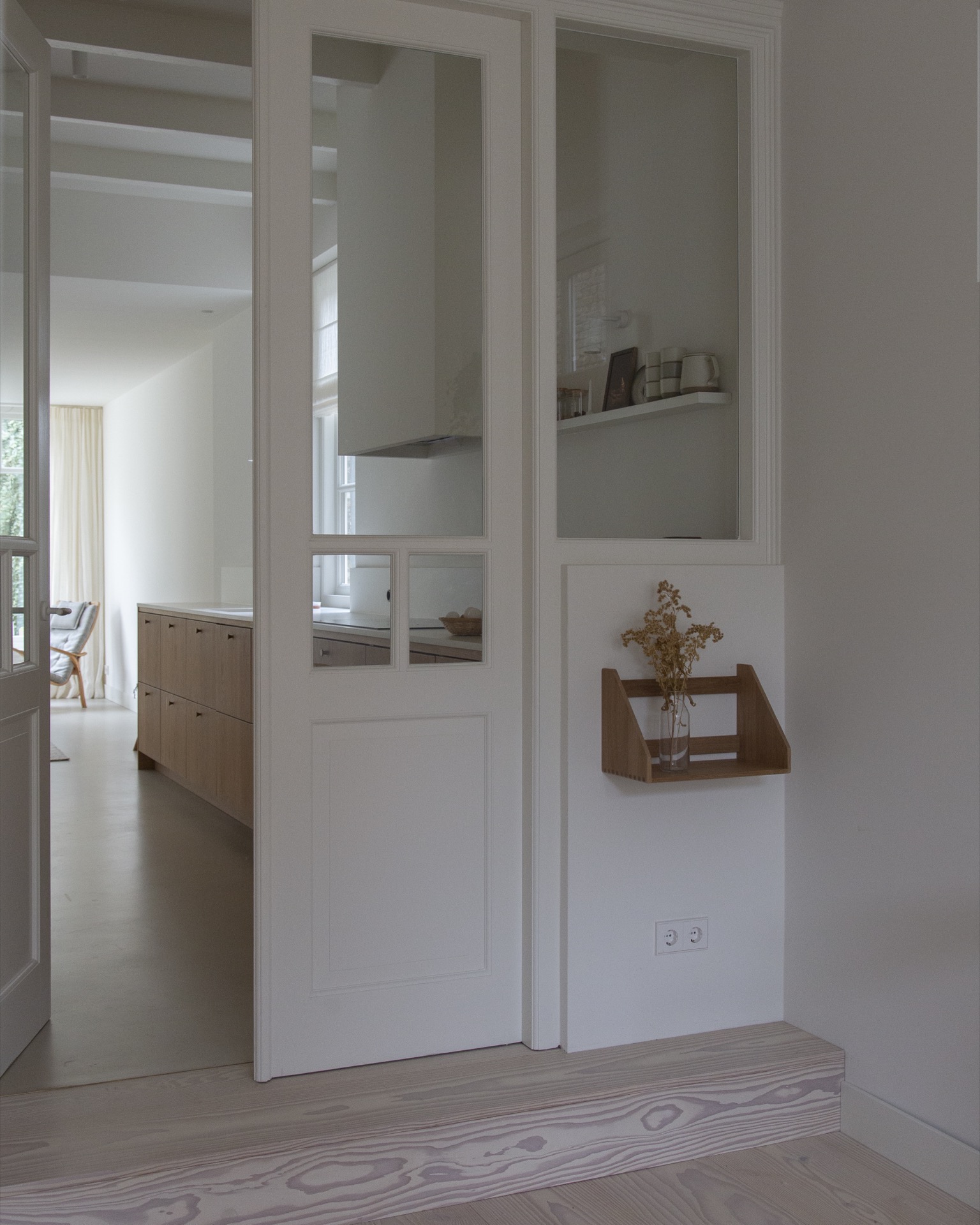
What stands out most is the way the new work follows the older openings rather than erasing them. Arched passages, framed thresholds, and deep reveals keep the house from feeling flattened by renovation. The eye catches the curve of one opening, then the square edge of another, and the route through the interior becomes legible. That is where the idea of a modern renovation with character becomes visible, not as a slogan but as a series of careful moves around existing shapes.
Preserving original features here means keeping the spatial rhythm of the house intact. The openings remain distinct, the transitions remain clear, and the renovated surfaces stay restrained enough to let those details speak. Rather than covering everything in one finish, the rooms use contrast: smooth white walls, exposed edges, timber grain, and the occasional brick surface. The house feels edited, not stripped. Its older structure is still readable in the way rooms connect and in the way light passes through them.
Openings that guide the eye
One of the clearest gestures is the boogvormige opening that frames a view toward the stair. The curved edge softens the straight lines of the walls around it, while the stair beyond introduces more timber and a tighter vertical movement. In the photo sequence, these openings do more than divide space. They set up a slow reveal, with each frame drawing attention to the next room, the next surface, or the next change in height.
The kitchen placed where the light is strongest
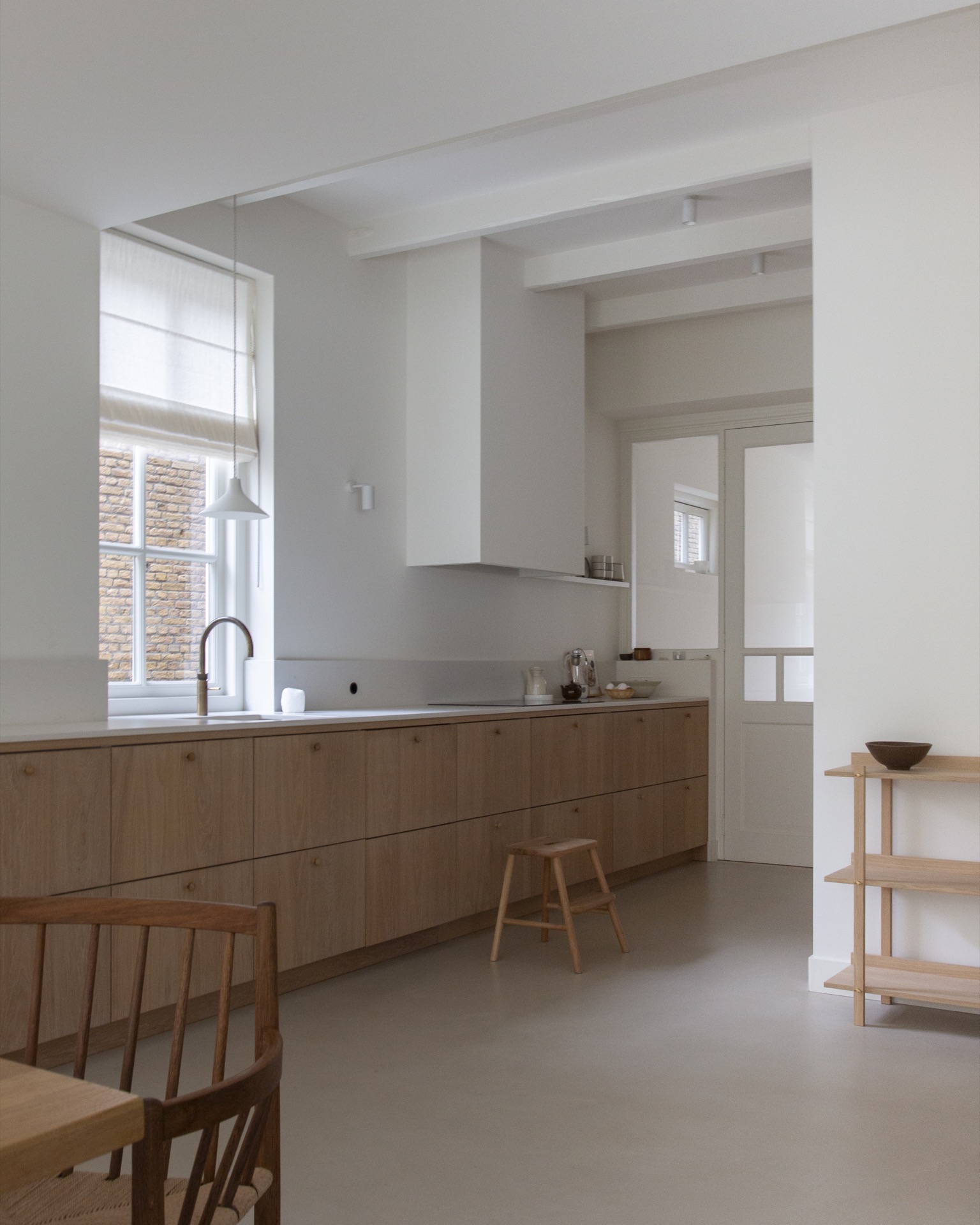
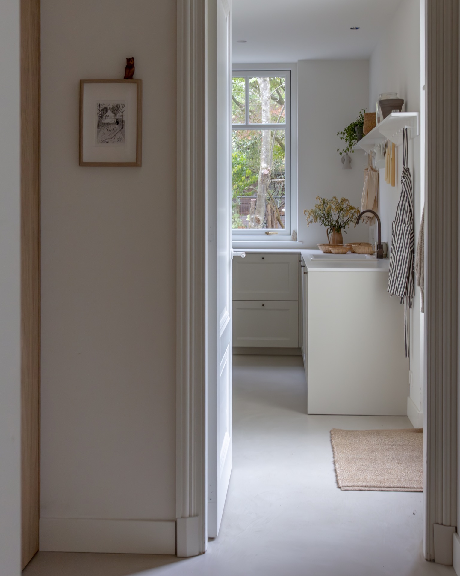
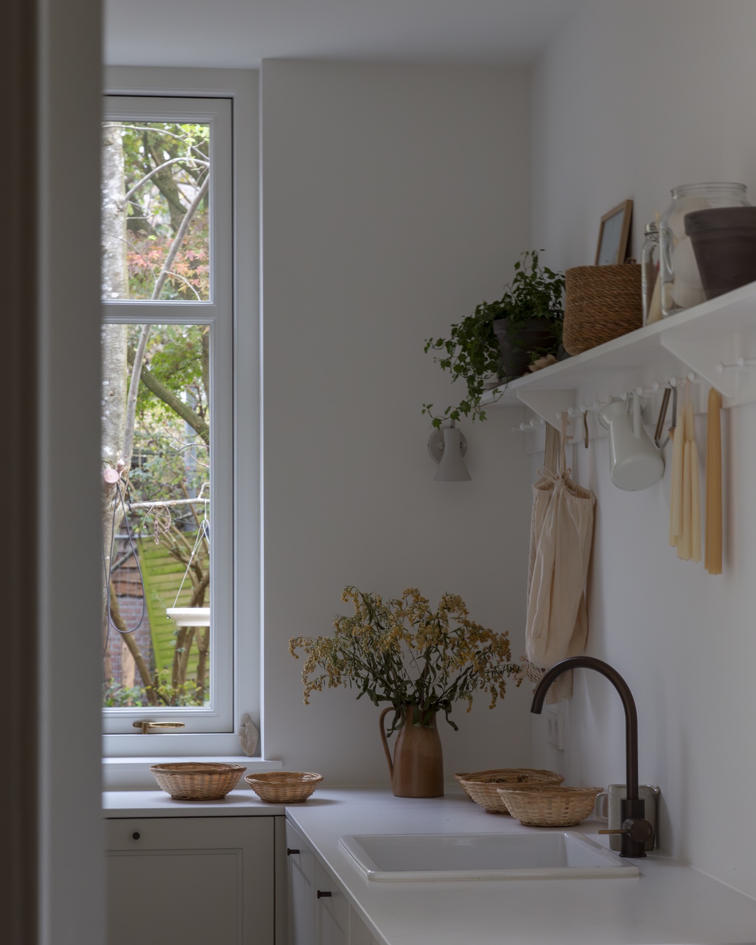
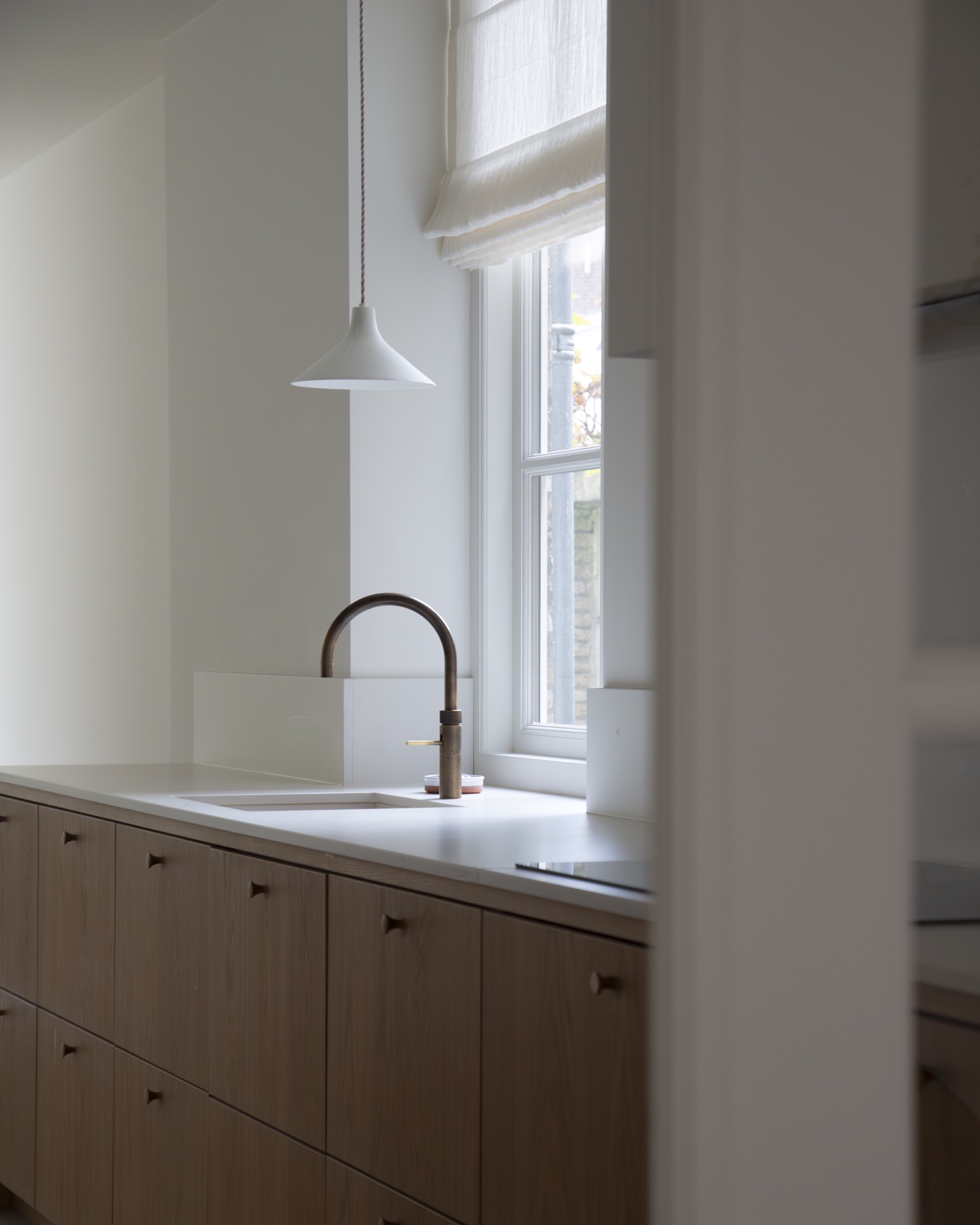
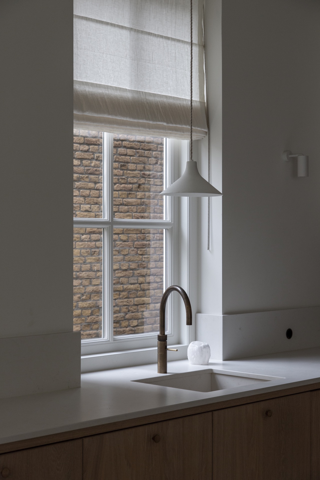
The kitchen sits with its work area by the window, and that placement changes how the room reads. Daylight reaches the countertop directly, so the sink, tap, and work surface stay visible even in the quieter parts of the day. Wooden fronts keep the run of cabinets from feeling cold, while the brick wall behind the window adds a rougher note to the otherwise smooth setting. This is a kitchen by the window that uses its position well: tasks happen in the brightest part of the room, and the view stays part of the daily routine.
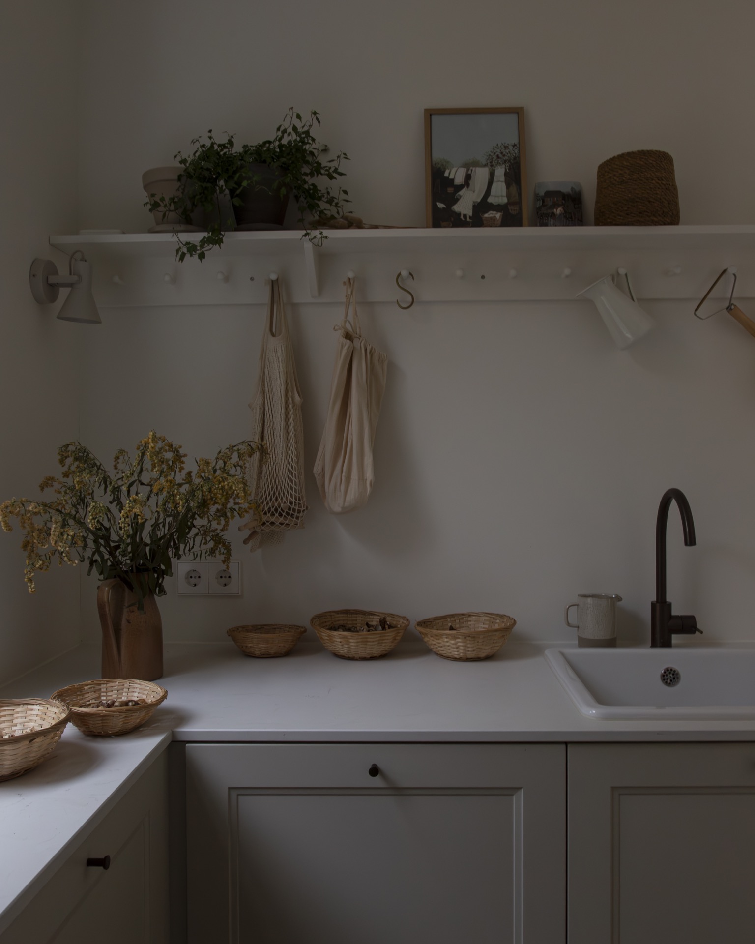
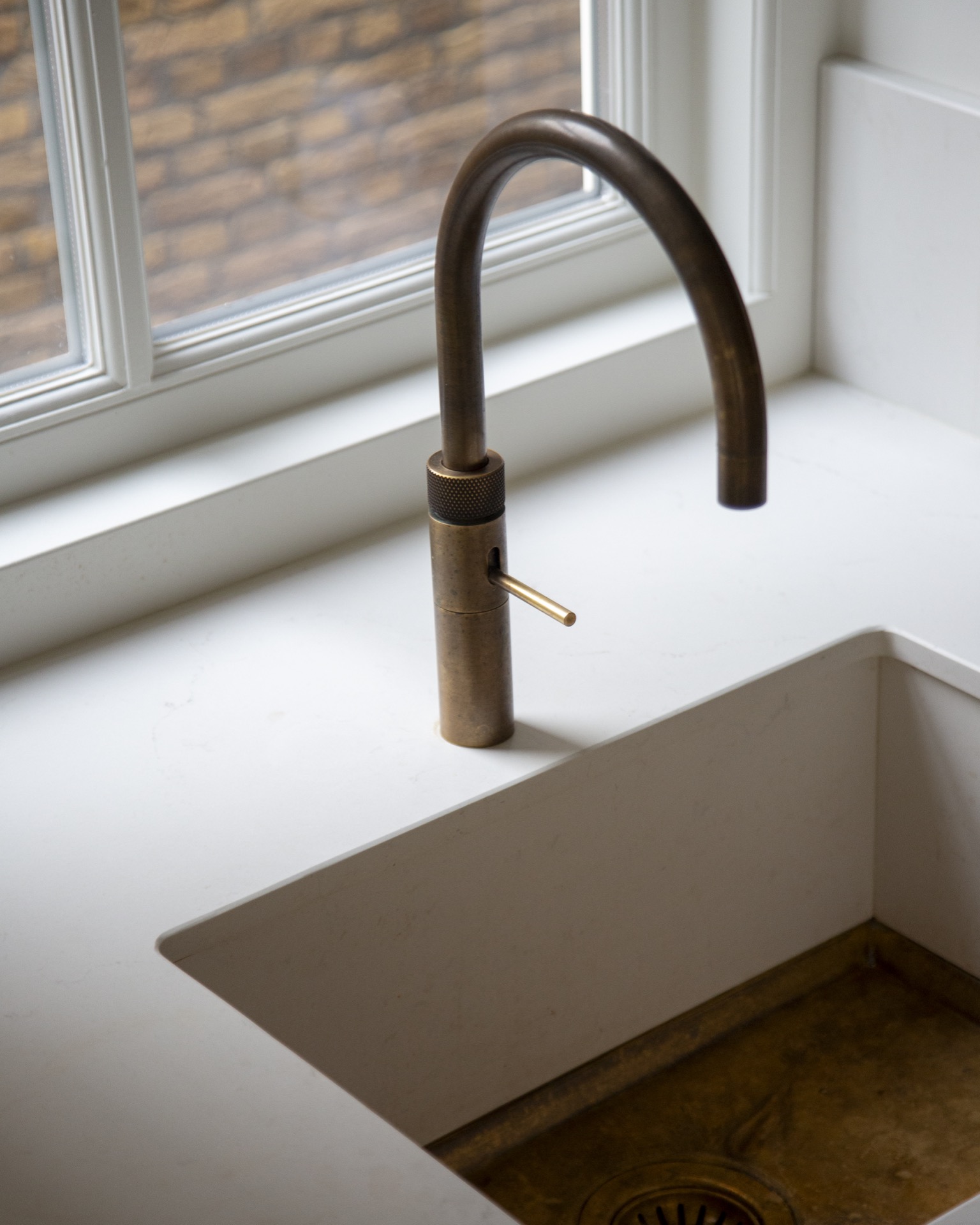
Close up, the details are understated but deliberate. A pale countertop meets a curved tap with a brass tone. Above it, a simple lamp hangs over the working zone. The brick surface behind the window keeps the kitchen from becoming too polished, and the mixture of wood and brass accents brings warmth through material contrast rather than ornament. Even the cabinet rhythm stays quiet, so the window and the light around it can remain the main event.
Cabinet fronts, brick, and the line of the window
The kitchen’s longest line runs beside the window opening, where wood fronts meet plaster and brick in a compact sequence. The eye moves from the sink area to the railing and curtain details, then back to the edge of the worktop. That small shift matters. It shows how the room was fitted around the opening instead of treating it as an afterthought. The result is a kitchen that feels anchored by daylight and by the surfaces that surround it.
Wood carries the rooms without taking over
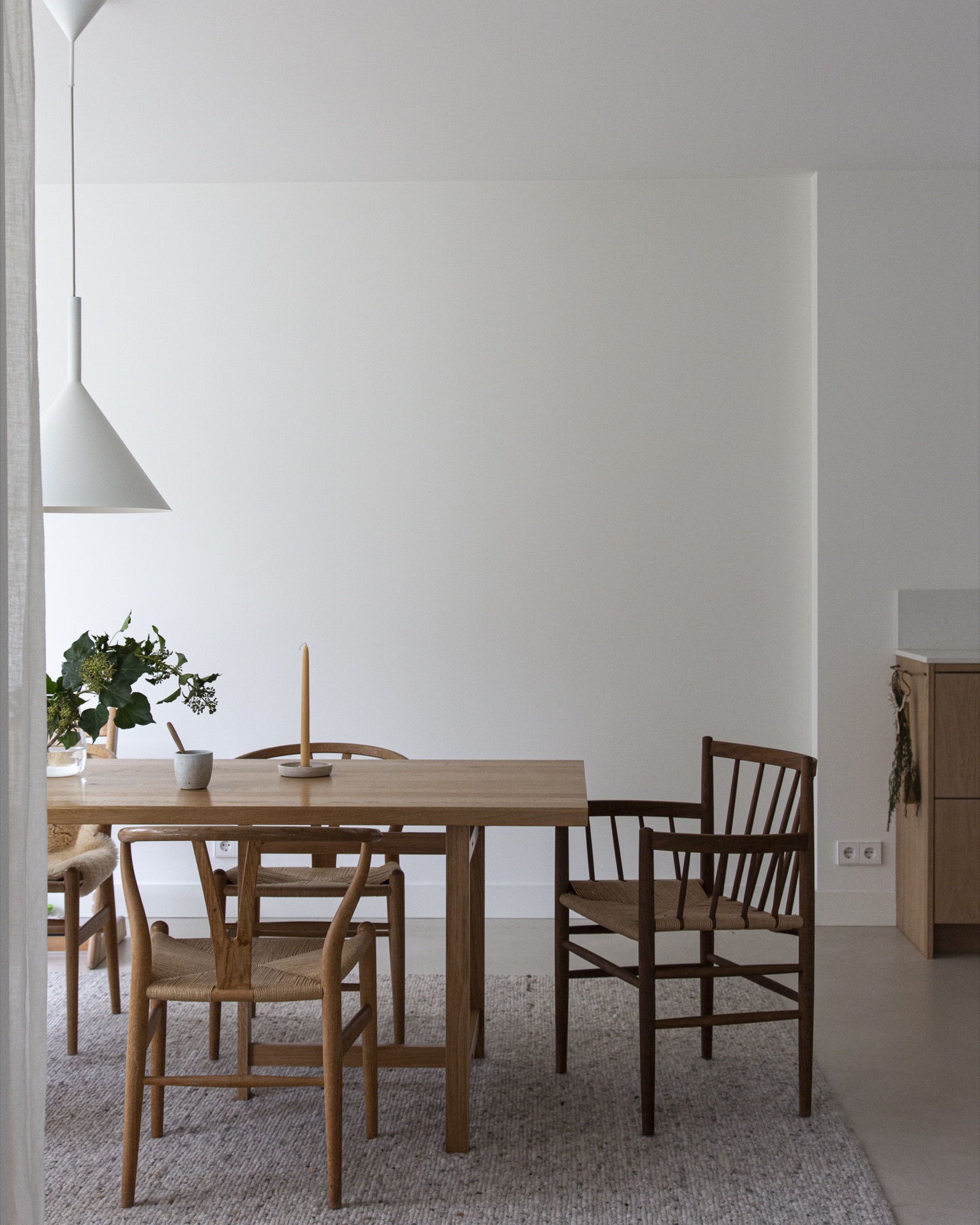
Wood appears in several registers here: as broad floor planks, as cabinet fronts, and as furniture with a natural oak finish. It is present enough to soften the white rooms, but never so dominant that it flattens the plan. In the dining area, the table and chairs form a compact island under the pendant lights, while the rest of the room stays open around them. That spacing makes the furniture read as part of the architecture, not as an isolated set of objects dropped into place.
The brass accents on the furniture and tap repeat the same measured approach. They are small, but they catch light at the edges and give the interior a few points of emphasis without changing its quiet tone. A wool rug sits beneath the dining setting and absorbs some of the visual sharpness of the floor. Across the rooms, the mix of white plaster walls and wood contrast material keeps the house bright while still giving it enough depth to hold the darker notes of brick and metal.
Details that hold the renovation together
Several details do the work that a larger gesture might otherwise try to carry. The curtain rail is visible, so the window treatment reads as part of the architecture rather than as a soft add-on. The frames around openings are crisp. The transitions between wall, ceiling, and joinery stay clean. These are small decisions, but they shape how the whole interior is experienced. They also keep the light interior renovation grounded in the actual structure of the house.
Seen as a whole, the project is less about transformation as spectacle than about adjustment. The rooms have been opened up, but not bleached of their original edges. White plaster walls make the daylight stronger. Microtopping floor finish and timber balance the brightness. Brick, brass, and arched openings keep the interior from becoming generic. The house now reads as a light spacious family home, but one that still holds onto the parts that give it memory and weight.
Want to see more of Studio Rede? View the page of Studio Rede for even more great projects and company information.


NEW 2026 Jubileum Edition The Best Interior Designers Benelux
Order Now €125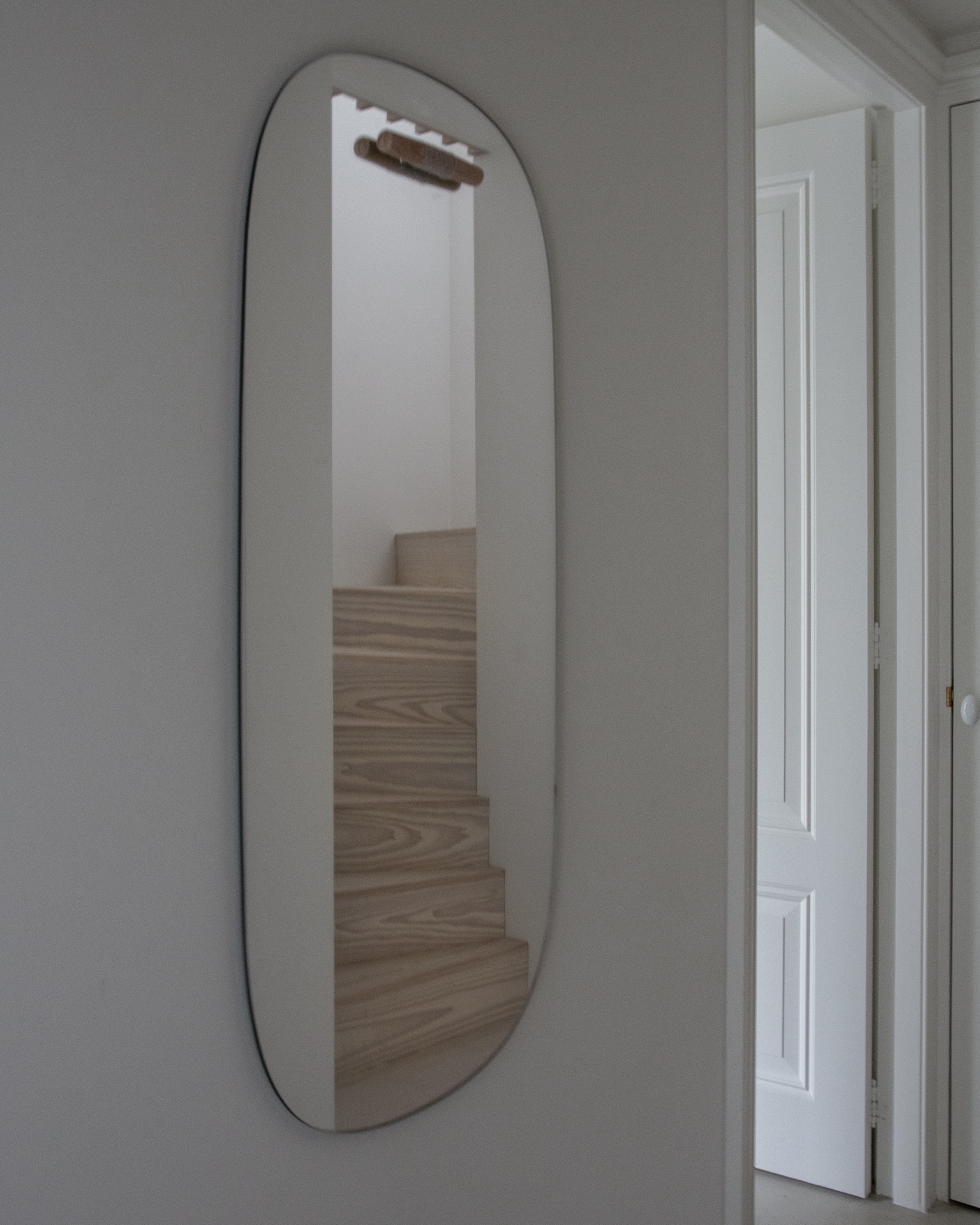
NEW 2026 Jubileum Edition The Best Interior Designers Benelux
Order Now €125
NEW 2026 Jubileum Edition The Best Interior Designers Benelux
Order Now €125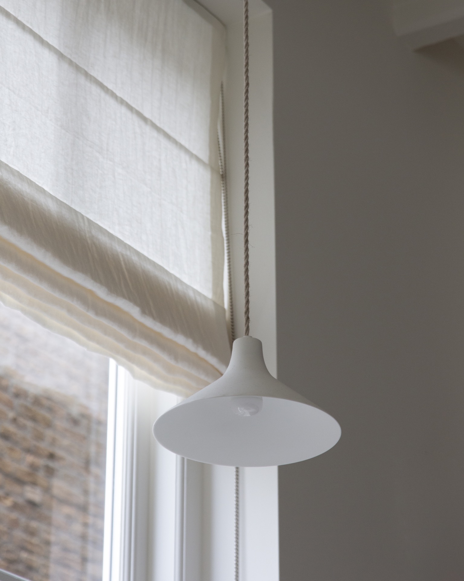
NEW 2026 Jubileum Edition The Best Interior Designers Benelux
Order Now €125