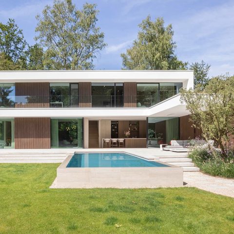
Living extension with large sliding glass doors
Large sliding glass doors set the tone here. They pull daylight deep into the living extension and open the view straight toward the park, where trees, movement and changing light become part of the room. The extension works as a finished piece of the house, with the living kitchen placed at the centre and the boundary between inside and terrace reduced to a single floor line.
Glass that frames the park, not just the room
The most immediate gesture is the glazing. Wide panes and minimal frames keep the garden setting visible from almost every angle, so the eye moves past the table, past the kitchen, and into the green outside. In the exterior views, dark frames and vertical slats give the new volume a sharper outline, while the brick base keeps it rooted in the existing house. The result is a modern home extension that reads as an addition, not an afterthought.
Inside, the same openness changes how the space is used. The room is bright without feeling exposed, because the furniture and joinery sit low against the glass and leave the upper field open. A round dining table and a suspended lamp mark the eating zone without closing it off. The park views remain present even when the room is busy, and that is what gives the extension its pace: stillness at the edge, activity at the centre.
An open plan living kitchen built around daily movement
The open plan living kitchen is the anchor of the extension. It gathers cooking, eating and sitting into one continuous room, but each area still reads clearly through material shifts and placement. The kitchen wall is dark and restrained, while the lighter surrounding surfaces keep the room from feeling heavy. Against that backdrop, the table, the fire zone and the window line create a simple sequence that follows everyday use rather than a formal plan.
What makes this custom kitchen design convincing is the way the cabinetry and work surfaces stay close to the architecture. The kitchen does not compete with the glazing. It sits beside it, using the long sightline toward the park as a backdrop to the work zone. A marble-like surface catches the light differently from the darker wood veneer, so the eye notices edges, joints and changes in depth instead of a display of ornament.
Dark timber, stone and brushed brass
The material mix is measured. Dark-toned oak veneer gives the kitchen a denser visual weight, while the Calacatta Oro marble introduces a pale veining that lifts the composition without breaking it apart. Brushed brass on the taps and lighting adds a softer metal note, picked up again in the reflections across the worktop and fixtures. Nothing is overdrawn. The materials stay legible as separate layers, which is why the room feels controlled rather than decorated.
That restraint also shapes the way the kitchen reads in the photographs. The tall, dark cabinetry forms a backdrop for the lighter table and the glazed wall beyond it. Stone surfaces appear almost architectural, especially where the worktop edge turns and catches the light. The whole arrangement supports the open plan living kitchen without turning it into a display piece. It is designed to be used, and the surfaces make sense when seen from the dining table, the fireplace, or the terrace.
A fireplace feature wall that steadies the room
The fireplace feature wall sits at the visual pause of the extension. Its darker surround and lighter adjacent panels create a clear contrast, and that contrast keeps the room from dissolving into glass alone. In the images, the fire zone appears as a compact focal point with crisp edges and a controlled opening. It gives the living area a place to stop, especially when the sliding doors are open and the terrace becomes part of the interior view.
That sense of pause matters in a room defined by long openings. The fireplace does not compete with the park views; it gives them a counterweight. In winter, the fire area will likely become the part of the room that draws people inward, while the large panes hold the outside in view. The extension then shifts between two reading modes: broad and outward in daylight, tighter and more enclosed at the fire line.
Flooring that continues onto the terrace
One of the clearest moves is the floor treatment. A warm, sand-coloured textured finish runs through the interior and continues onto the terrace, extending the room’s surface outward instead of stopping at the threshold. That continuity is visible, but it also changes how the extension is experienced: the door line becomes less of a break, and the terrace reads as an extension of the living area rather than a separate outdoor zone.
The same texture appears on walls and ceiling, which gives the interior a quieter envelope and keeps daylight from bouncing too sharply across the surfaces. The sand tone softens the darker kitchen joinery and the black window profiles. It also ties the room back to the natural setting outside, where the park greens shift against the lighter interior plane. The materials are modest in number, but they are used consistently, so every surface has a clear role.
Details that keep the extension grounded
Seen from outside, the extension has a direct, almost graphic rhythm. Brickwork, glass and darker structural lines create a sequence that is easy to read in profile. The large panes open the rear of the house, while the darker exterior elements sharpen the edges around the glazing. Inside, the same clarity is carried through in the cabinetry, the fire wall and the circular dining setup, where every object has room to breathe.
What stays with you is not a single gesture but the way the pieces work together in use: the table under the hanging light, the kitchen facing the garden, the fire wall holding the room in place, and the terrace picking up the same floor finish. As a living extension with large sliding glass doors, it is shaped by light and by views, but it is equally defined by the careful sequencing of materials. That is what makes the space feel settled when the doors are open and equally composed when they are closed.
The project shows how a light-filled extension can do more than add square metres. Here, the room is built around sightlines, touchable materials and a clear indoor-outdoor connection. The park view remains present, yet the interior still has enough substance to hold its own. Dark oak, stone, brass and textured plaster keep the composition grounded, while the sliding doors turn the edge of the house into something the residents can move through rather than simply look at.
Want to see more of TEN ARCHITECTS? View the page of TEN ARCHITECTS for even more great projects and company information.




NEW 2026 Jubileum Edition The Best Interior Designers Benelux
Order Now €125


NEW 2026 Jubileum Edition The Best Interior Designers Benelux
Order Now €125


NEW 2026 Jubileum Edition The Best Interior Designers Benelux
Order Now €125


NEW 2026 Jubileum Edition The Best Interior Designers Benelux
Order Now €125


NEW 2026 Jubileum Edition The Best Interior Designers Benelux
Order Now €125