Luxury bathroom renovation with custom vanity and double shower
Marble-look surfaces pull the eye across the room before the layout makes itself clear. A bathroom that dated from the late 1990s has been reworked into a luxury bathroom renovation with a more direct plan, while most of the technical connections stayed where they were. The result is not about adding more elements. It is about shifting what was already there into positions that make daily use feel obvious: the toilet in a separate corner, storage built into a cabinet wall, the bathtub set by the window, and the shower placed opposite it.
A cabinet wall that carries storage and the shower niche
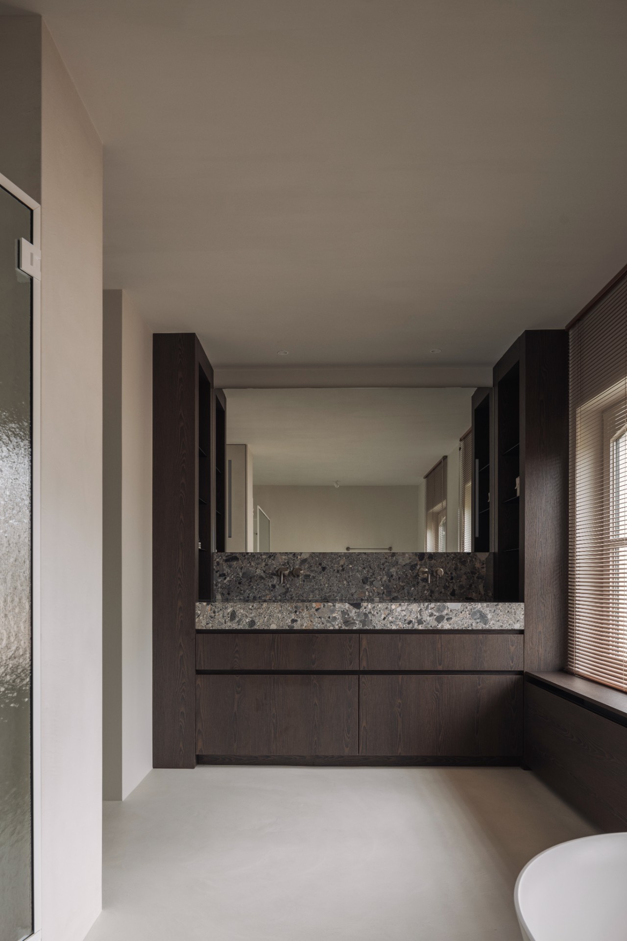
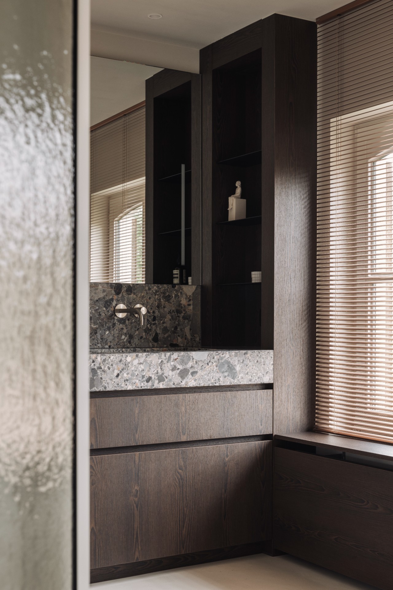
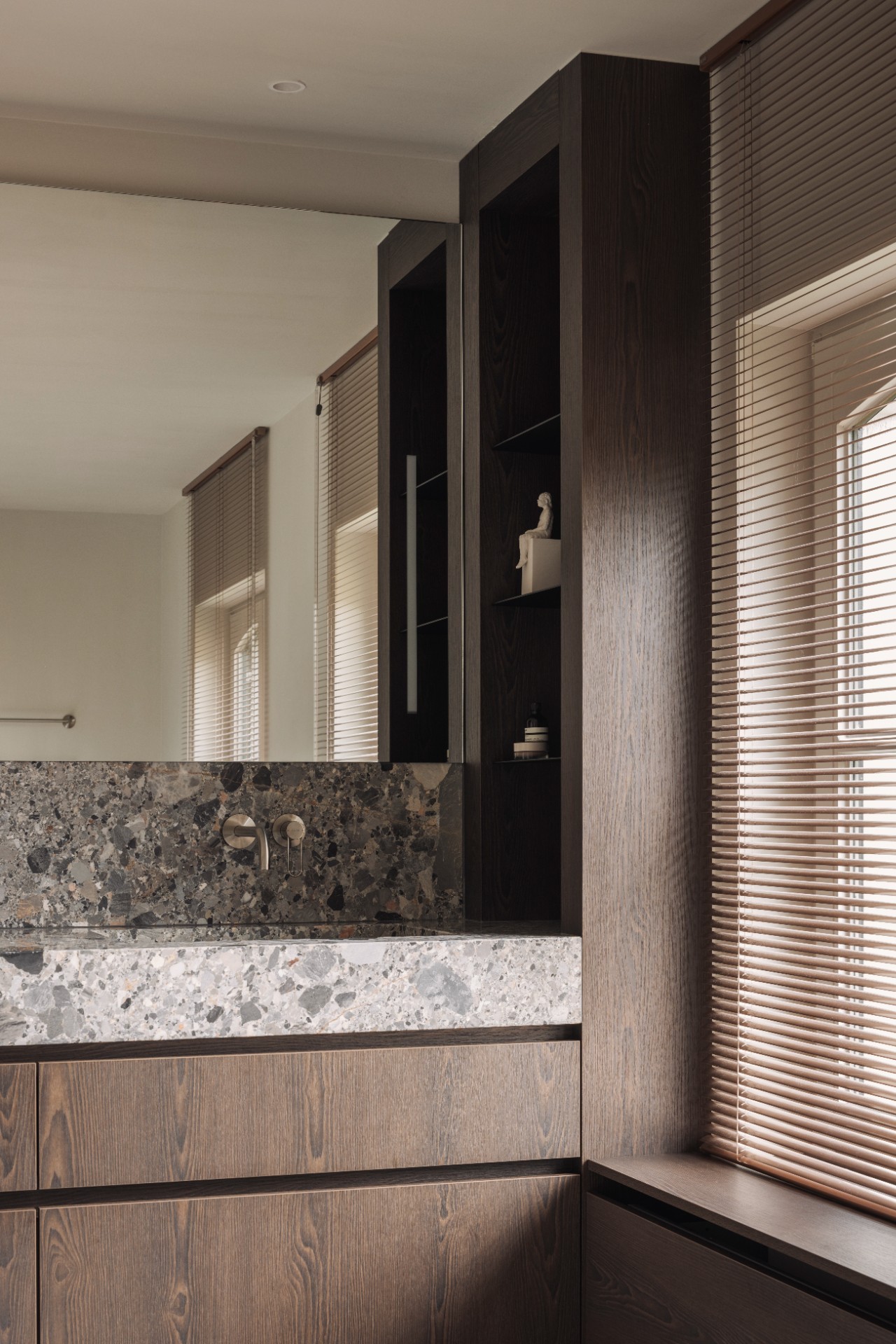
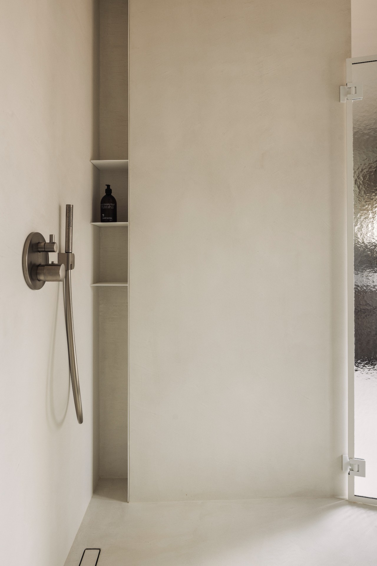
The most useful move sits in plain sight. A full-height cabinet wall gathers the storage, and the same wall continues as a niche in the shower behind it. That gives the room one continuous line rather than a series of loose cupboards. The front reads as a calm stretch of joinery, while the shower side takes advantage of the depth already needed for storage. In this bathroom remodel, the wall does more than hold products. It shapes the route between the vanity, the toilet corner, and the shower zone.
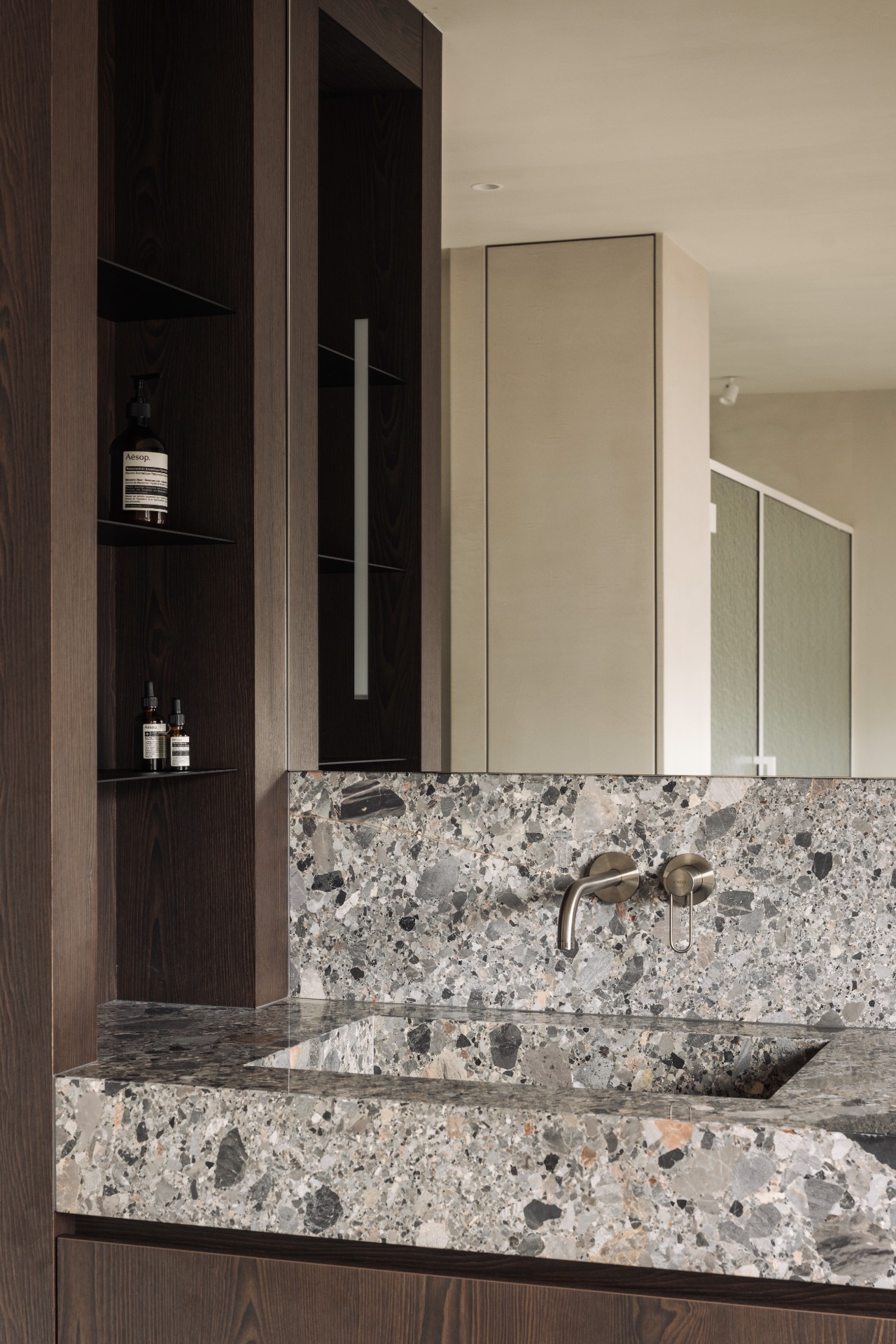
Dark wood fronts break up the pale stone pattern and keep the wall from becoming flat. Open niches are cut into the cabinetry, with shelves that leave toiletries visible but ordered. The detail is small, yet it changes how the room works: bottles and everyday items stay close to the basin, and the shower niche remains part of the same composition. That built-in niche storage is one of the clearest signs that the room was planned around use rather than decoration alone.
The bathtub keeps the window for itself
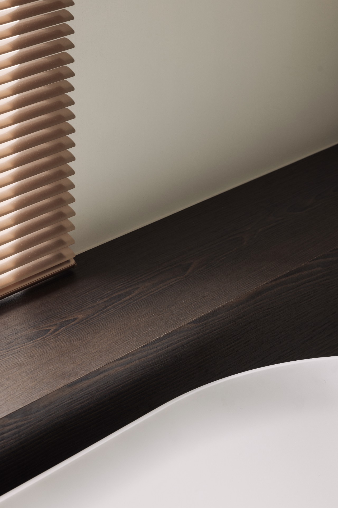
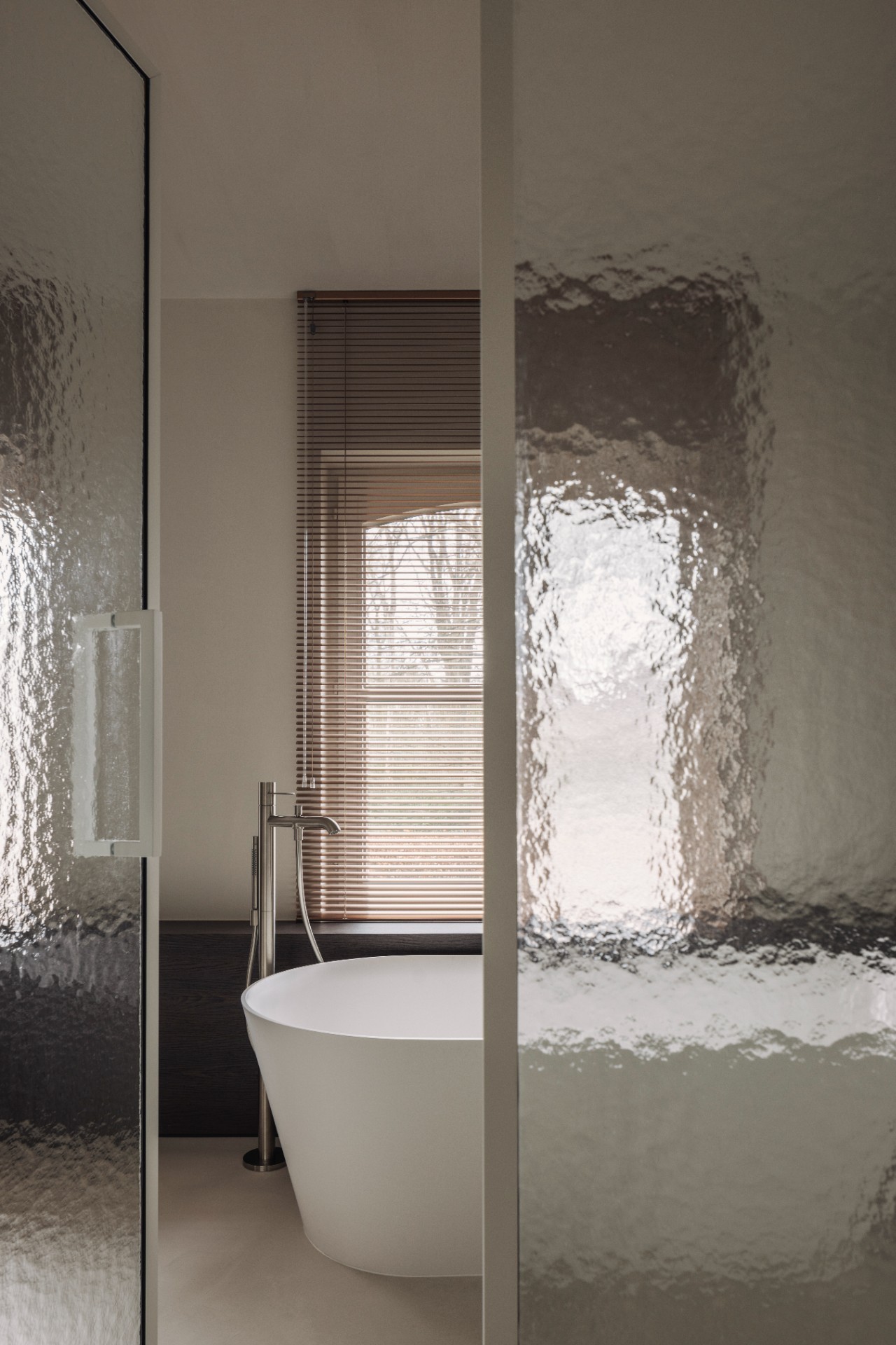
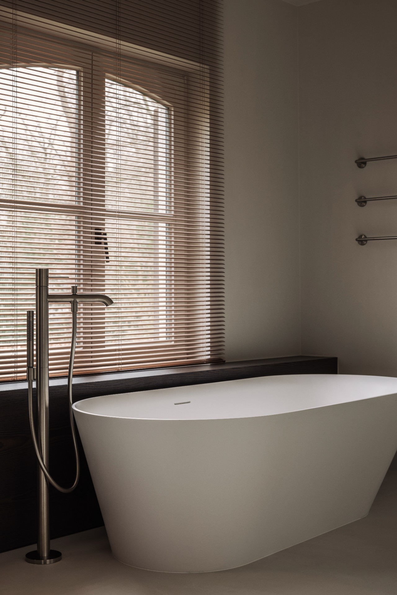
The freestanding oval bathtub was given the best position in the room, directly in front of the window. Light from the horizontal blinds lands across the bath and the surrounding stone, softening the reflective surface without washing out the material contrast. Behind it, the green residential view stays partially screened, which lets the bath feel open without exposing the room. The placement is simple and effective: the bath marks the edge of the room while still keeping the outside presence in sight.
Its rounded form works against the sharper cabinet lines and the straight edges of the shower enclosure. A visible metal tap detail sits beside the basin-like curve of the tub, adding a technical note to an otherwise quiet corner. In a luxury bathroom renovation, this kind of placement matters as much as finishes. The bathtub is not tucked away. It holds the window line and gives the room a clear centre of gravity.
A double shower framed by glass
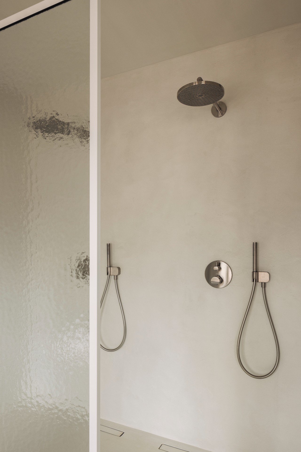
Across from the bath, the double shower opens up in a way the old layout never could. A glass shower enclosure keeps the space visible from the rest of the room and prevents the shower from feeling boxed in. The glass also draws attention to the wall behind it, where the surfaces stay clean and flat until the fittings take over. A ceiling- or wall-mounted shower head and dark control elements bring the focus back to the function of the space, not just the finish.
The shower is sized for two people, which changes the scale of the whole room. Rather than a narrow stall, it reads as a shared wash zone with enough width to stand side by side. That wider span also justifies the cathedral glass shower enclosure: the transparent panel keeps the volume readable, and the frame does not interrupt the line between the vanity, the bath, and the shower. It is the most open part of the room, yet it remains visually controlled.
How the separate toilet corner settles into the plan
The toilet sits in its own corner, slightly withdrawn from the main wash areas. That small partitioned zone takes pressure off the rest of the room. It also keeps the straight sightline between the bath and the shower from becoming cluttered with a fixture that needed a more discreet place. Because the technical connections were largely retained, the new arrangement works with the existing points instead of fighting them. The plan feels adjusted rather than forced, and that restraint gives the renovation its clarity.
What stands out is how little the room asks the user to turn corners. The toilet corner, storage wall, bath, and shower remain easy to read from one position. Even with several functions present, the room avoids feeling chopped up. That is the value of a bathroom remodel handled through placement: the same services stay in roughly the same place, but the room reads in a more direct sequence.
A custom bathroom vanity with room for small routines
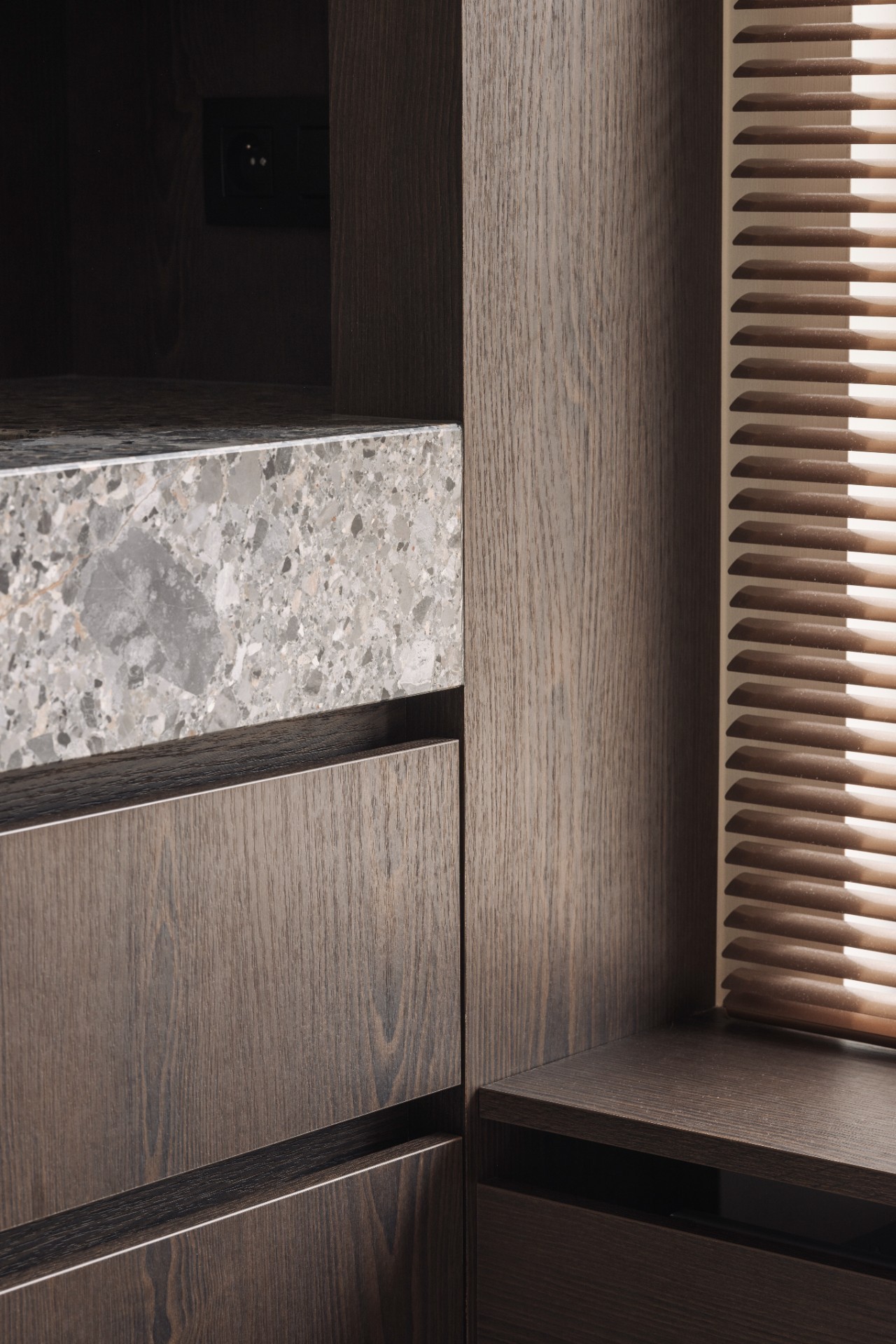
The custom bathroom vanity brings the same discipline to the basin area. Built in the atelier, it combines drawers below with open side niches that keep the most-used items within reach. Those open compartments are not just decorative gaps. They are practical cut-outs that allow the everyday clutter of a shared sink to stay visible but contained. The vanity surface carries the marble-look pattern across the front of the room, linking the wash zone to the broader stone language elsewhere.
Steel shelves inside the side niches add a harder line to the timber and stone. They also separate smaller products from the larger drawer storage underneath, so the upper and lower parts of the cabinet each have a different job. The effect is quiet but precise. The furniture does not try to dominate the room. It keeps the basin area organized and lets the materials do the talking.
Stone, wood, and glass keep their roles distinct
Marble-look bathroom surfaces set the pace, but they do not flatten the room. The stone pattern appears on the vanity, around the niches, and in the cabinet wall, while the wood fronts push back with a darker grain and a more grounded texture. Glass then clears the view again in the shower enclosure. Each material handles a different task: stone holds the room together, wood softens the cabinetry, and glass opens the shower zone. Because the palette stays limited, the layout remains easy to follow.
That clarity is visible in the images as well. The open niches, the front of the vanity, and the shower wall all speak the same language of straight edges and measured detail. Nothing here depends on ornament. The luxury comes from proportion, from where the bath sits under the window, and from the way the cabinet wall folds storage into the shower itself. In that sense, the luxury bathroom renovation is less about adding more and more about removing confusion from the plan.
Light, privacy, and the finish around the window
Horizontal blinds give the window a practical role beyond the view. They let daylight enter in narrow bands, which keeps the bath zone bright without exposing the room. The strips of light settle on the oval tub, the stone surfaces, and the nearby fittings, showing the texture of each material rather than flattening it. That effect works especially well in a room with strong straight lines, because the blinds add a finer rhythm to the larger surfaces.
Near the floor, the wood tone returns in smaller elements, anchoring the room after the brighter stone and glass surfaces. The transition from cabinet front to shower wall to window is never abrupt. It moves through texture and reflection instead. For a project that began with an outdated layout, this new bathroom feels measured and easy to read. The room now has a separate toilet corner, a custom bathroom vanity, built-in niche storage, a freestanding oval bathtub, and a glass shower enclosure that together define the new plan.
Want to see more of NERF Interieur? View the page of NERF Interieur for even more great projects and company information.


NEW 2026 Jubileum Edition The Best Interior Designers Benelux
Order Now €125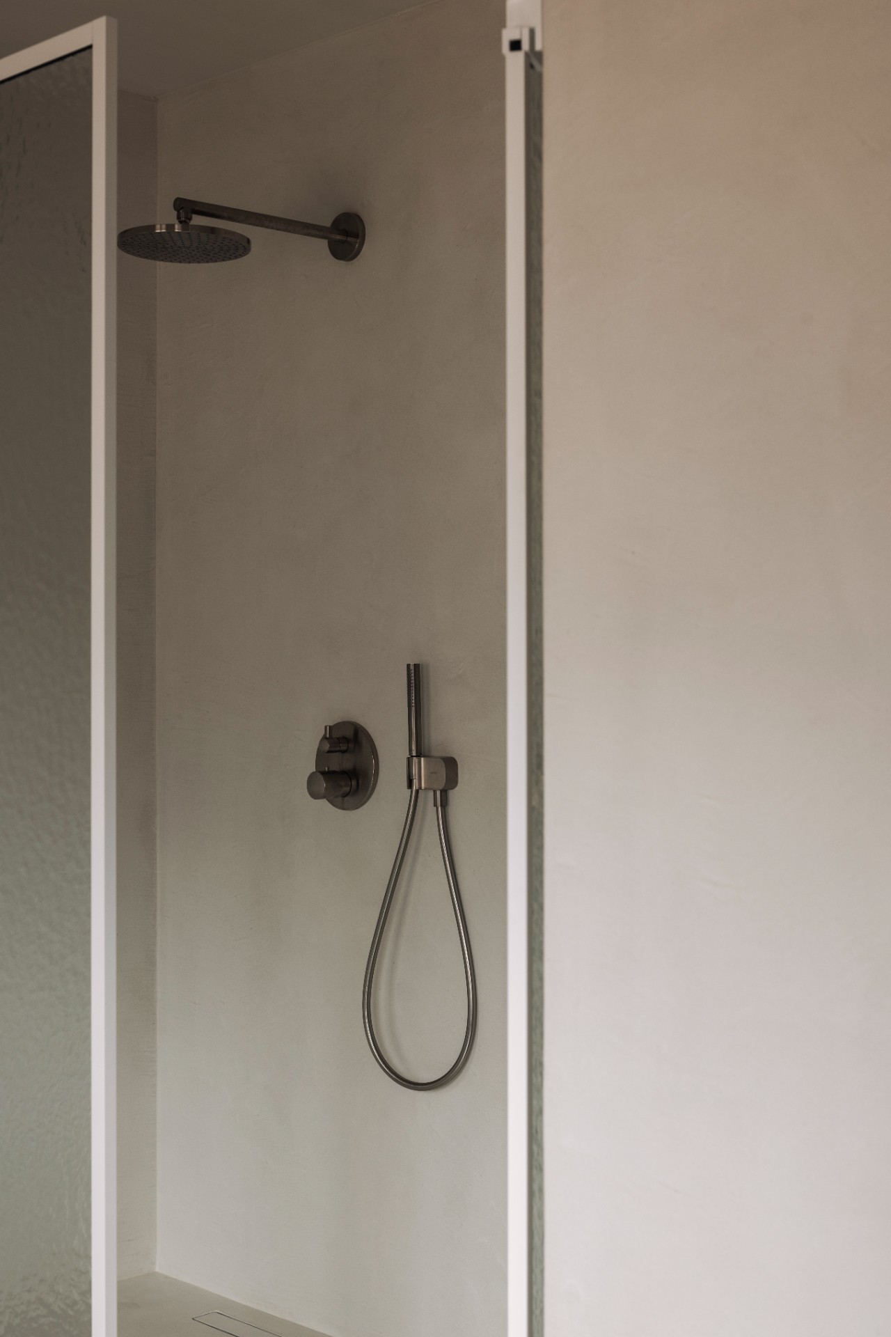
NEW 2026 Jubileum Edition The Best Interior Designers Benelux
Order Now €125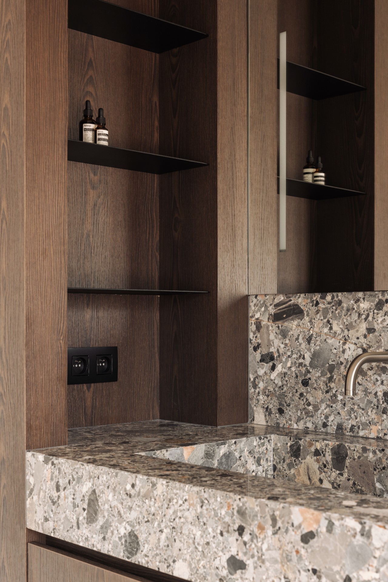
NEW 2026 Jubileum Edition The Best Interior Designers Benelux
Order Now €125