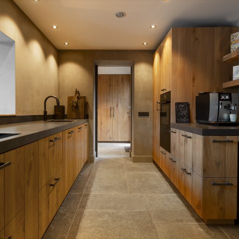
Luxury kitchen with island
The dark countertop is what catches the eye first. Its marble-look surface runs across the island and then continues down the side, so the stone pattern reads as one continuous gesture rather than a separate top and base. Against that, the black kitchen fronts stay quiet and precise, giving the island room to take the lead. The result is a luxury kitchen with island that relies on material contrast instead of excess.
Marble-look surface with a bookmatched edge
The bookmatched countertop gives the island its clearest line. Veining folds across the surface and carries on over the side panel, which makes the volume feel more architectural. In close-up, the marble veining countertop detail shifts between grey, beige and a trace of gold, changing with the light. That movement is strongest where the top wraps around the island edge, turning a practical surface into the main visual plane in the room.
Because the island is finished in a marble-look material rather than a plain slab, the surface holds attention without becoming noisy. The veining has enough variation to break up the darker base, but the pattern remains controlled. It sits well beside the surrounding black kitchen fronts, which use a finer vertical texture and keep the composition from feeling flat. This is where the luxury kitchen with island gets its depth: from the way one surface meets another.
Gold accents placed where the eye lands
The gold boiling water faucet is not treated as a separate feature; it is placed right where hands, water and countertop meet. That makes the finish feel functional and visible at once. The curved spout stands out against the darker worktop, and the reflective surface picks up light from the room. Nearby, a gold-look wine niche detail adds another note in the same tone, but in a quieter register. It reads as part of the kitchen’s material rhythm rather than ornament for its own sake.
These warm metallic accents work because the rest of the palette stays restrained. Black fronts, a dark island top and the stone-like veining form the base layer. Gold then cuts through that darker field in small, precise moments. On the island, the faucet becomes the brightest point. In the wall area, the wine niche detail repeats the tone in a narrower frame. Together they give this luxury kitchen with island a clear direction without crowding the space.
Black kitchen fronts with a fine vertical texture
The black kitchen fronts do more than provide contrast. Their vertical profiling gives the cabinetry a slight surface rhythm, especially when light touches the edges. That texture is subtle, but it matters. It keeps the larger cabinet wall from appearing heavy and it gives the island and worktop a cleaner backdrop. Seen from across the room, the black fronts pull the eye inward, toward the island and the lighter veining above it.
There is also a practical effect to the darker fronts: they frame the brighter details. The gold faucet stands out more clearly. The marble-look countertop appears richer because the surrounding cabinetry does not compete with it. Even the built-in appliances sit quietly within the composition. Nothing interrupts the main reading of the room, which is a single, strong island set against a dark perimeter of storage.
Light above the island changes the whole room
Above the island, the pendant light over island introduces a woven texture that softens the hard surfaces below. Its large shade adds volume overhead, so the room feels layered from floor to ceiling. In the images, the pendant sits in dialogue with the long worktop beneath it and the black cabinet wall behind it. The scale is important: one large light is enough to anchor the island, while still leaving the stone pattern open and readable.
At certain angles, the light also picks up the nearby window and the daylight around it. That layered lighting gives the island a different presence at different times of day. The marbling becomes sharper near the edges, then softer across the center. The pendant does not merely decorate the ceiling; it helps define the working zone over the island and adds another material note to a room already built from strong surfaces.
How the island volume is made to read as one piece
The side of the island matters as much as the top. Because the countertop pattern continues downward, the island reads as a single block rather than a box with a separate lid. That continuous edge is what makes the marble-look kitchen island feel more deliberate. It also gives the lower part of the island a stronger visual identity, especially where the darker surface meets the lighter veining and the fine lines in the cabinetry.
Seen from the side, the proportions are clear: the top projects enough to show the bookmatch effect, while the base remains calm and structured. The edge detail sharpens the silhouette. It is a small construction move, but it changes how the entire kitchen is experienced. The island does not dissolve into the room; it anchors it.
A kitchen built from contrast, not clutter
What gives this kitchen its presence is the discipline of the palette. Dark cabinetry, a stone-look island top, gold fittings and one large hanging light are enough to shape the room. Each element has a clear role. The fronts hold the perimeter. The island carries the pattern. The faucet adds a bright touch. The pendant light marks the center from above. With those pieces in place, the room feels considered without being overworked.
That clarity makes the kitchen easy to read from different positions. From one angle, the eye lands on the gold faucet. From another, it follows the veining across the bookmatched countertop. From a wider view, the black kitchen fronts pull everything into a darker frame and let the island stand forward. It is a straightforward arrangement, but the detailing gives it enough visual tension to remain interesting.
The final impression comes from the relationship between surface, line and light. The marble-look kitchen island carries the strongest pattern, the black kitchen fronts set the tone around it, and the pendant light above the island adds a softer layer overhead. Gold accents appear at the faucet and in the wine niche detail, tying the room together through small flashes rather than large gestures. That restraint is what makes the space memorable.
Want to see more of The Kitchen Art Studios? View the page of The Kitchen Art Studios for even more great projects and company information.



NEW 2026 Jubileum Edition The Best Interior Designers Benelux
Order Now €125