










Luxury modern kitchen with glass partition
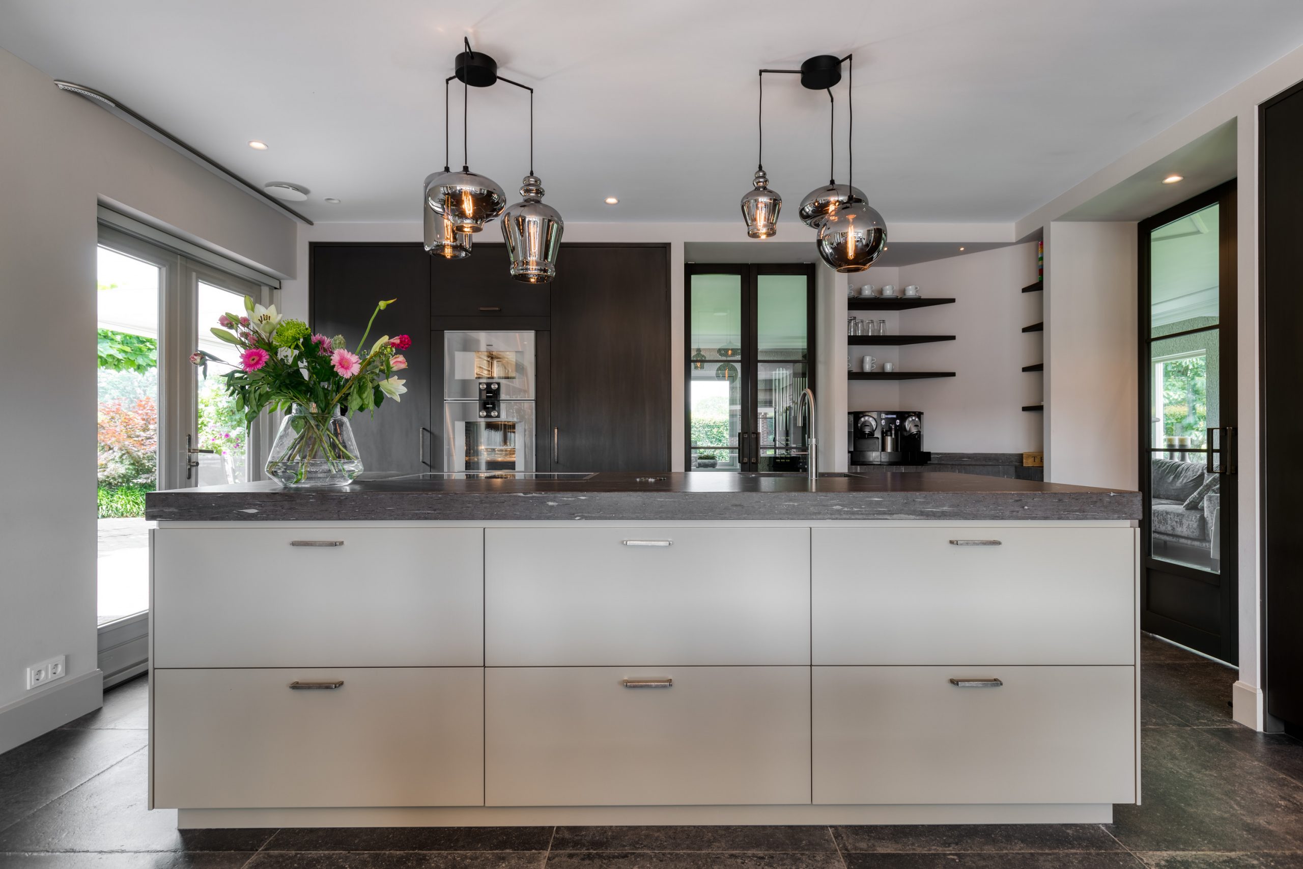
Dark cabinet fronts set the tone immediately. They run in a long line beside a large work surface in a stone-look finish, while the ceramic floor below reads in broad grey slabs. The result is a luxury modern kitchen that is built around material contrast rather than decoration. Glazed pendant lights hover above the workspace and throw a softer note across the darker joinery.
Dark cabinet wall with integrated storage
The main storage wall is handled as one continuous composition, with deep-toned doors, fitted appliances and drawers kept flush within the surface. Small metal handles catch the light without breaking the calm line of the cabinetry. Open niches interrupt the darker front in a measured way, giving the eye somewhere to rest between closed volumes and working zones. This is where custom kitchen cabinetry does most of its work: not by showing off, but by keeping tools, appliances and storage tightly organized in view.
White front elements appear in the kitchen too, creating a clear offset against the darker units. The contrast is practical as much as visual. It helps the larger composition read in layers: worktop, base cabinets, wall storage and the taller fitted units behind. Across those planes, the kitchen interior with ceramic floor remains grounded and quiet, with the floor finish continuing the same grey-brown register seen in the cabinetry and stone surfaces.
A stone-look counter that carries the room
The broad countertop is the strongest horizontal line in the space. Its dark, natural stone countertop look gives weight to the working area and extends the kitchen visually from one cabinet run to the next. The edge is crisp, and in the close-up details the junctions stay deliberately restrained. That precision matters because the surface is doing more than holding objects; it frames the entire cooking zone and keeps the composition legible from different angles.
From the wider view, the worktop also acts as a transition between solid storage and the open center of the room. It meets the light-toned fronts on one side and the darker fitted wall on the other, so the kitchen reads as a sequence rather than a single block. The pendant lights above the kitchen reinforce that sequence, dropping a warm point of focus over the work surface instead of spreading attention evenly across the room.
Glass partition to hall and black frames
The connection to the hall is visible through a transparent threshold rather than a closed wall. A glass partition to hall, held in black frames, lets the circulation space remain part of the kitchen view. You can read the line of the doorway, the ceiling lights beyond and the shift from kitchen floor plates to the darker passage area. It is a subtle move, but it changes how the room is experienced: the kitchen feels open to movement without losing its own boundaries.
Black frames sharpen that transition. They outline the glass without crowding it, and they match the darker notes in the kitchen cabinetry. In the hall, the same framing appears again around the glazed segment, so the route between spaces stays visually coherent. The glazing also allows daylight to travel deeper into the interior, picking up the grey tone of the floor and the dark wall finishes along the way.
Light, line and the path through the interior
Ceiling spots and a linear light element mark the passage beside the glass. Their placement is understated, but they make the route readable. The hall does not compete with the kitchen; it acts as a framed extension of it, with the glazing and black trim keeping the two spaces in dialogue. That line of sight is one of the clearest features in the project, because it lets the kitchen read as part of a larger interior sequence instead of as an isolated room.
In the wider composition, the light, the dark cabinet wall and the glazed partition settle into a strong horizontal and vertical grid. The kitchen surfaces stay low and grounded, while the glass and frames lift the eye toward the adjoining corridor. It is a layout built on clear edges and controlled openings, with each surface revealing the next.
Pendant lights and material detail at close range
The pendant lights above the kitchen have glass shades, so the bulbs remain visible as warm points rather than hidden sources. That makes the working zone feel drawn together without becoming visually heavy. Their round forms soften the straight cabinet runs, and the effect is strongest when seen against the dark wall units and the stone-look counter. The light does not wash over everything; it concentrates where the cooking and preparation area needs it most.
Close detail shots show how carefully the finishes meet. Metal handles sit on the dark fronts with a slim profile. A linear handle appears on a stone-like wall zone, catching a different kind of reflection from the cabinet hardware. These are small moves, but they give the kitchen its texture. The surfaces are not overly varied, so the change from glass to metal to stone becomes the main visual interest.
Edges, handles and the finishing line
The detail images are especially clear about the construction of the room. Cabinet doors align tightly, the handle positions stay consistent and the worktop edge reads as a sharp boundary rather than a decorative profile. Even the stone-like wall area with the linear metal handle stays restrained, which keeps attention on the material change itself. In a kitchen built around dark cabinetry and a broad counter, those finishing lines carry more weight than ornament would.
Seen together, the kitchen images describe a space that relies on proportion, depth and surface control. The dark cabinet wall, the natural stone countertop, the glazed link to the hall and the ceramic floor all belong to the same visual language. Nothing here is overstated. Instead, the room is defined by how the parts meet: matte against gloss, solid against transparent, deep tones against lighter fronts. That is what gives the luxury modern kitchen its clear presence.
From the entrance view to the close-up of the handle, the project keeps returning to the same set of materials and lines. The glass partition to hall stays visible as a spatial hinge, the black frames keep the opening legible, and the pendant lights above the kitchen add a small, concentrated glow. Together they turn a straightforward cooking space into an interior with clear edges and a measured sense of depth.
Want to see more of Dauby: exclusive door, window and furniture hardware? View the page of Dauby: exclusive door, window and furniture hardware for even more great projects and company information.




NEW 2026 Jubileum Edition The Best Interior Designers Benelux
Order Now €125


NEW 2026 Jubileum Edition The Best Interior Designers Benelux
Order Now €125


