









Metal tiles with a handcrafted finish
Metal tiles set the tone before the rest of the kitchen is fully read. In the images, the wall works almost like a field of small squares and rectangles, catching light in different ways as the view shifts across the cook zone. The pattern feels deliberate, but not rigid. It leaves room for the grain of wood, the pale cabinet fronts, and the darker worktop edges to stay visible around it.
A wall that reads as surface, not filler
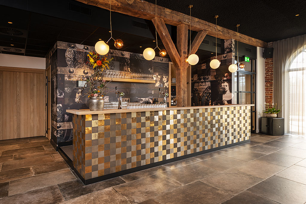
The collection is shown as a kitchen accent wall rather than a background detail. That matters, because the metal tile wall has enough presence to hold the room together visually. Some images show a checkerboard tile pattern in black, grey, and white; others move toward bronze and rust tones. The result changes with the surrounding materials, yet the same basic rhythm stays in place: compact modules, clear joints, and a surface that catches light instead of flattening it.
The project also shows how metal look tiles can sit between different kitchen languages. One setting leans more rural, with timber above and around the work area. Another feels sharper, with white cabinets and a dark counter line. In both cases, the metal tile wall is the element that pulls the eye in first. It gives the kitchen a defined vertical plane, especially where the backsplash meets the hob and the surrounding cabinetry.
Cast in sand, finished by hand
The making process is part of the appeal. These are handcrafted tiles, cast in sand molds and then refined by hand. That same approach is used for the metal tile collection and for the matching door, window, and furniture hardware in the project text. It is a method that leaves room for variation in the surface. Small imperfections are not hidden; they sharpen the character of the tile pattern and make each piece slightly different from the next.
Over time, the surface develops a natural patina finish. The source text describes that shift as an advantage: the older the product becomes, the more it changes in appearance. On a wall of metal tiles, that is visible as a gradual deepening of tone and texture rather than a flat, static finish. The material does not try to stay frozen on day one. It is designed to age into something more readable.
Square and rectangular formats
The collection comes in two sizes: 10 x 10 cm and 10 x 20 cm. That variation changes the way the wall reads. The smaller format brings out the checkerboard tile pattern more clearly, while the rectangular option stretches the rhythm across the surface. Both formats keep the same compact scale, which is why the wall can sit comfortably behind a cooktop without overpowering the rest of the kitchen.
Five finishes are mentioned: aged iron look, white bronze, rough bronze, raw metal, and matte white bronze. Together they move from dark and muted to lighter, reflective tones. In the imagery, that range is visible in the shift from charcoal and grey to bronzed and copper-like shades. The metal tiles are not presented as a single effect, but as a family of surfaces that can change the mood of a room through color and reflection.
Where the pattern does the work
Several of the kitchen views rely on contrast rather than decoration. A pale cabinet runs beside a darker plane. Wood brings in visible texture. Stone or stone-look surfaces appear near the work area. Against that mix, the kitchen backsplash tiles become the most graphic element in the room. The repeated square modules break up large surfaces and give the eye a clear line to follow, especially where lighting falls across the wall from above.
The checkerboard tile pattern also shifts depending on distance. From far away, it reads as a strong field with an almost woven effect. Up close, the small variations in tone and finish become more important. That is where the handcrafted tiles show their strength. The surfaces are not overly polished, and the slight irregularity helps the wall avoid looking mechanical. It feels composed, but not machine-flat.
Easy tile care for an active kitchen wall
Despite the visual depth, the care routine stays simple. The project text recommends a soft, damp cloth for regular cleaning. Grease spots and limescale can be removed with a soft cloth and a little vinegar. Acidic or aggressive cleaning products should be avoided. That straightforward approach suits a metal tile wall in a working kitchen, where the backsplash needs to handle daily use without demanding special treatment.
The maintenance instructions also fit the material logic of the collection. A patina finish is not treated as a flaw to erase. It is part of the surface’s life. So instead of trying to keep the tiles unchanged, the care routine focuses on removing marks that do not belong there, while leaving the natural evolution of the metal visible. The wall keeps its character, even as it is cleaned.
Details that stay visible in the room
What gives these metal tiles their presence is not scale alone, but the way the finish breaks light. In the kitchen images, the wall can appear soft in one moment and more reflective in the next. That makes the surface feel active, especially beside wood, white cabinetry, or a dark counter. The small grid of the pattern keeps the wall legible from a distance and close enough to reward a slower look.
As a kitchen accent wall, the collection works best when the rest of the room leaves space around it. The surfaces shown here do that well. Timber, pale fronts, black worktops, and stone textures keep their own role. The metal tile wall then acts as the fixed point in the composition, with its handcrafted tiles, visible texture, and changing patina carrying the scene forward.
Want to see more of Dauby: exclusive door, window and furniture hardware? View the page of Dauby: exclusive door, window and furniture hardware for even more great projects and company information.




NEW 2026 Jubileum Edition The Best Interior Designers Benelux
Order Now €125


NEW 2026 Jubileum Edition The Best Interior Designers Benelux
Order Now €125


NEW 2026 Jubileum Edition The Best Interior Designers Benelux
Order Now €125


NEW 2026 Jubileum Edition The Best Interior Designers Benelux
Order Now €125


