Modern apartment interior with a view of greenery
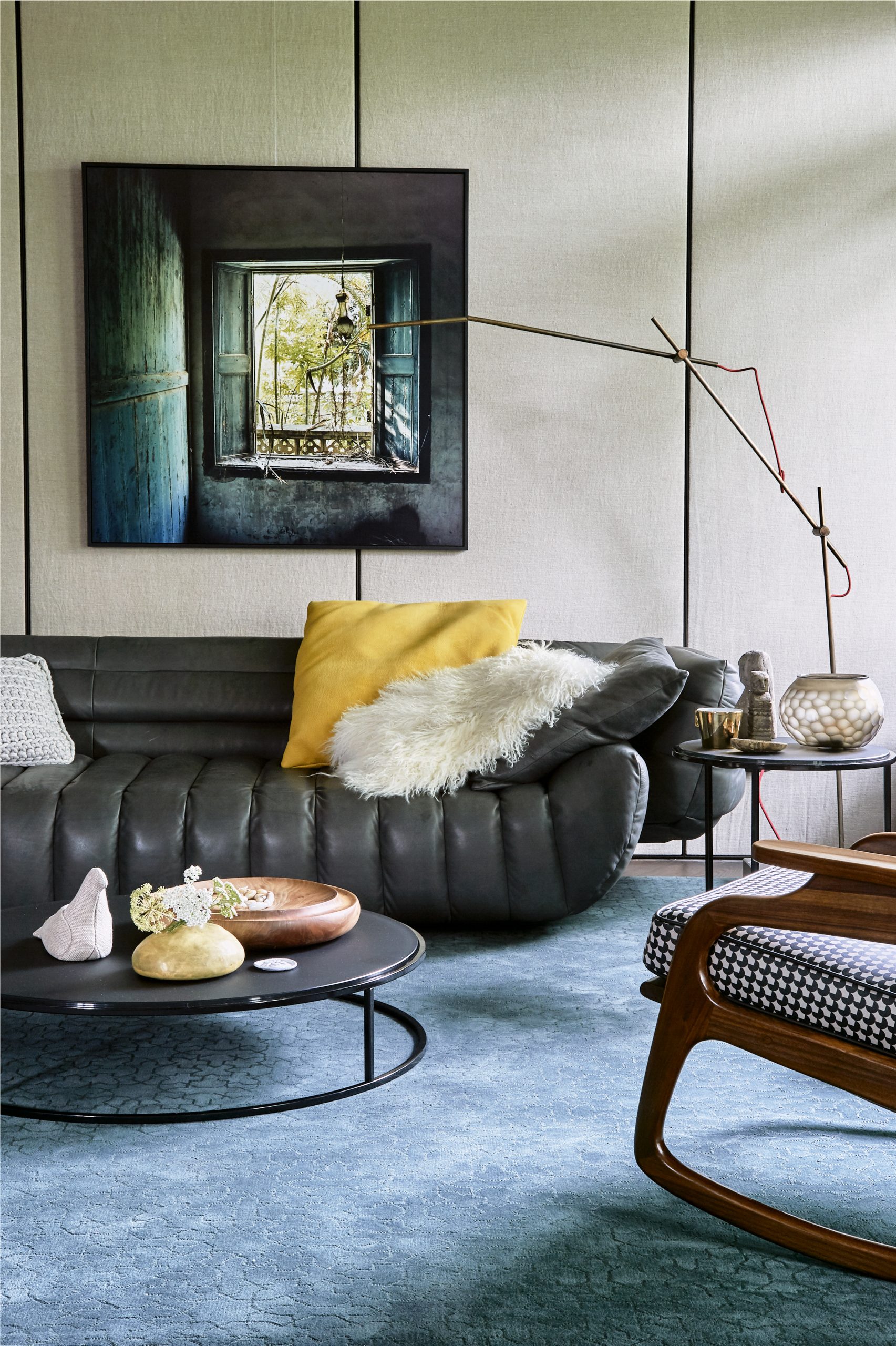
A wide green view sets the tone before the room itself does. Inside, the apartment reads as a modern apartment interior with clear lines, dark joinery and a restrained palette that lets the materials do the work. Light moves across the floor, the wall panels and the glazed partitions, while the rooms stay visually calm and open. The result is a modern apartment interior that feels shaped by contrast: soft daylight outside, deeper tones and tighter detailing inside.
Windows that hold the view in place
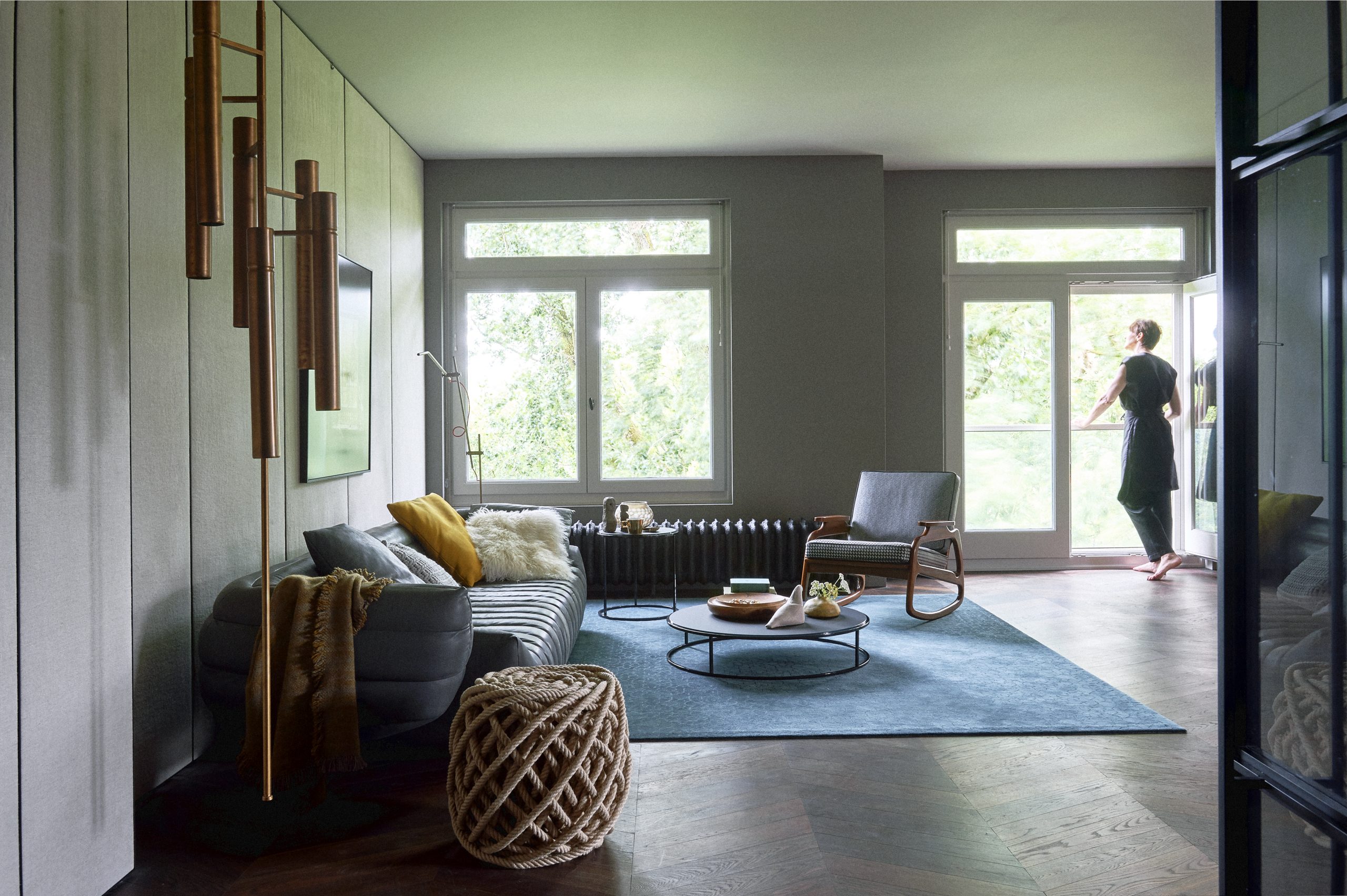
Large windows pull the park outlook into the living space and give the room its main horizon. The eye moves from the greenery outside to the darker built-in elements inside, so the apartment never feels closed off. Instead, the glazing creates a steady connection to the view while the interior keeps its own rhythm through panel lines, lowered light points and measured surfaces. In this modern apartment interior, the window wall is not a backdrop but part of the composition.
That effect is strongest where the daylight hits the darker finishes. The contrast makes the room read in layers: glass, wall, furniture and opening. Nothing shouts for attention, but the proportions are precise. The living area uses that green outlook as a visual pause, and the apartment interior becomes quieter because of it. Even the linear lighting seems to follow the same rule, running cleanly rather than breaking the room into fragments.
Dark custom cabinetry against a clean frame
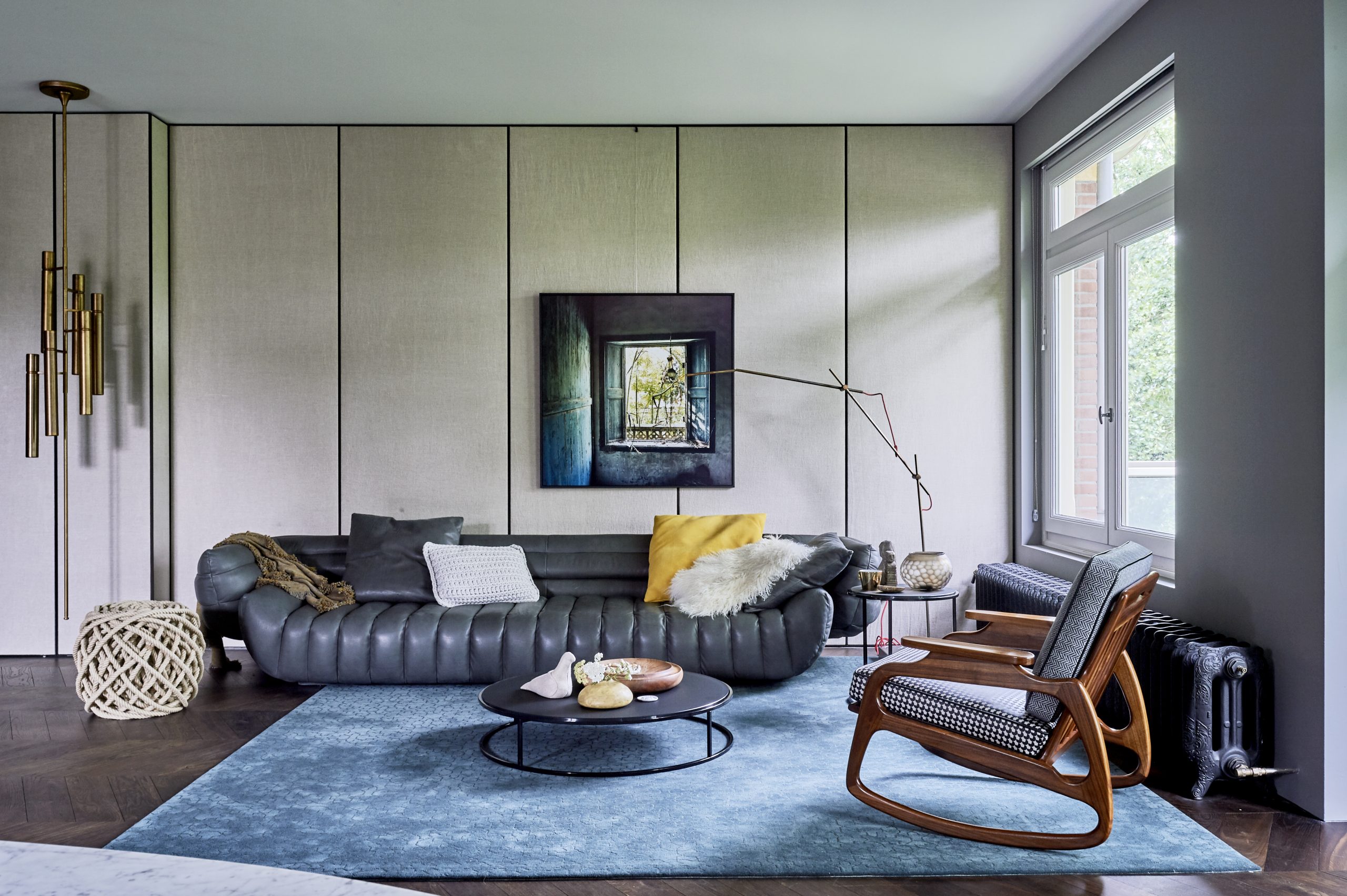
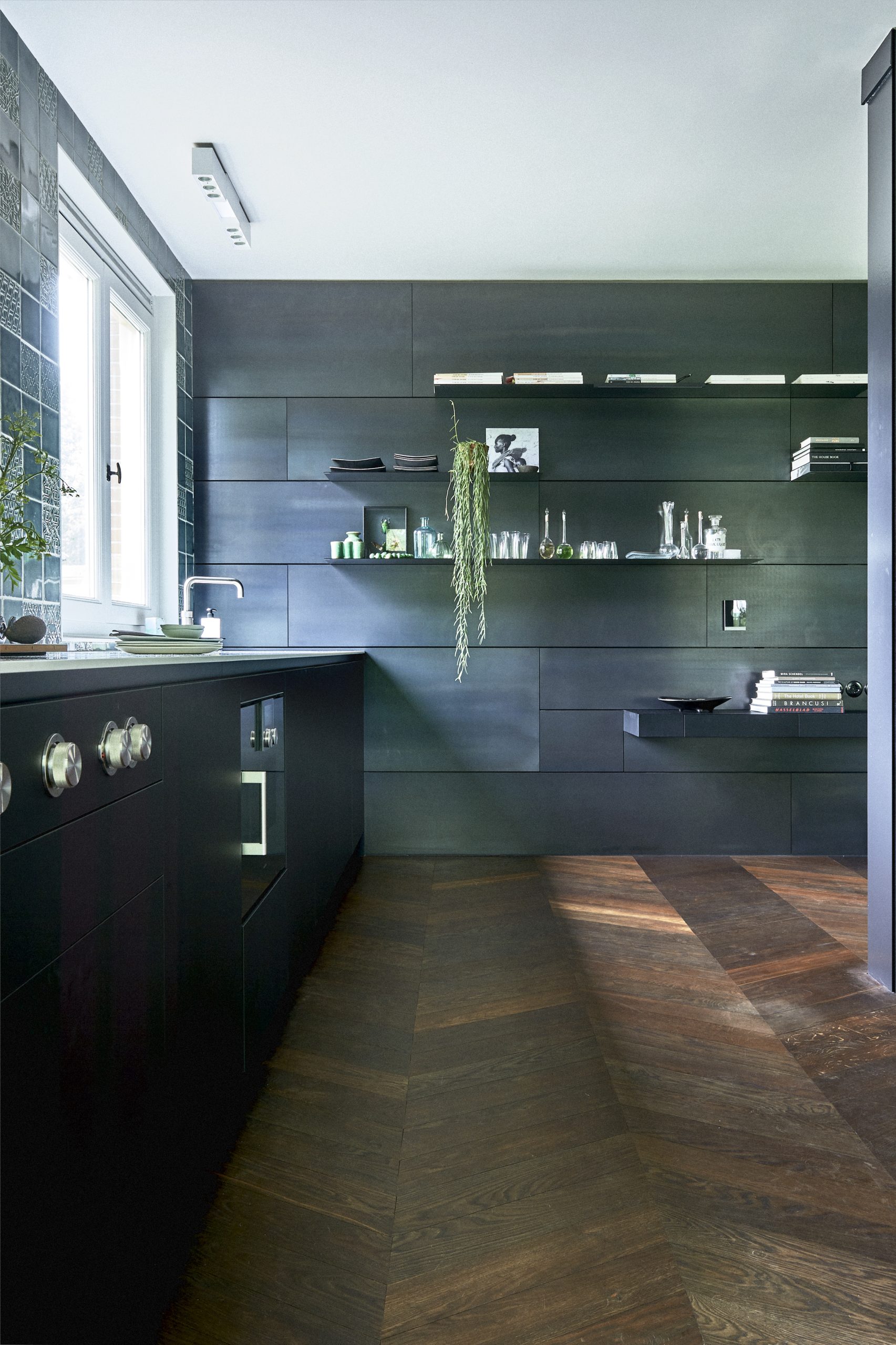
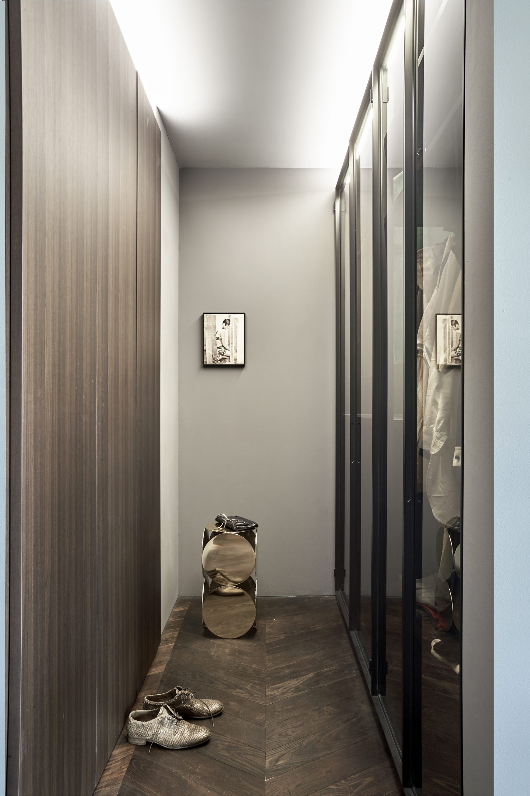
Along one wall, custom cabinetry in a dark finish anchors the apartment. The units sit flush and close to the architecture, so the storage feels built into the room rather than placed within it. That visual discipline suits the modern interior language of the project: straight edges, controlled transitions and surfaces that avoid unnecessary movement. A glass divider with black profiles adds another line, letting the spaces remain connected without blending into one another.
The cabinetry also gives the apartment a stronger sense of order around the living and kitchen areas. Cabinet doors, open niches and smooth panels shift between closed storage and exposed display, which keeps the wall from becoming static. The effect is understated but deliberate. This is where the modern apartment interior shows its clearest structure, with custom cabinetry doing more than storing objects; it gives the room its pace and frame.
A kitchen wall built from pattern and colour
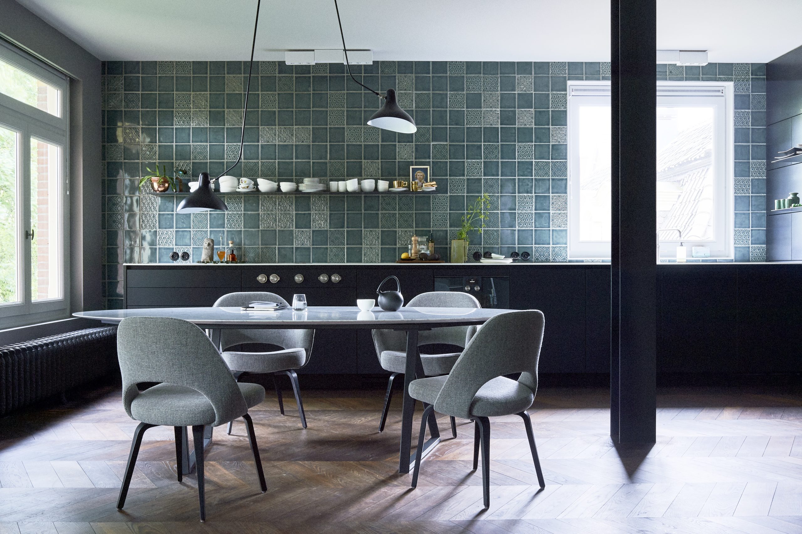
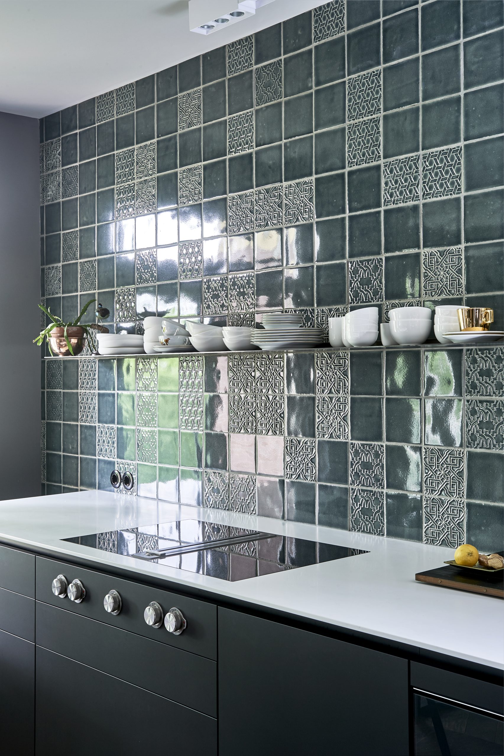
The kitchen turns on its tile wall. Glazed ceramic squares in green and blue tones form a dense field of repetition, interrupted by decorative inserts that give the surface a graphic pulse. From close up, the pattern is almost tactile; from a distance, it becomes a strong band of colour behind the darker fronts. The kitchen backsplash does not read as an accessory here. It is one of the main visual moments in the apartment, and it carries the room’s sharper edge.
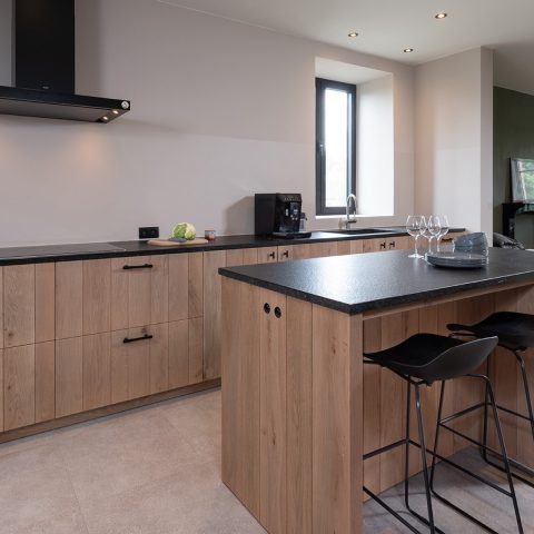
Dark cabinetry and a stone-like worktop keep the kitchen grounded so the tile surface can stay vivid. The round mixer and the hanging lamps are small counterpoints to the squared grid of the tiles. Because the kitchen sits within the larger apartment interior, the wall has to work both as a practical surface and as part of the wider room. It does that by repeating rhythm rather than adding volume, which suits the overall modern interior.
Where the kitchen backsplash becomes the detail that leads
At close range, the kitchen backsplash shows its varied glaze and the slight shifts between tile tones. The repeated joints make the wall read almost like woven fabric, though the material stays hard and reflective. That contrast matters in the apartment: the tile surface catches light differently from the matt cabinet fronts, so the kitchen gains depth without adding bulk. In a room defined by straight lines, this kind of patterned ceramic surface becomes the one place where the eye slows down.
Bathroom surfaces with a quiet graphic edge
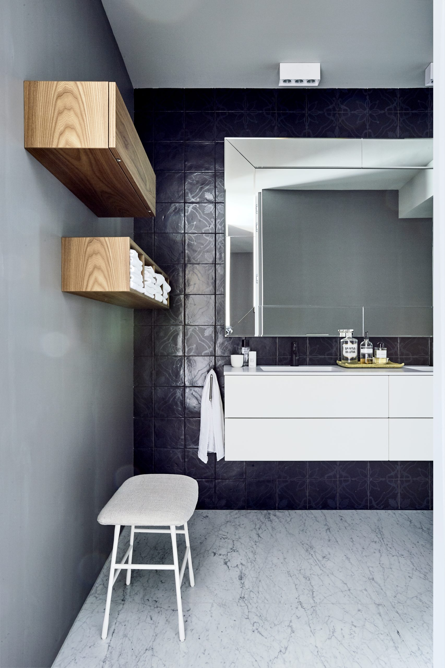
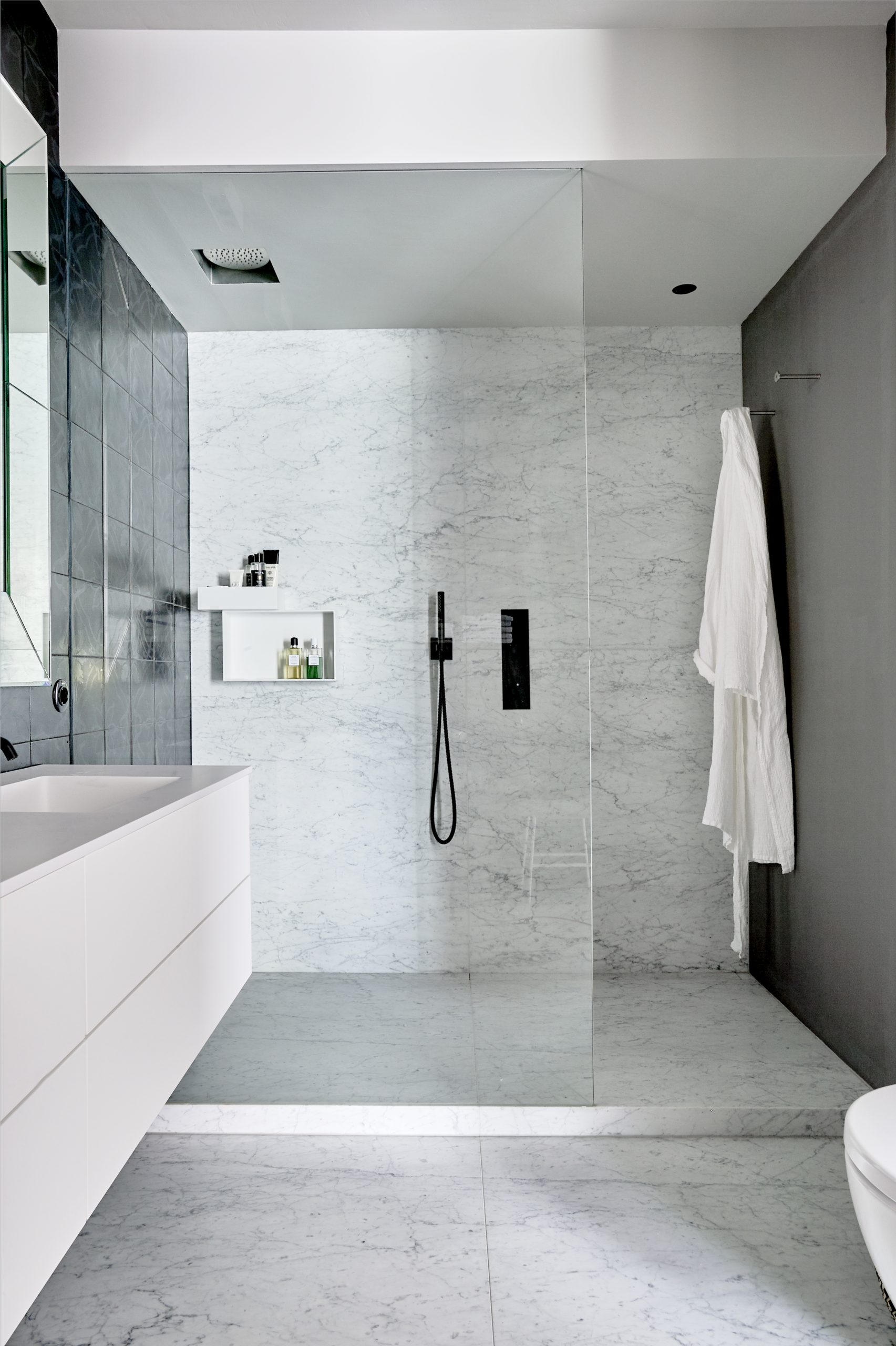
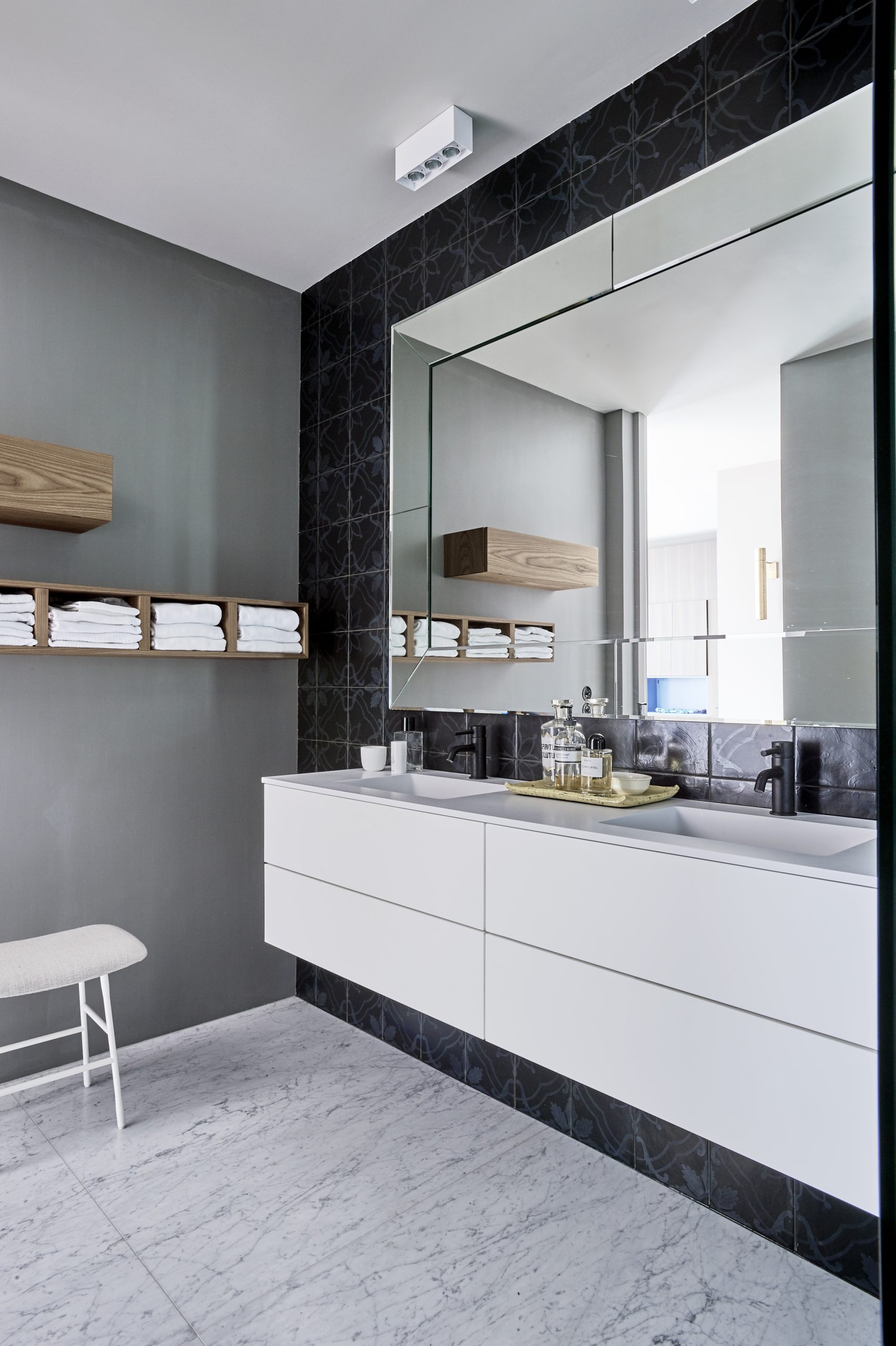
The bathroom continues the same discipline in a different register. Marble-look bathroom tiles cover the floor and larger wall areas, giving the room a pale base with faint veining and broad joints. A glass shower enclosure keeps the space open, and the black framing is echoed in the sharper lines elsewhere in the apartment. Here, the finishes are less about contrast in colour than about contrast in texture: gloss against matte, transparency against surface.
A dark tiled zone behind the basin introduces a stronger note, while a wood-front vanity softens the line beneath it. The room uses that mix to avoid feeling overly uniform. The glass shower enclosure sits lightly in the plan, letting the bathroom remain readable as one space even where the functions change. As with the rest of the apartment interior, the detail is not decorative for its own sake. It supports the room’s plain geometry and keeps the surfaces legible.
Wall panels, niches and a measured flow through the rooms
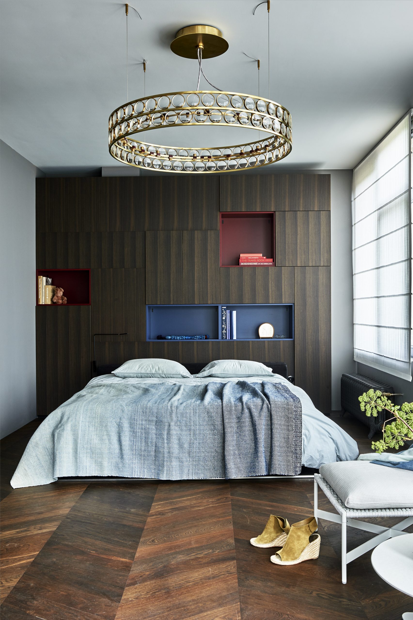
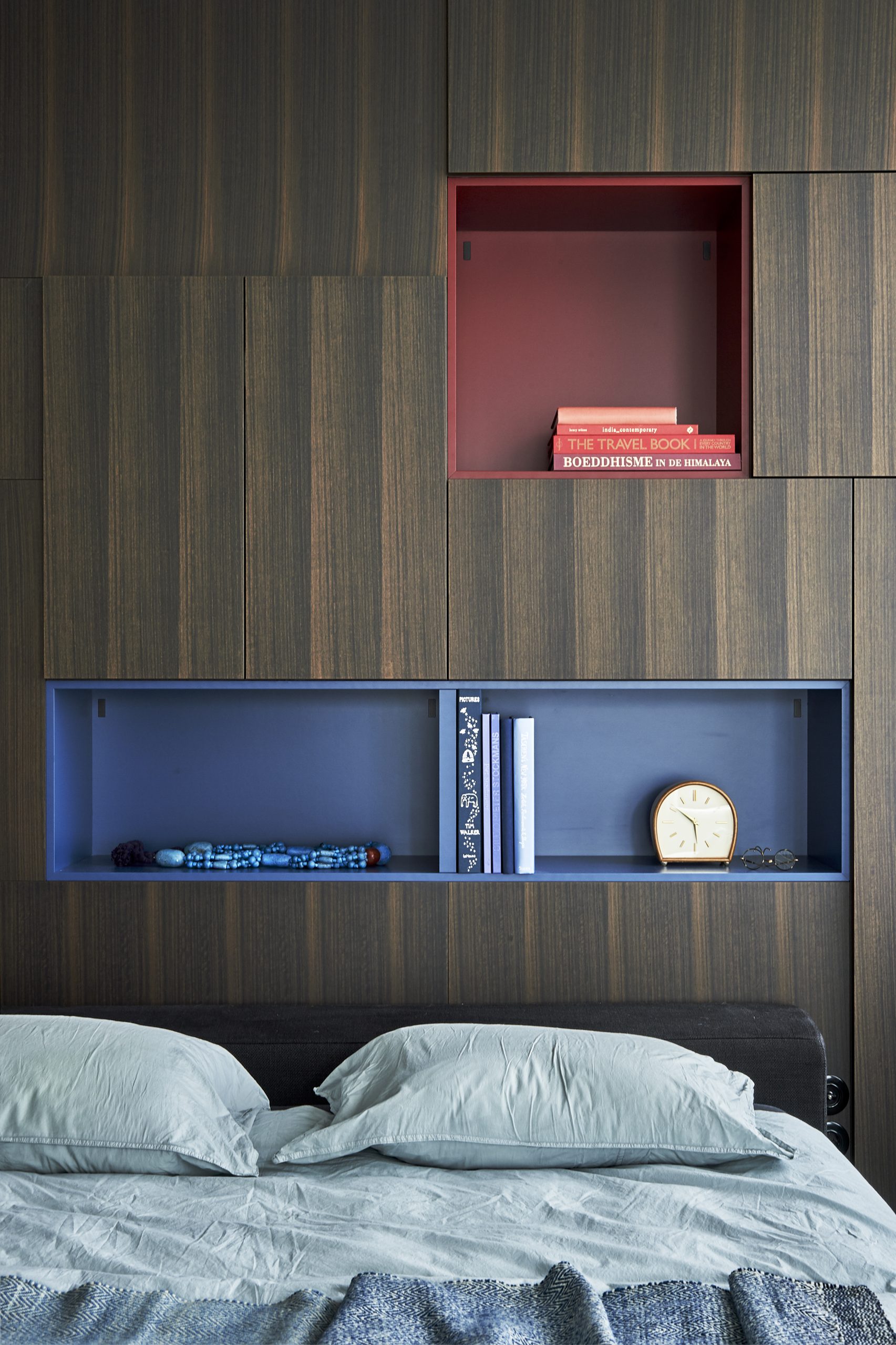
Vertical wall panels repeat through the apartment and give the interior a slow, upright cadence. In the living area they run behind furniture and lighting; in the bedroom they frame the bed zone and the niches cut into the wall. These recessed openings make use of depth rather than ornament, and they help the room hold smaller objects without breaking the surface. The apartment interior gains structure from those moves, especially where the panels meet the ceiling and the lines stay exact.
The bedroom continues the same visual logic with a ring light hovering above the bed and dark timber tones around it. The light acts like a drawn circle against the more rigid panel grid. Nearby, the niches break the wall into useful fragments without losing the overall line. It is a small space, but the arrangement is disciplined. Together with the rest of the apartment, it reinforces the sense of a modern apartment interior shaped by measured surfaces, visible joins and careful light placement.
A calm apartment interior shaped by material contrast
What stays with the viewer is not one isolated room, but the way the apartment holds together through repeated details: dark custom cabinetry, straight wall panels, glazed partitions and the green view outside. The palette remains controlled, yet the materials are not flat. Ceramic tile, glass, timber and stone-look finishes each bring a different surface response, so the rooms register as layered rather than plain. That is where the modern apartment interior finds its character.
The apartment feels most resolved when the view, the cabinetry and the tiled surfaces are seen together. Outside, the park gives the eye a rest. Inside, the kitchen backsplash, the bathroom tiles and the panelled walls keep the spaces defined without overloading them. The whole project depends on this careful use of line and texture, and the calm impression comes from that restraint. It is a modern apartment interior that lets its materials, openings and surfaces do the speaking.
Photography: Dennis Brandsma
Want to see more of DIS STUDIO? View the page of DIS STUDIO for even more great projects and company information.



NEW 2026 Jubileum Edition The Best Interior Designers Benelux
Order Now €125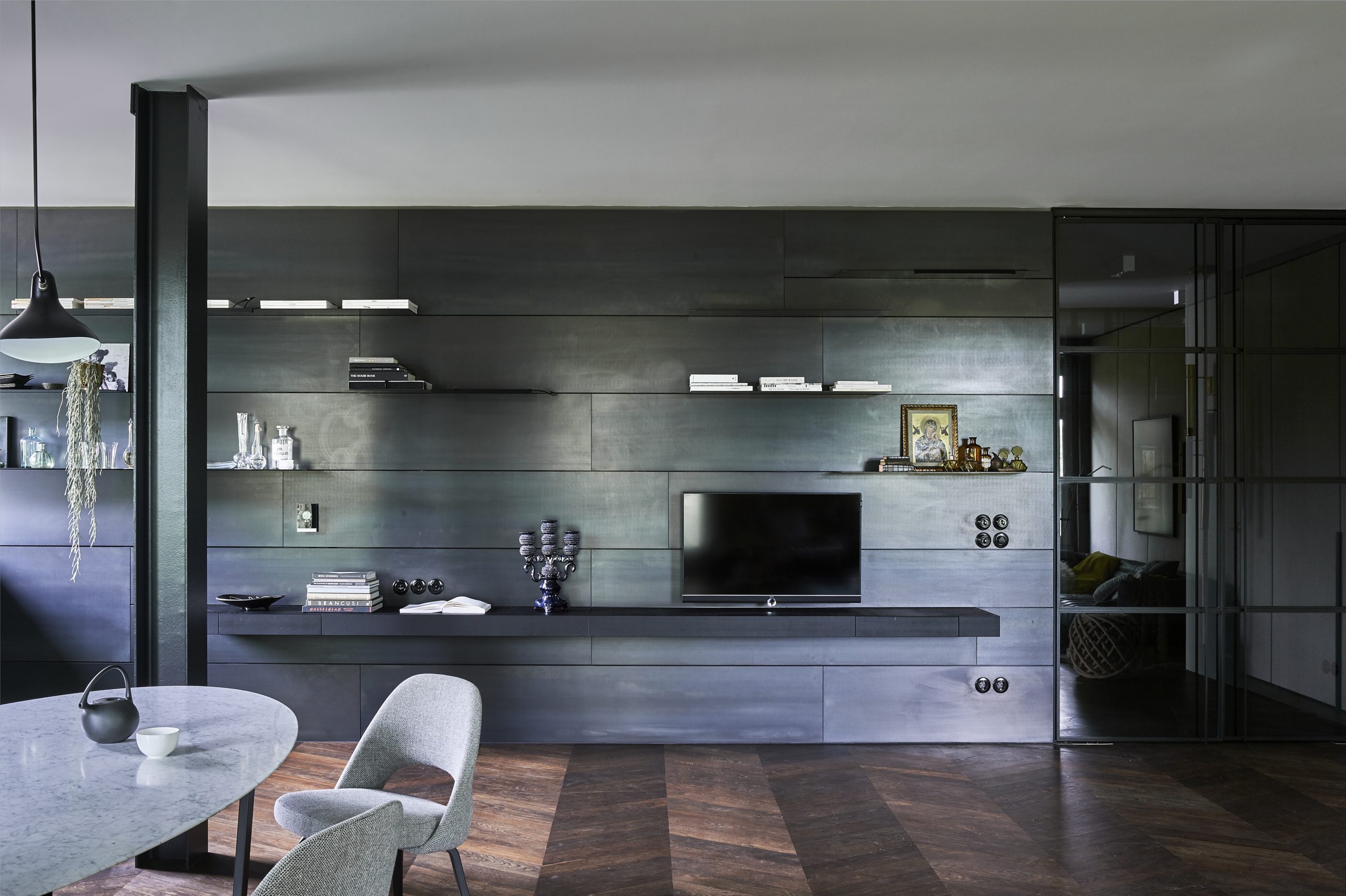
NEW 2026 Jubileum Edition The Best Interior Designers Benelux
Order Now €125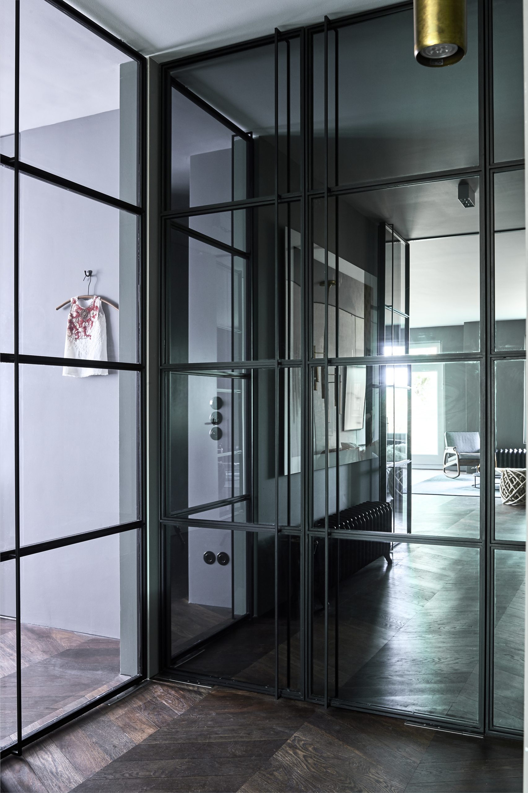
NEW 2026 Jubileum Edition The Best Interior Designers Benelux
Order Now €125