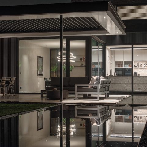
Modern art in luxury interior
Against off-white walls and darker joinery, the artwork takes over the room before anything else does. AbrahamArt created the modern art seen throughout this luxury interior, where large wall pieces sit beside concrete, wood and stone surfaces. The palette stays restrained: grey, black and soft white, with the occasional reflective edge from glass and metal. What keeps the eye moving is not decoration for its own sake, but the way each work lands against a different surface, from a stone accent wall to a darker kitchen front or a calm seating area.
Statement wall art in rooms that stay visually quiet
Several images place statement wall art at the center of a living or dining setting. One work hangs above a dark wall line with slim decorative moulding near the ceiling, while another is set against a stone-textured surface that gives the image more weight. The furniture stays low and calm: pale sofas, black round side tables, and an oval dining table with grey-toned chairs. That low profile lets the modern wall artwork do the talking, without competing surfaces crowding the frame. The result is a luxury interior with art that reads as part of the room, not an afterthought.
Artwork titles are part of the project record: Behind the scenes, Brand Awareness, Collision of Fairness, Flirt me to Space, I shoot back, Play Alive, Shades of Time, Still Alive and What If Bardot. The images do not map every title to every frame, but they do show how the work moves through the house as a sequence of visual moments. Some pieces feel graphic and direct, others more layered, with portrait references or poster-like fragments that sit naturally in the clean-lined spaces around them.
Custom wall panels and built-in storage keep the edges tight
Beyond the art, the interior shows custom wall panels and integrated storage that hold the composition together. Dark timber cabinet fronts run flush with the wall in one zone, while another frame uses pale paneling to soften the transition around a seating area. These built-in elements are not background noise; they set the proportions for the work on the wall and keep the eye from drifting into clutter. In a room with concrete floors, natural stone and wood surfaces, that discipline matters. It gives the wall art a clear field and keeps the architecture from overpowering it.
There is also a strong contrast between matte and reflective finishes. A black steel-glazed doorway cuts through the plan, and nearby a darker wall zone carries a piece of art in a passage setting. Elsewhere, the same restrained palette appears in lighter floor tiles and in the smooth faces of joinery. The project’s luxury interior with art relies on these quiet transitions: not dramatic gestures, but a series of measured edges that let each artwork register from a distance and then hold up at close range.
Concrete, wood and stone as a backdrop
Concrete appears underfoot and on the walls, sometimes as a smooth floor plane, sometimes as a broader surface that gives the art a rougher counterpoint. Wood softens that base through herringbone flooring, timber wall surfaces and darker veneered cabinet fronts. Stone comes in as an accent, most visibly in a textured wall or a marble-like kitchen worktop. None of these materials tries to steal the scene. They frame it. In a modern art in luxury interior setting, that restraint makes the work feel anchored rather than staged.
One living room view places a piece of art above a dark television wall, with light grey seating in front. Another shows a room with heavier timber and a stone accent wall, where the artwork stands almost like a pause inside the material palette. The project does not chase contrast for effect alone; it uses the contrast already present in the building to sharpen the reading of the artworks. That is what gives the wall art its clarity in each space.
In the kitchen, art shares the frame with darker surfaces
The kitchen images keep the same visual discipline. Dark cabinetry, a substantial island and a stone or marble worktop create a strong horizontal block, while the art remains visible in the wider interior context. In one view, a light island stands on a concrete-look floor; in another, the kitchen reads darker, with the worktop catching light against the matte fronts. This is art in a luxury kitchen without turning the kitchen into a display case. The artworks remain part of the room’s rhythm, seen beside the cabinetry rather than squeezed into it.
A different kitchen perspective shows a herringbone floor with a pale island and a concrete-look top. The mix of patterns is controlled, not busy. It gives the room texture while leaving enough visual calm for modern wall artwork elsewhere in the interior to remain legible. The same applies to the entry and circulation spaces, where black steel doors, glazed partitions and long sight lines create places for artwork to appear between rooms rather than only in the main living area.
Entry zones and transitions carry their own artwork moments
The hall and upper-level details are not treated as leftover space. A black steel-glazed door set anchors one entrance view, while a nearby artwork appears in the passing zone and gains value from that positioning. Another image shows a glazed opening with a dark frame and a work on the wall beyond it. These are transition spaces, but they still carry the project’s main idea: wall art can shape the route through a home as clearly as it shapes a living room. The narrowness of a corridor or landing often makes the image more direct.
Material changes help define those routes. Wood flooring appears in one entry view, while another zone shifts to light grey tiles beside dark joinery. The contrast is functional in the plain sense: it helps separate one area from another. At the same time, it gives the artworks a stronger edge. A piece placed beside a steel door reads differently from one set against pale paneling or concrete. That variation keeps the project from feeling repetitive, even though the palette remains consistent throughout.
A sequence of works, not a single image
Because the project includes several titled works, it reads less like one isolated installation and more like a sequence. Behind the scenes, Brand Awareness, Collision of Fairness and the other named pieces suggest different visual registers, yet the presentation remains consistent: crisp wall placement, strong framing, and interiors that give each piece room to hold attention. The result is a luxury interior with art that can change mood from one room to another without losing its overall line. You move from the dining area to the kitchen, then to the hall, and the works keep reappearing in fresh contexts.
That is where the project’s strength lies. The art is not hidden by the architecture, and the architecture does not flatten the art. Concrete, timber, stone and glazed steel all do their part, but they stay in support of the artwork made by AbrahamArt. Seen together, the rooms offer a clear picture of how modern art in luxury interior settings can work when the surfaces are measured, the lines stay clean, and the wall pieces are given enough silence to be read properly.
More projects in the same visual language
For readers looking at AbrahamArt as a maker of wall-based work, this project sits well beside other interior commissions and art-led presentations. The images here show why: modern wall artwork can shift a room’s reading without requiring a full redesign, provided the surrounding materials stay disciplined. If you are browsing similar examples, it is worth looking at other projects where statement wall art meets custom wall panels, dark joinery or a kitchen with strong material contrast. Those settings let the work stay visible from the first view through to the last.
Want to see more of AbrahamArt | Bram Reijnders Pop Art & Urban Art? View the page of AbrahamArt | Bram Reijnders Pop Art & Urban Art for even more great projects and company information.




NEW 2026 Jubileum Edition The Best Interior Designers Benelux
Order Now €125


NEW 2026 Jubileum Edition The Best Interior Designers Benelux
Order Now €125


NEW 2026 Jubileum Edition The Best Interior Designers Benelux
Order Now €125