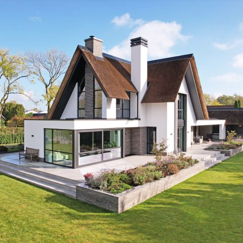
Riante semi-detached houses
Dark brick, pale wood and black-framed windows set the tone before you even reach the front door. The two semi-detached houses share the same material base, yet each one is given its own rhythm through openings, entrances and interior choices. The result is a pair of semi-detached houses that read clearly as one project, while still showing small shifts in detail from side to side.
Brickwork, wood and a roofline that stays sharp
The first impression comes from the dark brick facade, laid in a lively stretcher bond, and the blank Douglas wood used for cladding and columns. Those timber accents break up the masonry and soften the heavier surfaces without flattening the contrast. Anthracite roof tiles finish the upper line, while the wooden window frames are painted in RAL 7016, a dark tone that ties the openings back to the rest of the envelope. On the roof, the solar panels sit neatly into the overall shape rather than competing with it.
The garages are part of that same disciplined exterior reading. Each one has a sectional garage door with a pedestrian door built into it, so the large opening does not dominate the frontage any more than necessary. In the street view, the houses keep their profile compact and direct. The black window frames, the wood cladding and the dark brick facade do most of the talking, with the roof edges and dormer details staying visually light.
Large openings that pull the garden inside
At the back, the houses open toward the garden with wide glazed sections and wooden sliding doors. Daylight enters deep into the plan, especially where the glass reaches across the rear elevation and the kitchen corner window draws light in from two directions. The glass French balcony on the upper floor adds another layer to the facade, breaking up the upper volume with a small, precise gesture. It is a modest detail, but it keeps the upper level from feeling closed off.
The garden is arranged as a series of places rather than a single lawn. There are several seating areas, a lockable canopy and wide paving that runs straight out from the house. In one of the outdoor views, a rectangular water feature sits beside the terrace, reflecting the edge of the paving and the glazing above it. Grass, borders and stepping stones give the route through the garden a measured pace. The exterior space feels planned for use, but it remains visually calm because the materials stay limited and clear.
Terrace, water feature and sheltered outdoor space
The sheltered outdoor area is especially effective because it sits close to the glazed rear wall. Clear panels and a timber frame let the seating zone stay connected to the garden, while still giving it a defined edge. In the evening or on cooler days, that closed section becomes a place to sit without losing the sense of contact with the terrace. The water feature beside it changes the composition again: a hard-edged basin, a strip of paving and a line of planting are enough to create movement without adding clutter.
A kitchen with a corner window and a clear line of sight
Inside, the kitchen with corner window is one of the strongest spatial moves in the project. The corner join was kept as slim as possible, so the glazing can wrap around the room and bring in light from the side as well as the rear. That choice gives the room a wider read than the footprint suggests. Ceiling downlights are set into the plasterwork, leaving the ceiling plain and letting the windows, work surfaces and furniture carry the visual weight instead.
The kitchen image shows a glazed front and a stone worktop with a pronounced mineral pattern. It sits neatly against the lighter wall surfaces, which keeps the room from feeling visually crowded. Elsewhere in the living area, broad wooden floorboards run under large windows with black frames, and the neutral walls are interrupted only by carefully placed spotlights. The focus stays on the structural edges of the room rather than on decoration. Even the fireplace wall, with its stone texture and open recess, follows that same restrained approach.
Light, stone and wood in the living spaces
The living spaces rely on a few materials repeated in different ways. Wood appears in the floors and staircase, stone returns in the fireplace and kitchen surfaces, and glass cuts open the walls wherever daylight is needed. Because the colour range is narrow, the larger moves become easier to read: a doorway, a span of glazing, a stair opening, a wall niche. Nothing feels overworked. The rooms gain their character from the way surfaces meet, not from ornament.
Stairs, niches and the way the rooms are finished
The staircase is one of the most visible interior elements. Both homes use a Z-shaped stair with projecting block steps and slim steel wall rails. In the open stairwell, the wooden treads and white walls create a clean contrast, while the upper landing keeps the line of the stair easy to follow. One of the houses uses a closed staircase in pine to the first floor, which gives that route a different feel: more enclosed, more direct, and visually quieter than the open version.
The bathrooms continue the same measured detailing. Large wall tiles and a glass shower screen keep the surfaces broad and legible, while the wall niches break the plane in a useful way. In the bathroom close-up, a round lit niche sits above the washbasin furniture, turning a small recess into a visible feature. It is a simple move, but it shows how the project uses detail to shape the room without filling it up.
Above, the attic rooms follow the roof instead of fighting it. The open ridge gives those spaces extra height and keeps the ceiling line visible. In the upper rooms, that shape matters more than any extra finish: the structure itself is what gives the room its presence. The same goes for the glass French balcony on the upper floor. It does not try to expand the space; it just opens the elevation and lets the upper level breathe a little.
Two houses, two sets of decisions
Although the two semi-detached houses share their shell, the internal layout is not identical. The right-hand house includes steel pivot doors and an upper-floor stair with a quarter turn, finished with oak treads on stringers. That stair detail is distinctive because the treads sit on top of the supporting structure rather than between it, leaving the steps visually tight to the wall. The left-hand house uses flush doors on the ground floor and rebated doors upstairs, with a closed staircase in pine leading to the first floor.
These differences are subtle, but they make the pair easier to read once you move through them. One home feels slightly more open in its stair and door choices; the other is more enclosed in places, with the pine stair and simpler door detailing. What ties them together is the same base of dark brick facade, light wood facade cladding, black window frames and generous glazing. From the street, they sit as a composed pair. Inside, they show two separate ways of using the same material language.
Want to see more of HABÉ? View the page of HABÉ for even more great projects and company information.




NEW 2026 Jubileum Edition The Best Interior Designers Benelux
Order Now €125


NEW 2026 Jubileum Edition The Best Interior Designers Benelux
Order Now €125


NEW 2026 Jubileum Edition The Best Interior Designers Benelux
Order Now €125


NEW 2026 Jubileum Edition The Best Interior Designers Benelux
Order Now €125


NEW 2026 Jubileum Edition The Best Interior Designers Benelux
Order Now €125