Modern Brick House
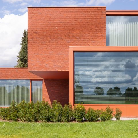
The red brick mass reads as a sequence of solid planes and openings. On one side, large glass panels cut into the volume and pull the eye toward the garden; on another, the wall stays closed and heavy, which fits the project’s theme of enclosed versus open. The result is a modern brick house that uses contrast as its main language, with brick, glass and dark metal kept visibly separate rather than blended into one surface.
Brick volumes that shift at the corner
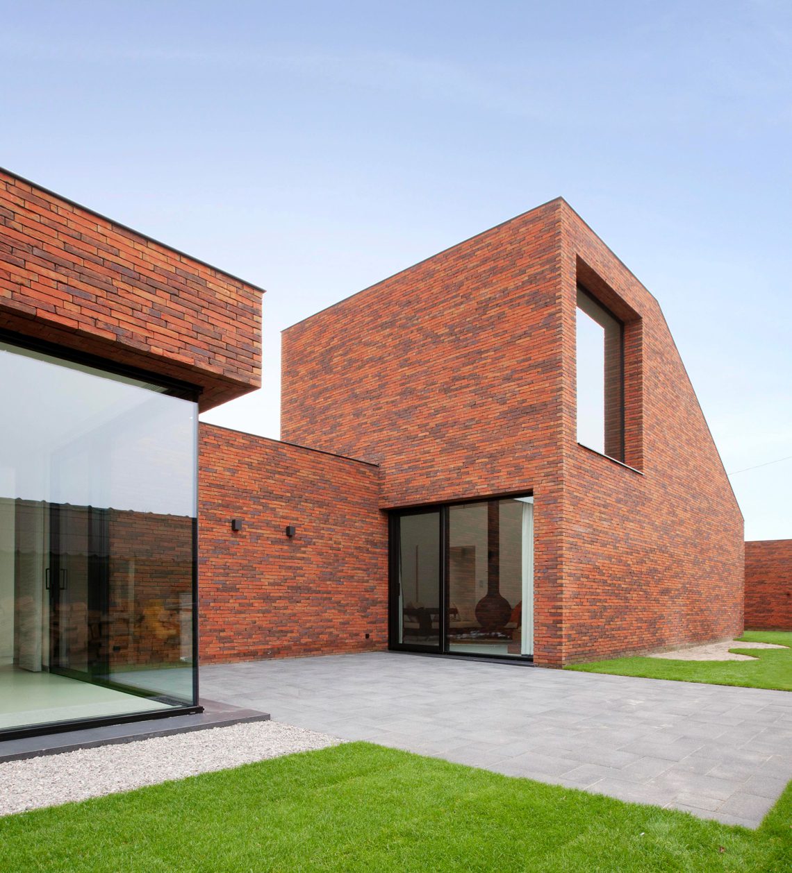
The composition starts with a corner volume that steps forward and changes the house’s profile. Its angled edges make the brickwork feel drawn around the site rather than simply stacked in a box. The red brick house is made of several connected parts, each with a slightly different depth, so the façade catches light in narrow bands and shadow lines. That movement is subtle, but it gives the exterior a clear order without flattening the house into a single face.
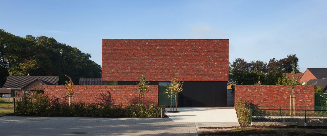
From the street side, the brick walls run in long, measured lines beside the paved approach. A broad opening interrupts the masonry and brings a more open reading to the composition. The dark vertical cladding on the smaller volume beside it adds a harder note, almost like a pause between the brick surfaces. In this contemporary brick house, those shifts are easy to read from a distance, which is what makes the massing feel deliberate rather than decorative.
Large glass panels set against solid walls
The largest glass panels sit where the house needs to release itself toward the outside. A sliding opening and other wide glazed sections break through the brick and let the structure read as both closed and porous. Seen from the garden side, the glazing sits low and wide, stretching the horizontal line of the façade. The effect is not about spectacle. It is about giving the solid brick shell a few precise openings where light and views can pass through.
Those glazed areas also change how the brick is experienced. Instead of a continuous wall, the façade becomes a rhythm of opaque and transparent parts. A rectangular window in the long brick wall marks a quieter moment, while the larger panes do the opposite and open the surface fully. In a modern brick house like this, the size and placement of the openings matter more than ornament. They determine whether a volume feels reserved or exposed.
Dark vertical cladding as a counterpoint
The dark vertical cladding is limited to one part of the composition, which makes it stand out even more. Set next to the red brick, it brings a sharper texture and a darker tone to the edge of the house. The vertical profile contrasts with the horizontal runs of brick and paving, so the eye slows down at that junction. This is where the project’s enclosed side becomes most visible: the smaller volume reads as a closed piece within the broader composition.
Because the cladding is confined to a smaller element, it does not compete with the masonry. Instead, it gives the brick house a second material language that helps define service-like or secondary parts of the building. The surface is darker, thinner and more linear than the brickwork. That difference is what makes the transition between the major volume and the smaller addition easy to understand in a single view.
A garden laid out in clear strips
The outdoor setting is kept plain and legible. Lawn sits beside paving, and narrow planting bands edge the hard surfaces without interrupting them. Gravel or light stone chips appear along parts of the base, softening the line where brick meets ground. This landscape design does not try to overpower the house; it frames it. The garden gives the modern brick house room to breathe, while still keeping the edges controlled and close to the building.
Seen together, the lawn and paving extend the same logic as the façade. Solid and open, heavy and light, enclosed and exposed: the garden repeats that pattern on the ground plane. The paved areas create a clean route along the house, while the grass keeps the larger plane open and readable. In photographs, the outside space feels measured, with no excess elements competing with the volumes or the glazing.
How the long brick wall holds the composition together
One of the most striking parts of the project is the long brick wall that runs across the rear or side view. It grounds the composition and gives the house a steady horizontal line against the greener parts of the plot. A single rectangular opening interrupts that wall and makes the surface feel less closed than it first appears. The wall is not merely a boundary; it is the surface that ties the different volumes together.
This is where the theme of a contemporary brick house becomes especially clear. The solid brick planes do not disappear behind the glazing, and the glazing does not erase the masonry. Each material keeps its own role. The brick carries the weight of the composition, the glass pulls the eye through it, and the dark vertical cladding marks a secondary piece with a different reading. The house works through those distinctions, not by hiding them.
Openings that soften the brick mass
The glass panels do more than increase transparency. They cut the brick mass into readable parts and make the house feel less static. A sliding glass opening near the terrace brings the outside close to the living edge, while the wider glazing on the other side stretches the view across the garden. The brick still dominates, but the openings make sure it never becomes rigid. Light lands differently on the masonry near each opening, and that changes the exterior throughout the day.
In the end, the project is less about a single image than about a repeated contrast. Red brick, dark cladding, large glass panels, lawn and paving: each element has a clear job in the composition. Together they shape a modern brick house that shifts between shelter and exposure without losing its clarity. The house remains readable from every side because the materials are allowed to stay distinct, and that is what gives the project its strength.
From the corner volume to the paved edges, the house keeps returning to the same measured tension between closed and open. The red brick house presents itself as a set of grounded volumes, but the glazing and the garden cut enough gaps into that mass to keep it moving. That tension is visible in the façade, in the landscaping, and in the way the dark vertical cladding marks one part of the whole. Nothing is overstated. The composition simply lets brick, glass and ground plane define the house together.
Want to see more of Egide Meertens Plus Architecten? View the page of Egide Meertens Plus Architecten for even more great projects and company information.




NEW 2026 Jubileum Edition The Best Interior Designers Benelux
Order Now €125