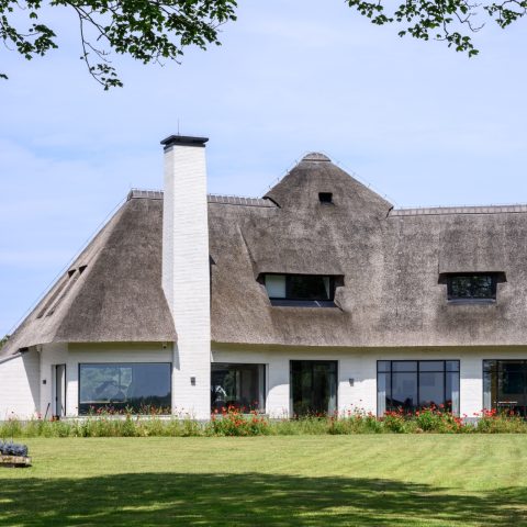
Modern extension of a classic townhouse with steel window bays and skylit daylight
The first thing you notice is the glass. Tall black steel frames pull light deep into the house, while the new white stucco extension gives the rear of the townhouse a crisp, quiet edge. Inside, the layout now runs more freely from front room to garden, with the modern extension of a classic townhouse setting the pace for the entire plan. The kitchen sits in the middle of that change, so everyday movement now passes through light, views, and a clearer sequence of rooms.
A new rear room that opens the house up
The extension is not treated as an add-on that sits apart from the old house. Its white stucco surface and large steel window bays connect directly to the interior, where steel doors and black frames return as a repeated line. The height of the glazing gives the rear volume more presence, but it is the shift in layout that matters most: rooms are no longer compressed into a closed chain. They stretch toward the garden instead, with openings that keep the route open and easy to read.
From the front room, the eye now travels through the house without interruption. That long sight line to the garden is one of the strongest spatial moves in the project. It makes the plan feel wider, even where the floor area itself has only changed in one direction. The indoor outdoor connection is not described by a single threshold; it is built up through repeated views, a glazed rear wall, and the way the new extension holds light at the back of the house.
The kitchen moved to the centre
Placing the modern living kitchen at the heart of the house changes how the rooms are used. The work zone sits where circulation gathers, so the kitchen becomes a pivot between the front of the townhouse and the extension at the rear. In the images, that central position is reinforced by a strong worktop and island arrangement, with ceiling spots and pendant lights marking the main surface. It is an everyday room, but it also acts as the hinge of the new plan.
The surrounding finishes keep the kitchen visually calm. White cabinet fronts, dark frames, and pale walls let the opening to the garden take over. Rather than enclosing the cooking area, the layout lets it borrow depth from the rooms beyond. In that sense, the modern living kitchen is less a separate destination than a place from which the rest of the house can be read. The result is clearer movement, shorter turns, and more contact between zones.
Daylight shaped by the skylight in the extension
Above the rear volume, a skylight in the extension brings light down from above and sends it further into the plan. That top light matters because the rear glazing alone would not create the same spread across the interior. In combination with the tall steel window bays, it brightens the middle of the house and keeps surfaces from flattening into shadow. The effect is visible in the ceiling line, where the light stays active across the room rather than stopping at the opening.
Visible beams sharpen that effect. They break the ceiling into intervals and create a clear play of light and shade as the day moves across the room. Nothing here is overworked; the structure is left readable, so the ceiling becomes part of the atmosphere of the house. The beams also give the extension a stronger rhythm, which helps the new rear room sit comfortably alongside the older fabric of the townhouse.
Steel frames repeated inside and out
The steel window bays are the most direct link between the exterior and the interior. Their dark profiles set a strong line against the white stucco extension, and that same darker metal returns inside in doors and openings. This repetition gives the classic modern interior a clear visual order. It also avoids a hard break between old and new, because the steel acts as a connector rather than a contrast for its own sake. The materials keep their own character, but they speak the same language.
That language is made more legible by the older parts of the house. Classical ceiling details, a white staircase, and paneled wall surfaces remain visible in the route through the interior. Against those details, the steel looks sharper, not louder. The mix is strongest where a steel-framed opening meets a plastered wall or where the staircase turns beside a dark frame. Those small collisions give the house its specific pace and keep the rooms from feeling overly polished.
Light, shadow, and the old staircase
The staircase is a quieter part of the story, but it carries the same contrast as the rest of the project. Painted white, it sits beside dark steel openings and pale walls with ceiling mouldings. In the images, this creates a narrow band of shadow under the rail and a more open feeling above it, where light reaches across the landing. It is a useful reminder that the house is not only about the rear extension. The inherited parts still shape how the interior is read.
That mix of old and new is strongest in the transitions. A wooden floor in one zone, a tiled terrace beyond the glass, and painted plaster surfaces inside all help define the route through the house. The rooms do not rely on decoration to make their point. They use edge, level change, and material shift instead. The modern extension of a classic townhouse works because those changes are easy to follow from the first room to the last.
Views that carry all the way to the garden
At the back, the large glazed wall turns the garden into part of the interior sequence. Curtains soften one opening; elsewhere the black steel frames hold a cleaner view of the terrace and planting outside. The long sight lines to the garden are not just visual. They also shape how the house feels in use, because each room now has a clear forward direction. That makes the new layout easier to understand and gives the house a stronger sense of depth.
The terrace outside continues that line in tile, with the white stucco extension above it and greenery set just beyond. It is a straightforward arrangement, but the proportions do most of the work. Tall glazing, a low horizontal terrace, and a deep view toward the garden keep the rear of the house open without losing definition. In that way, the project shows how a modern extension of a classic townhouse can expand living space while keeping the older house visible in every transition.
Photography by Wim Hanenberg and Dana van Leeuwen.
Want to see more of BNLA architecten? View the page of BNLA architecten for even more great projects and company information.




NEW 2026 Jubileum Edition The Best Interior Designers Benelux
Order Now €125


NEW 2026 Jubileum Edition The Best Interior Designers Benelux
Order Now €125