Zinderend Grijs: modern grey-white interior with built-in niche walls and a fireplace feature
The first impression is quiet, but it is built from clear contrasts: pale walls, dark tile fields, black shelving lines, and wood that softens the sharper edges. In this modern grey white interior, the eye keeps moving between recessed storage, framed openings, and flat planes that catch daylight without glare. The result is a grey and white luxury interior that feels drawn with a ruler, yet never feels sterile because every room introduces another material texture.
Walls that hold storage, fire, and display at once
The living area uses a built-in niche wall as more than a backdrop. Open compartments break up the surface and give books, objects, and daily items a fixed place without crowding the room. Next to it, the fireplace sits inside a rectangular wall opening, with the flame visible rather than hidden behind an ornamental surround. That built-in fireplace grey wall becomes the anchor of the room, while the surrounding white frames keep the composition light.
In another view, the same wall logic continues with open shelving and flatter cabinet fronts. The openings are measured rather than decorative, and that restraint helps the room stay open even when storage is built in. A grey white luxury interior depends on this kind of ordering: not by adding more pieces, but by giving each element a precise position. The wall reads as architecture, not furniture placed against architecture.
Gallery surfaces and small objects with sharp edges
A gallery wall framed art sequence appears in one of the more intimate images, set above a desk-like surface and under a window with horizontal blinds. The frames are arranged in a grid, which gives the wall a clear rhythm without relying on color. Nearby, small objects and a dark tabletop add depth against the pale background. It is a compact scene, but it shows how the project handles display: straight lines, repeated frames, and enough open wall around them to keep the composition from collapsing into clutter.
A black and wood kitchen grounded by tile
The open kitchen black and wood combination shifts the mood without leaving the overall palette. Dark cabinet fronts sit below warmer wood-grain storage, and the contrast is strongest where the cabinets meet the large dark tile floor. Broad grout lines make the floor read as a deliberate surface, not a neutral afterthought. Appliance niches are built into the wall so the kitchen remains flush and orderly, with the working parts tucked into the mass of cabinetry.
Seen from the dining side, the kitchen opens toward the table rather than closing itself off. Pendant lights hang above the dining surface, and the room keeps its depth through the long horizontal line of the cabinets and the wide glazing in the background. The black-and-wood relationship works because each material does a different job: wood breaks the visual weight, black grounds the lower run, and tile extends the room across the floor.
A second kitchen view makes the dark tile floor even more present. The surface catches the light differently from the cabinetry, which gives the room a layered reading from floor to wall. Glass panels and openings near the kitchen edge add another transparent line, so the room feels connected but still structured. This is not a kitchen trying to disappear; it is a kitchen composed as part of the interior story.
Bathroom niches cut into the slope of the room
The bathroom is compact in shape, but the surfaces are handled with the same discipline as the living areas. A white vanity with double basins sits in front of a darker tiled zone, and the contrast makes the wash area easy to read immediately. Under the sloped ceiling, a bathroom niche with tiles is set into the wall, giving the room a place for storage without interrupting the clean geometry of the basin wall. The mirror, basin edge, and tile joints all reinforce the room’s linear layout.
The sloping ceiling matters here because it creates a tighter upper line while the lower part of the room stays open and practical. Instead of fighting that angle, the design uses it to frame the niche and the vanity zone. Steel details appear in the fittings and in the crisp edges around the tiled surfaces, while plaster keeps the larger wall areas calm. The room feels planned around the ceiling rather than despite it.
Material changes that keep the room from feeling flat
In the bathroom, the shift from pale fixtures to dark tile is what gives the room depth. The vanity has a clean white front, but the niche and floor zone pull the eye downward, so the room does not become a single bright block. The angle of the ceiling also creates a small change in scale from one side to the other. That is where the project’s grey and white luxury interior approach becomes clear: the palette stays restrained, but the surfaces keep changing.
Under the roofline, light is controlled rather than hidden
The bedroom sits under a sloped ceiling with a skylight cut into the roof plane. Horizontal blinds sit beneath the opening and control the light in narrow bands, which is a simple move but an effective one. The bed is kept low and visually quiet, with pale bedding and a white wall around it, so the skylight becomes the main event in the room. This skylight bedroom blinds arrangement gives the space a clear top-down light source and a strong horizontal counterline.
Because the ceiling slopes down along one side, the room gains a sheltered feel without resorting to heavy finishes. The walls stay white, the textiles stay light, and the window treatment keeps the roof opening precise. There is no need for extra ornament here. The geometry of the skylight, the blinds, and the sloping ceiling is enough to set the tone.
Framed objects, glass, and the quieter corners of the house
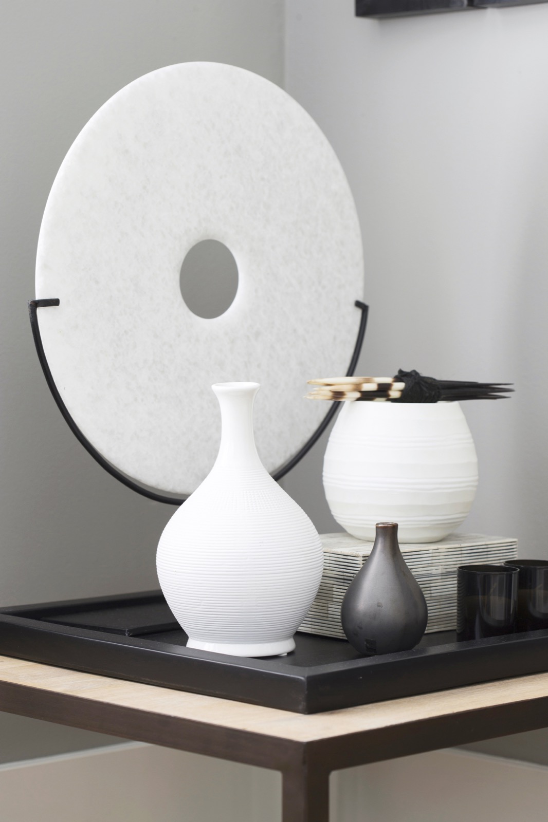
Several smaller images show how the project handles the edges of rooms. A dark shelf with ceramic vases sits against a pale wall, while a round wall piece with an opening creates a soft circle inside the otherwise straight-lined interior. In another corner, a glass bowl, a stone-like tray, and a few candles rest near a window. These details are not decorative noise; they are part of the way the interior is staged. Materials stay limited to ceramic, glass, wood, and stone-like surfaces, so even the styling reinforces the same calm visual order.
The gallery wall framed art returns here in a more domestic setting, with the frames grouped tightly and the desk surface left mostly clear. That balance between filled and open space matches the broader project. The rooms do not depend on many colors or highly varied finishes. Instead, they work through repetition, shadow, and a careful placement of objects against plain backgrounds.
What defines the finish across the whole interior
Across the rooms, the same material set keeps reappearing: tiles underfoot, wood in cabinetry and floors, plaster on larger wall planes, steel in fittings and edges, and a nature- or ornamental-concrete look on selected surfaces. Those materials are not used for effect alone. They help separate zones, frame openings, and hold the light that enters from the windows, the skylight, and the larger glazed walls. Together they build a modern grey white interior that feels measured from one room to the next.
The strongest moments come from the built-in niche wall, the fireplace opening, the dark kitchen base, the tiled bathroom niche, and the bedroom skylight. Each one uses a different material cue, but the visual language stays consistent. Straight lines, muted color, and visible joins give the interior its rhythm, while the changes in texture keep the rooms readable and distinct.
Want to see more of Studio R-STYLED? View the page of Studio R-STYLED for even more great projects and company information.



NEW 2026 Jubileum Edition The Best Interior Designers Benelux
Order Now €125


NEW 2026 Jubileum Edition The Best Interior Designers Benelux
Order Now €125


NEW 2026 Jubileum Edition The Best Interior Designers Benelux
Order Now €125