Modern Home Renovation
A deep reset of the house is visible before you even step inside: red brick has given way to smooth plaster, and the roofline now carries black tiles instead of the original red ones. The shift is immediate and decisive. It gives the entire volume a quieter profile, with the lighter walls and darker roof reading as one clear move. In this modern home renovation, the exterior change sets the tone for what follows indoors, where straight lines, pale surfaces, and carefully placed dark accents keep the language restrained.
A plastered shell with a sharper outline
The exterior no longer breaks into patches of brick and roof color. Instead, the house is wrapped in modern exterior plaster that flattens the surface and makes the windows stand out more strongly. Black roof tiles pull the upper line down visually, while the white walls reflect the daylight that lands on them from different angles. That contrast is simple, but it does the work. It turns a former traditional home into a modern architecture statement without adding ornamental detail.
Seen from the front, the large windows with screens reinforce that clean reading. Their broad glass areas open the house to the garden and bring a strong horizontal rhythm to the façade. The screens soften the brightness without interrupting the geometry. Around them, the wall surfaces stay calm and uninterrupted, so the glazing and roofline carry most of the visual weight. The result is a house that looks edited rather than decorated, with each exterior choice supporting the next.
Light, screens and a living room that stays open to the garden
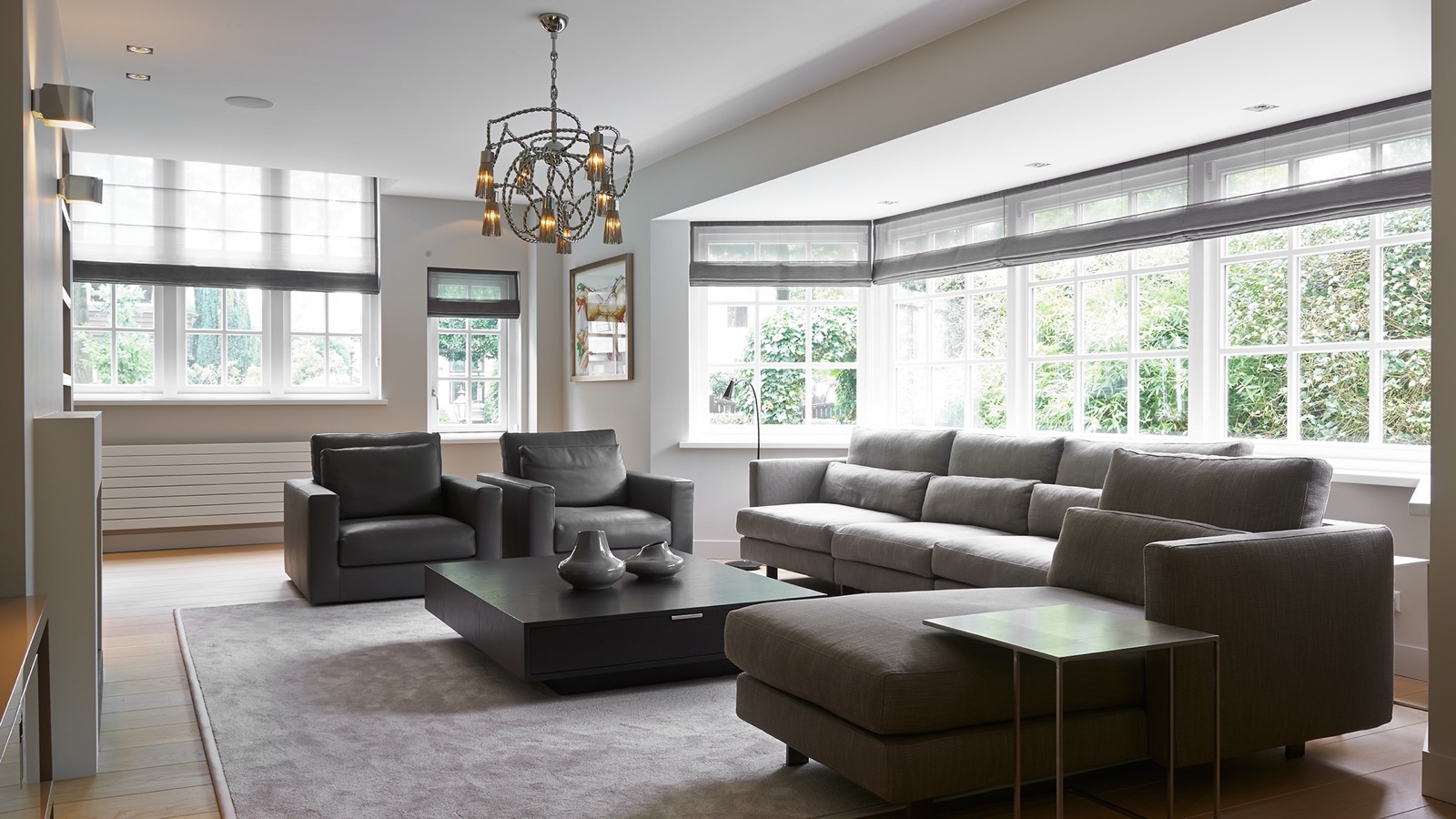
Inside, the living room depends on the same large windows with screens seen outside. They pull daylight deep into the seating area and keep the room bright even when the screens are partially drawn. A grey corner sofa sits low in the space, paired with a simple coffee table and a hanging lamp above the seating zone. Nothing is overdesigned. The furniture stays close to the floor, which lets the windows and the view beyond remain the main presence in the room.
The modern minimal interior becomes especially clear in the way the finishes step back. Light walls, a pale floor, and darker details around openings keep the room from feeling busy. The screens add another layer, filtering direct sun while leaving the glass readable. This is not a room built around display pieces. It works through proportion: wide openings, low furniture, and enough open floor to make the route through the room feel unforced. That restraint gives the interior its rhythm.
Built-in storage that keeps the circulation clear
A built-in hallway cabinet runs as a flat plane along the circulation zone, using vertical and horizontal lines instead of handles or ornament. It sits close to the wall and keeps the hallway visually quiet, which matters in a house where the exterior has already been simplified so strongly. The cabinet fronts are part of the architecture rather than separate furniture. They catch the light differently from the surrounding wall, so the storage reads as a deliberate surface break rather than an added object.
From this point in the house, the eye moves across light wood flooring, dark door panels, and open thresholds. A small work corner appears nearby with a black desk and a flexible desk lamp, a compact setup that fits into the wider interior without interrupting it. The same discipline returns in the bedroom, where large built-in wardrobe fronts create a flat wall of storage. Their pale finish keeps the room calm, while the carpet softens the floor beneath it. The space stays spare, but not empty.
Storage, light and a straight sightline
What gives the hallway its clarity is the way storage, wall surfaces, and openings line up. The built-in hallway cabinet avoids visual noise, and the adjacent doorways keep the route through the home readable. Light from the larger rooms reaches the corridor and touches the panel edges, which makes the joinery feel precise. This is where the modern home renovation shows its quieter side: not in a dramatic gesture, but in the way the passage spaces were edited to hold less and show more of the house itself.
Kitchen and dining space with darker tones and glass doors
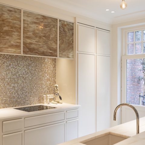
The kitchen shifts the palette toward darker finishes. Black cabinet fronts, a dark worktop, and a tiled backsplash with a grid-like surface give the room more depth than the living area. A stainless steel sink and tap sit clearly in the composition, their reflective surfaces catching light from nearby openings. The dining table sits in the same zone, which keeps cooking and eating close together without making the room feel crowded. The large glass doors beside it bring in another layer of daylight and open the view outward.
Here, the contrast between dark and light becomes more direct. The black kitchen surfaces anchor the wall, while the glass door expands the room toward the outside. The finishes are straightforward, but they are arranged carefully: flat fronts, clean edges, and no loose decorative elements competing for attention. That is where the modern minimal interior carries through most clearly. It uses fewer visual moves, then lets the materials do the rest of the work.
A staircase, fireplace and the shift between rooms
The transition zone around the staircase is one of the sharpest parts of the house. Wooden treads introduce a warmer note, but the structure stays plain and linear. Nearby, a modern fireplace sits inside a wall niche, so the flame is framed rather than announced. The hall moves into the living space through this combination of stair, wall, and fire element, and each part stays visually contained. It is a compact sequence, but it gives the house a strong internal order.
That same sense of order runs through the rest of the interior. Openings are broad, surfaces are smooth, and the darker details repeat in measured ways. The fireplace, the staircase, and the door frames all work as markers that help the rooms connect without blending into one another. The house does not rely on decorative transitions. It uses structure, material, and light to keep the circulation legible from one room to the next.
A controlled palette from room to room
Across the home, the palette stays within a narrow range: white plaster, grey seating, pale wood, black details, and glass. In the bathroom, a double vanity sits beneath a simple mirror area, with white cabinetry below and a darker bathing zone visible beyond the frame. The bedroom continues that controlled approach with built-in wardrobe fronts that hold the wall line steady. These rooms are different in use, but they share the same visual logic. Surfaces are kept flat, and storage is folded into the architecture wherever possible.
The renovation reads as a sequence of edits rather than a single dramatic gesture. Brick was replaced by plaster. Red roof tiles became black. Interior walls were cleared for larger openings, built-in storage, and simpler lines. The result is a house that holds together through material decisions instead of decoration. In that sense, the modern home renovation is most convincing where it stays most disciplined: in the exterior, in the windows, and in the rooms where light has enough space to move.
Want to see more of Villabouw Van der Windt? View the page of Villabouw Van der Windt for even more great projects and company information.




NEW 2026 Jubileum Edition The Best Interior Designers Benelux
Order Now €125


NEW 2026 Jubileum Edition The Best Interior Designers Benelux
Order Now €125