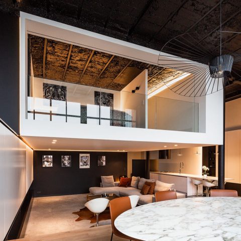
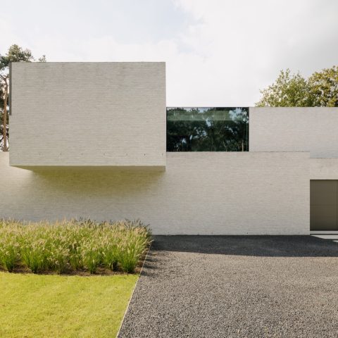
Modern luxury home inspiration with glass facade and custom minimalist interiors
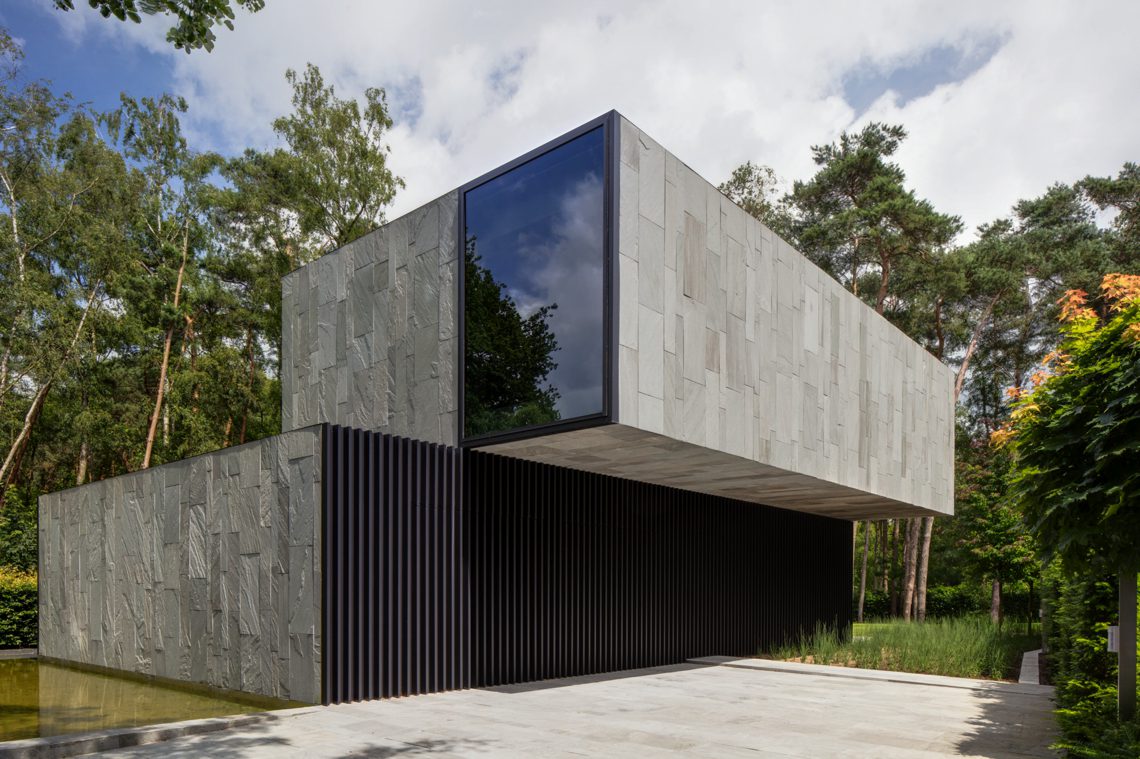
The first thing that reads clearly is the contrast: black window frames cut through broad sheets of glass, while stone cladding facade panels hold the volume down and give the house its weight. In this modern house inspiration with luxury architecture photography, the exterior is presented as a sequence of planes, shadows, and openings rather than a single front view. The overhang at the top line throws a hard shade, and the vertical lamella accent breaks the stone surface into a more measured rhythm.
Seen from outside, the house relies on clean geometry and material contrast. Large openings pull the eye inward, and the daylight through large windows gives the interior a second layer even before you step inside. The black frames sharpen every opening, while the lighter stone and stone-composite surfaces keep the composition grounded. It is a project that works through proportion: solid against void, smooth against textured, dark against pale.
Glass, shadow, and stone on the exterior
The facade presentation is strongest where the materials meet. Stone cladding facade panels are set in rectangular fields, which makes the wall read as a grid rather than a flat skin. That disciplined pattern is interrupted by a vertical slatted section, giving the volume a narrower, taller note. Together with the glass facade black frames, the result is restrained without feeling cold. The architecture depends on edges, and the photographer captures those edges with enough distance to show how the massing changes with each opening.
A terrace sits close to the house and extends the exterior story beyond the main volume. The paving is plain and direct, with grass and a water feature shaping the edge of the outdoor space. Reflections in the water add movement beside the stillness of the hard surfaces. From this angle, the house does not read as isolated from its surroundings; the terrace and the opening toward the garden make the transition visible, one strip of stone and glass at a time.
Light across the hall and the main circulation route
Inside, the hallway is less a connector than a line of sight. Large openings draw daylight through the plan, and the surfaces stay quiet enough to let the change in light do the work. The floor reflects just enough to register the brightness, while wall lengths remain uninterrupted. That gives the passage a clear direction and makes the interior feel edited rather than crowded. In a house like this, the route matters as much as the rooms, because every turn frames another material surface or a glimpse of glazing.
Minimalist interior built-ins shape the walls without announcing themselves too loudly. Storage runs along long surfaces, sometimes in darker tones, sometimes recessed so the volume reads as a single plane. The custom storage walls keep the corridor and adjacent rooms visually calm, but they also give the architecture a practical backbone. Cabinet fronts, niches, and flush transitions are used to hold daily items out of sight, leaving the larger gestures of glass and stone to stay visible.
A kitchen defined by dark cabinetry and a pale work surface
The kitchen shifts the mood through material rather than layout. Dark cabinetry forms a strong background, and the work zone is set off by a modern kitchen marble-look surface that catches light in a softer way than the surrounding fronts. The contrast between the dark storage wall and the lighter top gives the room a clear working line. A large opening beside the kitchen brings daylight through the side of the plan, so even the deeper surfaces remain legible.
What stands out here is the discipline of the joinery. Handles are visually quiet, and the storage reads as a continuous band instead of separate units. That fits the wider project language, where custom storage walls keep the interior composed and allow the eye to move from one room to another without interruption. The kitchen feels designed to be seen from outside as well, with its surfaces and openings forming part of the architecture, not just the equipment within it.
Built-in surfaces that keep the room open
The best detail in the kitchen is the way the cabinetry closes down visual noise. Flat fronts, dark planes, and the pale worktop make a tight material combination that leaves room for the glazing to do its work. Because the room is not overloaded with finishes, the daylight through large windows reaches deep enough to draw out the edges of the counters and the line of the floor. The result is measured and readable, which suits the rest of the house.
Living room views that stay close to the garden
The living room is arranged around a broad glazed wall, so the garden remains present even when the room is furnished. A sofa, a low console, and a television unit are set against that open background, leaving the view to carry the space rather than decorative layers. This is where luxury architecture photography is especially useful: it shows how the room changes as the light shifts across the glass and the floor. The house is not trying to hide its openness; it uses it to keep the room active.
The interior materials stay in the same restrained register. Tile flooring gives the space a hard, even base, while occasional wood-toned panels introduce a warmer note without becoming dominant. The balance here is not decorative. It is spatial. Large openings, clean walls, and a minimal amount of loose furniture make the room feel wide, and the eye moves easily from the seating area to the terrace and then outward again to the garden edge.
Bathroom surfaces built around light and reflection
In the bathroom, the room is organized around a freestanding tub and a large window. The stone and marble-look finishes create a pale shell that reflects daylight without losing their surface depth. The bath stands away from the wall, which gives it room to breathe inside the composition. Because the glazing is so generous, the room feels connected to the outside rather than sealed off from it. The effect is calm, but it comes from simple visual decisions: glass, a tub, and smooth wall planes.
A second bathroom view reinforces the same approach. The floor and wall finishes stay close in tone, which lets the fixtures stand out by shape instead of color. That avoids clutter and keeps the room readable in photographs. Even small changes in shadow around the tub edge or along the vanity surface become part of the composition. In a project presented through architecture photography, those shifts matter because they show how the room is made from light as much as from materials.
A suite where the tub and window share the frame
The bedroom and suite images bring the same bathtub motif into a more private setting. Here the tub is placed near a large opening, so the room is defined by the relation between the interior volume and the view outside. The bedding stays low, and the surrounding surfaces remain plain, which keeps attention on the window line and the water or greenery beyond it. It is a strong example of how minimalist interior built-ins and fixed elements can support a room without overtaking it.
Details that keep the rooms from drifting apart
What holds the project together is not a single statement piece but the consistency of its surface language. Dark cabinetry, stone-look finishes, glass edges, and measured storage all return in different rooms. The kitchen, hallway, bathroom, and suite are distinct, yet they share the same edited attitude toward material. That is why the project reads so clearly in images: the photographer can move from one space to another without needing to explain the transitions. Each room is already carrying a piece of the same vocabulary.
Seen as a whole, this modern house inspiration with luxury architecture photography offers more than a list of rooms. It shows how black frames, stone cladding facade panels, daylight through large windows, and a terrace with water feature can work together without overstatement. The house relies on simple moves: open a wall, darken a cabinet line, pull light across a floor, and let the outside remain visible. That clarity is what makes the project worth studying.
Want to see more of EX-IT Architectuur? View the page of EX-IT Architectuur for even more great projects and company information.





NEW 2026 Jubileum Edition The Best Interior Designers Benelux
Order Now €125


NEW 2026 Jubileum Edition The Best Interior Designers Benelux
Order Now €125


NEW 2026 Jubileum Edition The Best Interior Designers Benelux
Order Now €125


NEW 2026 Jubileum Edition The Best Interior Designers Benelux
Order Now €125