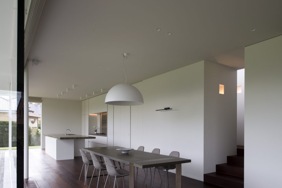
Modern kitchen in Villa K
A long row of recessed ceiling spots runs above the cabinet line, pulling the eye across the room and onto the white kitchen cabinetry below. The light lands evenly on the fronts, the worktop, and the dark niche behind the counter, where the surface shifts into a deeper tone. The room reads through contrast rather than decoration: white planes, a restrained opening, and materials that stay close to the wall.
Light laid out in a straight line
The kitchen with recessed spotlights is built around a clear ceiling gesture. Instead of spreading the lighting across the room, the fixtures follow the length of the kitchen and mark the working zone below. That line gives the space direction. It also keeps the ceiling visually quiet, so the joints in the cabinetry and the edge of the worktop remain easy to read. The result is precise without feeling rigid.
Seen from the room, the light does more than brighten the surfaces. It traces the line of the white fronts and makes the gap between upper and lower elements visible. On the darker niche behind the countertop, the same spots cut a sharper edge, which helps the back wall stand apart from the lighter joinery. The lighting is part of the composition, not an added layer.
White fronts with a restrained profile
The white kitchen cabinetry sits in a clean run, with narrow joints and a handleless appearance that keeps the front plane calm. Nothing interrupts the reading of the storage wall. The pale finish reflects the ceiling light and gives the room a clearer outline, especially beside the darker recess behind the counter. Because the doors and panels stay visually close to one another, the cabinetry feels measured rather than busy.
That handleless look is visible in the way the fronts meet and in the absence of protruding hardware. It is a detail that changes the pace of the room: the eye moves along the line of storage instead of stopping at handles or decorative breaks. The effect is subtle, but it defines the whole wall. In a modern kitchen, those small decisions carry most of the visual weight.
The dark niche behind the worktop
Behind the countertop, the dark niche creates the strongest contrast in the room. It sits deeper than the surrounding surfaces and works like a shadowed frame for the work area. The opening also gives the stone countertop backsplash a clear place to register, so the material does not disappear into the wall. Against the white cabinetry, the recess feels denser and more grounded.
The counter edge runs in front of this darker zone with a quiet, horizontal line. The stone or ceramic surface reads as one continuous plane, with the backsplash lifting the same material upward. That repetition matters here. It reduces visual noise and ties the work surface to the wall behind it. The niche is not treated as decoration; it is a functional void that sharpens the layout of the modern kitchen.
Materials kept close to the architecture
The palette stays limited and readable: stone or ceramic at the worktop and backsplash, plaster or concrete on the walls, and metal at the tap and fittings. Each material has a different surface response to light. The wall finish stays matte, the metal catches small highlights, and the counter has a tighter, denser look. Because there are few competing textures, the room depends on line and proportion rather than ornament.
Those material choices also reinforce the room’s depth. The darker niche absorbs light; the white cabinetry reflects it; the worktop sits between the two as a stable horizontal band. The kitchen with recessed spotlights uses that contrast carefully, so the materials do not compete. They support the same reading: storage, work surface, and back wall are all legible at a glance.
A composition built from edges and openings
A broad glazed opening brings in a stronger wash of daylight, which keeps the white fronts from flattening out. It also softens the transition between the kitchen and the rest of the interior by opening the room toward a brighter edge. The cabinetry stays compact against that light, and the clean geometry of the joinery remains intact. Nothing in the room depends on visual excess; the effect comes from how the planes meet.
Seen as a whole, the modern kitchen in Villa K is defined by restraint in the right places. The straight ceiling spots, the white kitchen cabinetry, the dark niche behind the countertop, and the stone countertop backsplash all work within one clear frame. The room holds its attention through surfaces, shadow, and line. That is what stays with you after the first look: a kitchen drawn with a limited set of moves, each one easy to read.
Even the smallest details reinforce that reading. The metal tap stands as a slim vertical note against the flat work surface, while the surrounding plaster or concrete wall keeps its quiet texture. The space does not rely on decorative contrast. It is built from measured relationships between light, material, and depth, which gives the kitchen its calm visual clarity.
Because the fronts remain close to the wall and the lighting follows the plan of the room, the composition never feels overworked. The modern kitchen stays focused on function as a visible order of parts: storage, counter, recess, and ceiling line. Each element is easy to identify, yet the room still feels composed as a single scene. That balance is what gives the project its lasting clarity.
Want to see more of Architectenbureau Glenn Reynaert? View the page of Architectenbureau Glenn Reynaert for even more great projects and company information.




NEW 2026 Jubileum Edition The Best Interior Designers Benelux
Order Now €125


NEW 2026 Jubileum Edition The Best Interior Designers Benelux
Order Now €125