Modern luxury house with brick-and-stone facade, large glass openings, and marble-look interiors
A modern luxury house can feel measured rather than loud when the materials do the work. Here, brick and stone set the tone outside, while dark window frames cut clear lines around the large glass openings. The result is a house that reads in layers: solid surfaces, deep reveals, and wide panes that pull daylight into the rooms behind them.
Brick, stone, and glass in one clear composition
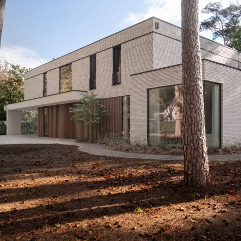
The exterior is built around a brick facade with stone-like sections and dark accents around the openings. That contrast keeps the volumes legible, especially where the walls step forward or recess under the overhangs. In several views, the large glass frontage sits beside masonry and shadow, so the house shifts between closed and open surfaces without losing its calm profile. A covered terrace extends that language outdoors, with a glazed enclosure that keeps the edge between inside and outside visually light.
Another view shows the same idea from the garden side: a terrace set against brickwork, framed by black profiles and a deep roofline. The glazed parts are not treated as decoration; they are part of the structure of the house. Even the wider openings feel anchored by the weight of the masonry, while the dark joinery keeps the composition crisp. For anyone looking at a modern home with a brick facade, this project shows how much restraint the exterior can carry.
A covered terrace that stays connected to the house
The terrace is partly sheltered, with a large glass panel system opening it to the garden. Because the glazing runs beside the brick wall and under a pronounced overhang, the space reads as an extension of the house rather than a separate outdoor room. The paving follows straight edges, and the surrounding grass keeps the setting simple. Nothing is overdesigned. The focus stays on the opening, the shadow line, and the way the terrace catches light across the day.
The kitchen centers on one strong horizontal line
Inside, the kitchen uses a kitchen island as its main anchor. The island carries a marble-look countertop with grey veining, which gives the room a sharp horizontal surface against the more matte cabinet fronts. Along one side, a tall cabinet wall rises in a clean block, with vertical handles that reinforce the height of the storage. A modern luxury house often relies on this kind of discipline: one clear work surface, one tall storage plane, and enough breathing room around them.
In the kitchen views, the large windows keep the room from feeling enclosed. Light lands on the island and on the marble-look countertop, where the veining becomes more visible near the edges and around the sink zone. The kitchen does not depend on ornament. Instead, it uses proportion and material contrast: dark details, pale stone tones, and straight cabinet runs. That approach keeps the modern home feeling composed even when the kitchen is visually busy with appliances, storage, and circulation.
Tall storage, straight handles, and a calm work zone
The tall cabinet wall is one of the clearest features in the interior. It gives the kitchen a vertical counterweight to the island and keeps everyday storage out of the main sightline. The handles are narrow and direct, almost architectural in the way they repeat down the run. Near the window, the worktop continues as a neat strip under the glass, which makes the room feel longer and lighter. It is a simple arrangement, but it carries the entire kitchen.
Daylight sets the pace in the living areas
The living spaces are shaped by large glass frontage and broad window openings that bring the outside into view without breaking the stillness of the interior. Dark wall panels and tall built-in elements appear against pale floors, creating a measured contrast rather than a decorative one. In one scene, the rooms feel open but controlled: the furniture stays low, the walls remain plain, and the window lines define the rhythm. That restraint lets the materials speak clearly, especially where daylight skims across the surfaces.
A round mirror appears in one of the interior views, introducing a softer shape among the straight lines. It works because the room around it is so restrained: flat planes, dark joinery, and broad glazing. The mirror does not try to dominate the space. It simply breaks the geometry for a moment. That small curve is enough to change the reading of the wall, especially in a house where most of the composition is built from rectangles, edges, and long sightlines.
Marble-look bathroom tiles and a freestanding bathtub
The bathroom continues the same material logic, but with a more reflective surface. Marble-look bathroom tiles cover the walls, their veining visible enough to animate the room without making it busy. A walk-in shower sits within that field of tile, and the glass keeps the outline of the wet zone clear. Next to the wash area, a round bathroom mirror and a dark vanity sharpen the composition. The contrast between pale stone tones and black details makes the space feel precise rather than decorative.
A freestanding bathtub appears in another bathroom view, set close to the vanity rather than isolated as a sculptural object. That proximity matters. It shows how the room is arranged around daily use, with the basin, mirror, and tub sharing the same visual field. The light grey tile finish continues underfoot, with straight grout lines that keep the floor visually steady. In a project like this, the bathroom works because each element has a fixed place and a clear outline.
One mirror, one basin, one clear axis
The wash area is stripped back to its essentials: a rectangular basin, a dark cabinet below, and a large mirror above. The mirror widens the room visually, but it also catches the marble-look tile pattern behind it, doubling the effect of the wall finish. The lines stay clean from basin to ceiling. Nothing interrupts the axis. That gives the bathroom a quiet order, and it allows the material surface to remain the main subject.
Entry, stairs, and floor finish tie the rooms together
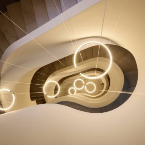
The entrance zone shows a modern staircase with dark accents, set against a pale surface that reflects the light from the nearby rooms. This part of the house is less about display than movement. The stairs rise beside straight wall planes and dark frames, so the route through the house stays easy to read. The same calm continues in the flooring: a light tile floor with crisp grout lines that runs from one area to the next, keeping transitions visually direct.
Because the floor finish is so even, the stronger elements stand out more clearly: the island in the kitchen, the dark cabinet wall, the marble-look bathroom tiles, the black window frames. The house relies on those contrasts. It uses brick facade, glass, stone-like surfaces, and sharp joinery without overloading the rooms. That is what gives the project its force: not excess, but the way each surface supports the next, from the terrace to the kitchen and on into the bathroom and entry.
Want to see more of VELOR architecten? View the page of VELOR architecten for even more great projects and company information.



NEW 2026 Jubileum Edition The Best Interior Designers Benelux
Order Now €125


NEW 2026 Jubileum Edition The Best Interior Designers Benelux
Order Now €125


NEW 2026 Jubileum Edition The Best Interior Designers Benelux
Order Now €125


NEW 2026 Jubileum Edition The Best Interior Designers Benelux
Order Now €125


NEW 2026 Jubileum Edition The Best Interior Designers Benelux
Order Now €125


NEW 2026 Jubileum Edition The Best Interior Designers Benelux
Order Now €125