










New-build house with a luxury, modern interior
Large windows set the tone in this new build house interior. Daylight runs across the living room in long strips, catching the hard-wearing floor, the textured dark wall panels and the pale upholstery that softens the room’s edges. The result is not about excess, but about contrast: glass beside structure, light beside depth, and a sequence of materials that reads clearly from one space to the next.
Daylight framed by wide window surfaces
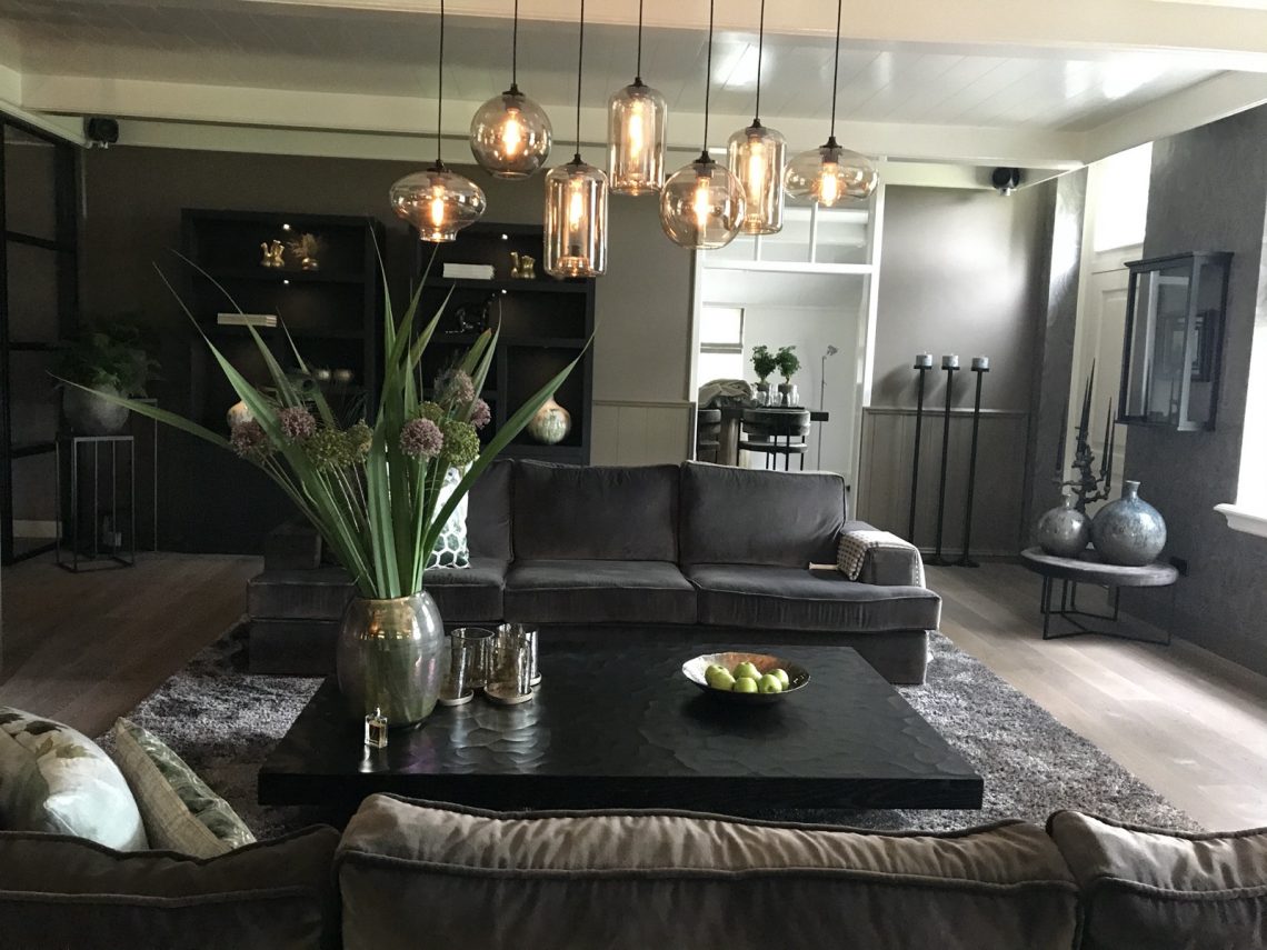
The living room uses the width of the glazing to pull the eye straight through the house. Curtains sit back from the opening, so the window line remains visible and the room keeps its open feel during the day. In the seating area, a corner sofa with scattered cushions sits near a round coffee table, while the television wall is finished with a built-in niche that keeps the screen zone visually contained. The room feels measured, not crowded, and that is largely due to the way the large windows shape the layout.
Round glass pendant lights hang low enough to matter in the composition. They add a reflective note above the seating area and break up the darker surfaces around them. Their visible light sources make the room feel layered after dark, when the glow shifts from the windows to the fixtures overhead. It is a simple move, but it gives the living room a clear rhythm between daylight and evening light.
Dark wall surfaces that carry the room
One of the strongest elements in the home is the use of the dark accent wall. In the living area, the darker panels have a textured, stone-like quality that gives the wall more presence than a flat painted surface would. They sit behind the television zone and next to lighter walls and fabrics, so the contrast is immediate. Rather than closing the room in, the darker surface gives the lounge a fixed point and helps the furniture read as a deliberate arrangement.
The same attention to material appears in the smaller details. A warm-toned floor runs through the space and bridges the difference between the dark wall treatment and the lighter seating area. The room avoids visual noise because each surface has a clear job: glass brings in the light, the wall absorbs it, and the floor links the two. That discipline makes the luxury interior feel calm without stripping away depth.
A modern kitchen defined by contrast
The modern kitchen continues the same palette, but in a more work-focused setting. Dark cabinetry, a lighter worktop and integrated wall detailing create a kitchen that feels grounded and orderly. The seating or dining zone is visible beside it, with tall stools placed close to the counter, and pendant lights hanging overhead to mark the transition between cooking, eating and gathering. The opening to the hall is also present, which keeps the kitchen connected to the rest of the home.
Here the material contrast is doing most of the work. The darker lower volumes anchor the room, while the lighter surfaces and glass pendants stop the composition from becoming heavy. A niche built into the wall adds a precise break in the kitchen run, giving the eye somewhere to pause. It is a practical gesture, but it also sharpens the room’s geometry. This is where the new build house interior becomes most legible: straight lines, clear edges and no unnecessary layers.
Pendant lighting above the working zone
The pendant fittings above the kitchen and dining area are not just decorative additions. They mark the table or work surface, help define the vertical space and echo the glass pendants used in the living room. That repetition makes the home feel connected from room to room without relying on identical finishes. The lights also catch reflections from the darker cabinet fronts, which gives the kitchen a slightly more graphic look in the evening.
Storage that disappears into the bedroom walls
In the bedroom, the emphasis shifts from open living to built-in order. A dark wardrobe wall runs across the room with clear divisions for hanging space, shelves and lower storage drawers. The interior of the cabinet is visible, and that makes the construction more interesting than a closed front would. It shows how the storage is planned around clothes and daily use, not just around the room’s proportions. This is where custom storage solutions matter most: they keep the floor clear and let the bedroom read as a single, structured space.
The wardrobe panels sit neatly against the rest of the room, and the darker finish ties them back to the accent tones used elsewhere in the house. There is no decorative excess here. Instead, the focus is on the way the built-in wardrobe frames the bedroom and turns a storage wall into part of the architecture. The hanging section, shelves and drawers are all visible at once, which gives the room a practical clarity that suits the rest of the interior.
How the bedroom keeps its lines clean
Because the storage is fully built in, the bedroom avoids the visual interruptions that separate furniture pieces can create. The wardrobe follows the wall edge closely, and the open compartments keep everyday items within reach. It is a quiet room, but not an empty one. The darker panels, pale wall surfaces and restrained floor finish make the space feel settled, while the visible organisation of the cabinet gives it a precise, tailored character. That balance supports the wider language of the home: contrast, daylight and measured detailing.
Across the house, the same material logic keeps returning. Dark against light. Glass against matte surfaces. Open glazing against enclosed storage. The living room uses it to frame the view and guide the seating, the kitchen uses it to define work and dining, and the bedroom uses it to organise storage without breaking the room apart. The overall effect is a new build house interior that feels direct in its choices and carefully edited in its finish, with each room carrying the same clear line of thought.
Want to see more of Miryam Schotman Interieurs? View the page of Miryam Schotman Interieurs for even more great projects and company information.




NEW 2026 Jubileum Edition The Best Interior Designers Benelux
Order Now €125


