Modern luxury villa interior with stone and custom details
Dark stone and warm wood set the tone as soon as the interior comes into view. The rooms feel drawn with a firm hand: straight cabinet lines, pale floors, black framing, and surfaces that shift between matte texture and a harder sheen. In the main living areas, the modern luxury kitchen anchors the plan, while the adjoining lounge and wet rooms carry the same material discipline into different settings. Nothing is overworked. The strongest impression comes from the way stone, veneer, glass, and light meet at the edges.
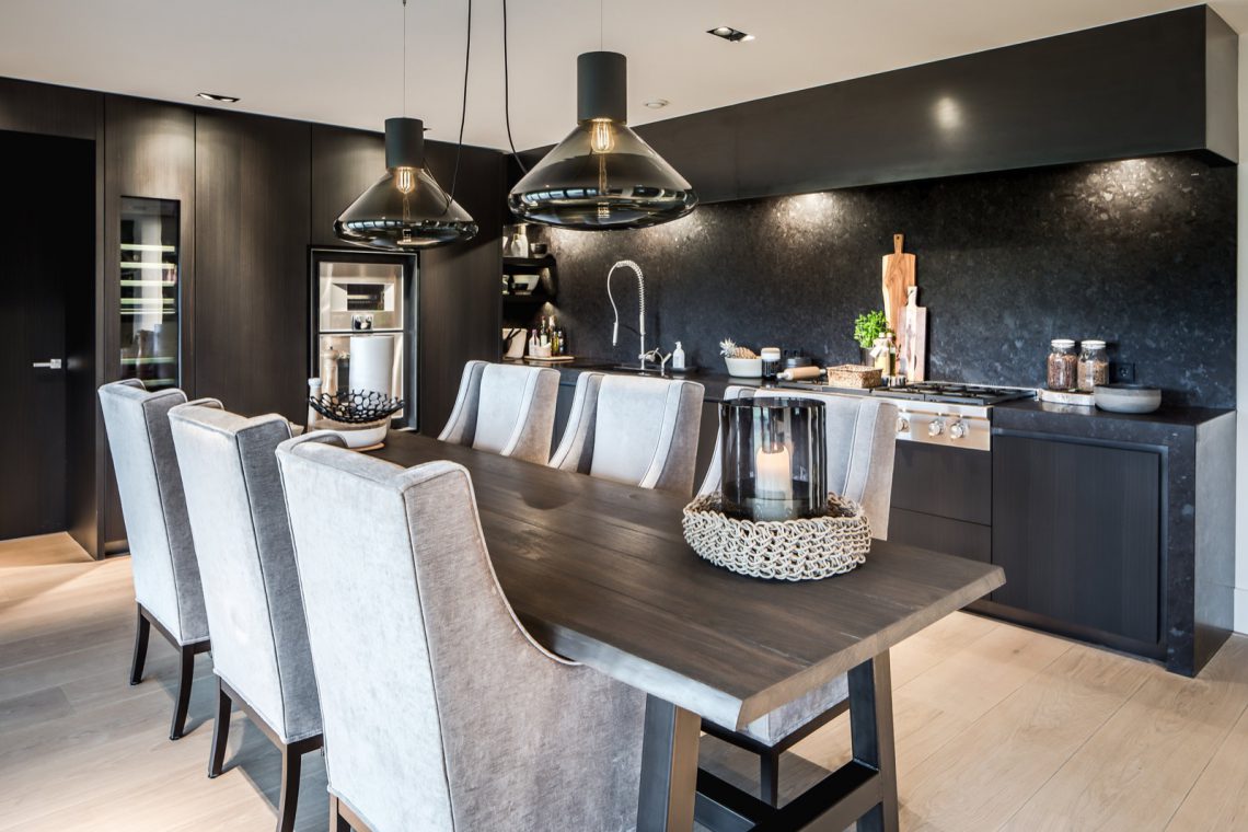
Kitchen wall, table zone, and a natural stone backsplash
The kitchen is built as a long, low composition with a full-height run of cabinetry at one side and a working counter folded into the room. Dark fronts keep the wall visually calm, while the natural stone backsplash introduces grain and depth behind the cooktop and sink area. The stone reads almost like a single slab from afar, then opens up in texture when you move closer. Above the table zone, pendant lights hang in a measured line and pull attention toward the center of the room without breaking the clean geometry.
At counter height, the details stay restrained. The faucet, the worktop edge, and the seam between stone and cabinetry are all left visible rather than hidden behind decoration. That makes the modern luxury kitchen feel precise rather than staged. The L-shaped layout also keeps the preparation zone close to the dining area, so the room can shift from cooking to sitting without changing character. Dark panels, stone texture, and a pale floor do most of the work.
Full-height storage in dark wood veneer
One of the clearest gestures is the storage wall in dark wood veneer. The grain softens the darker surfaces and gives the kitchen more depth than a plain lacquered finish would. Because the cabinetry rises in a continuous block, appliances and storage sit behind a single visual plane. The result is a wall that reads as joinery first and equipment second. In the wider view, that choice keeps the room from feeling busy, even with the table, lighting, and cooking zone all in use.
Small changes in material are doing the heavy lifting here. A glossy metal faucet cuts against the stone. Drawer fronts stay flat. The hand of the maker is visible in the alignment of panels and the way the worktop meets the rear wall. It is the kind of kitchen where the joinery is not simply background; it shapes how the room is read. That is why the custom cabinetry matters so much in the overall interior.
Living room volume shaped by a built-in fireplace
The lounge opens out with a clear central focus: a built-in fireplace set into a wall niche. Firelight sits inside a dark surround, and the niche lighting sharpens the outline of the opening once daylight fades. Around it, the seating arrangement stays low and relaxed, with large upholstered chairs catching light from the windows. The room is open, but the fireplace gives it a fixed point. It stops the eye and makes the surrounding floor, wall, and ceiling lines feel more deliberate.
A textured stone wall adds another layer to the living area. Its surface is not smooth or polished; it holds shadow and catches it differently from one angle to the next. Nearby, built-in storage continues the language of the kitchen with dark surfaces and exact joints. Large windows, fitted with horizontal blinds, bring a controlled brightness into the room. The blinds cut the light into bands, which makes the stone wall and the hearth niche read even more clearly.
How the stone wall and fireplace work together
The strongest part of the living room is the relationship between the stone wall and the fire opening. One surface is rougher and more tactile; the other is cut cleanly into the wall. Together they create a contrast between mass and void. That contrast is repeated in the cabinetry nearby, where flat fronts sit beside the deeper shadow of the niche. In this part of the villa, the material palette is limited, but the spatial effect is not. The room gains depth through those few, well-placed shifts.
Even the circulation line supports that effect. The open-plan floor runs straight past the seating zone, so the lounge remains connected to the kitchen without blending into it. Glass, stone, and dark joinery define the route, while the fireplace holds the center. It is an arrangement that suits a project where the rooms are meant to be read together, yet still keep their own edge.
Bathrooms with marble-look tiles and dark vanity zones
In the bathrooms, the palette turns lighter, but the material logic stays the same. Walls are finished with marble-look bathroom tiles that carry soft veining across large surfaces. Against that pale background, the vanity zones are darker and more grounded. The contrast makes the basins and countertops stand out without adding extra ornament. In one room, the ceiling slopes down, which changes the proportions and brings the fittings closer to the viewer.
Close-up images show how the tiles, worktop, and fittings meet. The vanity unit is set into a dark zone that holds storage beneath a clean horizontal surface. A black-framed opening nearby adds another crisp line to the room. The effect is more measured than decorative. Light from the ceiling spots lands on the tile surface and picks out the veining, while the darker base below keeps the room from feeling washed out.
Light, slope, and a tighter ceiling line
The bathroom under the sloped ceiling is the most spatially specific of the wet rooms. The angle of the roof changes the height, and the built-in spots follow that line rather than fighting it. Because the walls are tiled in marble-look surfaces, the geometry stays legible even in a compact corner. Dark joinery below gives the room weight, and the openings in the wall keep the composition from closing in. It is a small set of moves, but they are enough to give the room a distinct rhythm.
Elsewhere in the interior, the same care appears in the transitions between zones. A glass opening framed in dark metal marks a passage. A work surface in dark finish meets a wall of cabinets and open niches. The joinery never feels like an add-on. It is part of the plan, whether it is holding toiletries, storage, or a display surface. That consistency ties the bathrooms back to the rest of the villa without repeating the same look room for room.
Entry and work zones with glass, metal, and custom cabinetry
The entry area is darker and more enclosed, with wall panels and a framed opening that give the passage a sharper edge. A glass panel sits inside a narrow metal outline, and the surrounding surfaces remain subdued so the opening stands out. The floor below is lighter, which keeps the corridor from disappearing into shadow. The effect is quiet but exact. It prepares the visitor for the more open living spaces without changing the material language.
In the workspace and cabinet area, the same discipline continues through wall-mounted storage and a mirror zone. The cabinetry runs almost the full width of the wall, leaving only selected recesses open. A dark countertop projects into the space like a small desk or landing surface, and the veneer finish keeps the composition grounded. Here, custom cabinetry is not just about storage capacity. It also shapes the passage, the reflection, and the way the wall reads from one angle to another. Across the villa, those exact transitions are what give the interior its character.
Want to see more of Wolterinck? View the page of Wolterinck for even more great projects and company information.





NEW 2026 Jubileum Edition The Best Interior Designers Benelux
Order Now €125


NEW 2026 Jubileum Edition The Best Interior Designers Benelux
Order Now €125


NEW 2026 Jubileum Edition The Best Interior Designers Benelux
Order Now €125


NEW 2026 Jubileum Edition The Best Interior Designers Benelux
Order Now €125