








Modern minimalist interior with open living space
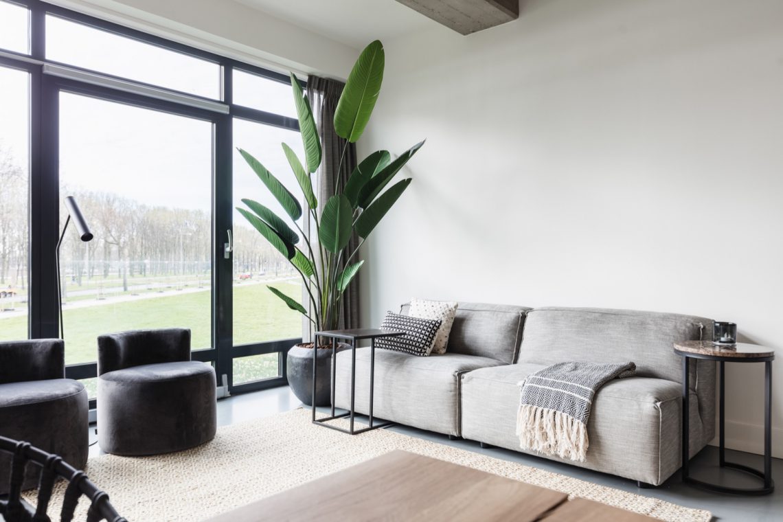
Daylight reaches deep into the room through the floor-to-ceiling windows, and that first impression sets the tone. A light gray sofa, a dark ottoman and soft rugs hold the seating area in place without closing it off. Around them, black window frames draw a crisp edge against the glass, while the concrete-look ceiling gives the open space a clear upper line. It is a modern minimalist interior built from contrast rather than decoration.
An open-plan living kitchen with uninterrupted sightlines
The living room and kitchen sit in one continuous volume, so the view moves from the sofa straight toward the open-plan living kitchen. Wood tones in the cabinet fronts, white walls and the concrete-look ceiling form a restrained backdrop for everyday movement between sitting, eating and cooking. Nothing here interrupts the route with heavy partitions. Instead, the furniture and the lighting define the zones, and the room stays readable from several angles.
In the seating area, the details stay low and close to the floor. The light gray seating area faces round dark ottomans and a narrow table structure, while a plant softens the edge of the window. Black floor lamps and a console with dark accents pull the eye toward the far side of the room. The composition leaves plenty of breathing room around each object, which is why the space feels open even when the daylight is less direct.
A concrete-look ceiling line above wood and textile
The concrete-look ceiling is the strongest horizontal gesture in the room. Its grey surface sits above pale walls and soft upholstery, adding weight without reducing the openness below it. Under that line, wood and concrete interior elements take over at eye level: cabinet fronts, shelving and wall details bring a warmer tone to the kitchen side, while the sofa fabric and rugs keep the lower plane quiet. The result is a layered room where each material has a clear position.
The kitchen connects visually to the rest of the living space through a low, floating cabinet wall and open compartments. That construction keeps the wall visually light, even though storage is clearly present. Above the kitchen and dining zone, rail or pendant lighting follows the length of the ceiling, giving the room a measured rhythm. Light lands where it is needed and leaves the rest of the surface open, so the room still reads as one long interior rather than a series of separate corners.
Black window frames and horizontal blinds as a sharp border
At the windows, black window frames and horizontal blinds create the hardest edge in the project. The glass remains dominant, but the frame gives it a precise outline. In one seating corner a dark curtain layer runs beside the opening, while other windows are left more transparent and direct. That shift between open and filtered views changes how the daylight enters the room, especially when the sun is lower and the contrast across the glass becomes clearer.
The same horizontal blinds appear in the bedroom, where they break the window into even bands and soften the incoming light. There, a bed with light bedding sits beside a wall of open niches and wood shelves. The room is smaller, yet the same visual language stays intact: light background, dark window treatment, open storage. Because of that, the bedroom feels separate from the main living space without breaking the overall interior logic.
Wood details that sit between concrete and glass
What gives the modern minimalist interior its depth is the way the materials are stacked. Concrete forms the upper frame, wood sits in the middle through the kitchen wall and storage elements, and textile and glass occupy the lowest and highest lines. The palette is limited, but it is not flat. Large windows daylight brings out the grain in the wood fronts and the soft texture of the rugs, while the dark frames keep the edges clean and legible.
Even the plants seem placed with a practical eye. One sits close to the window and breaks up the glass plane; another lifts the composition vertically without blocking the sightline. The furniture follows the same discipline. The sofa stays low, the ottomans are round and dark, and the accessories remain sparse. Nothing competes with the light or the long view from the seating area into the open-plan living kitchen, which is why the room feels calm without relying on empty surface area alone.
A bedroom that repeats the same restrained rhythm
The bedroom carries the same material logic into a quieter setting. Horizontal blinds control the light in narrow strips, and the wall with open niches and wood shelves makes storage visible rather than hidden. The bed is kept low and light against that background, so the room does not feel crowded by its own furniture. Instead of standing apart from the rest of the home, the space picks up the same black frames, pale textiles and wood surfaces found in the main room.
That consistency matters here, because the project depends on how one surface meets the next. Black window frames, the concrete-look ceiling and the wood-and-concrete palette set the pace, while the light gray seating area and the soft floor coverings keep the room grounded. The interior never turns theatrical. It simply uses daylight, material change and a clear layout to make the open volume easy to read, from the first window edge to the last shelf in the bedroom.
Material layers that keep the room readable
The strongest quality of this modern minimalist interior is clarity. You can read the room in layers: ceiling, wall, furniture, frame, textile. Each one has its own material and color, and none tries to take over the others. The open-plan living kitchen stays visible from the sofa, the large windows daylight reaches across the floor, and the dark accents only sharpen what is already there. It is a measured interior, built on visible edges and a limited set of surfaces.
That restraint gives the project its particular pace. The room changes from hard to soft as your eye moves from the black window frames to the blinds, then to the sofa fabric and the rugs, and finally up to the concrete-look ceiling. The kitchen returns wood to the middle of that sequence, keeping the lower and upper lines from feeling cold. Across the whole space, the same idea remains clear: let the structure show, let the light enter, and keep the material palette easy to read.
Want to see more of Maaike van Diemen? View the page of Maaike van Diemen for even more great projects and company information.





NEW 2026 Jubileum Edition The Best Interior Designers Benelux
Order Now €125


