










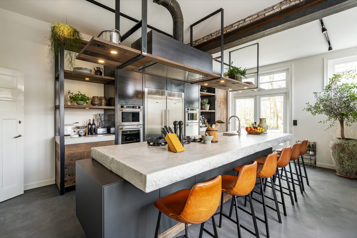
Modern oak kitchen with a stainless steel cooking zone
Light oak fronts set the tone from the first view, but the room is not built around wood alone. Stainless steel defines the working parts, while a stone or stone-look worktop stretches across the layout in broad horizontal planes. The result is a modern oak kitchen that keeps ornament to a minimum and lets material transitions do the work: grain against metal, pale timber against grey stone, and black appliance details tucked into the composition.
The cooking zone is the hardest-working surface
At the center of the room, the stainless steel cooking area reads as a distinct zone within the oak wall. A hob sits beneath an extractor, with the metal surfaces catching light more sharply than the surrounding timber. The vertical wood elements around the cooking section frame the equipment without turning it into a display. Instead, the eye moves from the cooker to the surrounding panels and back again, following the straight lines that keep the layout visually ordered.
The surrounding oak backsplash panels give the cooking area a measured, enclosed feel. Their vertical rhythm breaks the expanse of the wall and adds depth without resorting to decoration. In several views, the wood rises behind and beside the cooking zone, making the metal fittings stand out even more clearly. This is where the modern oak kitchen shows its strongest contrast: not through color alone, but through the way each material holds a different edge under the light.
Extractor, hob and the metal details around them
The extractor sits above the hob like a blunt, functional line. It is one of the few elements that interrupts the timber surface, and that interruption matters. The stainless finish repeats in the cooking hardware and in smaller visible parts of the room, so the eye never loses the thread. Black controls and dark appliance openings sharpen the composition further, but they stay secondary to the larger blocks of oak and steel. The whole section reads as deliberate and compact, without unnecessary additions.
A stainless steel sink area set into a broad work surface
Further along, the stainless steel sink area is built into a wide worktop that appears in stone or a stone-look finish. The sink and faucet sit cleanly within the surface, giving the preparation zone a clear center point. In the close-up images, the faucet rises above the counter with a simple profile, and the surrounding plane offers enough room for daily use without crowding the wall. The surface itself carries much of the visual weight here, stretching the room into long, calm lines.
That work surface does more than hold appliances. It creates a ledge-like horizontal band that separates the lower cabinets from the lighter wall plane above. The pale grey tone of the worktop softens the stronger stainless elements, while the oak below keeps the composition grounded. Seen together, the sink, faucet and counter form one continuous working strip, and that clarity is what gives the kitchen its quiet precision.
How the worktop shapes the room
Because the worktop runs broad and uninterrupted, it sets the rhythm for the rest of the kitchen. The edges appear crisp, and the generous depth gives the room an open feel even in close views. Rather than adding visual noise, the counter organizes the scene. It separates the light walls from the cabinetry and lets the stainless details stand out where they matter most. In a modern oak kitchen, that kind of surface control is often what keeps the plan from feeling busy.
The oak wall holds the cooling space in place
One of the clearest details is the integrated fridge stainless doors set into the oak wall. The tall cooling compartment sits within the timber composition rather than apart from it, and the metal doors make that insertion easy to read. Their vertical handles and reflective surfaces align with the rest of the kitchen’s straight geometry. Instead of disappearing completely, the unit marks a change in function through material, which is why it registers so strongly in the images.
The surrounding oak front panels keep the tall opening visually contained. Vertical lines continue around the fridge zone, so the cooling section feels like part of the same built structure as the base cabinets and wall panels. The contrast between wood and stainless is not decorative here; it helps define the practical zones of the kitchen. The cooling area, cooking area and sink area each receive a clear identity while still belonging to the same material language.
Open sightlines, measured contrast
Across the wider views, the room relies on openness and restraint. There are no heavy gestures competing for attention, only broad cabinet runs, light walls and the repeated grain of oak. The floor and wall finishes stay quiet, which allows the stainless steel and timber to read cleanly from one angle to the next. This is where the project’s composition becomes especially legible: every zone has its own surface, but none of them breaks the overall calm of the room.
The combination of oak, white and grey works because each element is used in a distinct role. Oak carries the front plane and the wall structure. Stainless steel marks the technical parts. The stone or stone-look worktop bridges the two and gives the room a more grounded base. In the close details, the faucet, hob and fridge doors all reinforce that split. In the wider views, the same materials tie the kitchen together without drawing attention to themselves.
What remains is a kitchen that reads through proportion rather than decoration. The modern oak kitchen is defined by its long lines, the visible grain of the timber, and the way metal is used only where it has a clear purpose. The cooking zone, sink area and cooling compartment are each easy to identify, yet none of them dominates the room. That measured arrangement gives the project its strength: the materials stay legible, and the plan stays open.
Want to see more of Restyle XL? View the page of Restyle XL for even more great projects and company information.




NEW 2026 Jubileum Edition The Best Interior Designers Benelux
Order Now €125


