Modern villa interior with stone and glass
Stone, glass and dark timber set the tone from the first step inside. Long sightlines run through the house, past a kitchen block in stone and toward the garden, where reflections change with the light. The project reads as a modern villa interior first, but its force comes from the way the rooms keep touching the outside world. Large panes, open transitions and deep overhangs make that connection visible rather than implied.
Glass links the rooms to the garden
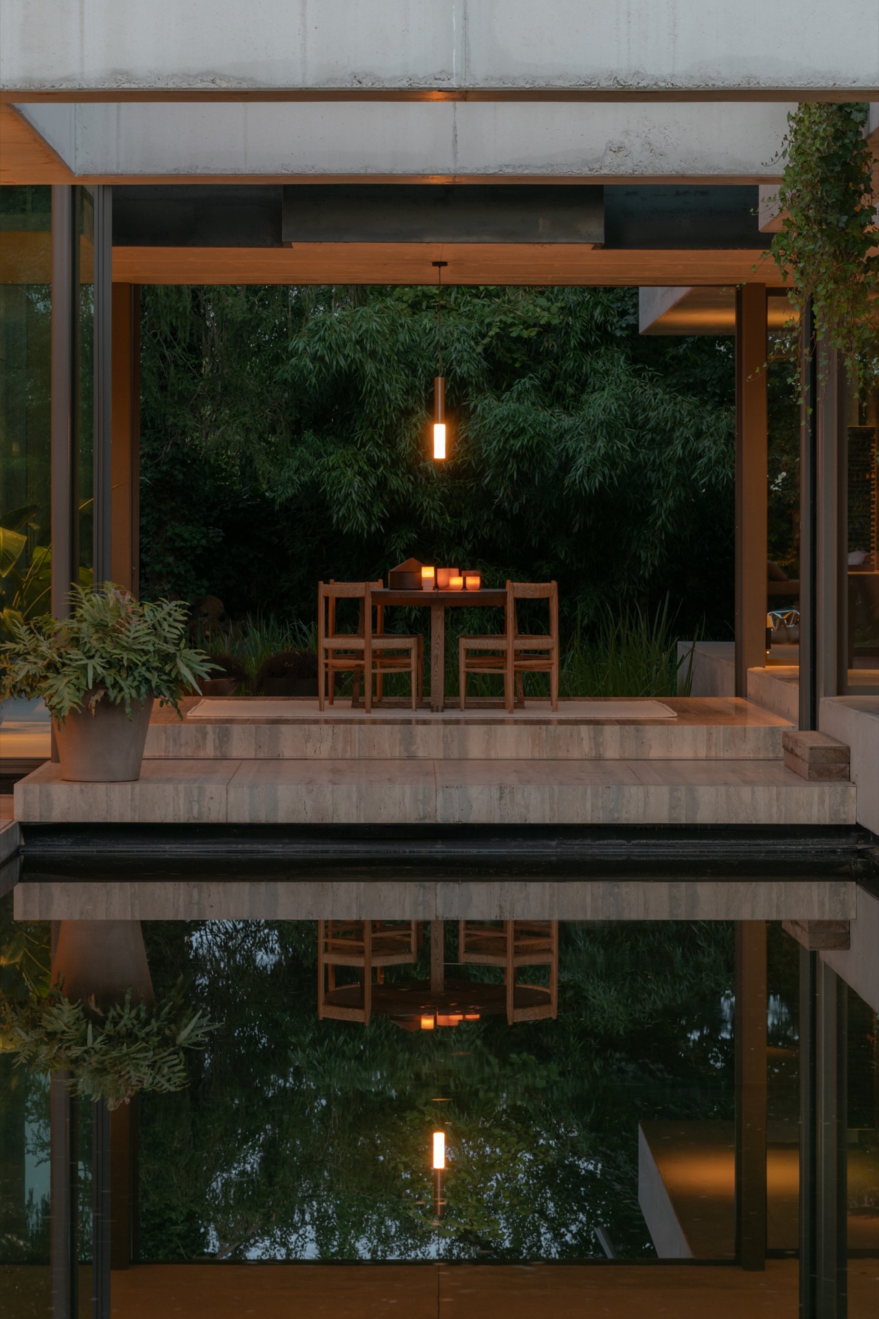
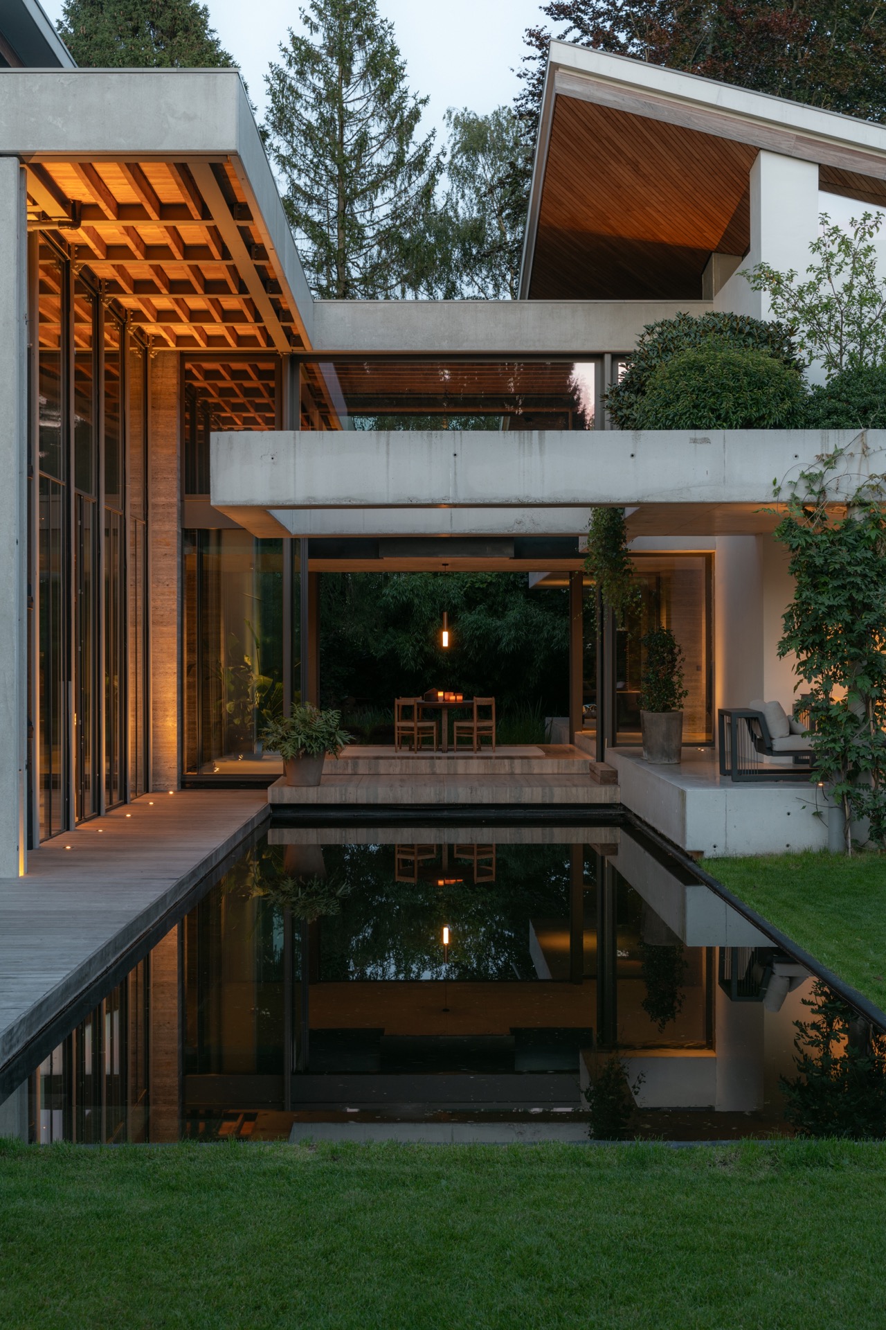
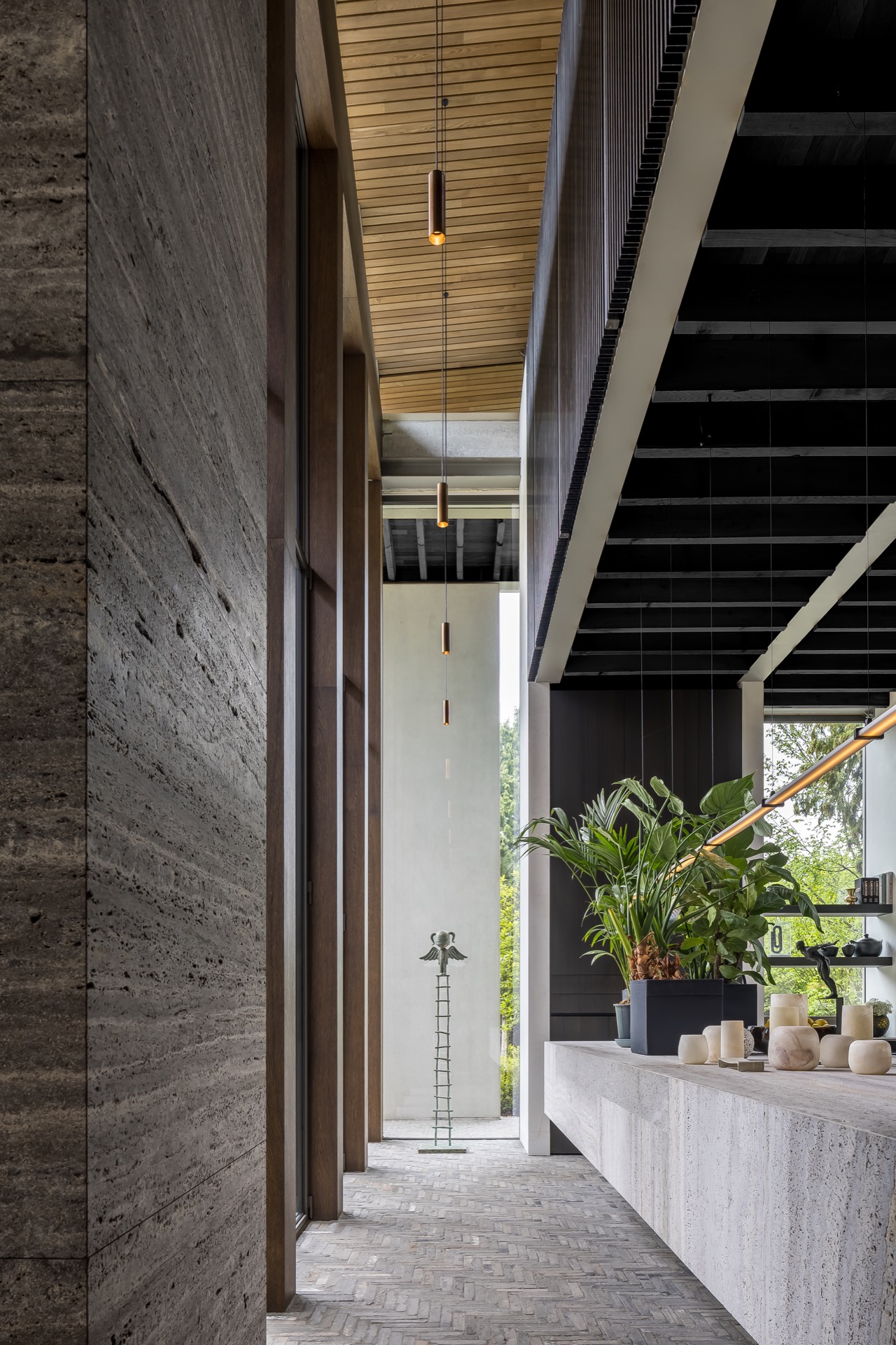
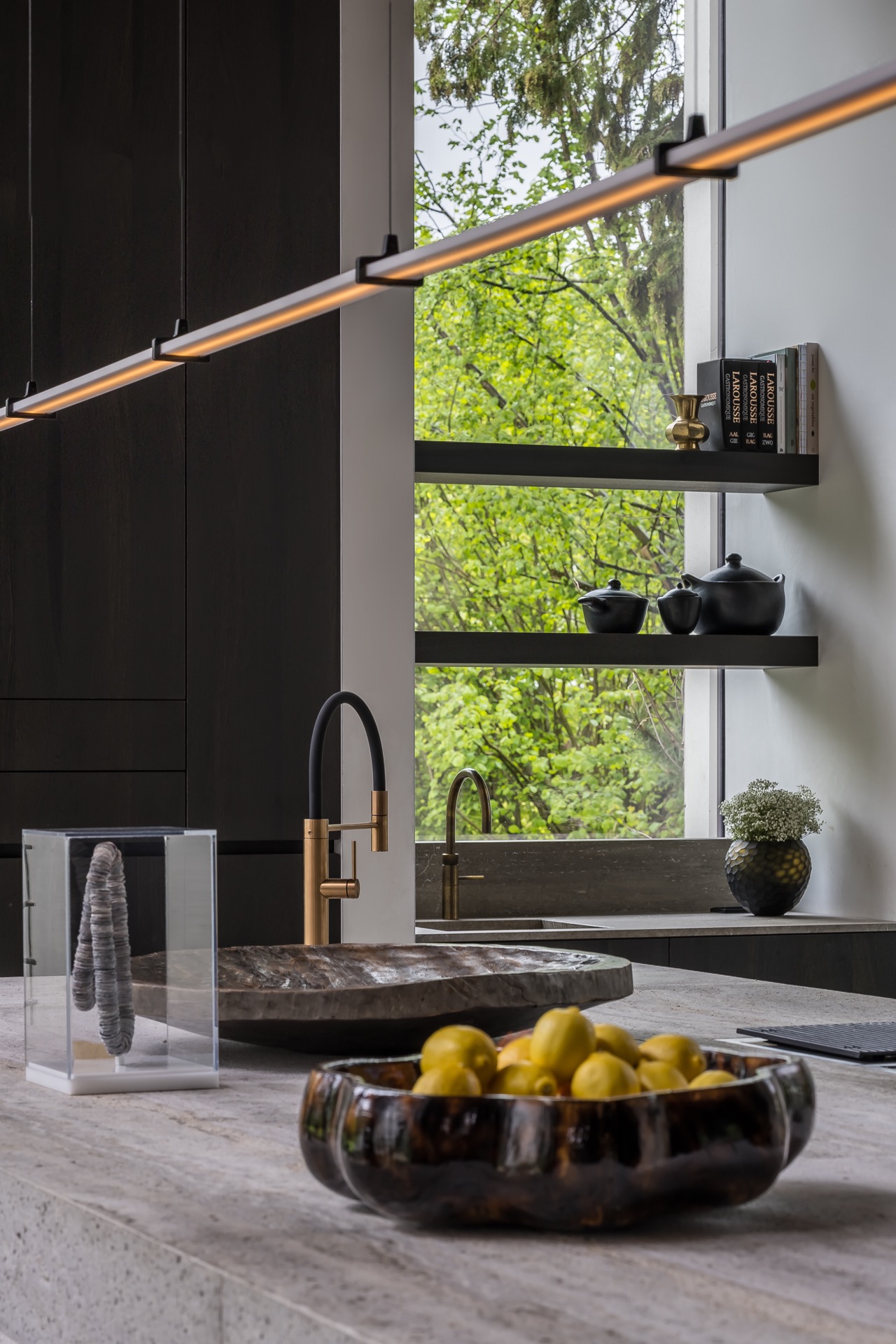
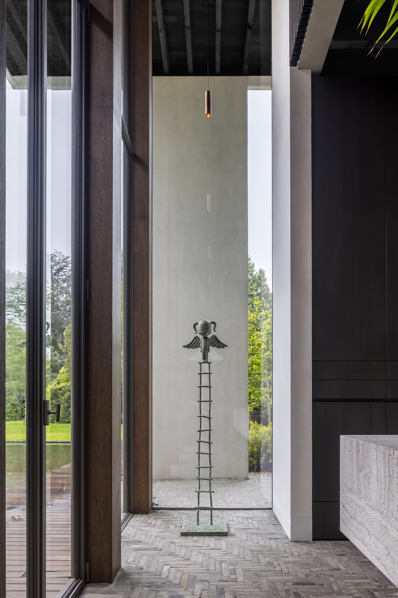
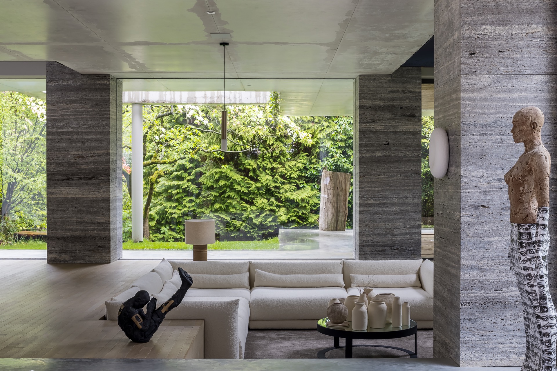
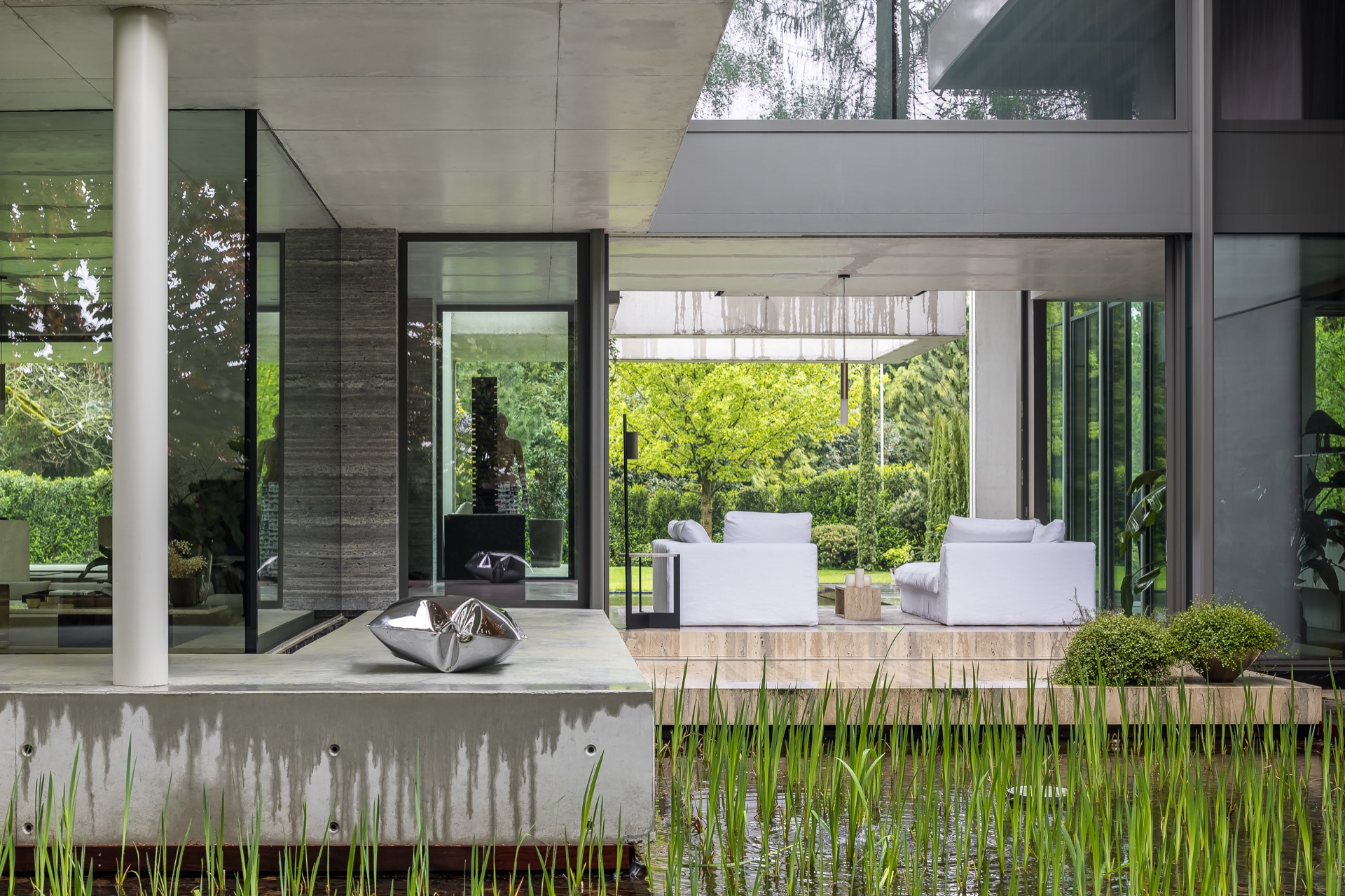
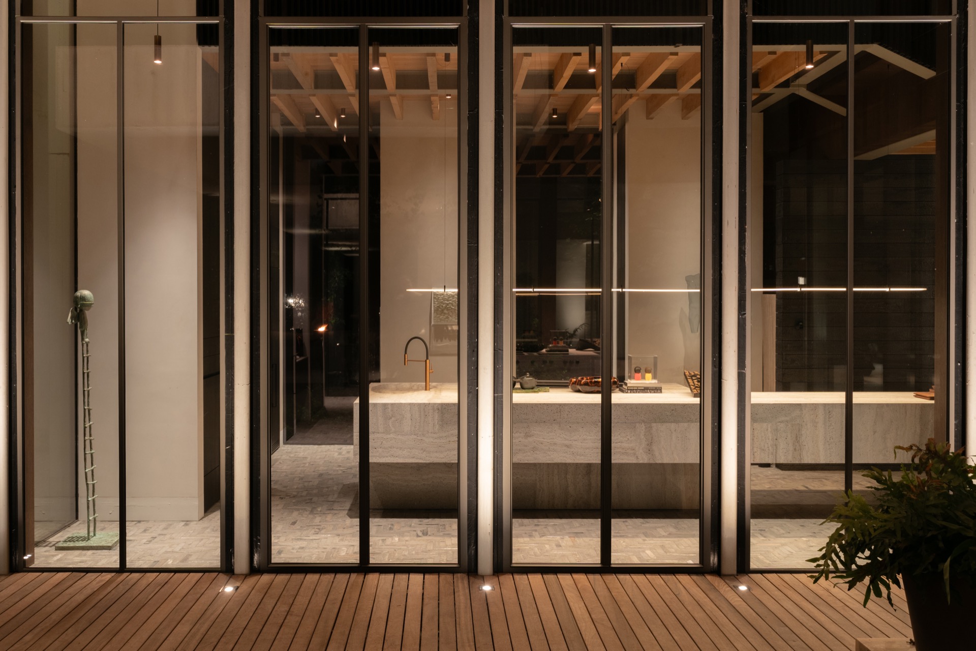
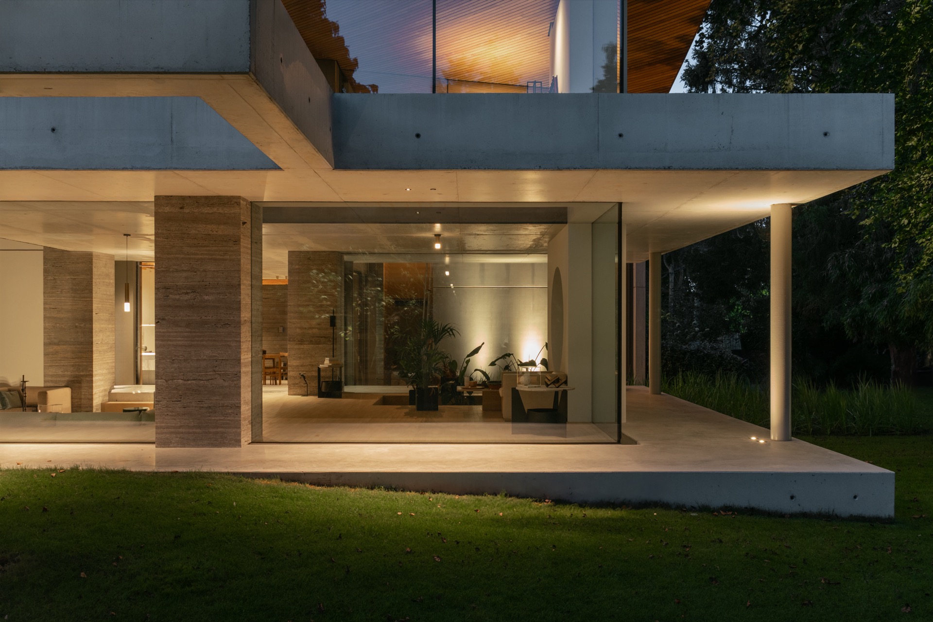
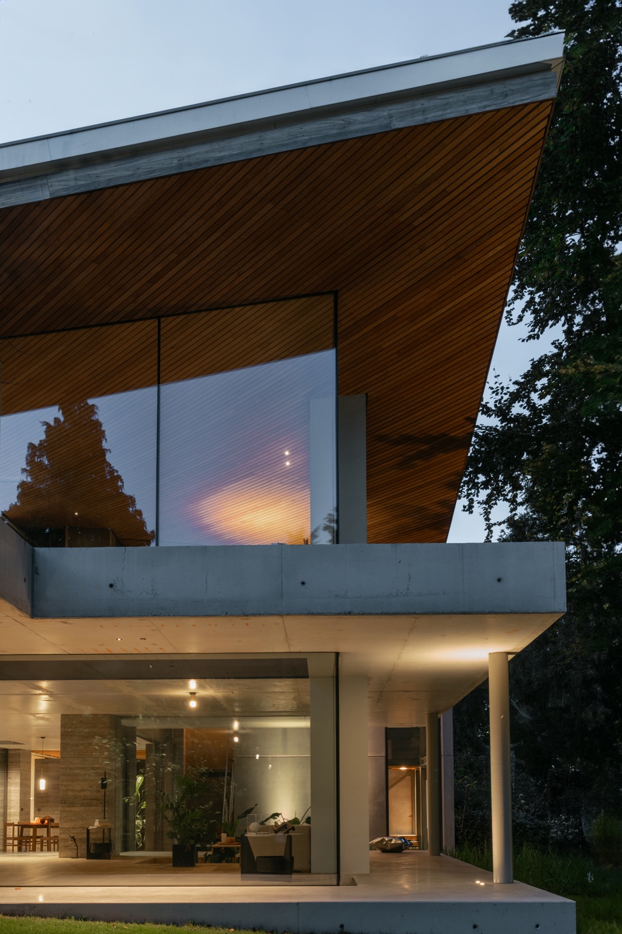
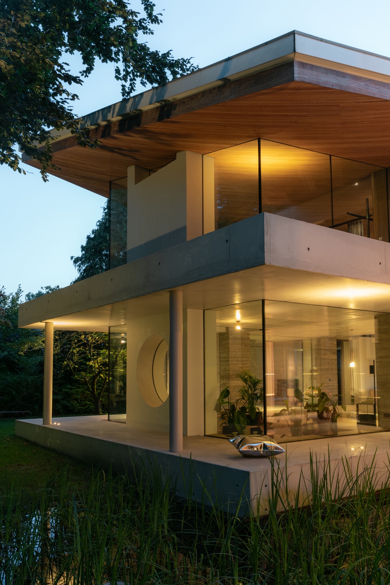
Two pavilions are joined by a glass bridge, so the plan is not simply open; it is staged in parts. That split gives the interior its rhythm. In some zones the ceiling rises to around nine metres, pulling the eye upward before it moves back to the horizontal line of the glazing. The large glass facade frames trees, terrace edges and the still surface of the water outside, which works like a mirror for the architecture. This modern villa interior depends on that back-and-forth between enclosure and view.
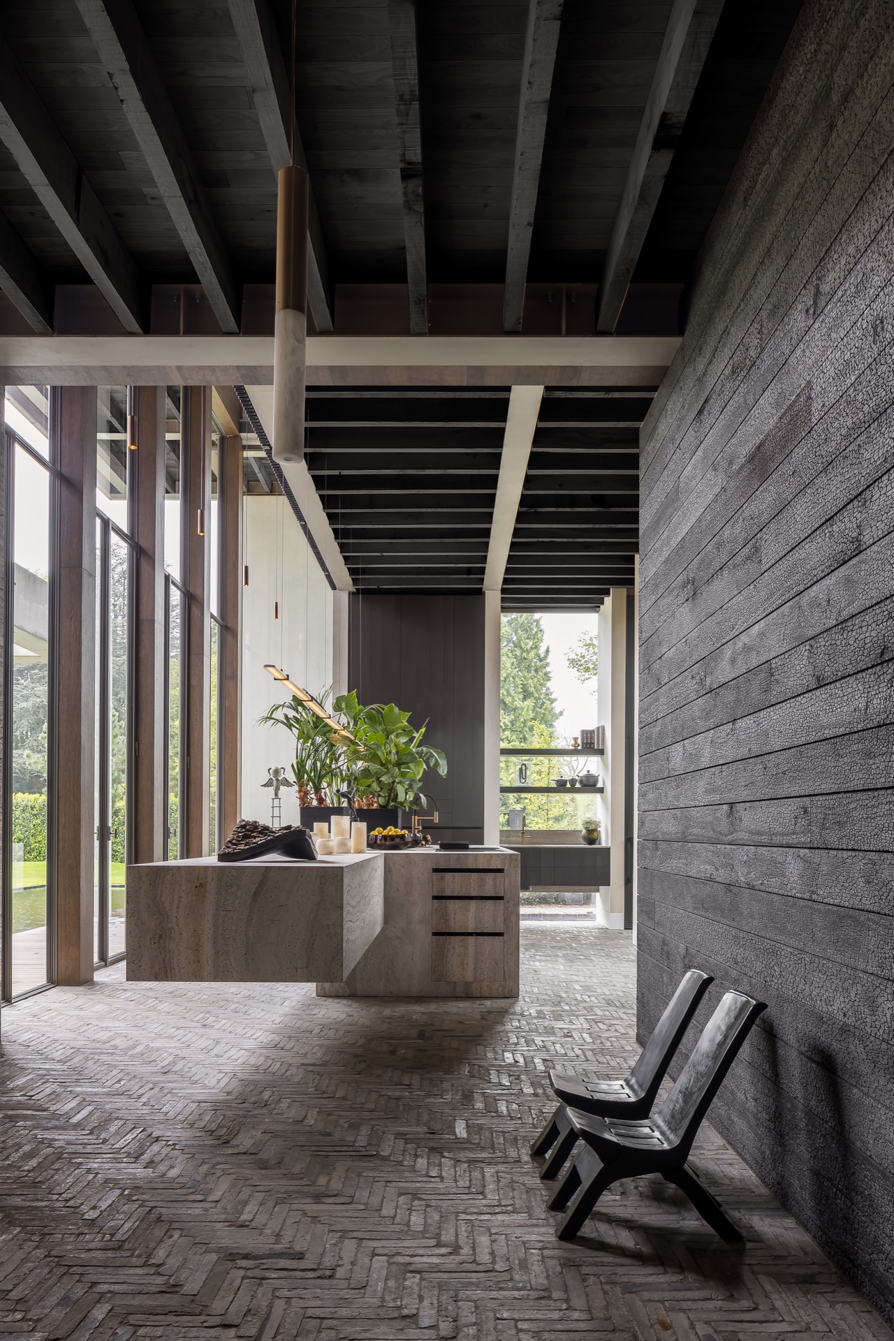
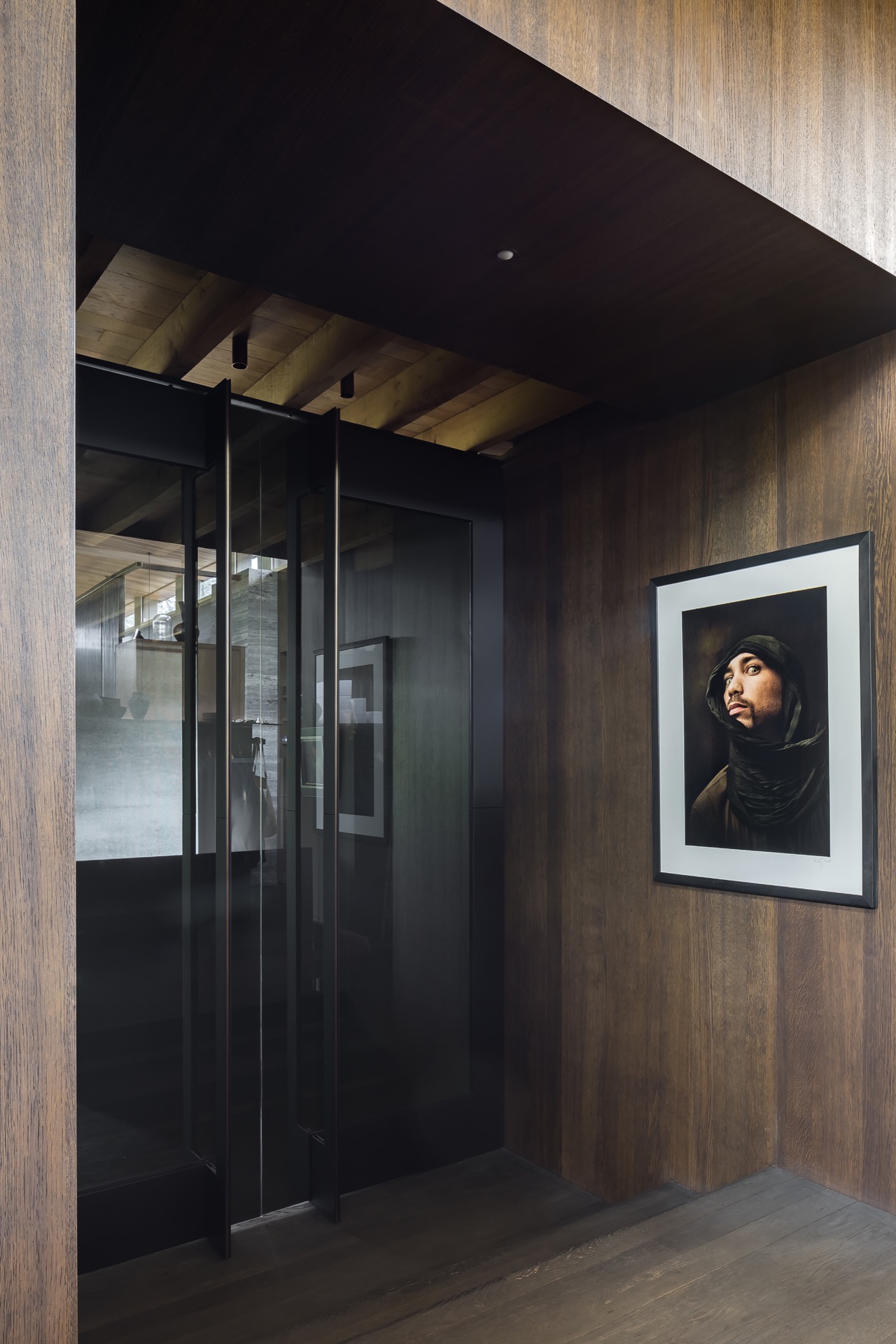
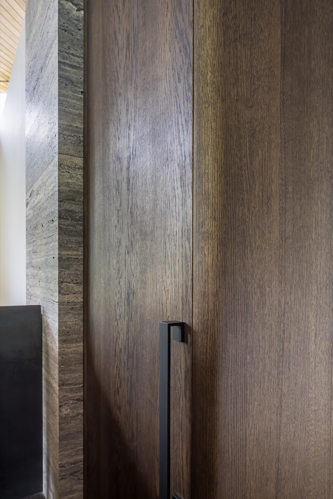
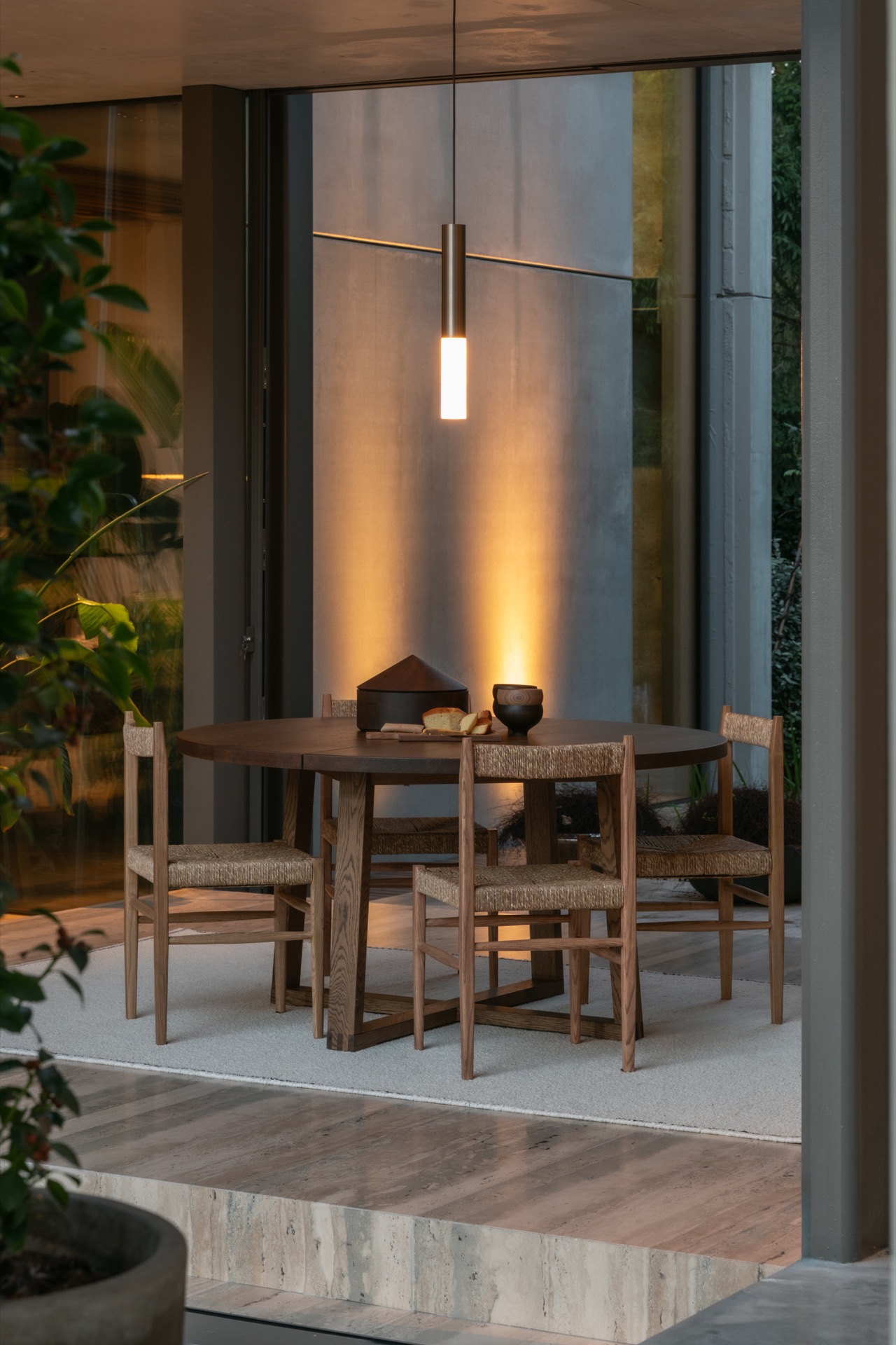
Natural materials soften the scale of the spaces. Stone, raw concrete and burned Sugi Ban wood appear against broad glazed openings, while the dark wall panels hold the composition together visually. The house never feels overloaded. Instead, each surface has a clear job: stone gives weight, timber draws the light inward, and the darker planes keep the long rooms from becoming visually flat. The result is direct and measured, with materials doing most of the speaking.
Lines of light, shadow and reflection
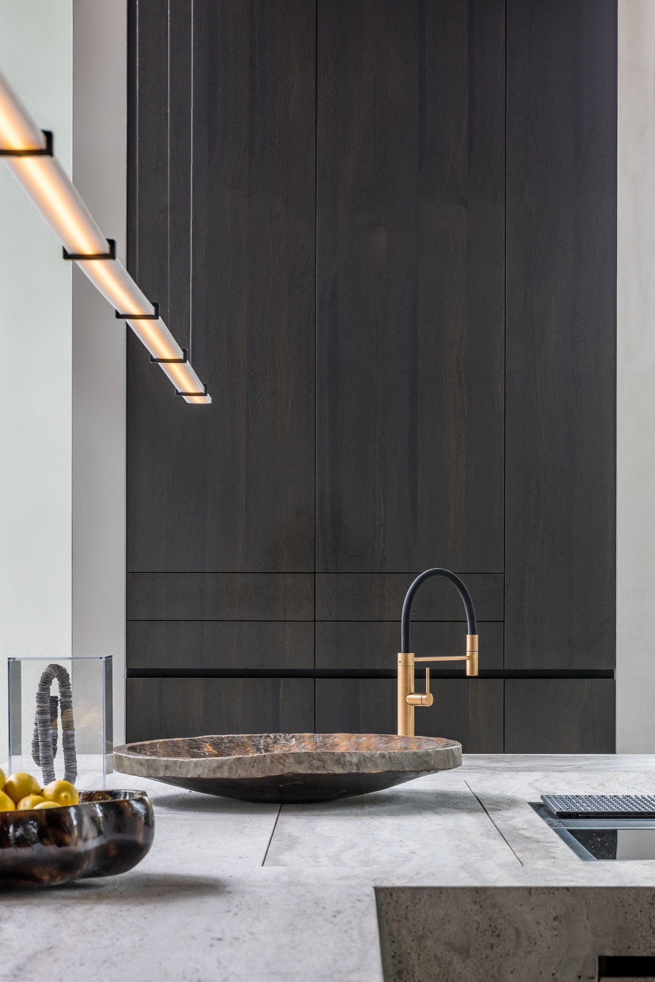
Daylight moves across the interior in strips and bands. Vertical openings catch one angle of sun; lower glazing brings in another. At several points, linear lighting follows the walls and ceiling edges, reinforcing the long perspective of the plan. Built-in niches and recesses break the darker surfaces, creating pauses without interrupting the flow. Because the rooms remain open, the shifts in brightness register immediately. A reflective surface, a matte panel, a patch of stone: each changes the way the next surface is read.
The kitchen as a fixed anchor
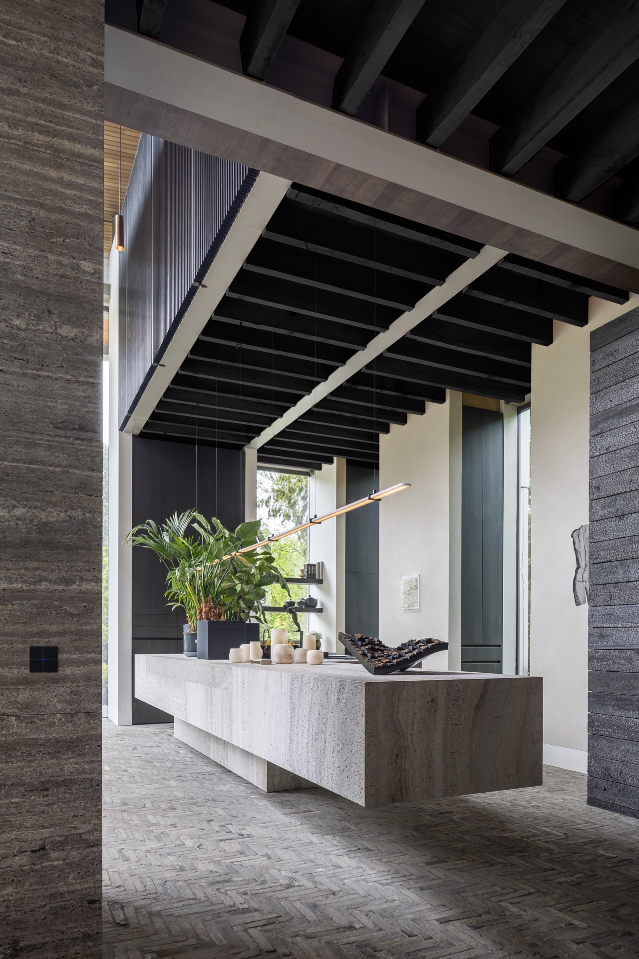
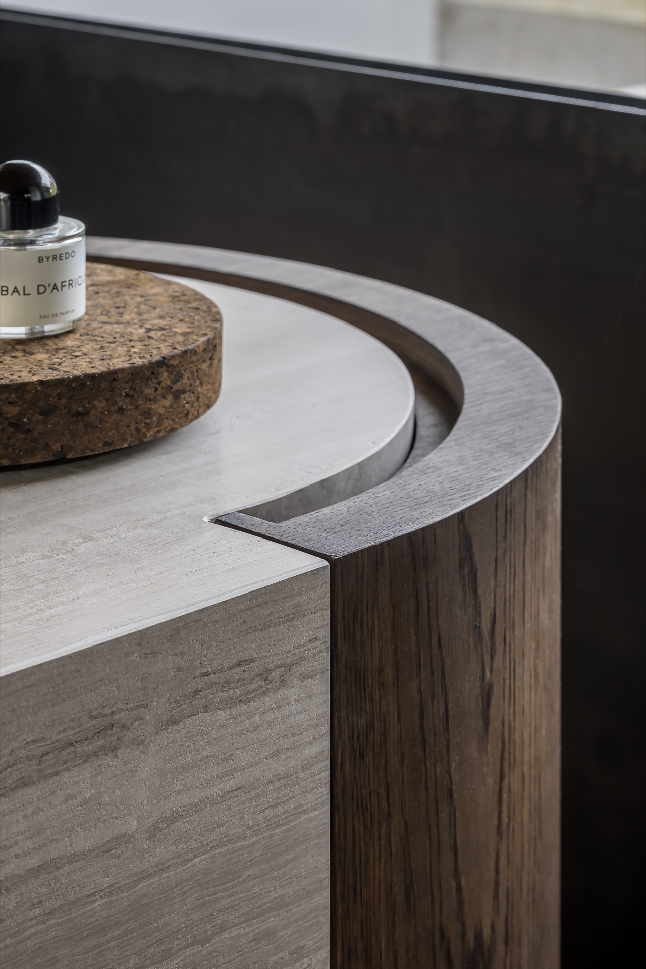
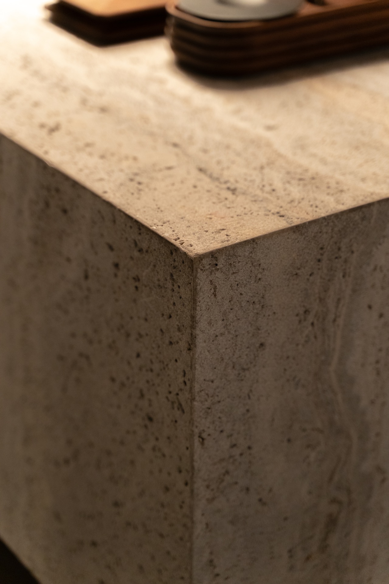
The kitchen carries one of the strongest gestures in the house. A stone kitchen island sits heavy in the room, yet part of it appears to hover because it is locked into the floor. That contrast between mass and lift gives the kitchen its tension. It is not presented as a separate zone but as part of the architecture itself. Dark fronts and the stone top keep the composition restrained, while the surrounding glazing makes the block feel even more defined. In this modern villa interior, the kitchen becomes a marker in the open plan.
Seen from the corridor-like approach, the island acts almost like a threshold. It sits under the long ceiling lines and aligns with the house’s rectangular order. Nearby, the dark wall panels extend the same graphic logic, so the kitchen does not read as a standalone object. It belongs to the sequence of spaces, where every material repeats a cue already introduced elsewhere: stone in the floor and worktop, timber on selected surfaces, glass opening the room to the garden. The whole plan stays legible because those elements are repeated with discipline.
Japan as a quiet reference point
The design takes its direction from travel impressions and from the Japanese idea of wabi-sabi, though the house does not quote that philosophy literally. You see it in the preference for texture over decoration and for surfaces that register light instead of trying to flatten it. The dark timber, rough concrete and stone do not compete. They age visually at different speeds, and that gives the rooms depth. The atmosphere comes from restraint, not from emptiness. Every opening, joint and edge is placed to sharpen the contrast between solid and transparent.
That approach also suits the house’s spatial structure. Because the plan is open, there is no need for repeated ornament or excess furniture to define the rooms. A change in ceiling height, a framed view or a recess in the wall is enough. The architecture relies on proportion and surface rather than gesture. In several images, the open plan reads almost like a sequence of framed stills, each one connected by the same palette of stone, dark wall panels and glass. The modern villa interior remains calm, but never static.
A round opening beside the seating pit
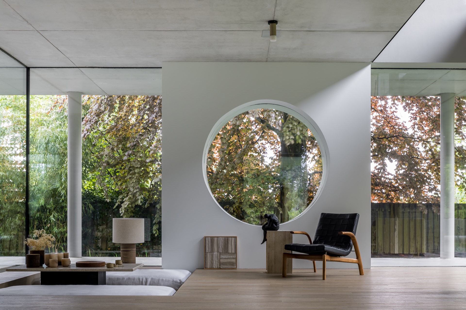
One of the most striking details is the round window near the seating pit. Its shape interrupts the straight lines of the plan and gives the wall a softer focal point. In contrast to the rectangular glazing around it, the circle feels deliberate and precise. It also pulls attention toward the outside, where the water and planting extend the composition. This is where the reflecting pond garden becomes more than a backdrop. It echoes the house’s geometry and gives the interior another plane of light to read against.
The seating area itself stays close to the ground, which strengthens the sense of height elsewhere in the house. Around it, the large glass openings and dark wall panels keep the view controlled. Nothing is left to chance. The eye moves from the stone floor to the opening, then outward to the landscape and back again. That constant return is what makes the project memorable: not one isolated feature, but the way the house keeps tying material, light and view into the same architectural line.
A reflecting pond that doubles the architecture
Outside, the reflecting pond garden turns the villa into an image of itself. The water catches the silhouette of the building, the planting and the sky, so the house appears twice: once as construction, once as reflection. Seen from inside, that effect matters. It extends the room without adding clutter, and it gives the glazing a destination. The house is not placed against the landscape as a finished object; it is set into a field of changing light and surface. That is why the modern villa interior feels so tied to the exterior around it.
What stays with you is the clarity of the composition. The glass bridge, the high ceilings, the stone kitchen island and the dark wall panels all work within the same language. Even the more intimate details, such as the niches, the linear lighting and the round opening, support that larger order. The project never leans on decoration to make its point. It uses material, proportion and reflection instead, and that is where its quiet strength lies.
Want to see more of Bob Manders? View the page of Bob Manders for even more great projects and company information.



NEW 2026 Jubileum Edition The Best Interior Designers Benelux
Order Now €125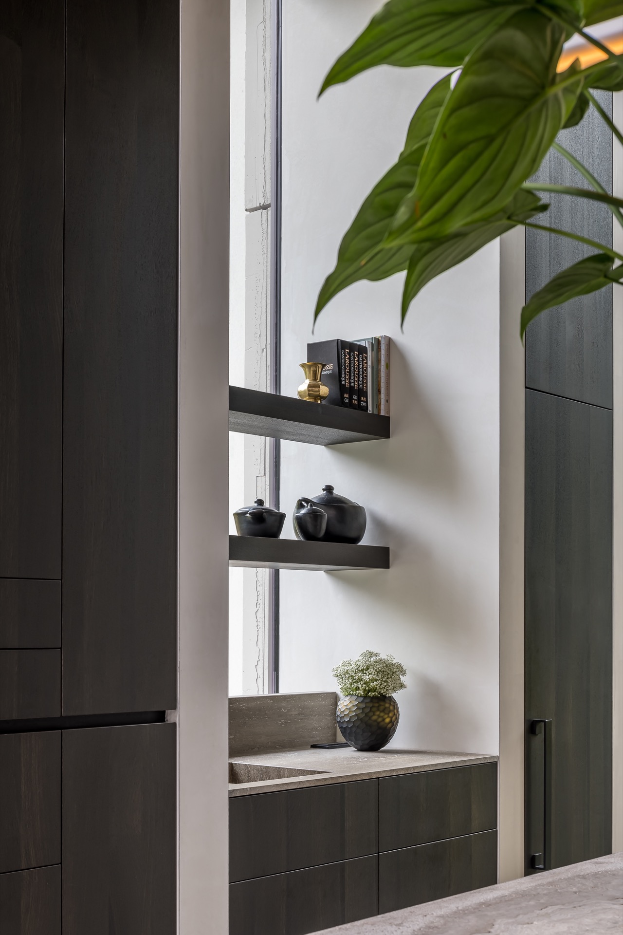
NEW 2026 Jubileum Edition The Best Interior Designers Benelux
Order Now €125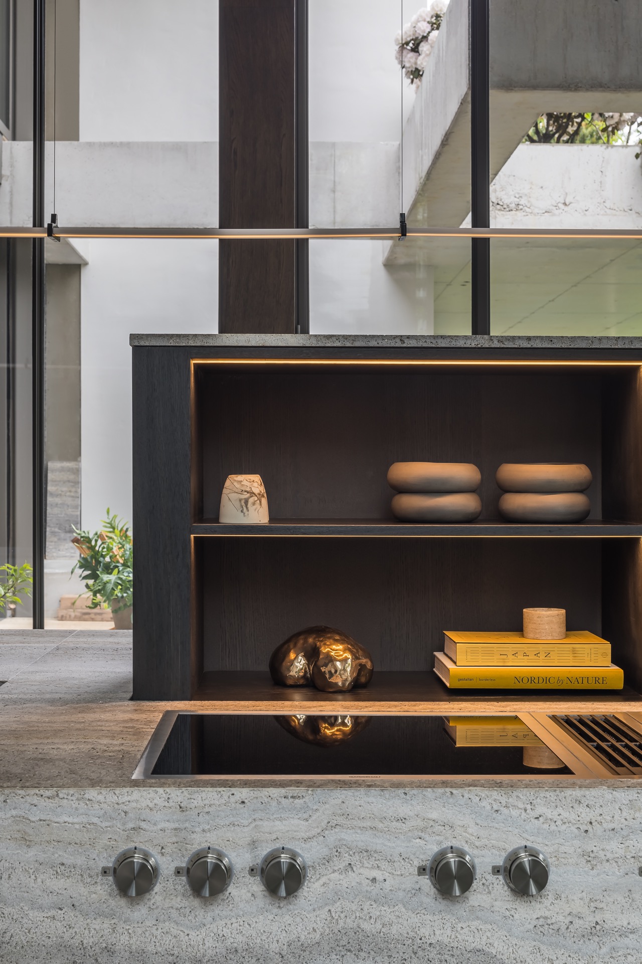
NEW 2026 Jubileum Edition The Best Interior Designers Benelux
Order Now €125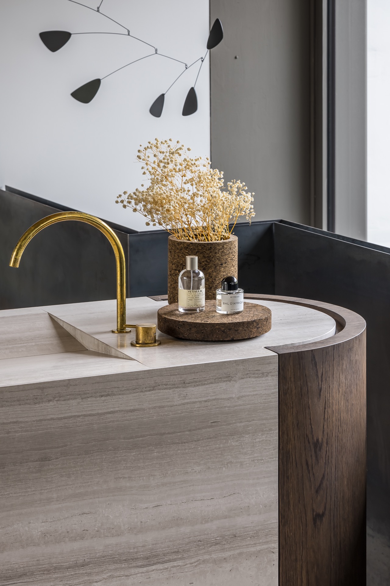
NEW 2026 Jubileum Edition The Best Interior Designers Benelux
Order Now €125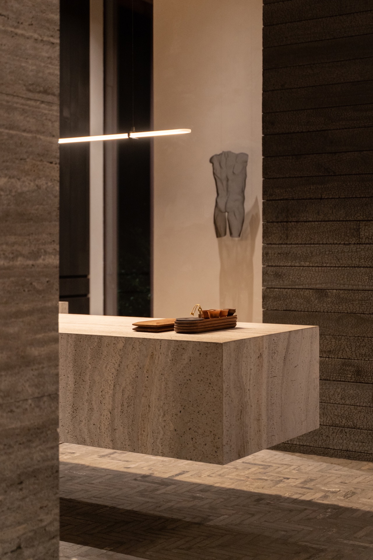
NEW 2026 Jubileum Edition The Best Interior Designers Benelux
Order Now €125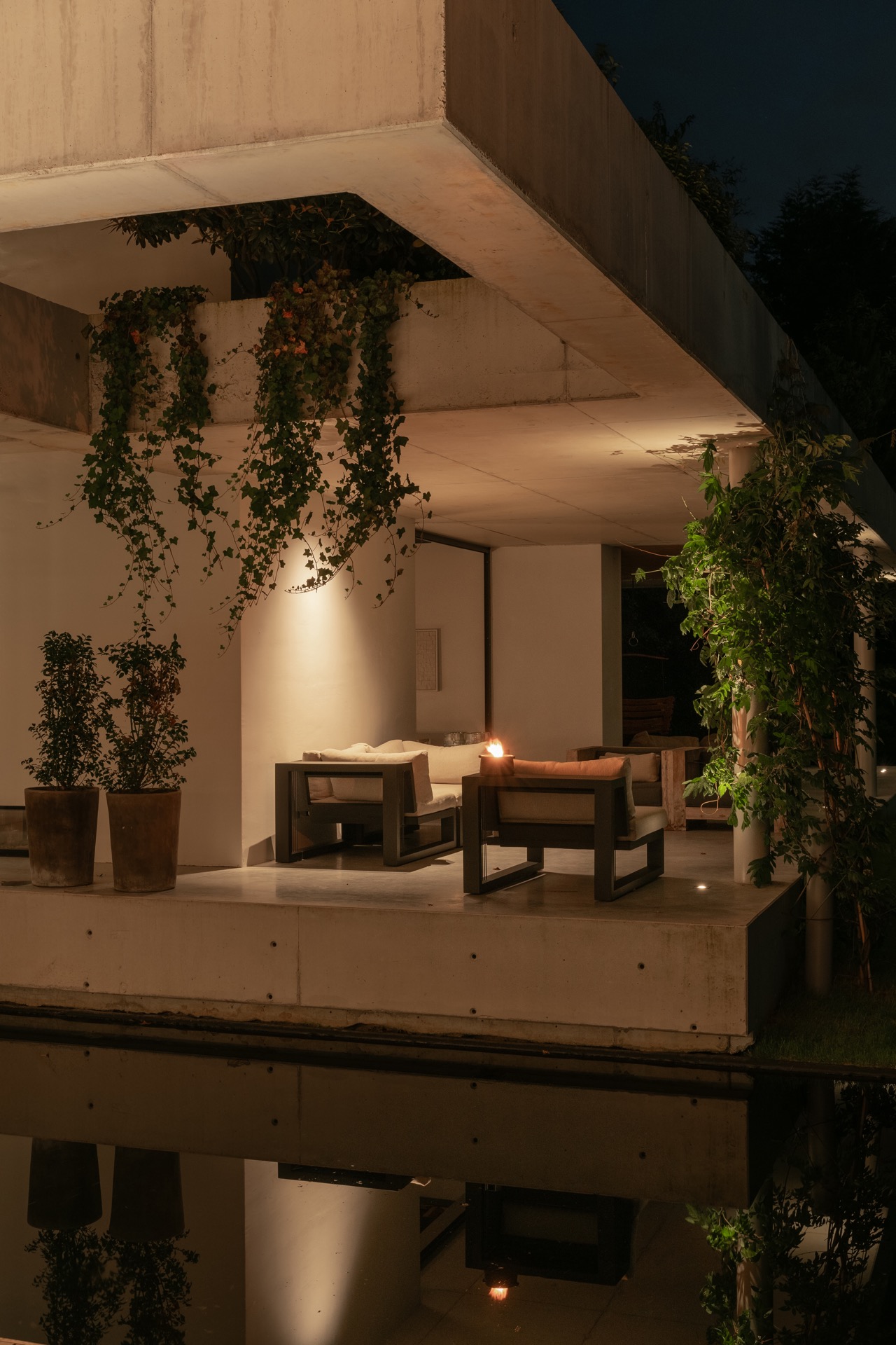
NEW 2026 Jubileum Edition The Best Interior Designers Benelux
Order Now €125