









Modern villa interior with warm wood accents and custom details
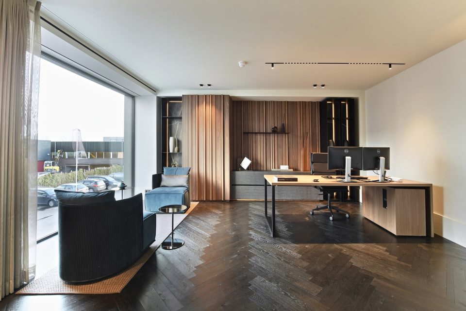
Warm wood panels run through the rooms before the eye lands on the larger surfaces: white walls, glazed doors with black profiles, and long spans of daylight. The modern villa interior uses those contrasts well. Built-in storage appears as part of the architecture, not as an afterthought, with open niches, closed fronts, and small pockets of light tucked into the joinery. In the background, large glass openings keep the plan visually open and pull the interior toward the garden.
Warm wood custom cabinetry and built-in niches
The custom wall cabinetry is one of the strongest visual threads in the house. It appears in the living spaces, the bedroom, and the storage wall, where wood fronts are cut into open compartments and recessed details. Some niches are lit from within, so the shelves read as shallow frames rather than heavy blocks. That lighter treatment lets the cabinetry sit quietly against the white plastered walls and makes the joinery feel integrated into the room structure.
In the living area, the storage wall stretches across the room with alternating open and closed sections. A round crystal-like ceiling light hangs nearby, catching the daylight that enters through the large windows. Elsewhere, a glass panel with black framing shifts the view from one part of the interior to another. The result is a plan that stays open without becoming empty, with each built-in element defining a clear edge or pause.
Light moves across the open-plan rooms
Large glass openings shape the atmosphere of the interior more than any single finish. They bring in a strong wash of daylight that softens the darker profiles in the doors and showers, while also picking up the grain in the timber. Curtains sit beside the windows in broad vertical folds, which gives the rooms a clear sense of height. In the hallway, white walls and pale floor tiles keep the route simple, so the wooden doors and darker handles stand out immediately.
The kitchen continues that open rhythm. A marble-look island countertop sits above a dark base, and the island’s long horizontal line anchors the room. Bar stools are tucked to one side, making the island read as both work surface and gathering point. A glass pendant hangs above it, echoing the round light seen elsewhere in the house. Through the open sightline, the kitchen connects directly to the living area and the glazed partitions beyond.
A kitchen island with a stone-like surface
The marble-look island countertop gives the kitchen a more measured surface than the timber around it. Its pale pattern catches the light but never dominates the room. Against that, the darker cabinetry below keeps the island visually grounded. The combination works especially well with the surrounding white walls and the broad openings beyond the kitchen, which prevent the island from feeling isolated. It reads as a central object, but one that belongs to the wider interior rather than standing apart from it.
Nearby, a storage or wine wall introduces a different texture. Wooden racks, glass fronts, and a stone-like backing create a layered composition that is more about depth than display. The compartments are narrow and orderly, which suits the restrained palette used elsewhere in the house. That same preference for measured surfaces appears in the entrance and corridor, where the doors, floor tiles, and skirting lines stay visually calm and let the joinery lead the room.
Bathrooms with light gray tiles and black profiles
The bathroom images shift the material palette toward light gray bathroom tiles, glass, and dark framing. In the shower zone, the transparent screen is outlined with black profiles, giving the enclosure a crisp edge. A wood vanity with a stone-look top sits below, and the wall tiles carry a subtle variation that makes the surface feel less flat. The layout is compact, but the clear lines keep the room readable from one end to the other.
A walk-in shower set into a quiet surface palette
The walk-in shower is not treated as a separate spectacle. It sits within the same restrained field of light gray tiles and black metal lines, so the enclosure reads as part of the room rather than a dramatic insert. The glass panel keeps the view open across the bathroom, while the darker hardware gives the water zone a firm outline. A second bathroom view shows a double basin beneath a large mirror, with the same palette repeated around the shower partition and tiled walls.
A guest toilet adds another layer of the same language in smaller form. A wall-mounted basin sits beneath a broad mirror, with wood-fronted storage below and a pale floor underfoot. The room is tight, but the mirror expands it visually. In the larger bathroom, a freestanding bathtub stands under roof windows, placed where the light falls from above. The tub sits beside a glass shower screen and a wooden vanity, so the room combines sharp edges with a softer central volume.
Roof light and a freestanding bathtub
The freestanding bathtub under the roof windows becomes a clear focal point because the ceiling treatment is so visible. The sloping plane above it brings daylight down onto the tub rim and the tiled walls around it. That overhead light changes the room more than ornament would. The bathtub is paired with a long vanity run and a glass partition, keeping the floor open and the sightline unbroken. It is a straightforward arrangement, but the geometry feels deliberate at every turn.
Another bathroom view shows how the same material language works around the double washbasin. Large light gray tiles wrap the walls, and the mirror spans most of the width above the vanity. Black fittings appear as thin accents rather than dominant features. The room depends on proportion, not decoration. Surfaces are kept flat and legible, which lets the reflections and tile joints do the visual work.
Brickwork, black frames, and the garden edge
Outside, the modern villa interior opens toward a brick facade with black frames and generous glazing. The exterior keeps the same clarity seen inside: masonry, glass, and dark window lines. On the roof, solar panels are visible against the pitched surface. In the garden, a lawn sits beside gravel paths and planting along the edges, so the route around the house stays loose and informal. The outdoor areas do not compete with the building; they frame it with open ground and a few controlled lines.
The transition from the interior to the garden is easy to read because of the large glass openings. They make the living spaces feel extended rather than enclosed, and they also link the darker exterior frames to the black profiles used indoors. That repetition gives the house a visual thread from facade to hallway to shower screen. It is one of the reasons the modern villa interior feels coherent without relying on heavy decoration or overstatement.
Across the rooms, the same materials return in different roles: wood as storage, glass as divider, tile as a neutral surface, and stone-look finishes as an anchor for worktops and basins. The modern villa interior is strongest where those parts are allowed to stay clear and legible. A cabinet niche, a mirror, a roof window, or a glazed door can carry the whole room when the surrounding surfaces are quiet. That restraint gives the house its rhythm and keeps each space connected to the next.
Want to see more of Villabouw Van der Windt? View the page of Villabouw Van der Windt for even more great projects and company information.




NEW 2026 Jubileum Edition The Best Interior Designers Benelux
Order Now €125


NEW 2026 Jubileum Edition The Best Interior Designers Benelux
Order Now €125


NEW 2026 Jubileum Edition The Best Interior Designers Benelux
Order Now €125


NEW 2026 Jubileum Edition The Best Interior Designers Benelux
Order Now €125


