Modern villa with thatched roof and high ceilings
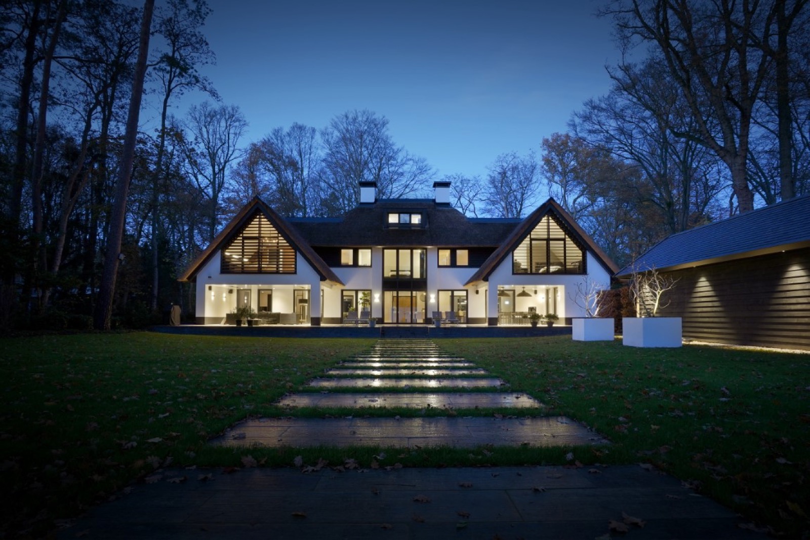
The thatched roof sets the first line of the house, but the frame beneath it is sharp: white rendered walls, dark window frames and long horizontal openings that pull the eye across the volume. In this modern villa with thatched roof, the contrast between soft roofline and crisp detailing gives the exterior its presence. At night, the windows and garden lighting pick out the edges of the building and the path leading to the entrance.
A entrance that opens around the staircase
Inside, the house rises quickly. The entrance is arranged around a generous void, with the staircase placed as a central piece rather than a side route. Light lands on the timber steps and the tall walls around them, making the double-height entrance feel even larger. The ceiling height reaches 2.9 metres, which is noticeably above the standard 2.6 metres mentioned in the source material, and that extra span is felt in the way the room lifts above eye level.
The interior lighting is not treated as an afterthought. It catches the stairwell, the upper edges of the void and the surfaces around the hall, so the entrance reads differently by day and by night. A visitor sees the volume first, then the details: the clean line of the banister, the pale walls, the darker frames beyond the hall. This is where the house begins to connect architecture and interior without forcing the gesture.
Timber, height and a direct line upward
The staircase has a straightforward geometry, with timber treads set against restrained surrounding surfaces. That simplicity lets the void do its work. Rather than filling the entrance with decoration, the design relies on height, light and proportion. The result is a double-height entrance that directs movement immediately and leaves enough open air around the stair to make the vertical space legible from several angles.
The same clarity continues into the open-plan living space. Large openings connect the sitting area to the kitchen, and the sightline runs through the house instead of stopping at a single feature wall. Dark-framed glazing cuts through the light interior shell, while the kitchen island anchors the room with a solid horizontal mass. Suspended lamps above the island and dining table add a second layer of light, separate from the daylight coming in through the glass.
Open-plan living space with a clear view to the kitchen
From the living room, the kitchen remains visible without dominating the whole floor. That balance depends on the width of the openings and the way the furniture has been placed. The open-plan living space feels ordered because the major elements sit on clear axes: seating near the windows, the island at the centre of kitchen activity, and the dining table under grouped pendants. It is a layout that lets movement stay fluid while keeping each area readable.
The lighting strategy is especially apparent here. In the evening images, the pendants hover over the table and island while recessed ceiling spots keep the rest of the room evenly lit. Those layers make the surfaces easier to read: cabinet fronts become darker blocks, tabletops pick up reflections, and the glazing frames the view out to the garden. The interior does not rely on ornament; it uses light to define edges and scale.
A basement used as a full living level
Beneath the main floor, the basement extends the house into another usable layer. Because it covers a substantial part of the footprint, it is described as suitable for wellness, a gym, wine storage and even a bedroom. The low placement of the light wells, or koekoeken, means that the rooms can still receive daylight and function as proper living spaces. That makes the lower level more than a technical zone; it is part of the residential plan.
The source material also notes that the basement can serve as a bedroom. That detail matters, because it shows how carefully the section of the house has been considered. Walls, openings and level changes are not left to chance. Instead, the lower floor is treated as a place where everyday use can continue, whether the room holds exercise equipment, storage or a quieter sleeping area.
Wellness, storage and daylight below ground
In projects like this, the lower floor only works when the openings are placed with precision. Here, the light wells sit low enough to keep the room usable without making the basement feel buried. That gives the level a practical depth: one room can hold gym equipment, another can store bottles, and another can be set up as a guest room or bedroom. The basement is not an add-on; it is built into the way the villa works.
Behind the house, the garden is laid out symmetrically, which mirrors the order found inside. Straight paths, clipped lawn edges and a water feature create a clear central line, while lighting picks out the routes after dark. The symmetry gives the plot a measured rhythm. At one side, the house reads as a strong volume; at the other, the garden stays open enough for the eye to travel across the full width of the site.
Symmetry in the garden, with a separate building on the axis
On the far side of the garden axis sits a freestanding pool house. Its open roof structure gives the interior more height than a closed box would allow, and the large glazed openings keep the space connected to the garden. It acts as a separate building, but it remains visually tied to the main house through the shared axis and the repeated lines in the landscape. In daylight, the glass softens the boundary between inside and outside; at night, the building becomes part of the lighting pattern across the plot.
That relationship between house, pool area and garden is what holds the project together. The modern luxury villa never depends on a single gesture. It is built from the way the entrance rises, the way the kitchen opens to the living room, the way the lower level is fitted into the section and the way the garden continues the symmetry outside. Even the photograph series reinforces that reading: each image returns to light, height or reflection as a way of describing the house.
Materials that keep the forms readable
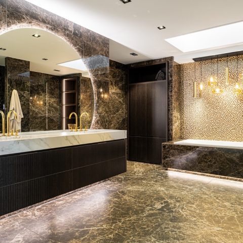
White render, dark frames, timber steps and tiled wet areas give the house a limited palette that is easy to read in both bright daylight and the evening shots. The indoor pool uses glazing, tile and controlled light to set itself apart from the rest of the interior, while the bathroom combines a freestanding tub with darker wall surfaces and a niche-like shelf detail. None of these rooms is overloaded. The materials stay close to their own function, which keeps the larger composition clear.
That discipline also explains why the modern villa with thatched roof reads as one project rather than a collection of separate rooms. High ceilings, the double-height entrance, the open-plan living space and the indoor pool all repeat the same idea of measured openness. Light is allowed to move through the house, but each zone still has its own surface and purpose. The result is a detached villa that feels deliberate in section, plan and garden layout, with every visible element supporting the next.
Photography: Robert Koelewijn
Want to see more of 01 Architecten? View the page of 01 Architecten for even more great projects and company information.




NEW 2026 Jubileum Edition The Best Interior Designers Benelux
Order Now €125


NEW 2026 Jubileum Edition The Best Interior Designers Benelux
Order Now €125