Monochrome renovated apartment with custom joinery
A dark kitchen line, a pale floor, and a run of built-in storage set the tone for this monochrome renovated apartment. The palette stays close to white, charcoal, and wood, but the rooms never feel flat. Surfaces shift from matte fronts to stone-like worktops, from glazed tile to timber, and the changes are enough to shape each zone without breaking the overall calm. The project reads as a full apartment renovation, with custom joinery doing most of the visual work.
A monochrome interior shaped by material changes
The monochrome interior is built from a limited set of finishes, yet each room handles them differently. In the hallway, white walls and doors meet a warm wood floor that runs straight through the space. In the living room, a wood accent softens the darker elements around it. The bedroom keeps the palette light, using curtains, white walls, and a built-in window seat to hold the room together. Nothing relies on ornament. The interest comes from the way edges, openings, and cabinet lines are drawn.
The apartment’s monochrome language is strongest when the light shifts across it. Ceiling spots mark the kitchen and corridor, while daylight lands on the long cabinet fronts and the pale floor. That combination gives the rooms a measured rhythm. Instead of changing style from one space to another, the renovation keeps the same visual grammar and lets each room use it in a different proportion. It is a restrained approach, but not an empty one; every surface has a job to do.
Custom kitchen fronts and stone-like worktops
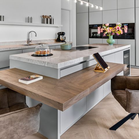
The kitchen is defined by flat fronts in white and dark grey, pulled into long horizontal runs. Long handle strips keep the face of the cabinetry clean, and the stone-like worktop extends the line across the room. The look is precise without being glossy. A dining table sits close by, catching the same muted light as the cabinets, while the upper ceiling spots place the work area in sharper focus. This is the most explicit example of the project’s custom joinery, and it anchors the monochrome renovated apartment from the start.
At countertop level, the materials do more of the talking. The pale, marble-like surface sits against the darker tall cabinets, and the contrast makes the kitchen read as one continuous piece rather than separate units. A brass-toned tap introduces a small change in temperature, but the overall impression stays controlled. The kitchen does not try to dominate the apartment; it sits inside the plan as a measured block, built to line up with the rooms around it. That restraint is what keeps the monochrome interior legible.
Built-in cabinets in the hallway
The hallway extends that same approach into storage. Tall built-in cabinets run along one side, their doors rising in a quiet sequence beside the white wall and timber floor. The doors are high and plain, which makes the corridor feel longer rather than busier. In a narrow passage, that matters. The joinery absorbs what would otherwise become visual clutter, leaving the route open and readable. Even the light from the adjacent rooms feels more intentional when it passes over these continuous cabinet fronts.
There is no sudden break between the corridor and the rest of the apartment. A doorway at the far end keeps the view moving toward the living area, while the cabinet wall holds the side of the passage in place. The result is practical, but also graphic. Straight lines repeat from door to door, and the hallway becomes part of the project’s composition rather than just circulation. It is one of the clearest signs that this renovation was planned around storage as much as around display.
A fireplace wall with niches as a focal surface
The fireplace wall brings a different texture into the monochrome renovated apartment. A glazed inset sits within a pale surround, and built-in open shelves are tucked to one side. The composition is compact, but it has enough depth to read as architecture rather than furniture. Here, the wall is not only a boundary; it also stores objects, frames the fireplace, and gives the living room a fixed point. The surrounding materials stay restrained so that the niche details remain visible.
Nearby, the living room keeps the same palette but introduces a warmer note through wood. That single change prevents the room from becoming purely graphic. The fireplace wall with niches stays central, while the rest of the room gives it breathing space: pale planes, dark accents, and a clear floor line. The arrangement shows how custom joinery can organise a room without overfilling it. Nothing feels added for effect. Each built element is tied to the wall it occupies.
Light, curtains and the bedroom window seat
The bedroom turns to daylight rather than contrast. Large windows sit behind curtains, and an integrated seat or window ledge is built below them. That low element gives the room a fixed edge and creates a place to sit without introducing another freestanding piece. The room stays quiet, but it is not bare. The window seat, the curtain fall, and the spotless wall surfaces work together to shape the depth of the room and to keep the light low and even.
Viewed from this angle, the bedroom window seat becomes more than a detail. It links the opening to the floor plan, turning the window zone into a usable strip rather than dead wall space. The built-in form also echoes the cabinetry seen elsewhere in the apartment, so the renovation does not fragment from room to room. Instead, the same habit of making edges useful carries through the plan. That consistency is one of the strongest signs of the project’s design language.
Bathroom surfaces kept broad and legible
The bathroom continues the apartment’s preference for clean planes and controlled contrast. Large tiles cover the walls, giving the shower area and adjacent surfaces a broad, unbroken reading. A walk-in shower sits within this tiled field, and a freestanding bathtub appears beside it in the same calm palette. A vanity with warmer wood tones breaks the grey and white pattern just enough to keep the room from feeling sealed off. The bathroom project uses the same ingredients as the rest of the apartment, only in a more compact arrangement.
The mirror above the basin extends the sense of height, while the glazed tile surfaces catch the light differently from the painted rooms outside. That difference matters. It marks the bathroom as a separate zone without changing the overall language of the renovation. Seen together, the shower, bath, and vanity form a clear sequence of uses, with the large-format wall finish holding them in place. The room is simple to read because the materials stay consistent and the details stay visible.
What holds this monochrome renovated apartment together is not a single statement piece, but the repetition of precise moves: long cabinet runs, built-in storage, a fireplace wall with niches, a kitchen finished in white and dark grey, and a bedroom window seat set into the room rather than placed in front of it. The apartment renovation uses custom joinery as a structural thread, and each room confirms it in a different way. The result is a project where the plan, the surfaces, and the storage all work from the same set of rules.
Want to see more of Martijn Veldman? View the page of Martijn Veldman for even more great projects and company information.




NEW 2026 Jubileum Edition The Best Interior Designers Benelux
Order Now €125


NEW 2026 Jubileum Edition The Best Interior Designers Benelux
Order Now €125


NEW 2026 Jubileum Edition The Best Interior Designers Benelux
Order Now €125