










Office to home renovation with light, open sightlines
The shift from work space to home is visible the moment the white walls and black window frames come into view. Light moves deep into the rooms, and the layout answers with open sightlines rather than heavy partitions. Wood floors soften the run of the interior, while glass openings keep one zone connected to the next. In this office to home renovation, the main move is not dramatic; it is legible. Spaces are arranged so that daylight can do part of the work, drawing out the contrast between white surfaces, brick, and darker frames.
Light as the first layer of the home
The light open living interior begins with restraint. White walls reflect daylight and give the floor, frames, and furniture more room to register. In the living area, a pale sofa sits back from the wall, and a rug separates the seating corner from the rest of the open plan. The room reads clearly without feeling bare. Small shifts in tone do a lot here: a brown bench near the window, a curtain corner, and a wall piece beside the glass all help the room move from one view to the next without breaking the long line of the house.
That clarity carries through the shared spaces. The route from hall to living area, and from living area to kitchen, stays open because the boundaries are made with material changes and frame lines rather than full walls. Black window frames hold the views in place. Wood in the floor adds a quieter layer underfoot. It is this disciplined use of sightlines in the interior that gives the conversion its pace: each room stays readable on its own, while still belonging to the same sequence.
A brick accent kitchen around the island
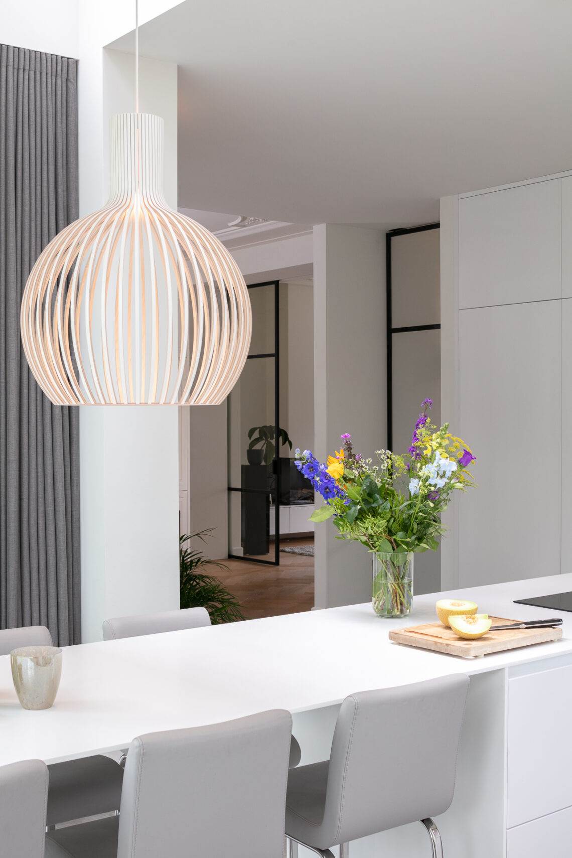
The kitchen shifts the tone with a red brick accent wall. Against that rougher surface, the white cabinetry and the kitchen island with its integrated sink feel sharper and more precise. The island sits in the open plan as both work surface and anchor. Above it, glass pendant lights mark the zone without weighing it down. A wooden worktop adds another texture, tying the kitchen back to the light floor that runs through the rest of the home. The result is not about contrast for its own sake; it is about giving each material a clear role.
Because the kitchen opens to a large window, the daylight reaches the worktop from the side. That makes the brick read more deeply and the white fronts appear cleaner. The brick accent kitchen becomes the most grounded part of the plan, exactly where cooking, looking, and moving overlap. It also shows how the office to home renovation uses a limited set of materials in a controlled way. Brick, glass, wood, and white surfaces are enough when they are set against light and each other with care.
Open dining in the same line of sight
The dining table sits close to the kitchen and stays part of the same visual field. Several pendant lamps hang above the tabletop, giving the long table its own place without closing it off. Chairs and table remain visually simple, so the eye keeps returning to the window openings and the wall planes. Through the glass, greenery is visible outside, which pulls daylight further into the room and stops the open interior from feeling flat. The dining zone is not treated as a separate stage; it is one more pause in the sequence.
A staircase with wooden steps as a connector
The staircase with wooden steps is one of the clearest pieces in the house. A dark metal balustrade with diagonal bars draws a firm line against the white wall, while the wood treads soften that line as it rises. Round pendant lights follow the stair axis and bring the eye upward. The result is a vertical moment that gives the open interior more height and rhythm. It is a practical connector, but also a point where material contrast becomes structural: black, wood, and white do the work of defining movement.
From the landing, the open plan below remains visible. The stair does not cut the home into separate levels so much as stitch them together. Black accents return in the frames and railings, which keeps the interior coherent without making it heavy. The wood edges and treads make the transition more readable where they meet the lighter floor. In an office to home renovation, this kind of stair is often central because it organizes the route through the house and gives the circulation a visible shape.
Doorways, frames, and the way rooms connect
Several views in the house depend on the frames around them. Black frames outline openings and create small pauses before the eye moves onward. In one view, a glass partition reveals the dining area through a dark border. In another, a corridor opens toward the living spaces, with a brick wall visible farther in. These are not decorative gestures. They are the elements that make sightlines in the interior understandable, especially in a house that has been converted from office use and needed a new spatial logic.
The same idea appears in the quieter rooms. The bathroom uses white elements, a glass shower wall, and a pale floor to keep its footprint compact and clear. It does not claim the page, but it confirms the project’s way of working: light surfaces, direct visibility, and a calm relation between parts. Even a smaller room follows the same rule as the larger living areas. The eye always finds a frame, a surface, or a shift in material before it reaches the next space.
Large glass doors opening the house to the garden room
The extension at the back adds another layer to the home through large glass doors. Black framing and broad panes pull the garden into view, while wood cladding gives the added volume a distinct surface of its own. From the terrace, the connection reads clearly: the garden room is not a separate object, but an extension that lets the house keep functioning in daylight. The brick and timber used outside echo the interior materials without copying them. That repetition helps the conversion feel continuous from room to room and from inside to out.
Outside, the mix of brick, glass, and wood makes the extension legible at once. A paved terrace sits against the glazing, and planting softens the edges of the volume. The black frames return here as well, tying the garden room back to the interior window system. This is where the daylight-filled home reaches its furthest point. The glazing opens the plan, but the material list stays tight, so the move outward still feels connected to the main house.
The office to home renovation ends up being most convincing where the materials stay disciplined. White walls keep the light moving. Wood floors and wooden steps temper the harder lines. Brick gives the kitchen a rougher center. Glass holds the views open. Together they produce a house that is easy to read as you move through it, from entrance to kitchen, from stair to dining table, and from the living area to the garden room. The spaces are distinct, but the transitions do the real work.
Want to see more of Kraal architecten? View the page of Kraal architecten for even more great projects and company information.




NEW 2026 Jubileum Edition The Best Interior Designers Benelux
Order Now €125


NEW 2026 Jubileum Edition The Best Interior Designers Benelux
Order Now €125


NEW 2026 Jubileum Edition The Best Interior Designers Benelux
Order Now €125


NEW 2026 Jubileum Edition The Best Interior Designers Benelux
Order Now €125


