










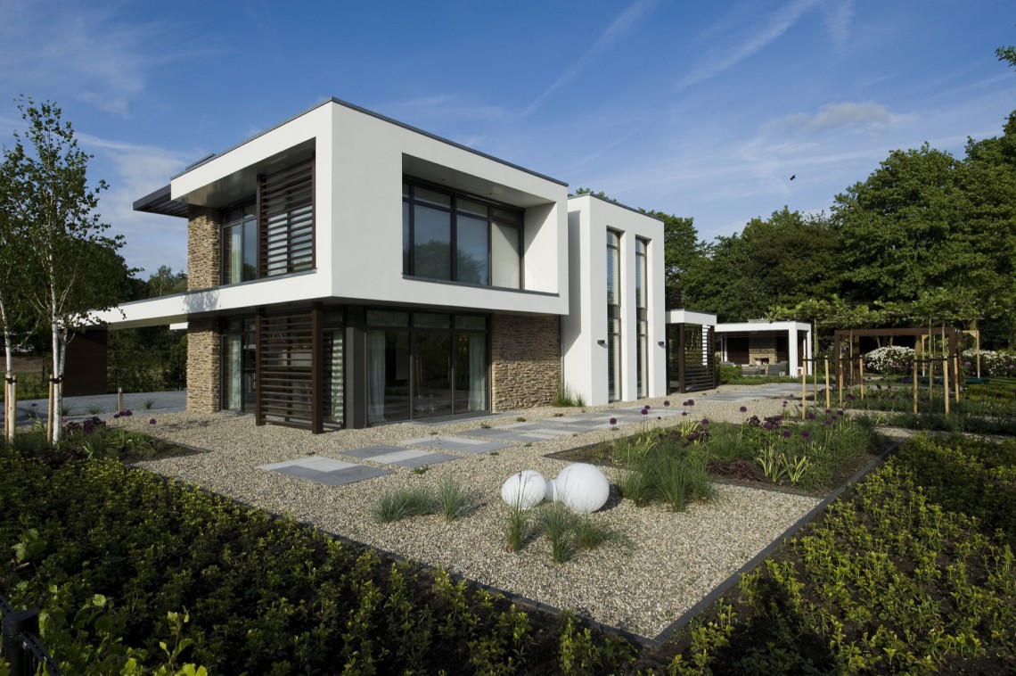
Modern villa with large glass openings and a minimalist interior
The first impression is set by the openings: broad rectangles cut into a white volume, edged by darker masonry and frame lines that sharpen the composition. Under the overhang, the facade reads in layers, with a wooden underside and lighting that picks out the edges as daylight fades. The result is a modern villa exterior with large glass openings that reveals its interior life before you even step inside.
A front garden built from gravel, steps, and straight routes
In front of the house, the ground is kept deliberately open. Gravel fills the front garden, while stepping stones lead toward the entrance in a short, direct line. That choice leaves the facade visible almost all the way to the threshold, and the paving changes from loose stone to concrete slabs at the terrace and landing areas. The route is simple to read, with the house, garden, and entry platform connected by a sequence of hard surfaces.
Outdoor lighting along the facade brings a second layer to the exterior once the light drops. It runs beside the stone accents and under the canopy, catching the dark accents around windows and the sheltered entrance zone. From the front, the house feels composed around these contrasts: white wall planes, dark framed openings, and a strip of gravel that softens the approach without hiding the architecture.
The canopy and the glazing work together
The overhang or canopy at the facade does more than mark the entrance. It pulls the upper edge forward and gives the glazed openings a deeper frame, especially where the wooden underside is visible. In daylight, the dark profiles around the windows stand out against the white render. At dusk, the same elements turn into lit outlines, so the facade shifts from a flat composition into a layered surface with shadow, reflection, and illuminated joints.
Seen from wider angles, the house keeps a restrained silhouette. The volumes are clean and squared off, but the glazing prevents the structure from becoming closed. Large panes open the walls to the terrace and the garden, and the transparent parts are balanced by narrower masonry fields and the darker cladding accents that punctuate the surface. The modern villa exterior with large glass openings gains its rhythm from that back-and-forth between solid and open.
Inside, light walls and open sightlines set the tone
Once inside, the palette turns lighter. White wall surfaces and pale finishes let the daylight travel farther into the rooms, especially where the large glazing looks out toward the terrace. The interior remains minimal without feeling sparse; instead, it relies on clear lines, polished floor surfaces, and a measured amount of built-in detail. Views move straight through the kitchen and living area, so the outside stays present as a visual extension of the room.
Horizontal shading elements across the glass add another layer without interrupting the openness. They filter the view and break the surface of the windows into bands of light and shadow. A few decorative light points in the ceiling keep the tall spaces from becoming flat, and the overall effect is calm, but not static. The rooms are shaped by the same precision seen outside: clean edges, broad openings, and a strong line of sight.
A staircase that adds material contrast
The staircase is one of the clearest interior details. Wooden treads carry the warm grain, while the white railing keeps the stair volume visually light. A darker handrail traces the ascent, and the surrounding white walls frame the movement upward. In the stair and void area, the hanging lights become part of the composition, dropping a vertical note into a space that is otherwise defined by planes and lines.
That stair zone also shows how the interior uses contrast without overstatement. Wood, white paint, and dark metal are kept distinct, so each material reads clearly at close range. The result is a sequence that feels deliberate when you move through it: a step, a landing, a turn, then another view back toward the glazed rooms and the light coming in from outside.
Bathroom surfaces with relief, glass, and a precise wash zone
The bathroom shifts the focus to texture. One wall is covered in patterned or relief wall tiles, which give the surface depth without introducing strong color. In front of it, the wash area is set out with rectangular basins and a straight countertop, and the shower glass panel zone keeps the room visually open. The glass does not dominate the room; it simply marks the shower area while allowing the tile pattern to remain visible across the wall.
Because the finishes stay pale and controlled, the tile wall carries most of the visual weight. Light catches on the raised surfaces and creates small changes across the pattern. The room is still minimal in layout, but it is not blank. A few well-placed elements — the basin line, the glass panel, the textured wall — are enough to define the whole space.
A fireplace niche framed in light tones
Back in the living area, the fireplace wall forms a quiet focal point. The rectangular fireplace niche sits inside a light surround, so the opening reads as a precise cut rather than a heavy block. Nearby, the pale floor and white walls keep the fire opening visually sharp, and the glazing behind or beside it ties the wall back to the garden view. It is a small composition, but one that organizes the room around a clear horizontal and vertical line.
The furniture shown around it stays low and neutral, including a upholstered backrest with a subtle stitched pattern. That soft surface sits against the harder geometry of the niche and the surrounding wall, which keeps the room from feeling overdesigned. The interior stays focused on proportion, light, and the way each element holds its place.
Across the project, the same logic returns: broad glazing, dark facade accents, a canopy that deepens the entrance, and a front garden set out in gravel and stepping stones. Inside, the wooden stairs with white railing, the patterned bathroom wall, and the rectangular fireplace niche all reinforce the same measured approach. The house is read through its openings and surfaces first, and only then through its rooms.
Want to see more of Marco van Veldhuizen? View the page of Marco van Veldhuizen for even more great projects and company information.



NEW 2026 Jubileum Edition The Best Interior Designers Benelux
Order Now €125


NEW 2026 Jubileum Edition The Best Interior Designers Benelux
Order Now €125


NEW 2026 Jubileum Edition The Best Interior Designers Benelux
Order Now €125

NEW 2026 Jubileum Edition The Best Interior Designers Benelux
Order Now €125


