










Open-plan kitchen with island
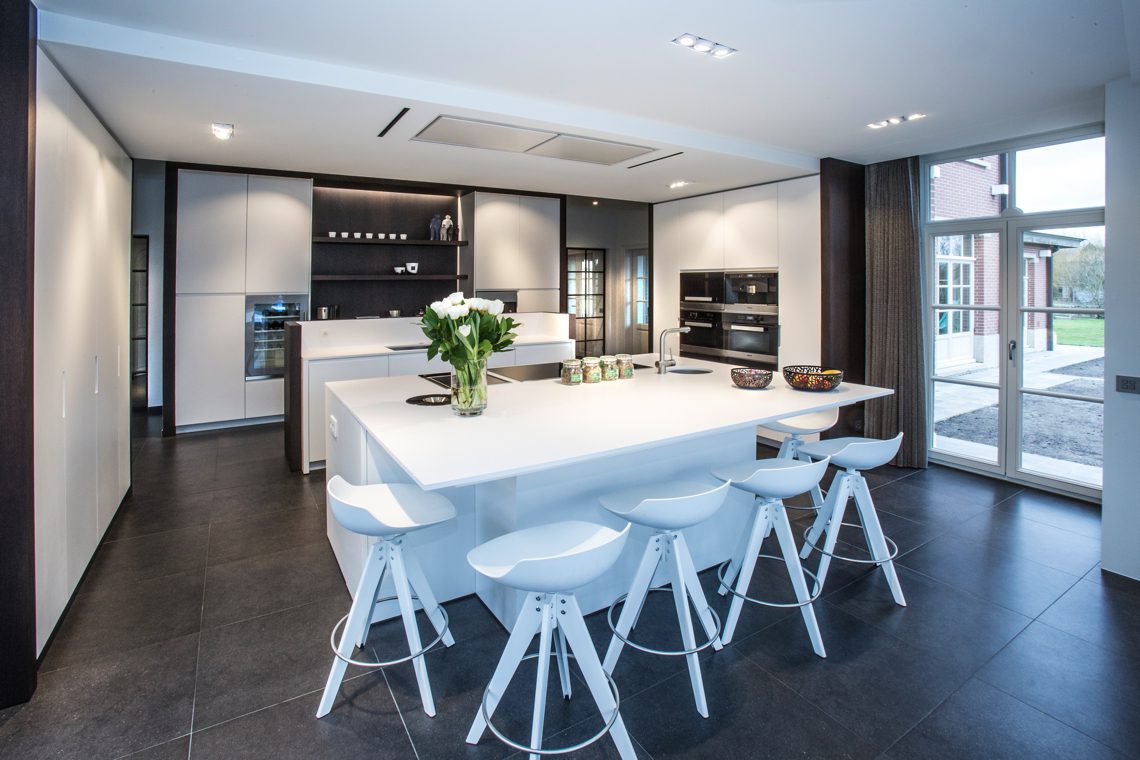
The island sits at the center of the room and immediately sets the pace of the open-plan kitchen. Around it, white built-in cabinetry runs in long, clean lines, while the darker wall behind creates a clear break in the composition. The cooktop and sink zone are built into the island, so the work surface reads as one continuous plane rather than a collection of separate parts. From the first view, the kitchen feels arranged around movement: from cooking to seating, and from the worktop toward the dining area.
A kitchen island that anchors the room
The open-plan kitchen island is the main reference point in the space. It carries the integrated cooktop and sink zone, with stools placed around the edge so the island also works as a place to sit. The worktop has a stone- or quartz-like look, which helps the island stand apart from the white fronts below. Because the island is visible from several angles, it connects the kitchen zone to the rest of the room without closing it off.
Seen from the dining side, the layout opens up toward the large windows at the back. Curtains soften the window wall, but the glazing still brings in a broad sweep of daylight. The round dining table sits in that field of light, close enough to the kitchen to read as part of the same everyday route. This open connection between kitchen dining with large windows and the island gives the room a clear social center without relying on extra decoration.
White cabinetry, kept straight and quiet
Modern white kitchen cabinetry forms the outer frame of the project. The tall units rise in a neat block, their handleless fronts giving the storage wall a flat, restrained surface. Nothing interrupts the vertical rhythm except the darker inset areas, where the material changes and the composition becomes more detailed. The result is a kitchen that uses storage as a visual backdrop rather than a dominant feature.
The cabinetry is not only about height. Lower runs and built-in sections continue the same language of straight lines, so the whole kitchen reads as one fitted system. In the detail views, the fronts stay visually calm while the open shelving and recessed niches break the surface just enough to hold appliances and objects. That mix of closed storage and exposed niches gives the room a practical rhythm, especially where the darker elements are inserted into the white field.
The dark wall and the niche behind it
A dark accent wall in the kitchen cuts into the white setting and gives the project a stronger depth. In the main view it sits behind the island and storage wall; in the close-up images it appears as a recessed niche with shelving and an integrated appliance zone. The contrast is not decorative for its own sake. It helps separate the working parts of the kitchen and gives the built-in joinery a sharper edge.
Inside that darker zone, the surfaces are layered rather than left flat. Shelves run across the niche, and a glazed appliance or refrigerator-style door appears in the cabinetry detail. The change from white fronts to a darker frame makes the recess read more clearly, especially in photographs where the niche catches less light than the surrounding units. It is one of the clearest examples of how the kitchen uses material contrast to organize the wall.
Light above the work zone and the table
Lighting is handled in two distinct layers. Rectangular ceiling cassettes and spots sit overhead, giving the room a measured grid across the ceiling. Over the island, pendant lighting drops lower and marks the place where people gather around the worktop. The pendants are visible in relation to the island and the dining area, so the room does not rely on a single light source. Instead, the ceiling fixtures and hanging lamps divide the plan into practical zones.
Ceiling lines that follow the plan
The ceiling treatment is discreet but important. The rectangular lighting cassettes pull the eye along the length of the room and reinforce the open route from kitchen to dining space. Spots are set into the ceiling alongside them, which keeps the surfaces visually clean while still giving the room enough illumination for the island, the cabinets, and the table. The lighting does not compete with the joinery; it sits above it and leaves the materials to do the visible work.
The pendant lights over the island add a lower point of focus. They hover above the worktop rather than spreading across the whole room, which gives the island its own place within the open plan. From the dining side, the hanging lamps also help distinguish the kitchen from the eating area, even though both remain within the same open volume. That simple shift in height is enough to mark the room’s different uses.
Materials that keep the room grounded
A tiled floor runs through the kitchen and dining zone, giving the interior a firm base under the lighter cabinetry. The surface appears to have a ceramic or stone character, which fits the straight geometry of the room. Against it, the white fronts stay crisp, while the darker wall and niche add depth. The materials are limited, but each one has a clear role: floor below, cabinetry around, and glazing at the edge of the space.
The large windows with curtains pull in daylight that changes the look of those materials through the day. The tile floor picks up softer reflections, and the white fronts read differently when the light shifts across them. In the detail shots, the stone-like worktop, the dark niche, and the glass appliance door each take on a slightly different surface quality. That variation is subtle, but it keeps the room from becoming flat.
How the dining area sits beside the kitchen
The dining table is not pushed into a separate room. It sits beside the island, close enough to share the same light and circulation path. In the wider images, the table’s round shape softens the stronger lines of the cabinetry and the island. The chairs around it complete the picture of a kitchen that extends into the eating area without a hard break. Seen this way, the open-plan kitchen island does more than define a cooking zone; it organizes the whole room around a clear sequence of use.
What stays with you is the contrast between the white storage, the dark inset wall, and the bright window line at the back. The plan remains open, but the zones are still readable. That is where the project’s strength lies: in the way the island, the cabinetry, the niche, and the dining table each hold their own place while remaining part of one interior.
Want to see more of Interieurburo Claeys & Verbeke? View the page of Interieurburo Claeys & Verbeke for even more great projects and company information.





NEW 2026 Jubileum Edition The Best Interior Designers Benelux
Order Now €125


NEW 2026 Jubileum Edition The Best Interior Designers Benelux
Order Now €125


