


Interior with open stair void and deep daylight
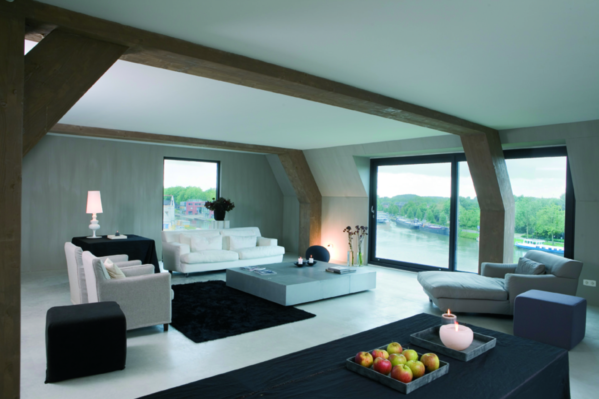
The open stair void interior is immediately visible in the way the project is framed. Light reaches far into the apartment through the open stair voids, sliding past the two sloped roofs and the patio between them. That opening does more than connect floors: it links the living areas, pulls daylight deep into the interior, and gives the plan its quiet rhythm. On the living level, large window openings bring the view close to the rooms, while the upper sleeping level turns more inward.
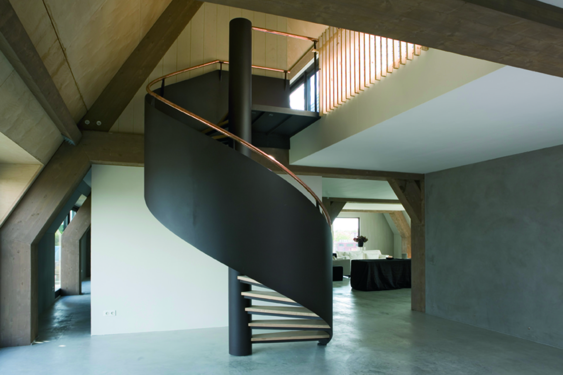
open stair void interior as the architectural starting point
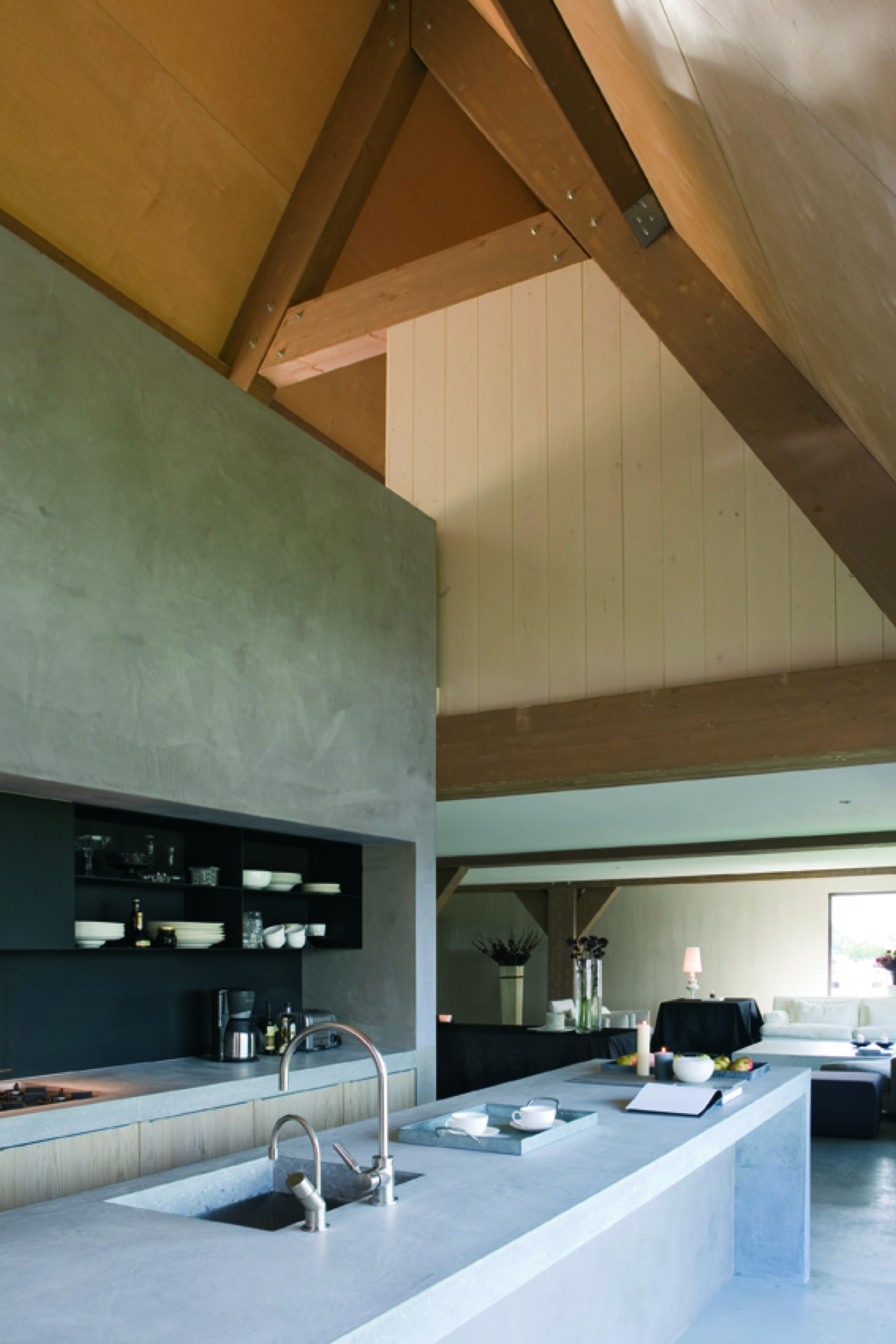
The apartment is arranged across two floors, but the separation is never rigid. Two large voids cut through the volume and let the rooms on either side stay visually connected. In the staircase, a round central column anchors the movement upward, while the open balustrade and slatted screen beside the void keep the edges light. From one level to the next, the eye moves across voids, roof slopes and openings instead of stopping at a closed wall.
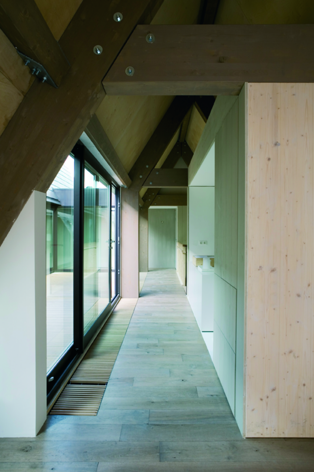
That spatial setup gives the interior a measured openness. A hallway with glass partitions extends the sightlines further, and the ceiling changes with the roof shape rather than hiding it. Visible wooden beams under the roof mark the structure plainly, while the pale walls and concrete floor keep the surfaces calm. The result is an interior that lets the construction remain legible without turning it into a display piece.
Daylight deep inside the plan
The strongest move in the project is the way daylight deep interior becomes part of daily use. The two pitched roofs and the patio between them create room for light to enter from above, while the large window openings on the living floor pull in more light and widen the view. The apartment does not rely on a single bright façade; it gathers light from several directions and lets it travel through the voids.
That effect is especially clear where the living spaces open toward the windows. The view becomes part of the room, but the plan does not dissolve into glass. The upper sleeping level stays more enclosed, with a more inward orientation and lower visual noise. This shift from open to closed gives the apartment its pacing: movement and light below, stillness above.
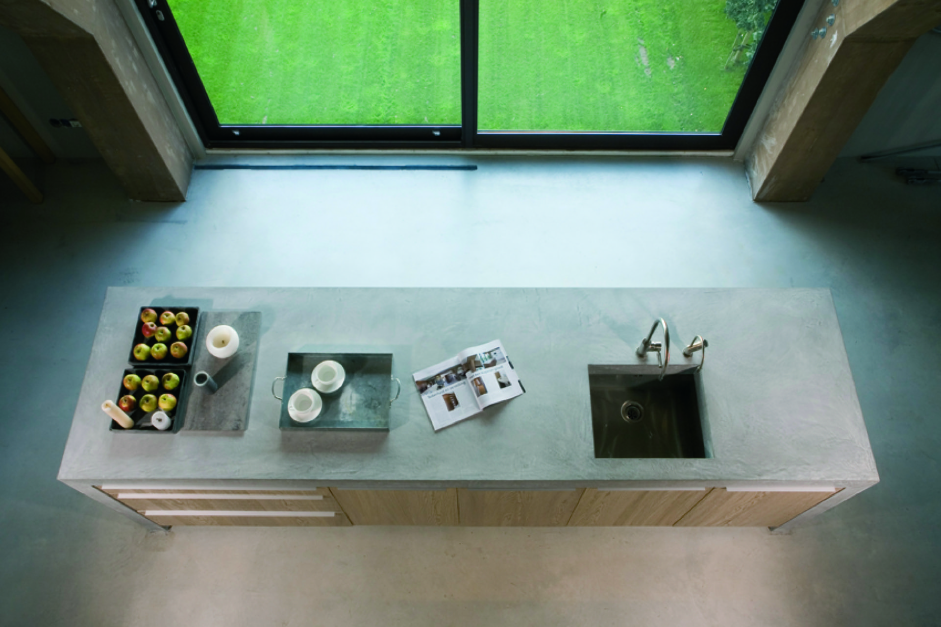
A living floor shaped by openings
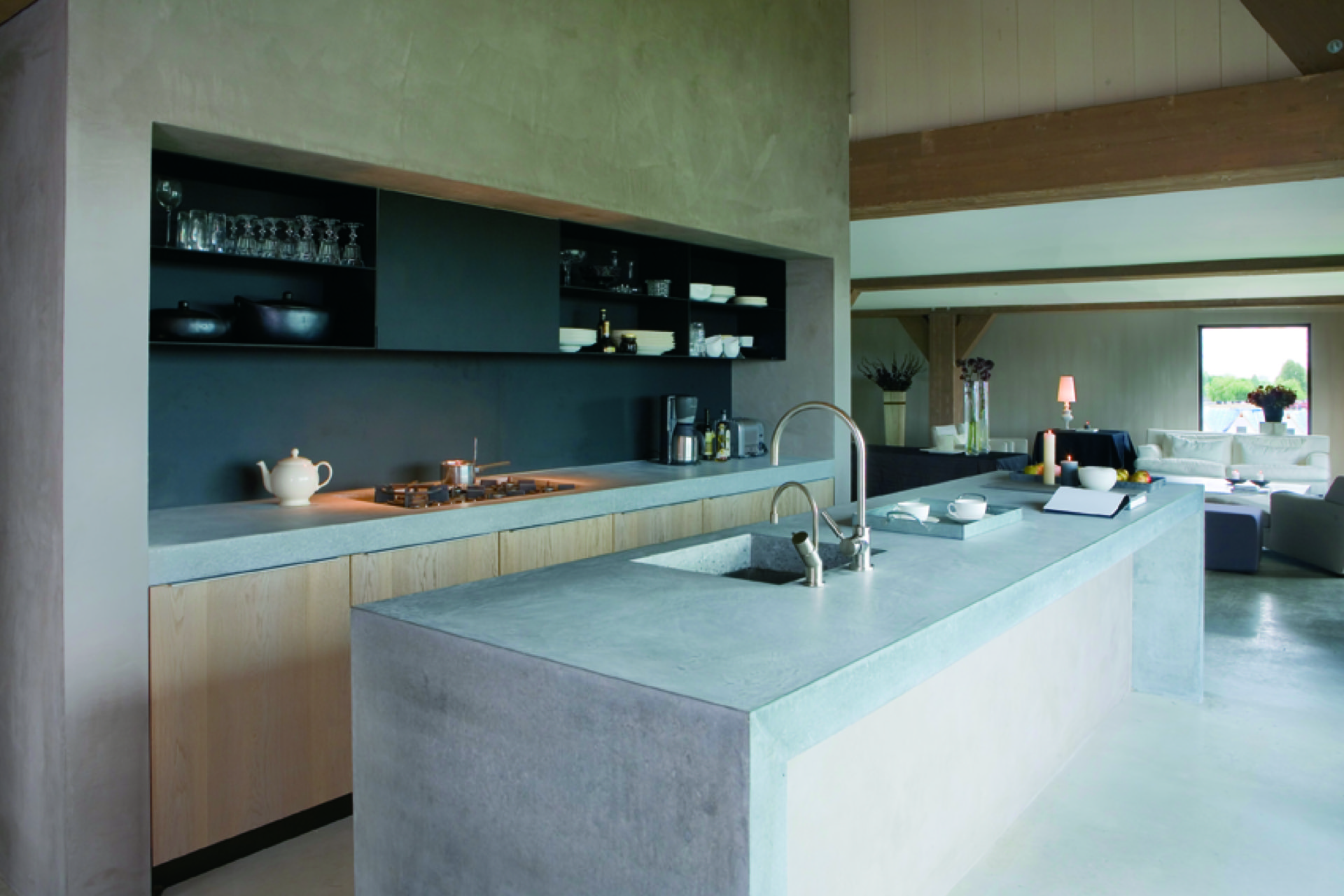
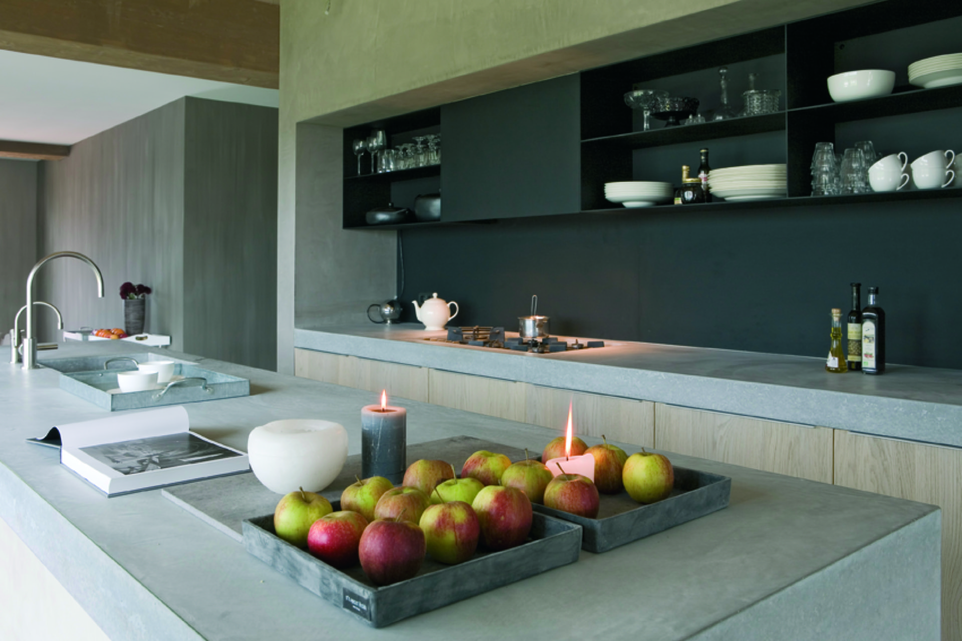
On the living level, the apartment feels wider than its footprint. Large window openings frame the outside, but the interior stays grounded by the material palette: wood, stone, glass and a concrete floor. The kitchen sits as part of that broader room rather than as a separate box. A central island defines the working zone, while the surrounding cabinetry keeps the edges clear and low.
Dark wall niches add depth to the kitchen wall. They hold open compartments and smaller shelves, creating contrast with the lighter worktop and the pale wall surfaces. The built-in cabinetry keeps storage integrated into the architecture, so the room can stay visually open even when the practical functions are all present. Here, the open stair void interior and the kitchen work together; both are doing spatial work, not just serving as features.
Wood, glass and the weight of structure
Throughout the apartment, wood is used in a restrained but visible way. It appears in the staircase screen, in the cabinetry, and in the panelled surfaces along the hallway. Those parts catch light differently from the surrounding plaster and glass, so the interior keeps shifting as you move through it. The wooden beams under the roof add another layer, giving the upper spaces a clear structural line without making them feel heavy.
Glass partitions in the corridor and around the voids keep the routes open. They separate without cutting off the view, which matters in a plan with several levels and changes in ceiling height. The combination of glass, wood and pale surfaces gives the apartment its measured tone. Nothing is overworked; the details are specific, and they let the volumes remain readable. That makes the open stair void interior part of the architectural character rather than a loose finish.
Storage built into the walls
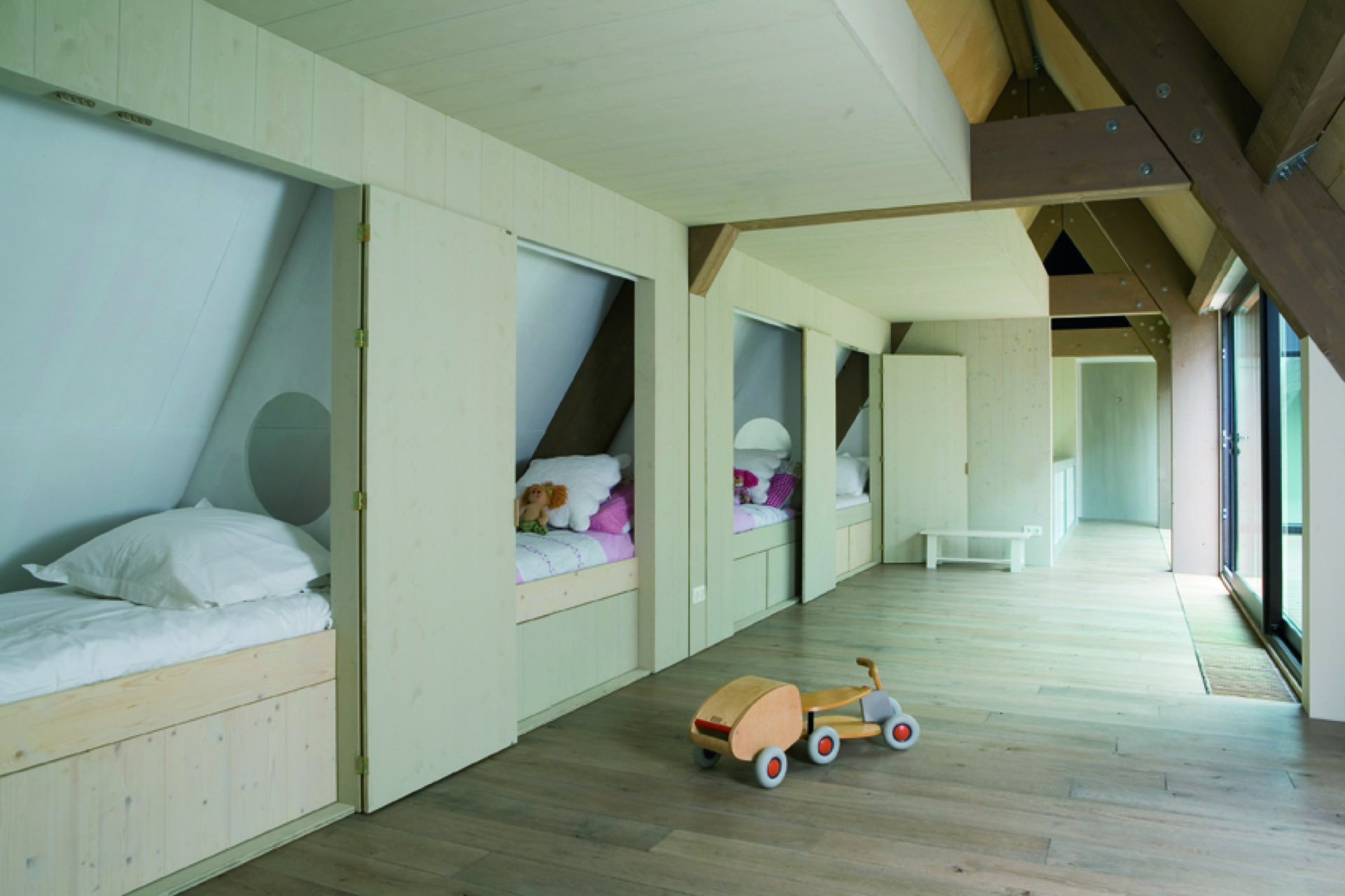
Built-in cabinetry runs through the interior as a quiet organizing device. In the kitchen, it holds the working wall and leaves the island free. In the sleeping areas, lower cabinets and open niches are fitted under the sloping roof, turning awkward corners into usable storage. The same approach appears in the hallway, where panelled walls and integrated units keep the circulation space from feeling fragmented.
These built-in elements are not hidden, but they do not compete for attention either. Their fronts, openings and recesses follow the lines of the architecture, especially where the roof comes down close to the floor. That makes the upper sleeping level feel more settled and compact than the living floor below. The layout uses the shape of the building instead of resisting it.
An upper sleeping level that pulls back
The mezzanine / upper sleeping level has a different mood from the floor below. Where the living room opens to the windows and the voids, the sleeping rooms are more inwardly arranged. The sloped roof edges, built-in storage and narrower openings make the level feel contained. It is still connected to the rest of the apartment, but the visual tempo slows down as soon as you step up.
That shift is important to the plan. The apartment does not treat both floors in the same way. Instead, it uses the height, the roof angles and the voids to separate public and private use. The upper level gathers around the structure, while the lower level opens toward the larger window openings and the patio. The contrast is subtle, but it keeps the apartment from becoming one continuous room.
Materials kept close to the surface
The finish of the interior stays close to the materials themselves. Concrete is visible underfoot, wood appears in panels, cupboards and beams, and glass keeps the transitions light. In the kitchen, the island worktop reads as stone or engineered stone, which gives the work zone a firmer edge against the surrounding timber. Darker niches break up the lighter surfaces and give the wall a clearer depth.
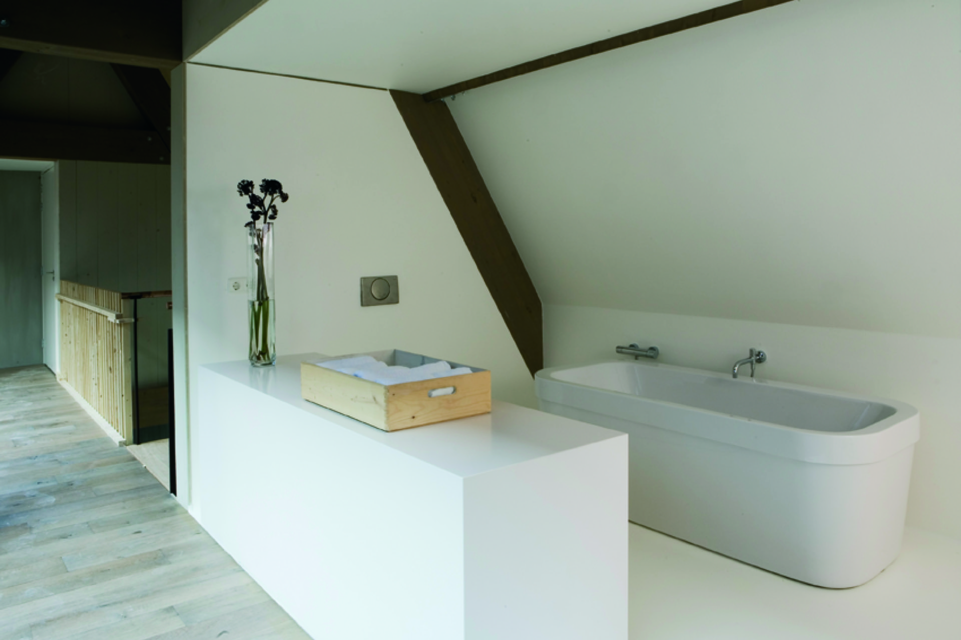
The bathroom continues that material discipline. A long bathtub sits within a simple arrangement of wood and pale surfaces, with the structure above still visible. It is a modest space in terms of gesture, but it carries the same attention to lines and openings as the rest of the apartment. Across the home, the materials are used to describe the volume, not to decorate it.
That approach also explains why the open stair void interior feels so consistent from room to room. The voids, the daylight, the roof structure and the built-in parts all belong to the same spatial idea. Even where the apartment closes down, as in the sleeping level and the bathroom, the details remain connected to the larger plan. The interior does not rely on statement pieces. It is shaped by openings, routes and the way light lands on wood, glass and stone.
The history of the wider building is present in the background rather than in overt decoration, and the project was recognised in April 2007 with a Bouwfonds Monumentenprijs. What stays most visible, though, is the present-day interior: a two-level apartment where voids, roof forms and carefully placed openings make daylight part of the architecture itself. That makes the open stair void interior part of the architectural character rather than a loose finish.
Want to see more of Ex Interiors? View the page of Ex Interiors for even more great projects and company information.


.png)


