










Penthouse interior with custom joinery and marble-look details
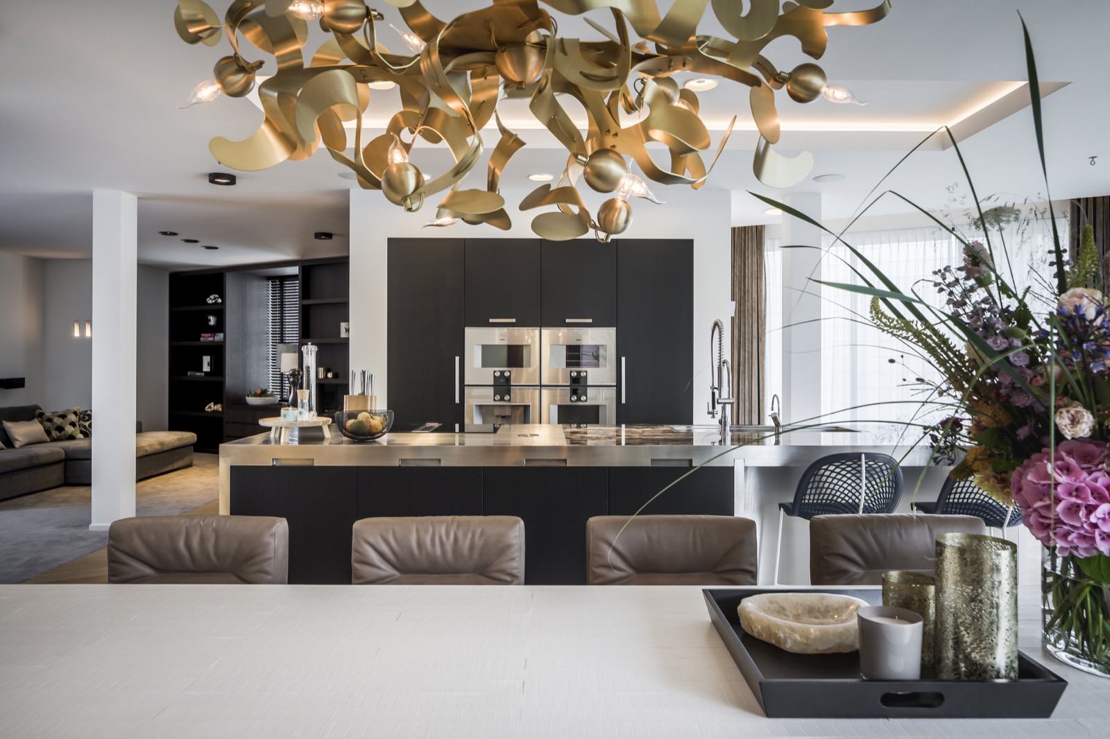
A light stone worktop, dark cabinet fronts, and a line of pendant lights set the tone as soon as you enter this penthouse interior. The kitchen sits within an open-plan living space, so the eye moves straight from the island to the dining and lounge areas. That long sightline is repeated in the joinery: tall cupboards, open niches, and flush fronts keep the room visually calm while still giving it clear structure.
Open kitchen with island and dark cabinetry
The kitchen combines a modern kitchen with island layout and a wall of dark custom cabinetry. Built-in appliances sit behind flat fronts, which lets the material rhythm do the work instead of handles or decorative breaks. A pale stone-look worktop lightens the composition, while the deeper cabinet tone grounds it. Large windows bring daylight across the island, and the sculptural pendant lamps add another layer without crowding the ceiling. It is an efficient setup, but it also reads as part of the wider room rather than a separate zone.
Seen from another angle, the island becomes the clearest horizontal line in the room. Its broad edge and integrated cooking zone make it the main working surface, yet the surrounding cabinets prevent the kitchen from feeling exposed. The open-plan living space benefits from that restraint. You can read the kitchen, dining area, and adjacent seating at a glance, but each part still has its own weight and position.
Joinery that keeps the room ordered
Storage is handled as architecture rather than furniture. Dark custom cabinetry runs in tall planes, broken up by open shelves and recessed sections that hold small objects without turning them into display clutter. The same approach appears in the hallway and niches, where white walls, light wood flooring, and round recessed spotlights create a quieter transition between rooms. These in-between spaces matter here: they slow the pace before the more heavily detailed zones begin.
Bathroom surfaces with a marble-look edge
The bathroom shifts the palette toward marble-look wall tiles with a dark vein running through them. Against that surface, the white sanitaryware and compact basin furniture stand out clearly. A marble-look bathroom works well in this project because the slab-like finish carries the same ordered feeling as the kitchen joinery. In one view, a freestanding bath sits in front of the patterned wall; in another, a double vanity is tucked into a darker frame with the same stone effect continuing behind it.
The shower area is kept visually open with glass and a rain shower head mounted against the tiled wall. Close details matter here: chrome fittings, the sharp edge of the glass panel, and the way the tile joints line up across the surfaces. The result is not decorative in a loud sense. It relies on proportion, reflection, and the contrast between the pale fixtures and the darker veining in the wall and floor finishes.
Light, reflection, and the wet zone
Recessed spotlights are used in the ceiling and within wall niches, so the bathroom feels defined by points of light rather than by ornament. That same lighting strategy continues in the shower, where the glass panel and tiled surround catch a softer reflection. Even the toilet area stays visually integrated, thanks to the same marble-look surface treatment and the tight layout around it. The bathroom reads as one continuous sequence of surfaces, each adjusted for a different use.
A living room framed by a built-in fireplace wall
In the living room, a built-in fireplace wall anchors the seating area. Dark joinery surrounds the fire opening and the television niche, turning the wall into a single composed element instead of separate devices. That decision matters in an open-plan living space, because it gives the lounge a clear boundary without closing it off. The wooden floor continues through the room, while ceiling spots keep the ceiling line light and even. Nothing here is overdrawn; the wall does the organizing for the space around it.
Another detail that stands out is the way the wall panels and open shelves are handled beside the seating niche. They add depth without breaking the straight lines of the room. A low, grey upholstered bench or sofa recess sits against the darker surfaces, and that contrast makes the circulation around it easier to read. You move from kitchen to living area through material shifts rather than changes in level or decoration.
Sauna with wood slat wall and glass shower zone
The sauna introduces a different register of texture. A sauna with wood slat wall and built-in seating replaces the darker cabinet language with warmer, more tactile surfaces. The slats run vertically, so the room feels taller and more enclosed, while the glass shower zone keeps the composition from becoming heavy. You can see the shower head through the glazing, and the adjacent timber elements, including a tub-like wooden form, give the space a measured, custom-made character.
What makes this area effective is the contrast between wood, glass, and stone. The bench lines are simple, the lighting is recessed, and the surfaces are easy to read in a single glance. That clarity matters in a compact wellness zone. Instead of stacking features, the room arranges them side by side: slatted wall, glass partition, stone base, timber seat. The sequence is calm, but the materials keep it from feeling flat.
Hallway details and the transition between rooms
The hallway holds the project together more quietly than the larger rooms do. White wall planes, light wooden flooring, and small round downlights guide the route through the penthouse. Niche openings and flush transitions appear again, which means the corridor does more than connect rooms; it reinforces the same custom-made logic seen in the kitchen and bathroom. In one of the views, a narrow opening frames daylight at the end of the passage, giving the walk through the apartment a clear finish line.
A bedroom or guest room continues that restrained approach with a dark wall accent, a recessed niche, and soft accent lighting built into the opening. The detail is modest, but it echoes the rest of the penthouse interior: surfaces are kept flat, light is placed with precision, and storage or display is never separated from the wall itself. Across the apartment, the same materials return in different roles. Dark cabinetry, marble-look finishes, glass, timber, and recessed lighting shape the whole project without needing to compete for attention.
Want to see more of François Hannes? View the page of François Hannes for even more great projects and company information.





NEW 2026 Jubileum Edition The Best Interior Designers Benelux
Order Now €125


NEW 2026 Jubileum Edition The Best Interior Designers Benelux
Order Now €125


NEW 2026 Jubileum Edition The Best Interior Designers Benelux
Order Now €125


NEW 2026 Jubileum Edition The Best Interior Designers Benelux
Order Now €125


NEW 2026 Jubileum Edition The Best Interior Designers Benelux
Order Now €125


