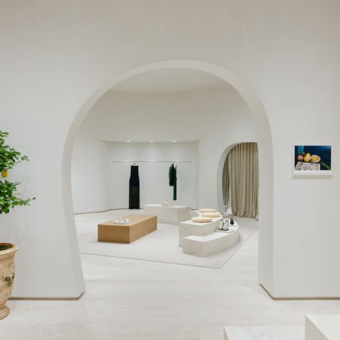
Minimal practice interior with seamless microtopping concrete look
White surfaces set the tone here, but they never read as flat. The walls hold a soft concrete-look texture, and the seamless microtopping finish gives the space a quiet depth that keeps the minimal white interior from feeling clinical. Light moves across floors, cabinets and furniture in one restrained palette, while the material grain stays visible enough to give each surface a little resistance.
Microtopping as the main surface language
The project relies on microtopping as more than a finish. It runs across the floors, the built-in cabinets, the furniture and the reception desk, so the eye reads one continuous interior rather than a series of separate pieces. That continuity is what softens the room. The seamless microtopping finish absorbs light rather than throwing it back, and the result is a calm setting with a concrete look texture that remains understated. Nothing is overworked; the surfaces do the talking.
From a distance, the reception zone appears monolithic. Up close, the edges reveal fine changes in depth and tone. The microtopping reception desk sits in the room as a single block, with its rounded or angled corner detail depending on the viewpoint. Around it, the wall finish stays light and matte, so the counter can carry the strongest visual line without breaking the overall restraint.
Clean lines in cabinets and benches
The built-in cabinets clean lines are one of the clearest signals of how the interior is put together. Their fronts sit flush and follow narrow joint lines, which keeps the storage calm even when it occupies a large part of the wall. A few of the images show open niches with wood inside, and that small shift in material breaks the white field without introducing clutter. The same approach appears in the bench-like elements along the wall, where a horizontal line is enough to define the space.
Instead of adding decoration, the joinery works through proportion. The cabinet runs are long and light in tone, so they extend the room rather than closing it off. In the detail shots, the line between panel, plinth and wall remains precise but quiet. That is where the seamless microtopping finish earns its place: it gives the surrounding surfaces enough texture to support the cabinetry, without competing with the straight geometry of the fronts.
Track lighting that keeps the room legible
Above the waiting and circulation zones, track lighting with spotlights runs in a visible line across the ceiling. The system is not hidden, and it does not try to disappear. Instead, it marks the route through the interior and picks out the long walls, the cabinet fronts and the seating edges. In several views, the spots create small pools of light against the pale surfaces, which helps define the depth of the room without adding visual noise.
The lighting also keeps the textures readable. On the matte wall finish, the spots catch a slight surface variation; on the microtopping areas, they bring out the betonlook grain rather than flattening it. This is especially clear where the corridor opens toward the waiting area. The ceiling line stays simple, but the sequence of fittings adds a measured rhythm above the smooth floor and the restrained wall surfaces.
A waiting area divided by glass and light
The waiting area introduces a different kind of transparency. Frosted glass partitions temper the view between zones, so the room gains separation without hard barriers. Through the washed or opaque panels, shapes remain soft and partial: a seat, a wall, a lit edge. That blur works well with the minimal white interior, because it avoids sharp contrast and keeps the focus on the surfaces closest to hand. The result is a space that feels organized through line and light rather than through heavy enclosure.
Wood appears here in small but meaningful ways. A short bench or console sits close to the wall, and the material brings a warmer tone to the pale field. It is not used as ornament. It simply interrupts the white surface at the right moment. The light floor and matte wall finish continue past it, so the furniture reads as part of the room’s structure. In this setting, the microtopping concrete look texture gives the white palette a surface depth that the wood can lean against.
Details that keep the sanitary zone visually steady
The sanitary area follows the same logic, with a continuous base cabinet line and a microtopping countertop that carries a clear horizontal edge. The worktop includes a cut-out for the sink and a visible tap position, but the composition stays controlled because the line of the counter is uninterrupted across the wall. The light front below it mirrors the rest of the interior, so the zone feels connected to the reception and waiting areas instead of standing apart as an isolated room.
Here, too, the material choice matters in the way it holds the eye. The microtopping sanitary countertop does not rely on shine or contrast. Its concrete look keeps the surface quiet, while the clean edge of the basin opening makes the geometry easy to read. The wall behind it remains pale and softly textured, which allows the fixture layout and cabinet line to stay clear. It is a compact detail, but it reinforces the same interior grammar used throughout the project.
What the project leaves behind
What remains after moving through the rooms is the sense of a surface system rather than a collection of finishes. The seamless microtopping finish links the floors, cabinets, furniture and reception desk into one visual language, and the white palette gives that language room to breathe. The texture is there, but it never overwhelms the architecture of the interior. Instead, it gives the walls, joins and furniture edges just enough relief to keep the space from feeling blank.
The strongest moments are the ones where material and line meet: the round or angled desk edge, the narrow cabinet joints, the rail of spotlights above the corridor, the frosted glass partition in the waiting area, and the continuous sanitary counter. Each detail stays close to the facts of the room, yet together they show how a minimal white interior can carry depth without relying on excess. The project is restrained, but it is not empty.
Want to see more of Texture Painting? View the page of Texture Painting for even more great projects and company information.




NEW 2026 Jubileum Edition The Best Interior Designers Benelux
Order Now €125


NEW 2026 Jubileum Edition The Best Interior Designers Benelux
Order Now €125


NEW 2026 Jubileum Edition The Best Interior Designers Benelux
Order Now €125


NEW 2026 Jubileum Edition The Best Interior Designers Benelux
Order Now €125