Spot light design in a monochrome penthouse
Dark stone, pale walls and a strip of light running across the ceiling set the tone here. The monochrome penthouse relies on spot light design that stays close to the architecture, letting the black and white interior read in clear planes rather than competing layers. In the living areas, corridor links and bathroom details, the lighting is directed, restrained and exact. Each lighting zone has its own task, yet the overall impression remains calm and measured.
Linear ceiling light draws the rooms together
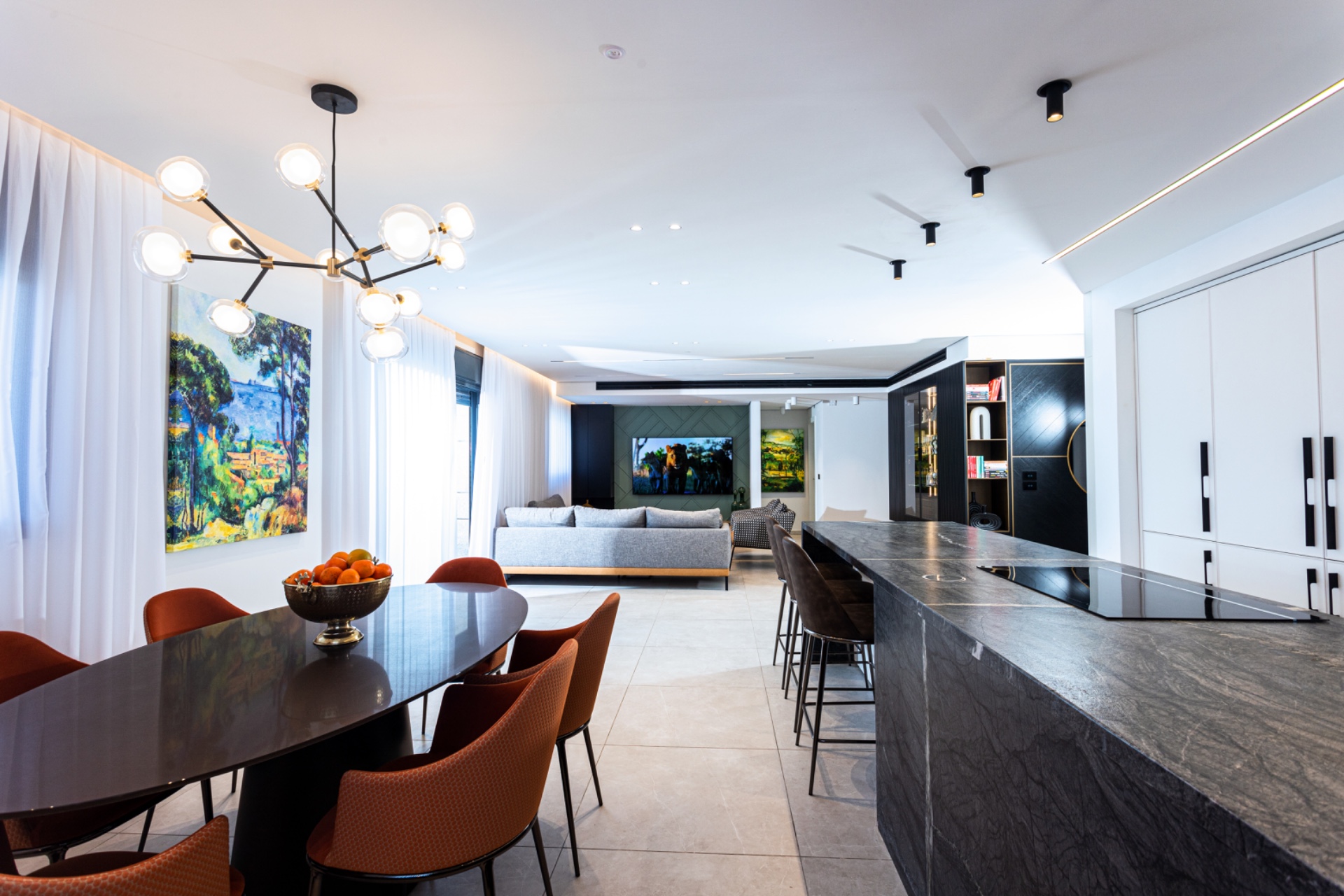
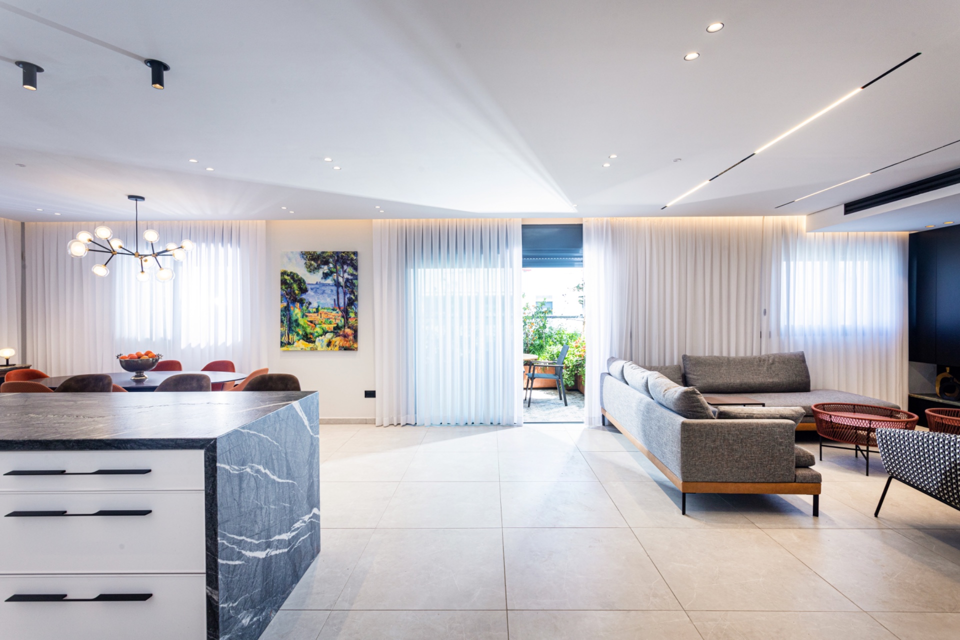
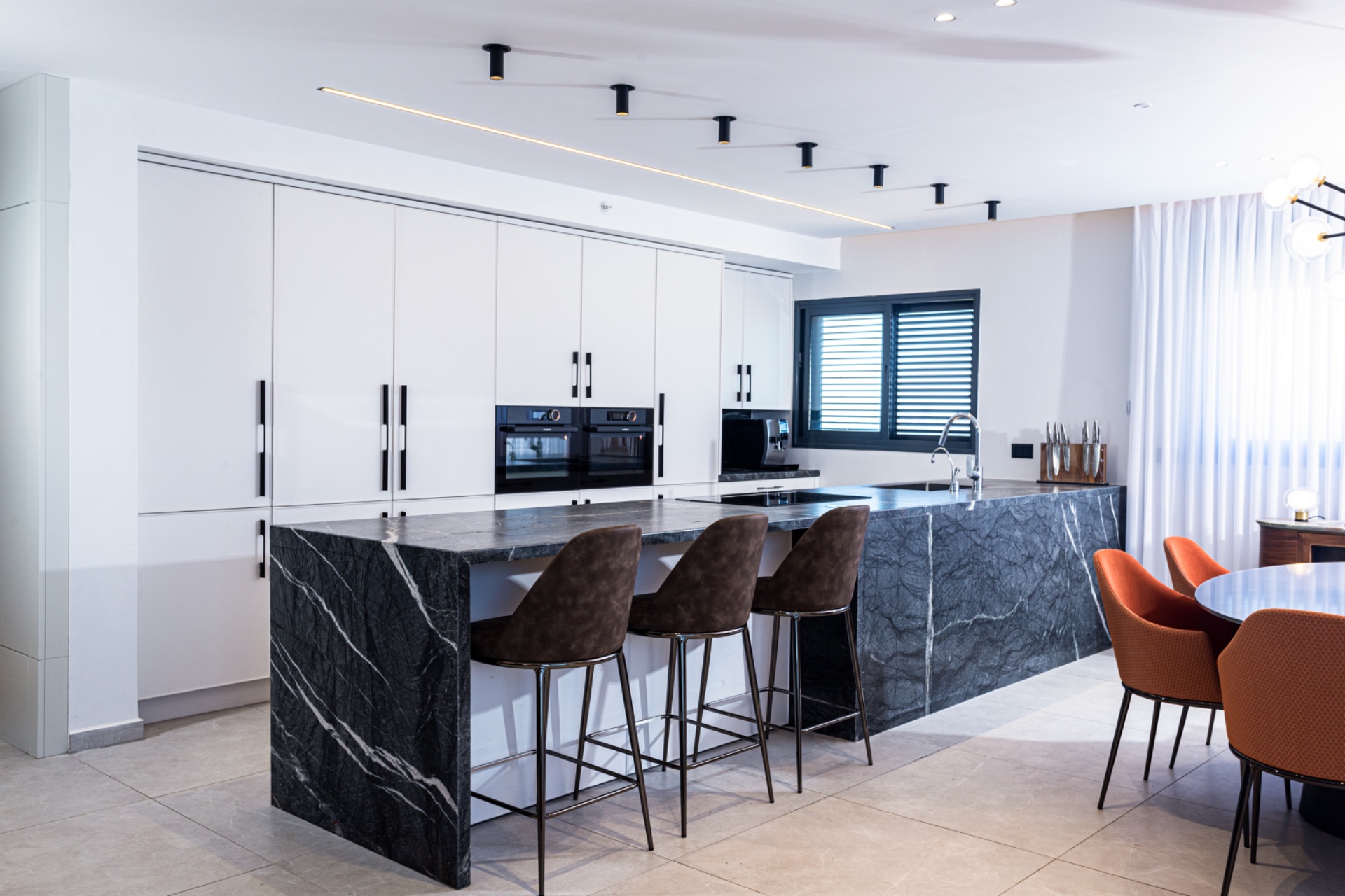
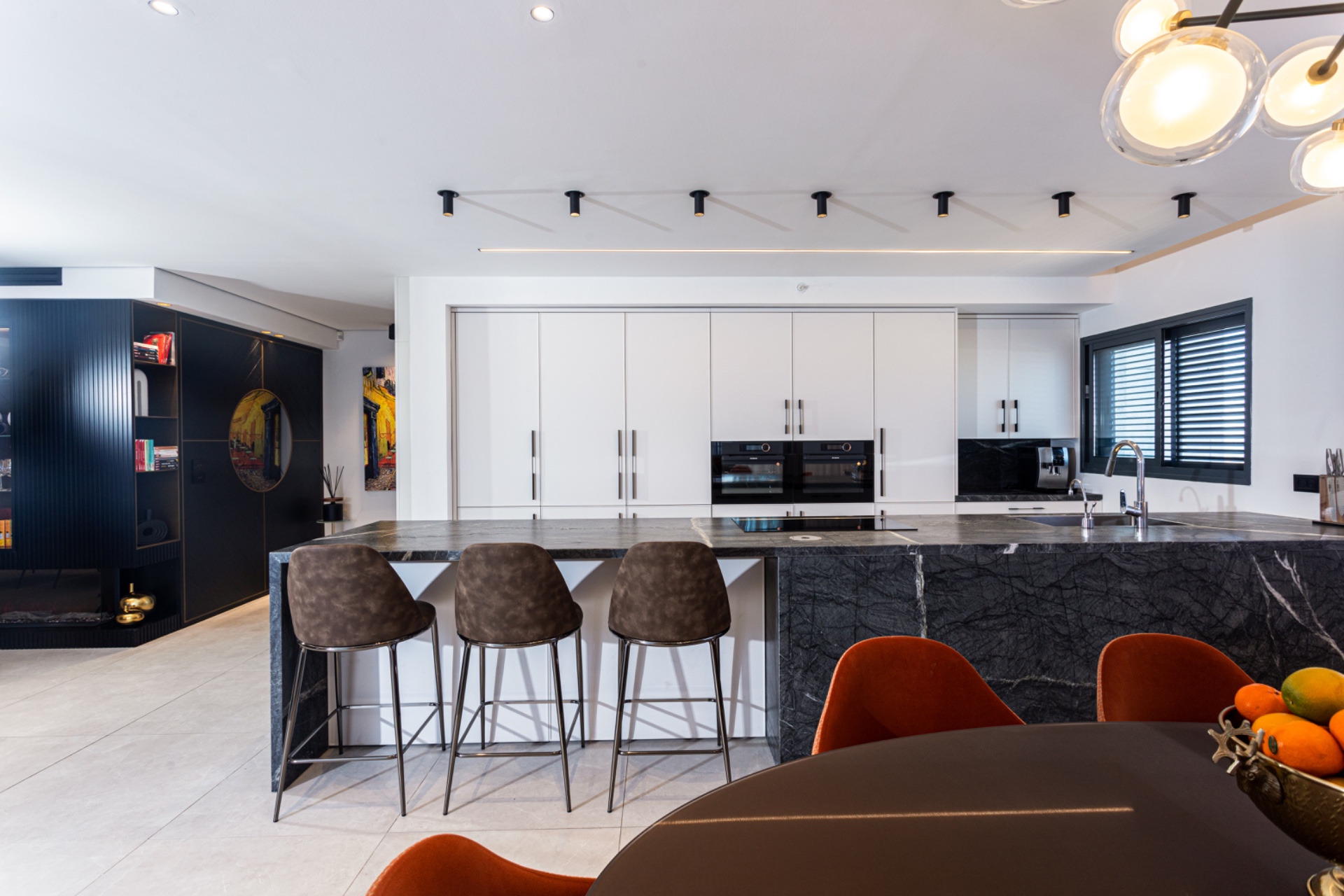
A linear LED ceiling lighting line appears again and again in the photo series, tracing the length of kitchen and living spaces with a clean horizontal gesture. It works as a visual guide above marble, stone and dark panel surfaces, while recessed ceiling spots add smaller points of light where the room turns or opens. The result is not decorative layering. It is a clear lighting route that supports the plan of the penthouse and keeps the ceiling visually quiet.
The interior lighting design uses that quiet ceiling as a backdrop. In the open areas, the line of light gives the room a measured rhythm. Around it, spot light fittings remain secondary, but never disappear. Their placement shapes the way the eye moves from table to worktop, from seating area to circulation space, and from glossy stone to matte wall finishes. The lighting follows the geometry already present in the room.
Recessed ceiling spots in the main living areas
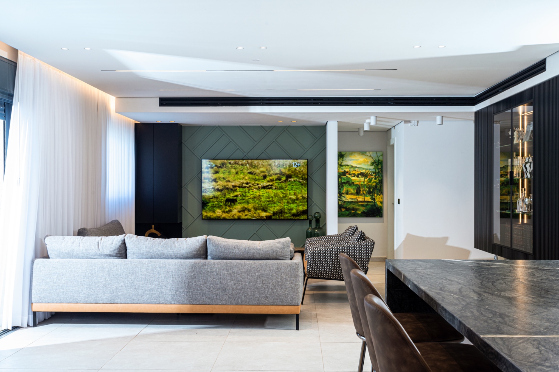
In the living room, recessed ceiling spots provide the base layer. Their small openings keep the plaster plane uninterrupted, so the ceiling reads as one surface rather than a field of fixtures. The anti-glare light is soft enough to avoid hard reflections on the stone and polished finishes, but precise enough to hold the room together after dark. That balance is most visible where the seating area meets darker framing and large glass surfaces.
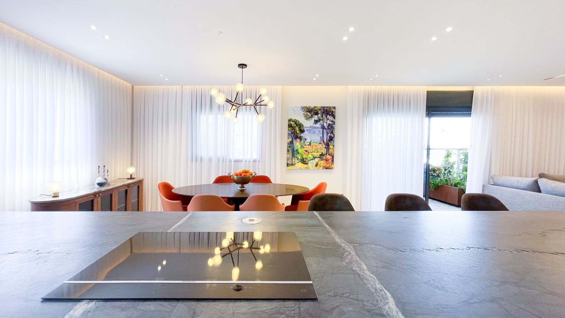
One image shows the lounge with grey upholstery, a dark frame and a marble front nearby. Here the recessed ceiling spots do the practical work of lifting the seating zone without flattening the material contrast. Another frame opens onto the dining area, where a hanging lamp sits above the table while the ceiling lighting continues behind it. The layers are distinct, but they do not fight for attention. Each one marks a different part of the room.
Lighting zones that follow the plan, not the décor
The strongest feature of this monochrome penthouse is the way the lighting zones are drawn across thresholds. Corridors do not receive the same treatment as the living space, and the bathroom is handled differently again. That variation keeps the rooms legible. A short passage can be lit with adjustable spots that turn and tilt to meet the wall line, while a larger zone can carry a longer ceiling line and broader light spread. The plan shifts with the architecture.
In the transition spaces, the spot light fittings are used as directional tools. Their ability to rotate and tilt is visible in the way the light lands on dark walls, glazed openings and the tiled floor. Nothing feels overlit. The beams cut through the black and white interior with enough definition to show edges, but not so much that the surfaces lose depth. This is where minimal design lighting becomes more than a style label; it is a way of keeping the circulation areas readable.
Adjustable beams for corridors and thresholds
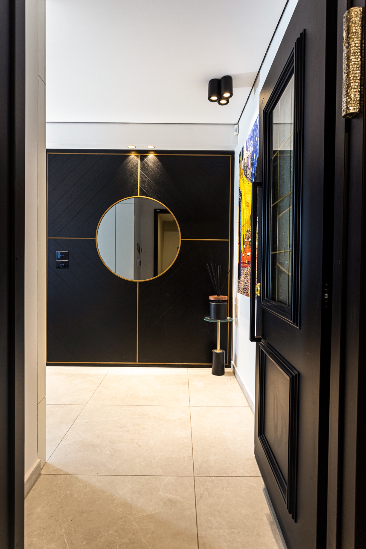
Several images focus on the corridor run, where a series of small spot light fixtures line the ceiling and guide movement toward the next room. A dark wall with a subtle pattern, a round mirror and a narrow strip of light create a clear pause point at the entry. Elsewhere, a corridor with a tiled floor and a framed opening uses the same language in a more restrained way. The fixtures sit close to the ceiling, but the light is angled to reach the wall plane and the floor edge.
That approach gives the hall and passage areas a practical clarity without turning them into technical spaces. The adjustable heads help define where one zone ends and the next begins. In a penthouse with strong contrast and reflective stone surfaces, that matters. Too much spill would erase the edges. Here, the beams stay controlled, and the architecture remains easy to read.
Dark surfaces, soft reflections and a steady contrast
Marble, natural stone and tiled surfaces carry much of the visual weight in the photos. Under the spot light, their patterning becomes more visible: a polished kitchen island front, a textured wall, a glazed partition, a line of grout around the bath area. The lighting never washes these surfaces flat. Instead it lets reflections sit in measured patches, especially where the ceiling line meets the darker wall finishes and the black frames around openings.
The black and white interior depends on that measured contrast. Without it, the room would feel hard. With it, the dark zones settle back and the lighter planes come forward. The light does not fight the materials; it outlines them. That is especially clear in the kitchen, where the linear LED ceiling lighting runs above the work area, and in the lounge, where a vertical slatted wall catches the light in thin bands. The room gains definition through those small shifts.
Bathroom details kept bright but controlled
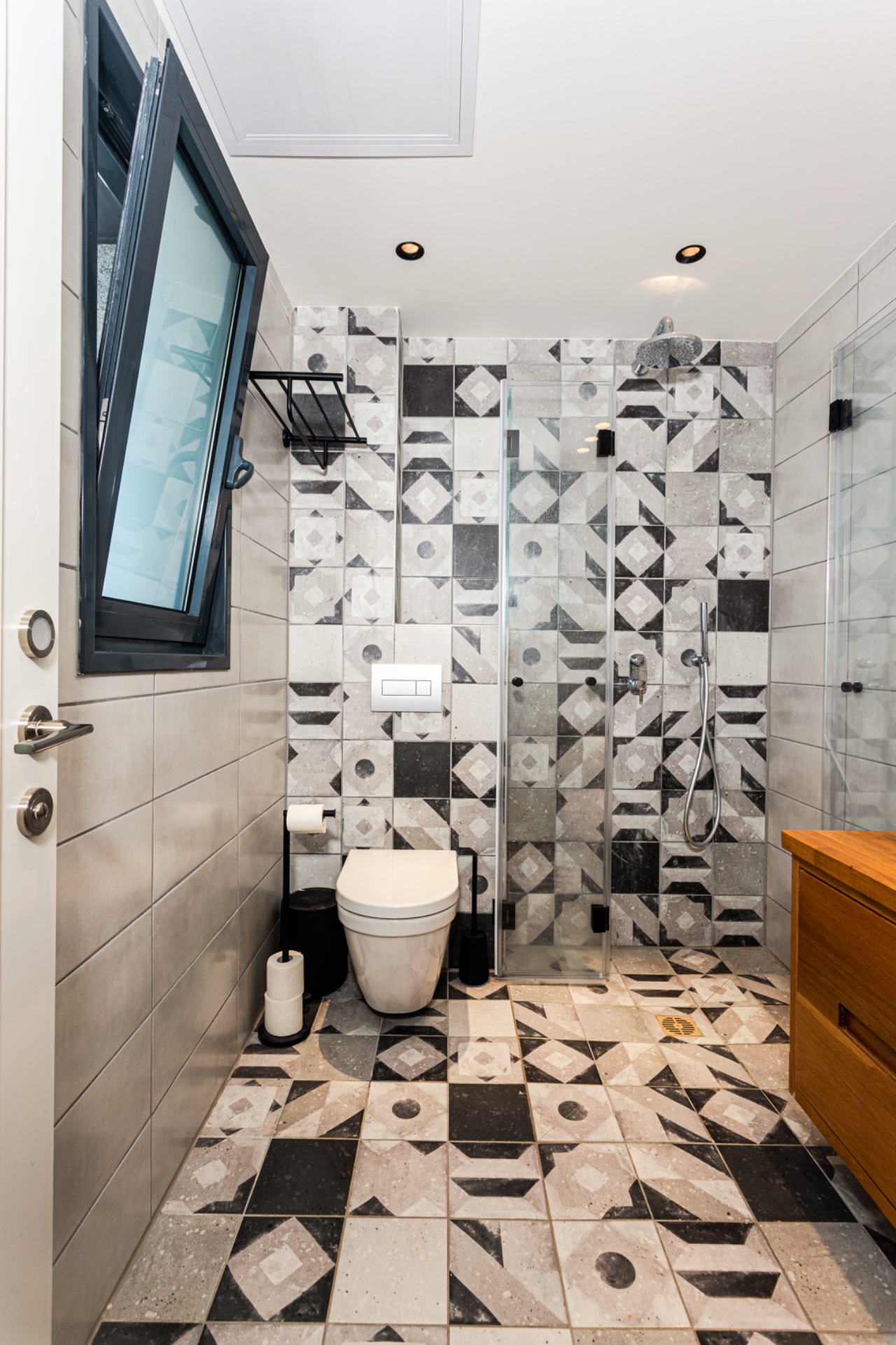
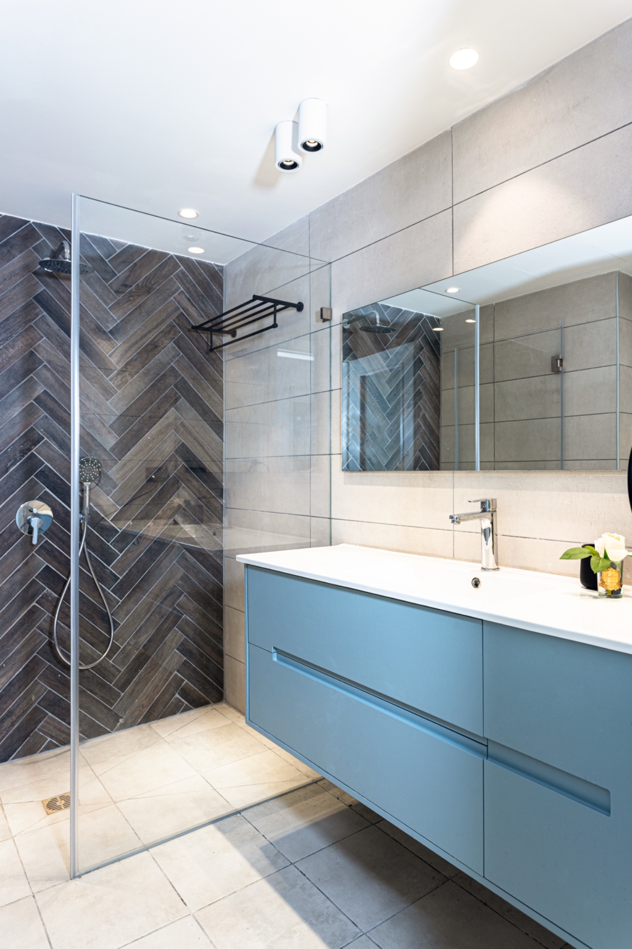
The bathroom images move the focus to glass, tile and compact surfaces. A glazed shower screen, mosaic-like tile patterns and a wall of textured finish all sit under small recessed spots in the ceiling. Here the anti-glare light matters most, because the room combines reflective glass with close-up use. The beam is aimed to illuminate the shower edge and surrounding surfaces without creating harsh points across the glass.
That makes the bathroom feel part of the same lighting language as the rest of the penthouse. It is brighter in intent, but not visually louder. The ceiling remains neat, the fittings stay small, and the light lands where it is needed: on the mirror zone, the shower enclosure and the tiled wall. The result is a room that keeps the monochrome theme intact while handling a more practical set of tasks.
A precise rhythm across the whole penthouse
What holds the project together is not a single fixture type, but the rhythm between them. Linear LED ceiling lighting, recessed ceiling spots and adjustable spot light fittings each handle a different part of the penthouse, from open-plan living to narrow transitions and the bathroom. The lighting zones are clearly separated, yet they share the same visual discipline: low profile, controlled direction and a preference for surfaces over spectacle. That approach suits the black and white interior well.
Across the ten images, the same pattern returns in different room types. Kitchen light lines sit above marble and stone. Corridor spots trace the route through dark frames and tiled floors. The bathroom uses compact ceiling points to keep the glass and tile readable. Each space keeps its own character, but the lighting never breaks the architectural line. It stays close to the ceiling, follows the geometry of the plan and leaves the materials to do the talking.
Want to see more of Karizma Luce? View the page of Karizma Luce for even more great projects and company information.



NEW 2026 Jubileum Edition The Best Interior Designers Benelux
Order Now €125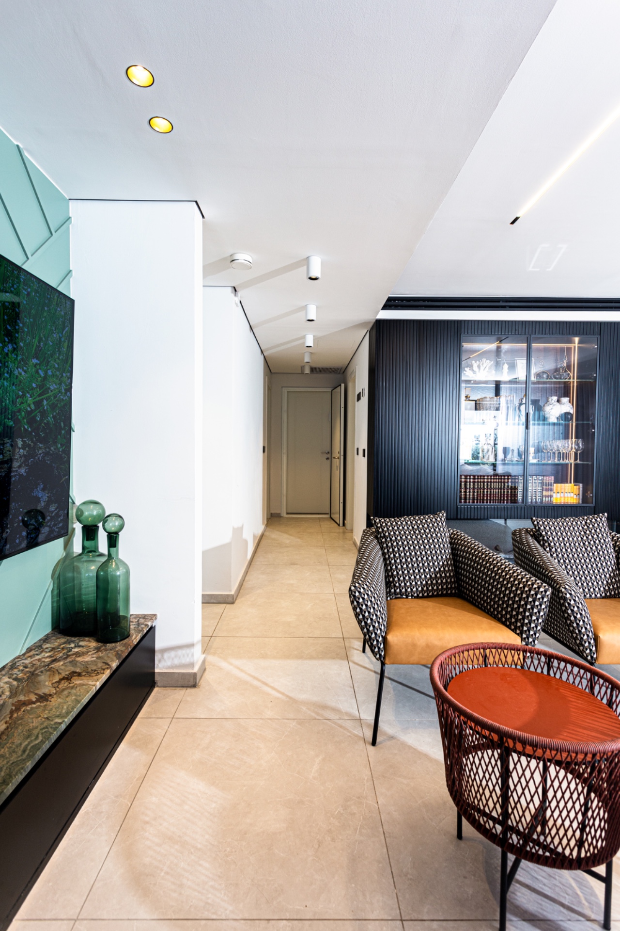
NEW 2026 Jubileum Edition The Best Interior Designers Benelux
Order Now €125